Filip Peraic Sets the Stage
for Leon Bridges' New LP
MIKE O'DONNELL / EDITOR
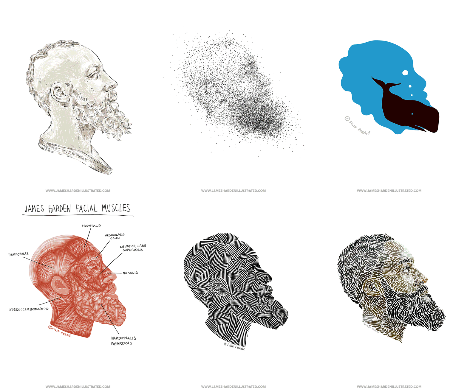
After fawning over WNW Member Filip Peraić's personal project "James Harden Illustrated," it's great to see that exercise directly lead to his next all-star project. The Croatian Illustrator + Designer has created ten original pieces to serve as the official song artwork for Leon Bridges' much-anticipated new LP Good Thing, released May 4th. Filip's art is rendered as subway ads, Instagram stories, concert animations, and will also be available as lithographs in special-edition versions of the LP.
In our interview below, Filip discusses the collaboration with Leon Bridges and Columbia Records, how he thinks his artwork effectively sets the stage for Bridges' new sound, and which musicians he'd love to design artwork for next.
Tell us a bit about your creative background. Who is Filip Peraić and how did he get here?
I’m an illustrator and designer based in Zadar, Croatia. While attending School of Design, I started getting commissions for illustration projects. Somehow, my first commission ever was the cover art for Fly Emirates inflight magazine. The cover won a Merit Award from the Society of Publication Designers. After earning a Masters degree in 2013, I just kept going. So far I have worked with brands such as IBM, Sony, Nike, Forbes, Sony, Wired, Columbia Records and others. My work seems to revolve around illustrating human faces in all sorts of ways and I love that, although I do other stuff too. It’s hard to do a good portrait and clients trust me with that.
How would you describe your creative style? Do you recognize a signature style that links all your projects?
I’m sure there are some signature aesthetics linking my projects, but I try to avoid having a style. I like illustrators who think as designers; I get so bored when applying the same style to multiple projects. I like to push myself and look for new ways of expression. I want to work on diverse projects; that’s why I’m showing a wide array of approaches in my portfolio.
What do you see as the turning point in your creative development and career?
I’d say my personal project "James Harden Illustrated." I created this project in 2014 where I draw the profile of NBA player James Harden over and over again, using different concepts and styles just to work on my skills. Soon, they went viral. From USA Today and Yahoo to Colombian radio and French TV shows, people talked about them and found them pretty weird and interesting. I was already working a lot, but this opened new doors and art directors started asking for stuff I was doing in my personal project for fun. Doing self-initiated work is something everyone should do. That’s where you work on stuff you have a passion for, and if the work is good, hopefully people will hire you to do same thing for them.
“The whole project is sort of a dream job. The team trusted me and I had creative freedom from the start... Right now you can find my artwork in subway systems of New York, Los Angeles, Chicago and San Francisco.”
For the last few months, you’ve been working on a project with Leon Bridges and Columbia Records. What’s it all about?
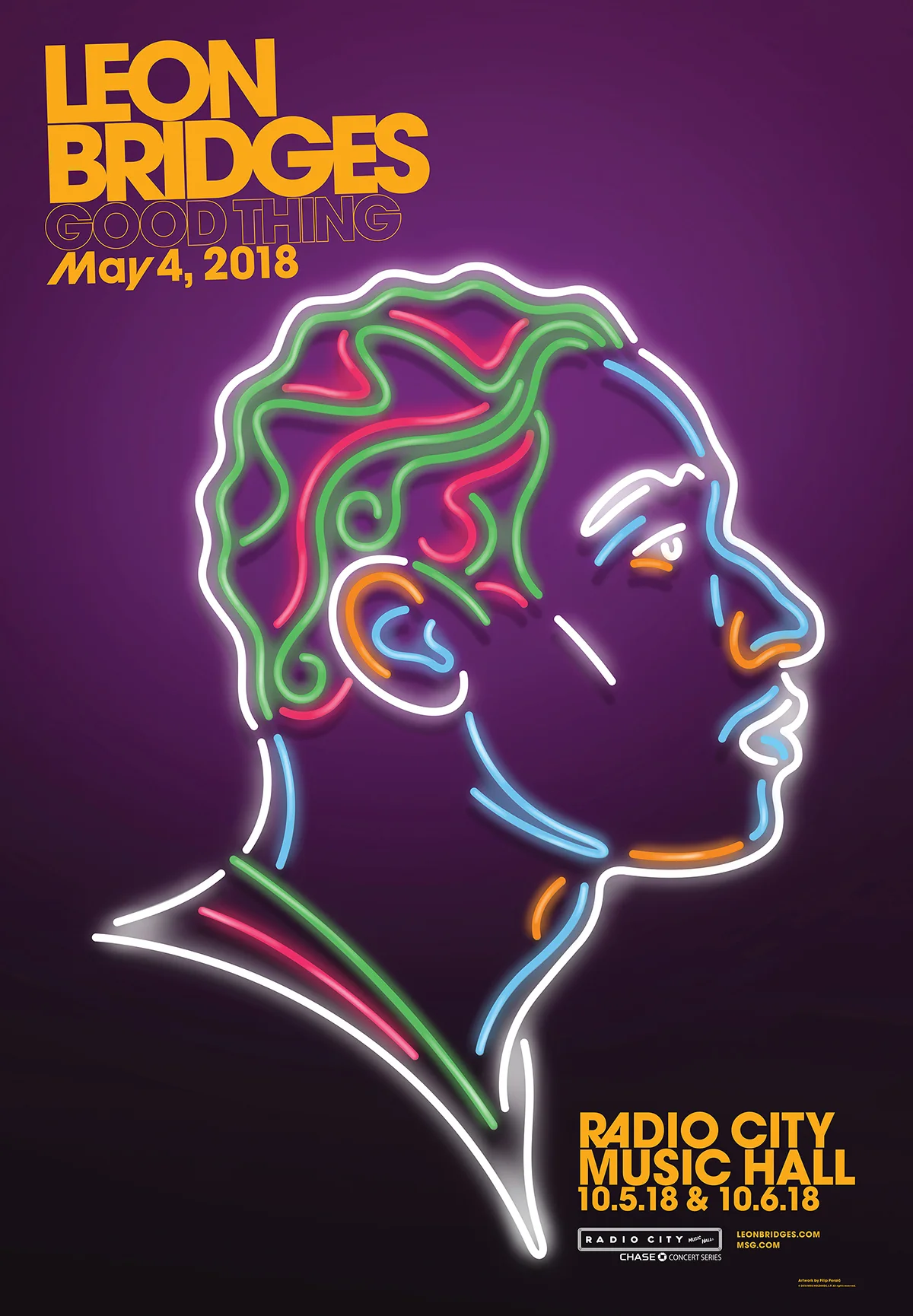
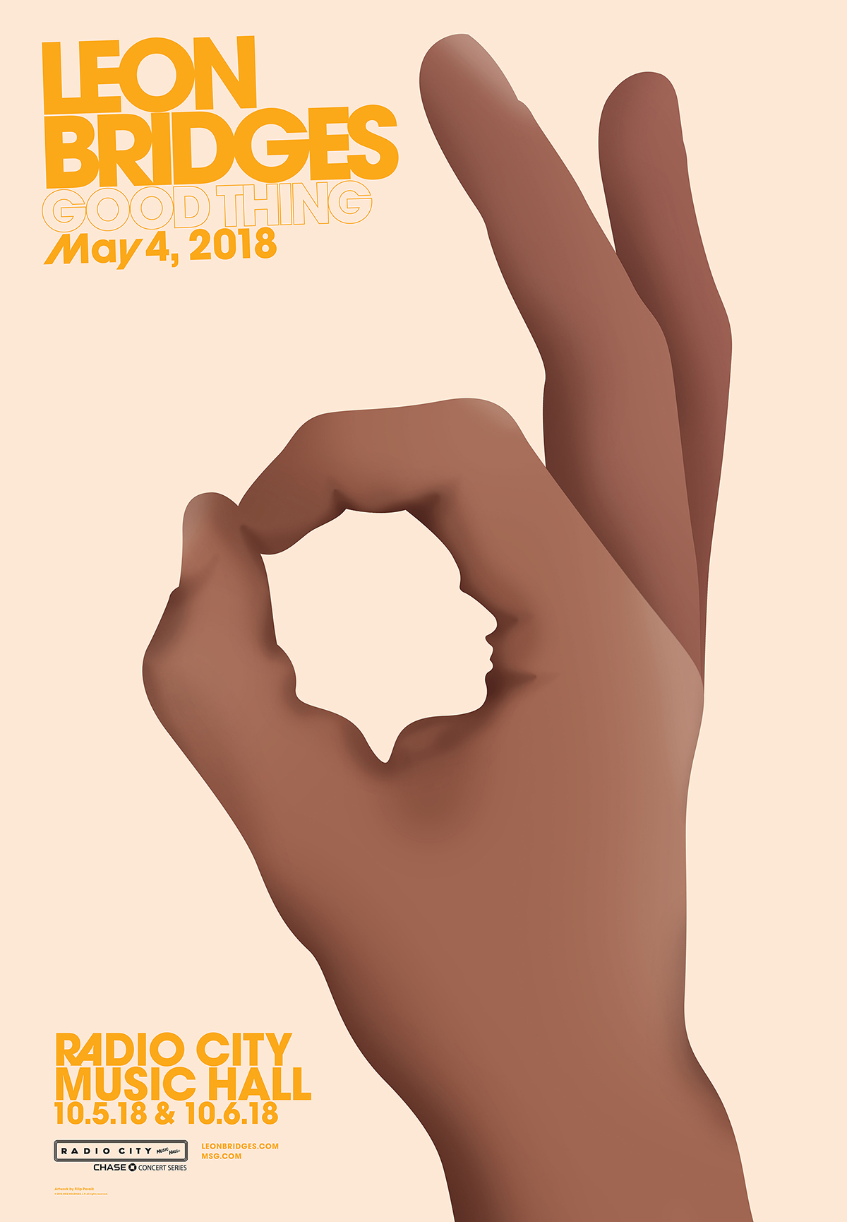
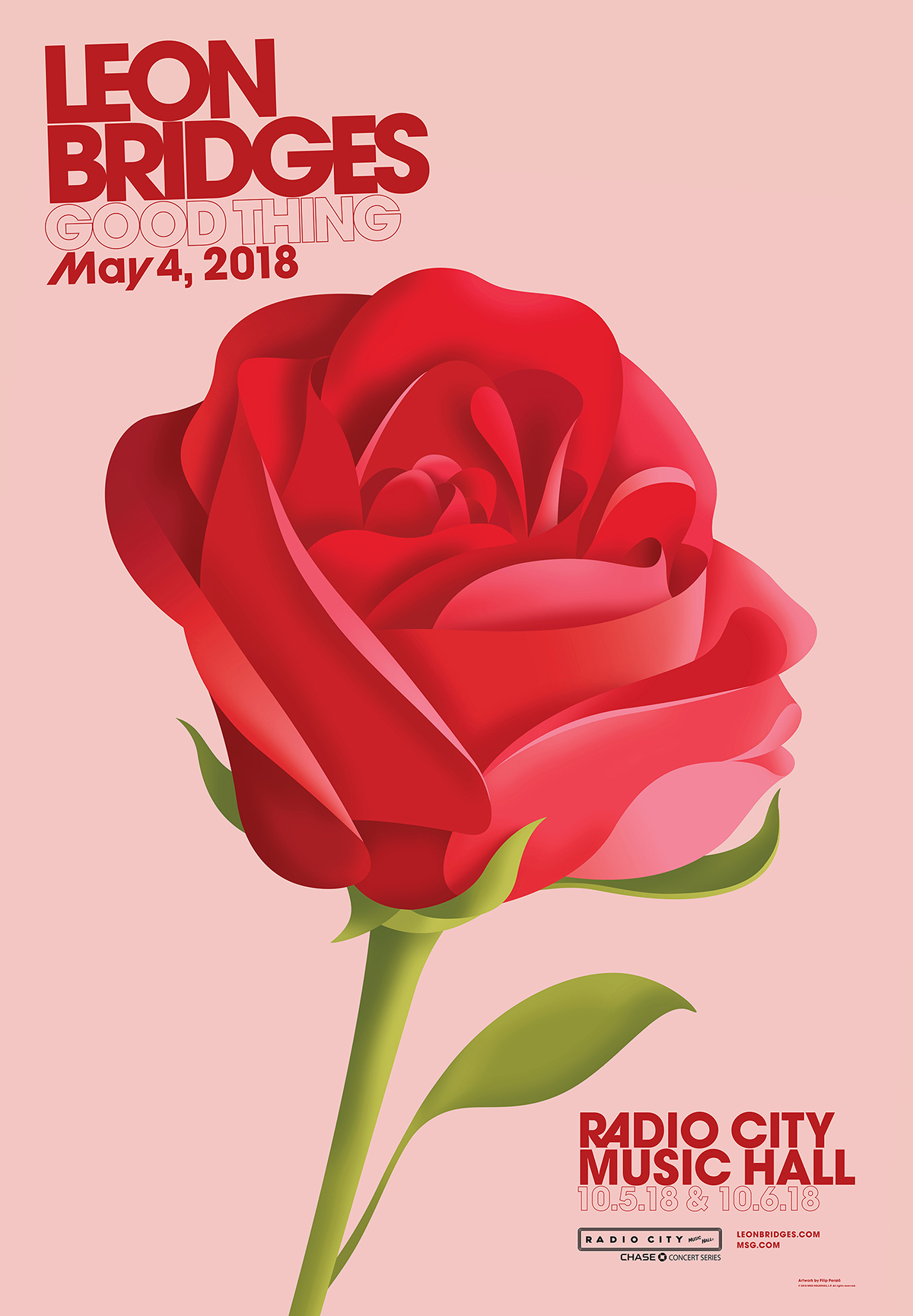
I was approached by Leon’s agents with an idea that we do something similar to my James Harden Illustrated project. We discussed ideas and ended up creating a series of ten artworks which are used as official singles covers for Leon’s much anticipated new album Good Thing. The whole project is sort of a dream job. The team trusted me and I had creative freedom from the start. There is a worldwide campaign out; right now you can find my artwork in subway systems of New York, Los Angeles, Chicago and San Francisco. Live shows include animated artworks, and there will be special LP editions with lithographs, and so on. Best of all, I got to listen to Leon’s new album for months before it came out! They have these watermarked secure links, top-secret stuff.
What was the goal for the project? What excited you most about taking it on?
It was exciting to get the opportunity working for Leon and Columbia Records because I liked his music even before the team reached out to me. The concept was ambitious. It’s tough to do ten portraits of the same person while aiming at certain aesthetics without repeating yourself. Luckily we had enough time to juggle many ideas and filter the best ones. Our goal was creating a collection of single cover artworks that will be used everywhere, including social media, prints, merchandise, and animations. The idea was to subtly evoke feelings of some 70s covers, including bold colors, gradients and collages. The label did a great job of building the album’s visual identity which goes so well with the art.
“There were many references. Each piece pretty much had a different mood board. From Grace Jones covers by Jean-Paul Goude and Waldemar Świerzy portraits to Miami Vice visuals, neon lights, and so much more.”
Do you work best finding ways to bend restrictions or when you have a wide open brief?
I like having certain constraints because that’s when you can look for a way to do something unexpected. Having rules actually helps me.
Were there any particular creative influences and references you turned to going into this project?
There were many references. Each piece pretty much had a different mood board. From Grace Jones covers by Jean-Paul Goude and Waldemar Świerzy portraits to Miami Vice visuals, neon lights, and so much more.
Can you share some of the creative challenges and breakthroughs that came with this undertaking?
The first challenge was to come up with a good idea for each song, I wanted to make portraits that surprise. You have to take a good look at some to notice the portrait of Leon hiding in there. The second challenge was execution — finding an ideal balance between doing a conceptual portrait while achieving the likeness of Leon. We aimed at aesthetics that don't include realistic renderings but you still have to recognize it’s Leon. We wanted visuals to have this clean, iconic quality to them. I felt I was more designing the portraits rather than drawing them. The third stage was the production of animations of each portrait that will be used on video walls during Leon’s shows and on his social media. This took the work to a whole new level and I love how they look when animated.
“One piece of practical advice: always do more background than you initially need. Illustrations should be okay for use in 9:16 Instagram story format and wide enough for 16:9 videos.”
What expectations do you think your artwork sets about how Leon’s new release will sound?
Leon’s new sound has a more modern soul and progressive feeling compared to the first one. We wanted visuals going in the same direction. We made a mood board with some covers from the 70s but I tried not to blindly follow those visuals. The portraits are kind of an eclectic mixture just like Leon’s new sound. The art includes all sorts of mediums: collage, actual broken glass for “Bad Bad News,” and neon lights.
Any lessons creative or otherwise learned that you’d like to impart?
One piece of practical advice: always do more background than you initially need. Illustrations should be okay for use in 9:16 Instagram story format and wide enough for 16:9 videos.
If you could design album art for any other artist, who would it be?
Ha! This made me think. Philip Glass and Rihanna.
What’s your favorite thing on the internet this week?
Probably Richard Turley’s crazy Volkskrant cover. Reminds me of the Sex and Lies 3D work by Mirko Ilić.
What do you do when Not Working?
When not working for clients, I love drawing in my sketchbooks. I like to lead a pretty active lifestyle, working out and hiking. I live in a Mediterranean city by the sea, the climate is ideal so you can spend a lot of time outside.
Who are some other WNW members whose work you admire and why?
Nicolas Ménard! The way he tells his stories is wonderfully weird and bold.
Check out Filip's portfolio site and make sure to follow his latest updates on Instagram.


