“As a fan and a commercial illustrator, it’s the coolest thing to look at the list of available stars to work with and brainstorm visual ideas. These posters are stories: the wrestler’s stories. It’s my main priority to have a sensitivity to that and create exciting ideas that everyone is happy with.”
Read MorePROFILES OF THE WEEK: MARCH 23RD
PROFILES OF THE WEEK:
MARCH 23RD
Eric Stevens, Art Director. Los Angeles.
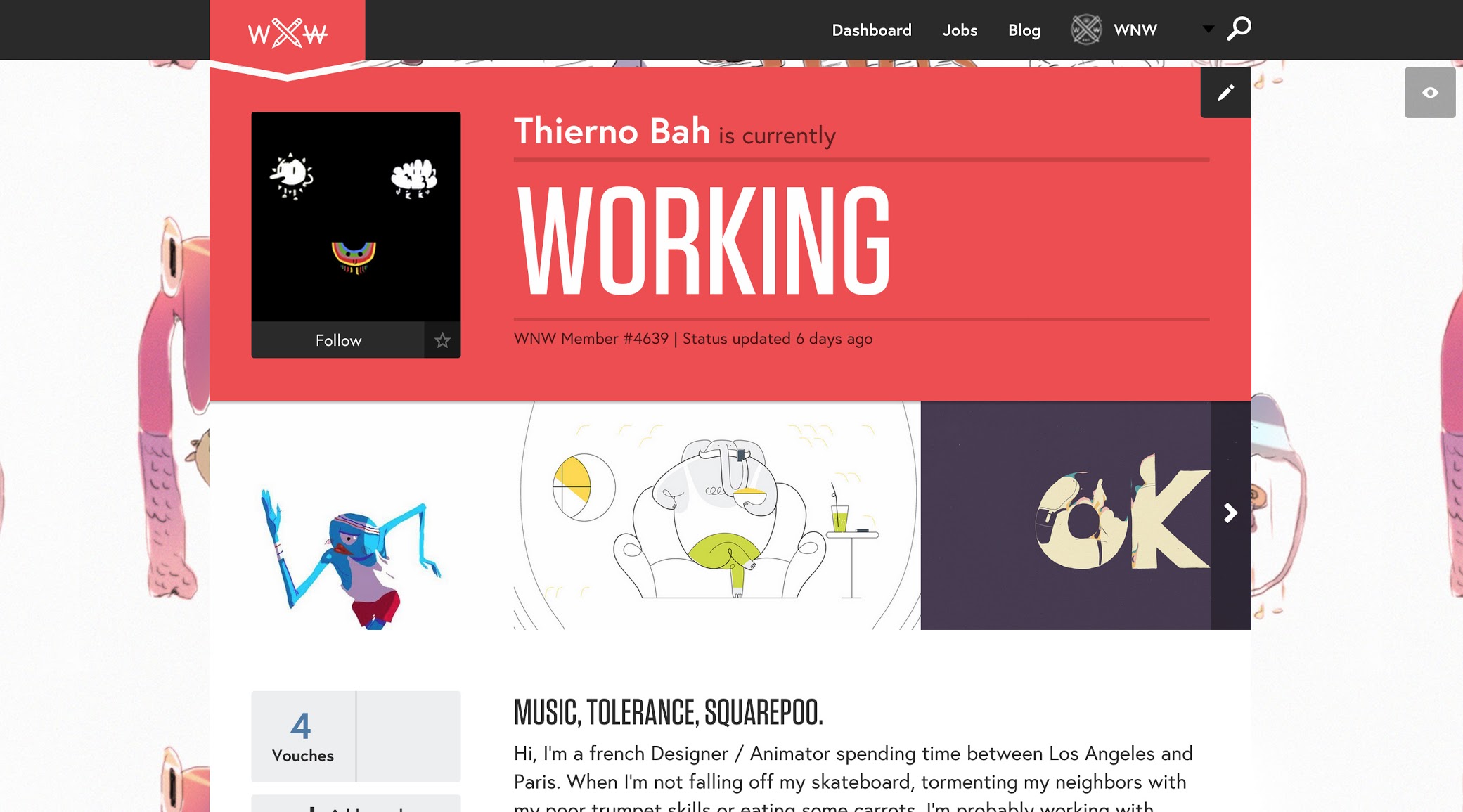
Thierno Bah, Animator. Los Angeles.
Jonathan Bartlett, Illustrator. New York City.
Leanna Perry, Designer. Brooklyn.
Scarlet Page, Photographer. Reading, UK.
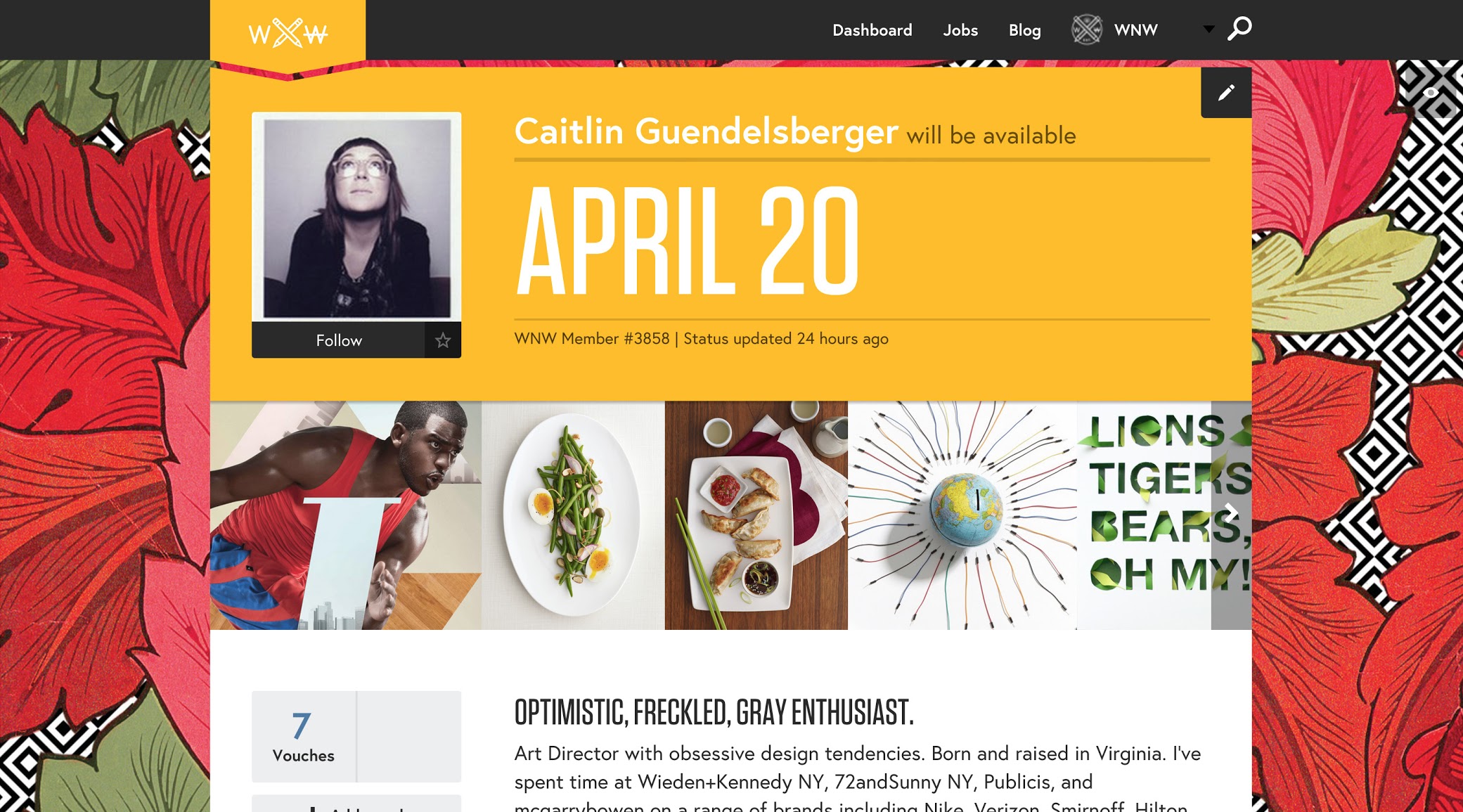
Caitlin Guendelsberger, Art Director. Brooklyn.
Jeff Greenspan, Copywriter. New York City.
Think your profile should be featured? Email us!
WORK: RALPH LAUREN ART WALL PROJECT
WORK: RALPH LAUREN
ART WALL PROJECT
WNW Member #2487 Jonathan Bartlett just tackled a pretty big job. The proof is, well, incredible. Jonathan created a mural spanning the entire Denim & Supply, Ralph Lauren building, located at University Place and 12th Street in NYC. Pictures are one thing, but if you can go see it for yourself.
How did you get involved with Ralph Lauren?
Ralph Lauren was initially in touch with a few mentors of mine which I believe led to my name being thrown around. After the standard vetting process we had a great first meeting and things took off from there.
How long did the planning and the painting take?
For a project of this scale it was relatively short. I signed on at the end October and we just launched the final product the first week of February. From day one the clock was ticking and everything else was put to the side. I make pictures all the time, but with this project had so many different things to consider; window displays, T-shirt designs, in-store displays, to name a few. I had very little time to doubt my own ambitions, so in reflection the tight deadline was probably a good thing.
Before
Did you paint it yourself of did you have help translating it to the wall?
NO! That would have been a disaster. I am incredibly lucky that we were able to partner with the world famous Colossal Media (Skyhigh Murals) to do the painting. Colossal is amazing, I can't stress how great it was to work with those folks. True artists. Much thanks goes to Jason Coatney, the lead painter. If it were not for him, this thing never would have come together so well.
Jonathan in the studio with the team from Skyhigh Murals
Have you ever done anything this big before?
Absolutely not. The one project that comes to mind was when I illustrated a poster for the NYC MTA. Seeing my illustration throughout the subway system felt (and is) really big, but then this opportunity came along and the scale, literally and figuratively, got turned way up.
What was the biggest challenge?
The biggest challenge was not what to make pictures about, but how it would fit on the building. Working to design an effective composition with meaningful content all the while thinking “ Does that face fall in a crack? How far apart must these flowers be to avoid a doorway? That would look good, but there’s a sculpted wall ornament in the way…”. In the end I was able to use those things to my advantage, it just took some mathematical-like problem solving to get to that point.
What other pieces did you do for the project?
There were so many things. What was great about this project was the ability for me to break out of the box of what illustration can be. It was by no means just pictures on paper, which you can see from the list below...
-Mural for the exterior
-Window concepts which link directly to the content on the wall
-8 conceptual assemblage sculptures, such as the bowler hats with floral growth
-2 new illustrations as window back drops
-2 T-shirts, female and male
-2 scarfs designs made from T-shirt art and other project elements
-4 short animations for Instagram video
-Store signage
-(yet to be released!!) Ad campaign posters for project promotion. (really excited for this, it's going to be sweet.)
How was it different creating the image for the wall vs. print or digital?
Honestly, because I didn't have to literally get up on a lift and paint the wall myself nothing about my process had to change. Kind of rehashing your earlier question, the only major difference was considering all of the obstacles that could ruin the image. It was much more complicated than worrying about a page gutter or headline to work around.
AFTER


