Corey Brickley Adds His Touch
to Netflix's New Hit Doc
MIKE O'DONNELL / EDITOR
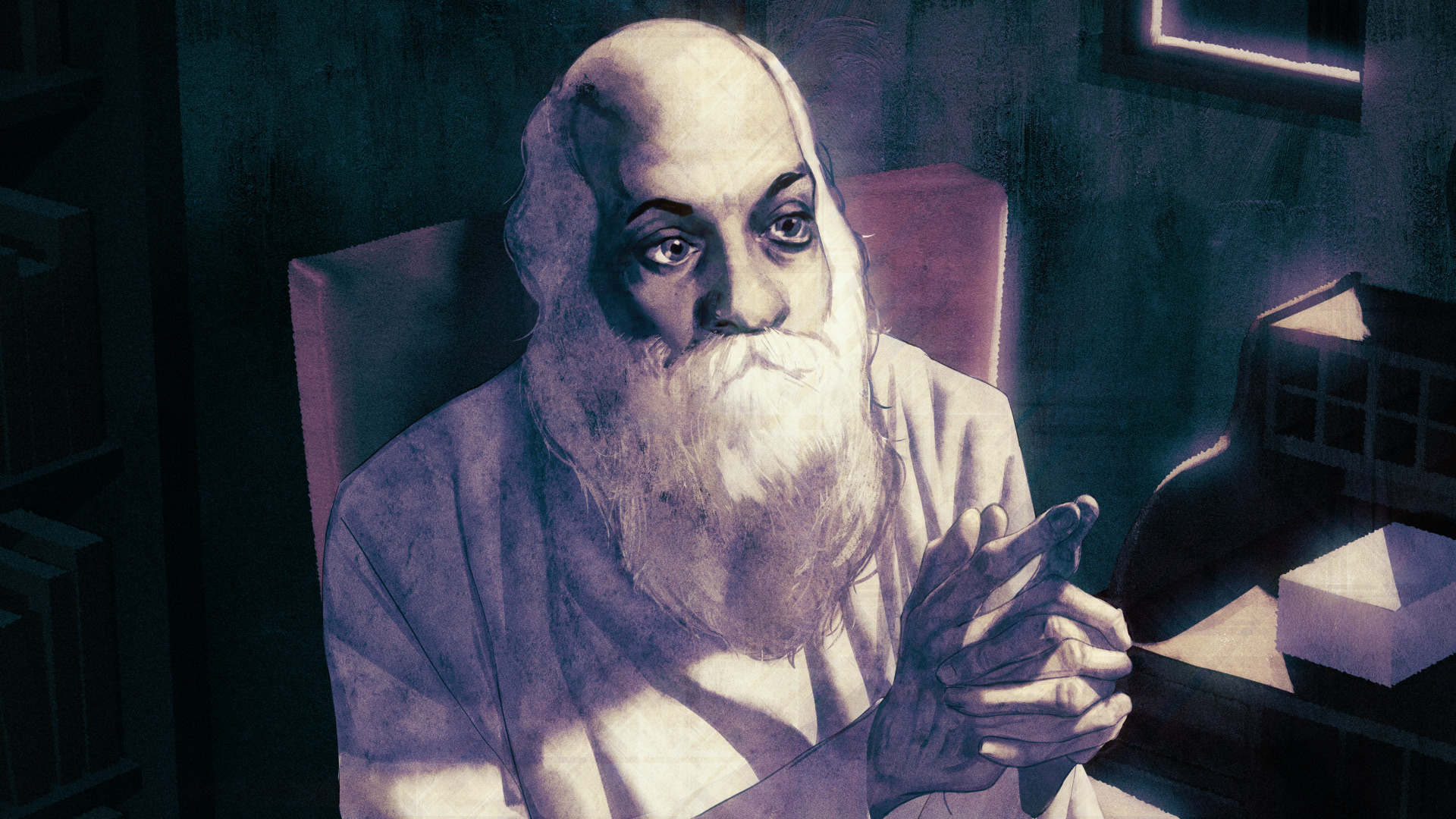
WNW Member Corey Brickley has built his career as a freelance illustrator, primarily creating editorial pieces for coveted clients like The New York Times, The New Yorker, Huffington Post, VICE, and The Atlantic. But his latest project may be his most impressive of all, not just in quality but in how distinct it is from the rest of his portfolio. Corey was brought in by Netflix and Duplass Brothers Production to create animations and illustrations for Wild Wild Country, a new documentary series about a controversial guru who builds a utopian commune in the Oregon desert, causing a massive conflict with local ranchers.
Below, Corey goes into great detail on his process and how he worked to keep his creative contributions both visually striking and tonally complimentary to the live footage and filmed interviews. Wild Wild Country is streaming on Netflix.
How did you first hear about the job doing animations & illustrations for Wild Wild Country?
I was contacted by one of the documentary’s directors, Chapman Way, who’d seen some motion editorial illustrations I did for the Huffington Post in 2015. Even though he (and his brother/co-director Maclain) had tons of archival footage to work with, some events talked about by the interviewees hadn’t been filmed, and they thought it would be cool to depict those scenes with illustration & animation. They thought my style worked well based on the Huffington Post piece and got in touch!
What expectations did you have going in and in what ways were you surprised early on?
Mostly I was nervous about doing a good job. This was my first foray into the world of documentary filmmaking, and Duplass Brothers Productions as well as Netflix are intimidating first clients. Luckily the creative team and everyone involved were super awesome to work with and incredibly friendly and accommodating. I definitely felt like a part of the team early on.
“This was my first foray into the world of documentary filmmaking, and Duplass Brothers Productions as well as Netflix are intimidating first clients.”
Who else was part of the creative team you worked with? Or was this a one-man operation? Who from the show did you bounce ideas off of?
I worked almost exclusively with Chapman and the documentary’s producer Juliana Lembi. We shared many, many e-mail chains and conference calls during the documentary’s production.
What was your process for actually building these animations and illustrations?
Chapman would first send me the documentary episodes with big “ANIMATION” title cards inserted into the spots where animation would go, and we’d talk a bit about the content of the animations. I’d send the footage back with sketches inserted into the “ANIMATION” spots and Chapman would e-mail me back with any notes. At that point I’d treat the shots like any other editorial illustration I do--taking reference photos, doing gestural sketches, then working in Photoshop and Cinema4D to build the illustration. After that, I’d export different elements into PNG layers I would bring into After Effects, where I’d add a bit of parallax motion as well as some other fun bells and whistles to make the shots pop.
What were some of the creative challenges that came with the job? Did you have any prior experience with narrative graphics or TV animation?
The Huffington Post piece I’d worked on was the closest I’d come to this type of project, though it wasn’t nearly as big in scale. I’ve always dabbled in After Effects and Cinema4D as a hobby, so I was definitely stoked at the opportunity to go more in-depth on a project like this.
If not, was the initiation into this world energizing or daunting?
Definitely both! I was definitely worried about doing a bad job, but at the same time the work was such a blast to produce and the story of the documentary was incredibly compelling. I think mostly I was excited to be working with such fantastically gifted filmmakers.
“The style of my editorial work matched the visual and narrative tone of the documentary. A lot of stuff I get assigned is a bit grittier and darker, and I think that darker sensibility and sense of drama was something I put a lot of attention towards.”
How long did the project take?
I worked on it on and off for about 7 months as they finished cutting together episodes. I think all told, my work on the project was probably about 7 concentrated weeks of work spread out over those 7 months.
Your animations are vibrant yet they complement the visual tone of the camera footage and interviews. What are certain creative considerations that came with the job?
I think Chapman in part picked me because the style of my editorial work matched the visual and narrative tone of the documentary. A lot of stuff I get assigned is a bit grittier and darker, and I think that darker sensibility and sense of drama was something I put a lot of attention towards.
Are there any other TV graphics or other creative influences that inspired this work beyond the documentary itself?
I always try to emulate my illustration heroes in my work, to varying degrees of success, including J.C. Leyendecker, Bernie Fuchs and the Stenberg Brothers. I love mixing flat, graphic areas with a more painterly, textured look and those sensibilities were definitely present on this project.
What are some skills that you have developed through working on this project?
I got a lot better at painting backgrounds and doing figures quickly while working on this! The illustrations I did and the fluidity of the animation got drastically better as I worked on the project. I actually wish I could get a second shot at some of the earlier animations I did, haha.
What advice from this experience can you share with fellow WNW Members?
Say yes to things outside of your comfort zone, and then crush it! It’s always wild to me the paths that lead to projects--saying yes to one crazy thing will randomly put your work in front of the eyeballs of someone who has an amazing project you’d be perfect for.


