
It's Nice That Enlists Illustrator Thomas Hedger for New Issue of Printed Pages
WORKING NOT WORKING
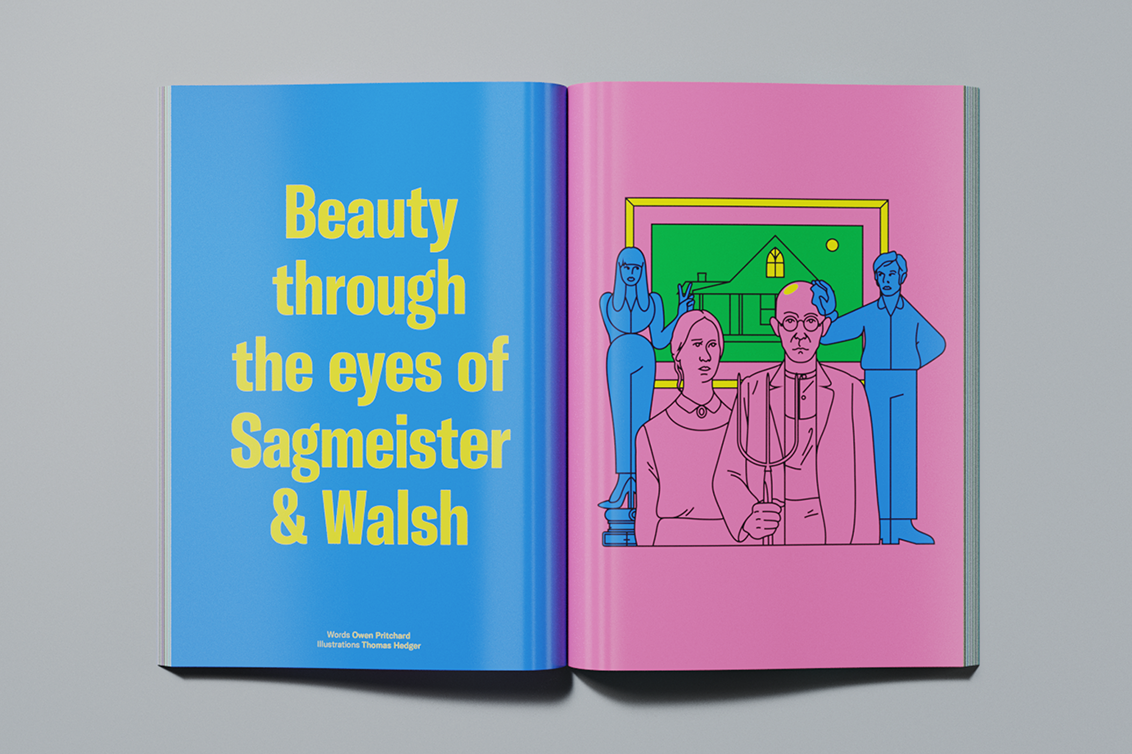
In the latest issue of Printed Pages, our friends over at It's Nice That commissioned WNW Member Thomas Hedger to illustrate a feature interview with design duo Sagmeister & Walsh.
As a pair who have been thinking hard about beauty, aiming to “eradicate the tired notion that beauty is in the eye of the beholder,” Hedger’s illustrations place Sagmeister & Walsh in a series of classically beautiful, instantly recognisable artworks. Find out how Thomas interpreted such distinguished works as Edvard Munch’s Scream to Réne Magritte’s The Son of Man into his own style, below.

Talk us through the brief you were given when first approached to create these illustrations?
In response to Sagmeister & Walsh’s upcoming Beauty Project, I was asked to illustrate famous, classically “beautiful” historical artworks, injected with a bit of cheek to sort of reflect Sagmeister & Walsh’s studio reputation. I was really excited by the idea of having a go at drawing a series that I’d never approach on my own and about being part of a bigger conversation. Although I felt pretty intimidated about having to recreate such prominent and recognisable artworks! They were so well carved into my mind, that forgetting about them in order to approach them from new eyes was going to be difficult and, of course, I wanted to do them justice. I also thought a lot about striking the tricky balance between representing the artworks and introducing the silly side — I really wanted to avoid any meme-like qualities, where the artwork is mocked.

From this brief, what were some of the initial ideas you explored?
With the artworks set, I tried to break them down and strip them back to the parts that make them recognisable. I played around with how much I could take away from a piece or ways in which I could restructure elements. Some of them were easier than others, like The Son of Man, it’s the bowler hat and the apple. However, with The Rape of Proserpina I didn’t want to undermine the piece by subtracting, I wanted to keep the story intact – Cerberus and all. At the start I looked at past campaigns by Sagmeister & Walsh – their naked photo shoot and Pins won’t save the world, for example. I tried to reference these to merge the campaigns with the artworks but I think it started to over-focus (or become overtly cheeky!) and ended up clouding the original artworks, only making them harder to make out.
How, eventually, did you land on the idea of recreating famous artworks with Stefan and Jessie incorporated into them?
I had the chance to work with It’s Nice That’s art director Will Knight on this project, which was great. The brief was quite open from the beginning in wanting to insert Stefan and Jessica. It started on the idea of face-swapping them in place. But after we bounced a few images between us, it was nice to see the idea develop more towards how Stefan and Jessica could interact with the artworks and that’s where the fun came. It also brought forward a respect for the pieces as the humour came out indirectly in wanting to play and put yourself in their place. The artworks are so widely recognised, I think we can all sympathise with wanting to dress up and engage with them a little less formally.


Which artworks have been recreated and why?
The brief set out the artworks but I feel they weren’t the usual choices – there wasn’t the Mona Lisa, David or The Birth of Venus that typically get chosen for their “classical beauty.” They all show very different ways that an artwork can be beautiful, which is not objectifying or prescriptive. What was really interesting to think about was why a work is perceived as beautiful, even though the subject is nightmarish – like considering beauty with Edvard Munch’s Scream - it opens up a deeper meaning for their quality and story. The pieces all bring something different, which made it quite nice for me to draw as I could have some fun with that but having them all figurative meant Stefan and Jessica could interact easily with them.
How did you decide what they would look like? For example, why did you choose this colour palette? Or to keep the colours as block colours, free from texture?
I was tempted to take these down a hazier path. I think I could have played with the dreamlike atmosphere to abstract beauty but then the drawings would have ended up more suggestive and not recognisable, which was key. Keeping to bold graphic lines meant I could try and make the idea of the story more obvious – it was this idea of keeping them honest and obvious that directed me away from free and floating tones. This came through with the colours, which I settled on quite early – I don’t normally do that as I usually leave choosing colours to the end but I wanted them to all jump out at you rather than softly sitting on the page – to jump out and say, “I’m American Gothic, you know me.”