How to Create a Brand Identity that Sets the Mood for an Erotica Audio App
Interview by Mike O'Donnell / Editor of the WNW Magazine
When Dipsea, a female-founded tech company and story studio, reached out to WNW Members Elena Miska and Victoria Herrera to create a brand identity system, web design, and printed collateral, there was little hesitation. “We were excited to take on a project made by women for women with such a provocative message, and knew that the branding had the potential to be as modern, refreshing and sexy as the platform’s content. Plus, we were excited by the fact that we hadn't seen anything like this out there.” Dipsea provides a platform for audio content that is catered specifically toward the sensual and psychological wants and needs of women. It’s a market that’s unfortunately undersaturated, which only further enticed Elena and Victoria to take on this unique brief.
In our interview below, Elena and Victoria share how their design approach served the client, what’s involved in creating visuals for an aural experience, and what their biggest takeaways are from this experience.
How did you get on Dipsea’s radar, and what made you say yes to taking on the project?
We connected through our network in San Francisco, where we first started working together before moving to New York. We were excited to take on a project made by women for women with such a provocative message, and knew that the branding had the potential to be as modern, refreshing and sexy as the platform’s content. Plus, we were excited by the fact that we hadn't seen anything like this out there.
What were you tasked with creating?
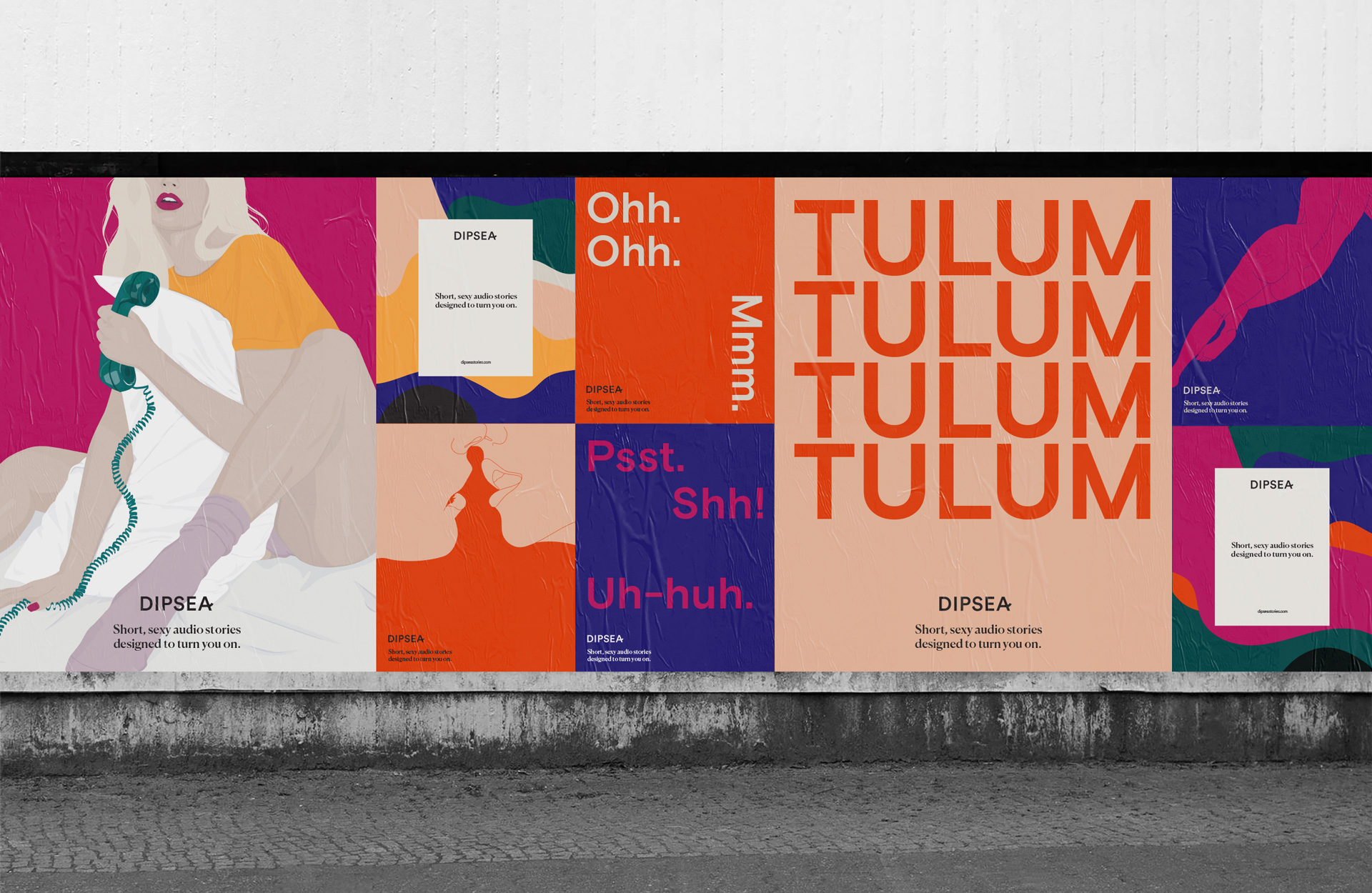
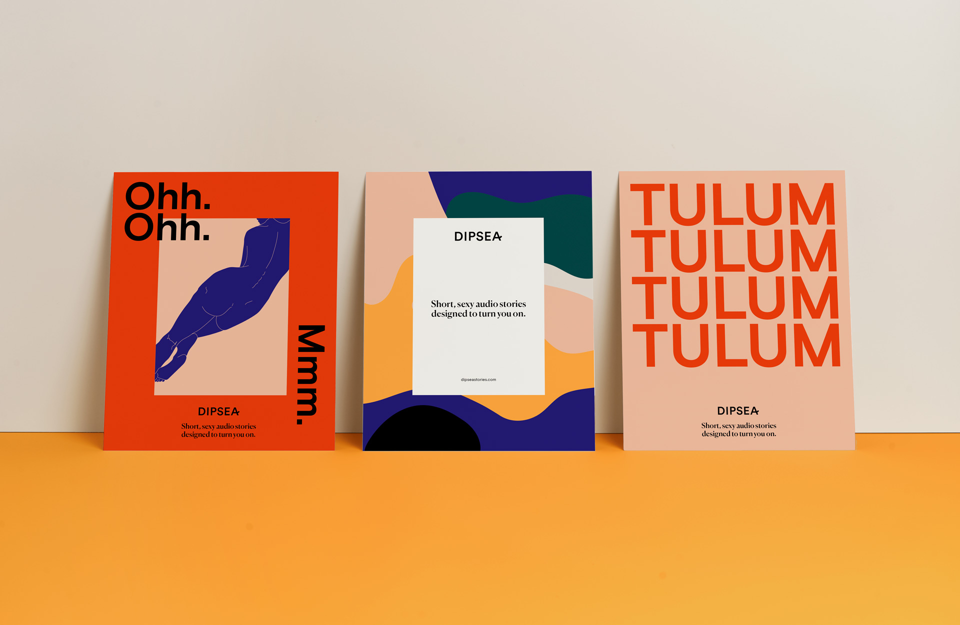
We were first tasked with creating a brand identity system, and one that could be flexible enough to house a library of other artists' artwork while still being interesting enough that it could stand on its own as well. After establishing that system, we then went on to design Dipsea’s website and key app pages, as well as printed brand collateral.
How did your branding and design approach cater to the sensual, psychological, and feminine nature of Dipsea?
These were essentially the key words that made up our design strategy. We knew it needed to appeal to a female audience, it had to be sensual in an approachable way, and that it should be something women are proud to use.
The direction that our clients selected was inspired by the layered sound design of the audio tracks themselves. (For example, in the story “Tulum”, the listener hears the ocean waves, the breeze rustling through the palm fronds, and other background sounds to really put her in that place while the story is going on.) These were visually represented with the layered organic shapes that became the primary graphic language of our identity. That in combination with a rich color palette added to the depth and resulted in an artful system that could both stand on its own or house the artwork for each of the tracks.
What are your creative considerations when trying to add visuals to a mostly aural experience?
Our clients knew from the beginning that they wanted each of the stories to be visually represented by illustration-based artwork. This is an important element, as it’s the one visual that might entice a user to listen to that story. So while we did create the initial set of illustrations for Dipsea’s launch, one of the main considerations for us during the design phase was coming up with a set of guidelines that future artists commissioned by Dipsea could use so that their illustrations were on-brand without hindering their artistic expression.
Did you sample Dipsea’s offerings to inform how you would brand it?
Yes, we did! It was the only way to really understand how unique the experience was, and it’s what informed our designs when we started working on how we could visualize the soundscapes.
What are your biggest takeaways from this project?
Great work can come from great collaborations. We fully believed in the product our clients were developing, and our clients fully trusted us to do the work they hired us for. This resulted in a really enjoyable, seamless process that gave us a result we are all extremely proud of.


