Parisian Typographer Tyrsa Discusses Donald Glover, the Influence of Graffiti, & Us By Night
Interview by Mike O'Donnell / Editor
WNW Member Alexis Taieb (AKA Tyrsa) is a Paris-based typographer who has worked with clients including Nike, Jordan, Drew League, Criterion, Timberland, and Donald Glover. In our interview below, we discuss his recurring collaboration with Donald Glover, from “This Is America” to Guava Island, and also touch on how graffiti has influenced his typographic work and why he’s excited to return to the Us By Night festival this year (and the next ten.)
Mike: How did you first get started in type? And when was the moment you decided to pursue it in a professional capacity?
Tyrsa: I started doing graffiti and painting murals almost 20 years ago when I was around 14. I wasn’t really doing typography at all. I was mainly doing complicated letters that only graffiti artists could read and understand. I then started studying painting a lot and learning what graphic design was. With graffiti, I was spending hours and hours just drawing one letter because I needed to have my own style. When I learned what the classic typographers were doing, I understood that these guys did what I was doing, but a hundred years before me. I started to really fall in in love with old-time typographers.
While at school, I starting doing my first freelance jobs for friends, things like flyers and posters for parties and shows. And that's where I started to mix my knowledge of graffiti with my understanding of typography.
Mike: What's your creative approach now? Is there a process of mood boarding and research? What’s your general process for how you kick that exploration off?
Tyrsa: It's funny because I don't have a clear process. Each project is different and so each process is different too. With a lot of projects I take a lot of time to do mood boards and to try to understand my client's ways: what they’re doing, their values, their identity. And then I do a lot of sketches.
Sketching is a really important process for me. And you'll see in my office I have so many filled-out A3 papers where I evolve an idea. But sometimes, you have clients where the idea comes right away. And you say, "Oh, maybe I should try this." So you don't need to do all this research. I like not having only one kind of process because each client's project is different. But everything starts with a pencil and a sheet of paper.
“I like not having only one kind of process because each client’s project is different. But everything starts with a pencil and a sheet of paper.”
Mike: Just from looking at some of your projects, it seems like you're comfortable ultimately working with different mediums and tools too. Whether it’s Sharpie or gold paint or staying with pencil.
Tyrsa: I think that my goal today is not to be the best at using each tool; it’s just about using the right tools for the right project. I take time to process which tool will work well with a project. So, for example, you mentioned a sharpie, which I used for the “This Is America” logo for Childish Gambino. When I understood the lyrics and the idea behind his video, I found that I had to use something really simple, something that everyone could use and draw.
Childish Gambino talks about some really important issues in the US, so it was not about me or about showing my skills. It was more about an American voice of an everyman who could be heard and understood by everyone.
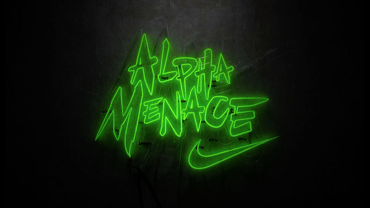
When I do work for Nike, where it's all about something dynamic, something edgy, something rough and tough, I believe that using a brush plus acrylic and adding some texture will work way better. I believe that I use the tool when it's the right subject and project in front of me.
Mike: How did your recurring collaboration with Donald Glover come about? What was the first project you guys worked on?
Tyrsa: It's funny because we started working together three years ago now, on his album Awaken My Love. So, Awaken My Love was first named Operation Highjump. And they asked me to work on some lettering for the album. They found me through friends of friends. They were looking for someone doing typography, and they picked me because they considered my style to be pretty versatile and felt I could adapt.
So they gave me the final album cover image and they said, “Can you do some exploration for Operation Highjump lettering?" So I did a ton of exploration over maybe two months. It was pretty cool because they gave me a lot of different references which were not really in my style. Most of my clients give me my own references. They say, "Oh, we love what you've done for this project. Can you do the same for us?” Here, they gave me random posters from different bands and groups—sometimes psychedelic posters, sometimes hardcore metal bands and rock bands. Then, we agreed on one look, it was approved, and I was waiting for the album to be released. And I didn't hear any news until they contacted me to say that they changed the name of the album and didn't need any typography any more.
So, my work was not released for that project. After that, they contacted me to work on Atlanta. So I did a lot of exploration for the logo of Atlanta. And the exact same thing happened: at the last minute, FX wanted to do the logo in-house. So Glover and his team told me, “We’re probably going to do this in-house." So my logo and all my exploration was rejected and nothing was approved. So it was the second project that was not released.
Finally, they called me a little more than a year ago to work on the poster for the Childish Gambino tour and I did a lot of exploration, and this time it was released. After it was released, they asked me to do a lot of different typography. They asked me to do “This is America.” They asked me to do the Child Gambino logo. They asked me to do the Guava Island logo too.
I'm still this guy they know who is able to do a lot of different things if they need any kind of typography, and I’m in.
Mike: After the second instance where your work was not released, were you starting to internalize that and take it personally, or was the fact that they kept coming back to you a sign that you were doing something right?
Tyrsa: I think this kind of thing you should never take personally because you know it's not about you. It’s about an artist who has his own creative process. So if Donald believes that Operation Highjump is the right name for his album, we'll work on this business. And if at the last minute they decide to change it, no one would say in the room, "Oh no, don't change the name because there is a guy who works on the typography for it." You know? It's not about me, it's not about my ego or me, it's all about the creative process of this artist. And I'm working for this artist. I'm not the artist in this whole thing, you know?
I don't have a big ego. I don't really care about that. Even if it was the second time they hired me and the project was then canceled, I was okay with it. Working in the advertising industry, you work with so many clients and come to understand that it's not about you most of the time. I'm doing my best every time. When a client asks me something, I'm doing my best to please them.
Mike: Do you work pretty closely with Donald Glover and his creative team? It seems like he's the kind of world-building artist where every aspect of an artistic release has his complete input and approval.
Tyrsa: Exactly. I'm working really closely with his creative director Ibra Ake. I like the process because he feeds me with a lot of different references every time. Most of the time, they’re references that I myself don't know about. I try to adapt and I try to interpret what he gives me. I love it because they trust me, and I send them a lot of sketches. Most of the time I'm never really talking to Donald, but I know that at the end they have meetings to review the typography and every other part of the project. I think that Donald is surrounded by people who are really talented, but also who he really trusts.
So most of the time if Ibra approves it, then it's most likely going to be approved by Donald. For me, the big thing is to please Ibra because he's really picky. He ultimately knows exactly what he wants. We try a lot of different stuff. And then, once we try several different things, we start to know more what he wants. I explore a lot, and most of the time he gives me references in a style that’s really new to me. Everything I've done for them is not something I would've done by myself for my own project. I really like that.
Mike: That’s really interesting, that the clients projects you choose to take on will shape your creative style and point you down a certain path, whether you want them to or not. Even if just through the kinds of references you're seeing. It stresses the importance of an artist choosing the right projects and the right collaborators because they're exposing you to things that will inevitably chart your course.
Tyrsa: It's funny because I have had a lot of client projects that made me do something different even with the personal project that follows the client work. They give me references and I grow to like them. "Oh that's cool. I like this reference because I've never used it in my personal work. But I like it, so let's try and explore with this kind of reference." And then, after that you realize that it's actually really close to your own style, close to who you are, and close to your own values. So you use it again. Something can look pretty personal while at the end it's just a client's wish sent to you.
I think that I'm pretty lucky now to have really good clients, and that I like them and respect them, and that they respect my work. It's all about sharing, you know? I share my own references and they share their own references, so at the end the project is better and richer because it's brought together people who have a different knowledge and different culture sharing themselves and their ideas. My work has really evolved thanks to my clients and my briefs.
“It’s all about sharing, you know? I share my own references and they share their own references, so at the end the project is better and richer because it’s brought together people who have a different knowledge and different culture sharing themselves and their ideas. My work has really evolved thanks to my clients and my briefs.”
Mike: Which of your projects was most fulfilling and why?
Tyrsa: It's funny because “This is America,” for example, is the simplest project I've ever done. I mean, if you just see the visuals at the end, it's the simplest typography that I've done because I just took my Sharpie and tried a lot of different things. And then the feedback from Ibra was, "Can you try to do something that even a doctor might write on a prescription pad? Something not so good, not so big.”
I’ve been doing this more than 10 years now, so it was almost complicated just to do something not “good,” because I'm used to taking my hand and my pencil and creating something clean and really smooth. This time, I just had to make it appear effortless. But at the end, I realized that once you put it on this video, it becomes really iconic. So I think it was one of the best things I've ever done in my career, while it was maybe not the most “creative” process ever.
Another personal favorite project was one I started over a year ago last June for a huge mall in Paris in the Avenue du Champs-Élyséese. They asked me to do the whole identity of the food courts of the mall. I had to do the identity of the 10 different food stands. And after doing the identity of all the stands, I had to do a huge illustration with other artists doing a mosaic interpretation of each illustration I’d done. When you go into this mall, you see 10 different places, 10 different logos, and 10 different illustrations. It became pretty huge to me, because it's in Galeries Lafayette Champs-Élyséese which is a huge store in Paris, and now everyone talks about it in the fashion world, not only in France, but everywhere.
It was a nine-month project, and I'm not used to working that long on one project. Most of the time my deadlines are really short. I have to move in a hurry, have a brief, and then my clients ask me to send something within two weeks. I had 10 different stands, each stand is a different restaurant, and each restaurant already had a logo that I had to put my own style on. So it’s like I had 10 different clients. Now a lot of people go there every day and I get a lot of Instagram mentions from people going there. And I was able to do my own style while doing everything I love.
Mike: You’re going to be speaking at the Us By Night festival later this year. How did that come about and what excites you about attending this fall?
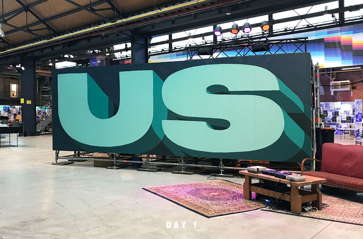
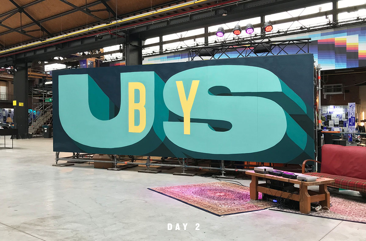
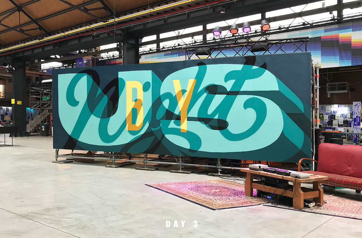
Tyrsa: Us By Night first called me three years ago, which was the first edition, and asked me to talk. I was really happy to go but I was really stressed because it was the biggest talk I'd ever done up to that point, in front of a thousand people. But it was really great. Rizon Parein was so nice and the whole team was really cool, so I felt welcomed and comfortable there. They then called me like two years after that. They asked me to go back and I painted murals. This year is going to be the fourth year I'm going.
It's an important moment for me each year because it's where I get really inspired. I learn so much directly from each artist, each photographer, illustrator, and art director. They invite the best creatives in the world. I could never dream of a better inspiration. On Instagram, you see good, beautiful images, but at Us By Night you spend 30 minutes in front of someone who talks about their story, about their process, and everything is so inspiring.
It’s a real human experience, where you meet real people and the whole team is great, so I feel really happy to go back this year and to be able to show my work again.
Mike: With the whole premise of doing a night festival, Us By Night feels pretty distinct from other conferences.What is it about the vibe of Us By Night that personally suits?
Tyrsa: It has such a creative energy. We all have our own culture, our own knowledge, our own experience. And then we all share this experience and knowledge, which is not something that I do often enough back home.
You have artists who have the exact same problems as you every day. They are freelancers who have briefs from clients, feedback from clients. And then we can share our thoughts and our experiences; it makes me like my work better. You have someone on stage whose story you relate to. You may react one way with clients, but then the artist on stage says that they react a different way. You can learn a lot.
I don't go to so many festivals, just because I also have a lot of work in Paris and can’t spend like four or five days away from my office. But Us By Night is one for sure that I keep going back to, and I hope I'm able to do it for the next 10 years.
“You have artists who have the exact same problems as you every day. They are freelancers who have briefs from clients, feedback from clients. And then we can share our thoughts and our experiences; it makes me like my work better...You may react one way with clients, but then the artist on stage says that they react a different way. You can learn a lot.”
Mike: How do you put your visual creativity and process into words when giving a talk?
Tyrsa: Giving a talk is not just showing images and talking about how you create the images. It's more about the behind-the scenes stories that I want to share. You have some really good creatives in the audience listening to you. You also have young kids who are just starting, and people who are art directors who never succeeded as freelancers.
It's good for me to show them projects that were successes, but also to show some failures. Because sometimes you have some projects that fail because they’re not released, or not approved, or canceled. I try to show them everything. Because if you go and see my Instagram or my portfolio, it's the same for every creative—you will believe that everything has been given to the person.
I could be sad because a project is canceled. And sometimes I feel really happy because I have defended my creation and my creativity has been respected. So there are a lot of different emotions at play like this, and I try to show that on stage to say that this is just the way it goes. It's just part of the deal, and when you just do your best and make the best creation you can, there is nothing to be ashamed of.
Mike: Any advice you have for young and up and coming artists?
Tyrsa: For me, authenticity is the key thing for me in my work, and I believe it is really important for young artists to remember. I started doing graffiti 20 years ago, and then when I started art school, all my teachers were saying to me, “Forget about graffiti. Graffiti is for young kids, graffiti is shit, don't do graffiti. We are doing graphic design, this is serious.”
So I was a bit ashamed and started to forget about graffiti in everything that I was doing, but I ultimately truly believed that I needed to explore it. You shouldn’t listen to these kinds of teachers, who tell you to forget about who you are.
Because I am graffiti. I fell in love with hip-hop culture when I was 13 years old, and graffiti is part of it. Graffiti made me want to do typography today, so without it, maybe I would not realize that I love graphic design. It's been just really important for me to keep this authenticity because 15 years ago I didn't realize that it was part of me and part of my personality. At the beginning it was not about me, about training my own skills. It was more like art direction. But more and more I started to show people what I was doing with typography. And then I added a lot of graffiti references. And now, I think that people know me for this kind of style, which is a mix between graffiti and typography, and that's okay. That's me, that's my personality.
Today I'm doing great in my career and it's thanks to graffiti. It’s what makes me different from other type artists. I encourage young artists to have your own personality. If you have something that you love, don't forget about it. Be inspired by your own country, and its artistic references and identity. Be inspired by what you see all around you, and don't be inspired only by what you see on Instagram.
