The Collected Works Overhauled Their Portfolio Site. Here’s What They Learned in the Process.
Interview by Mike O'Donnell / Editor
When we ask creative hirers what carries the most weight in their search for the right candidate, the answer’s always the same: the portfolio site. It’s the one place where a creative can have full control of how they present their work. A hirer can quickly gauge an individual’s skillset, personality, passions, contributions to collaborative projects, and that they know how to self-curate. That is, if they’re looking at a strong portfolio site.
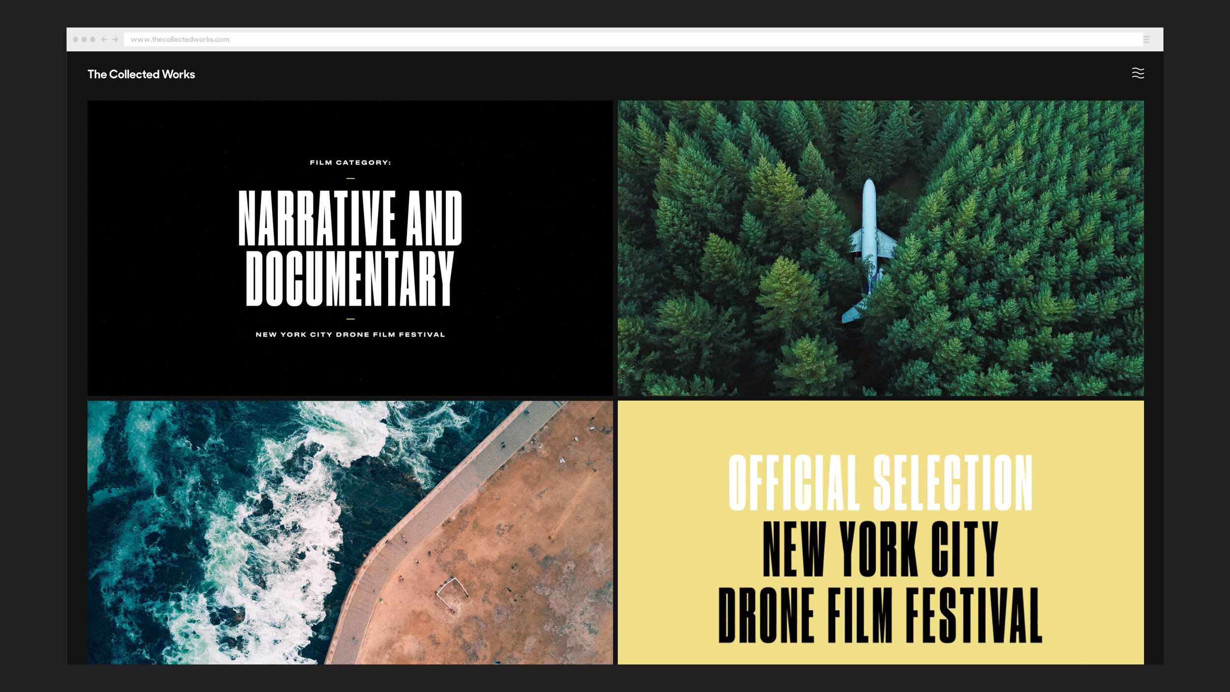
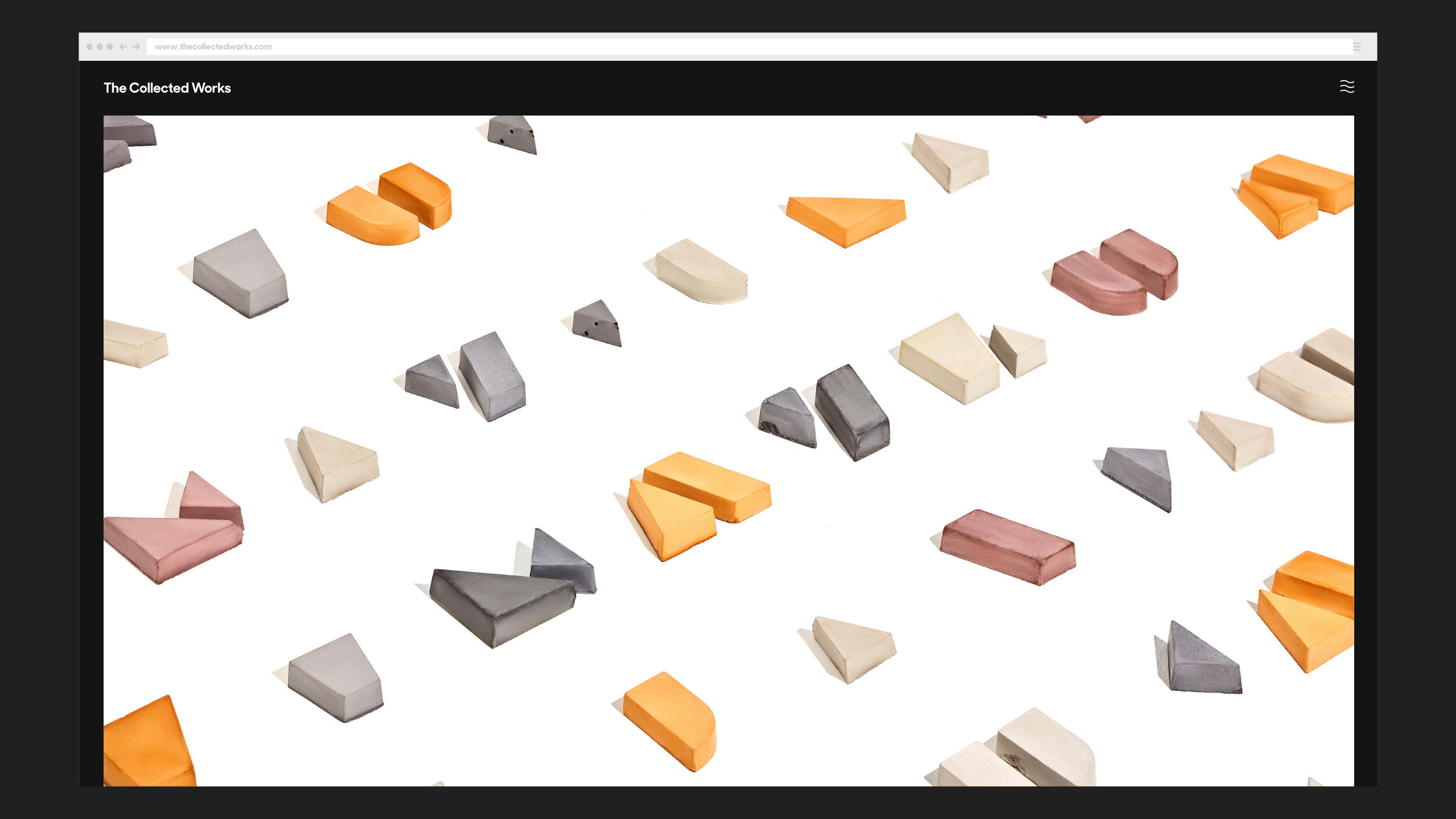
New York-based studio The Collected Works recently overhauled their portfolio site, and it’s a statement piece in itself, worthy of the same attention as any creative project that it houses. So we talked to founders Justin Colt and Jose Fresneda to pick their brain on some of the do’s and don’t’s that frame how The Collected Works presents itself to potential clients and collaborators. We also cover the importance of case studies, why Instagram isn’t a portfolio replacement (but a valuable addition), and 5 strong portfolio sites from fellow creative studios to kickstart some ideas for your own.
3D scan of Jose
3D scan of Justin
Why are portfolio sites an important component of a professional creative career?
As a designer, one of the most important tasks is to get the work out there. Most designers fall into the trap of finishing a project, and never actually taking credit for it. Never actually sharing it with the world. It’s ironic how most designers are really great working with clients, but really bad at promoting themselves. “Update my portfolio” is always on their to-do list, but they go years with a stale website.
In this line of work, especially if you’re an independent designer or run a studio, you have to always be fishing for new work. Your portfolio (in our opinion) is that bait. Not only do you need to keep it updated and fresh, but you actively need to be casting it out into the world.
What I mean by this, is don’t just update the site and move on–but get it in front of people. Hit up the clients you did the work for, to show them how well the case study came together. Hit up the clients you’d love to work with, to show them what you just wrapped up. Make sure it’s easy to find on Pinterest and Behance. Drop it on your social media channels, and send it around to relevant blogs and sites. Cast a wide net whenever you have new work, as that work will likely lead to more (similar) work.
This all goes back to say: without a solid portfolio in place, you’re doing yourself a great disservice as a designer. Self-promotion isn’t about being egotistical; it’s about staying in business and having people find you. It should also be said that the internet has leveled the playing field for small studios competing against the biggest agencies. Present yourself (and your work) in the best light, and you can compete against the biggest and best.
How have you seen portfolio sites evolve over the years?
A trend we’ve seen, which we agree with, is the move towards longer case studies and portfolio projects. I’ve heard it said by writers, that there’s always a market for long-form content. I believe this carries over to portfolio sites as well.
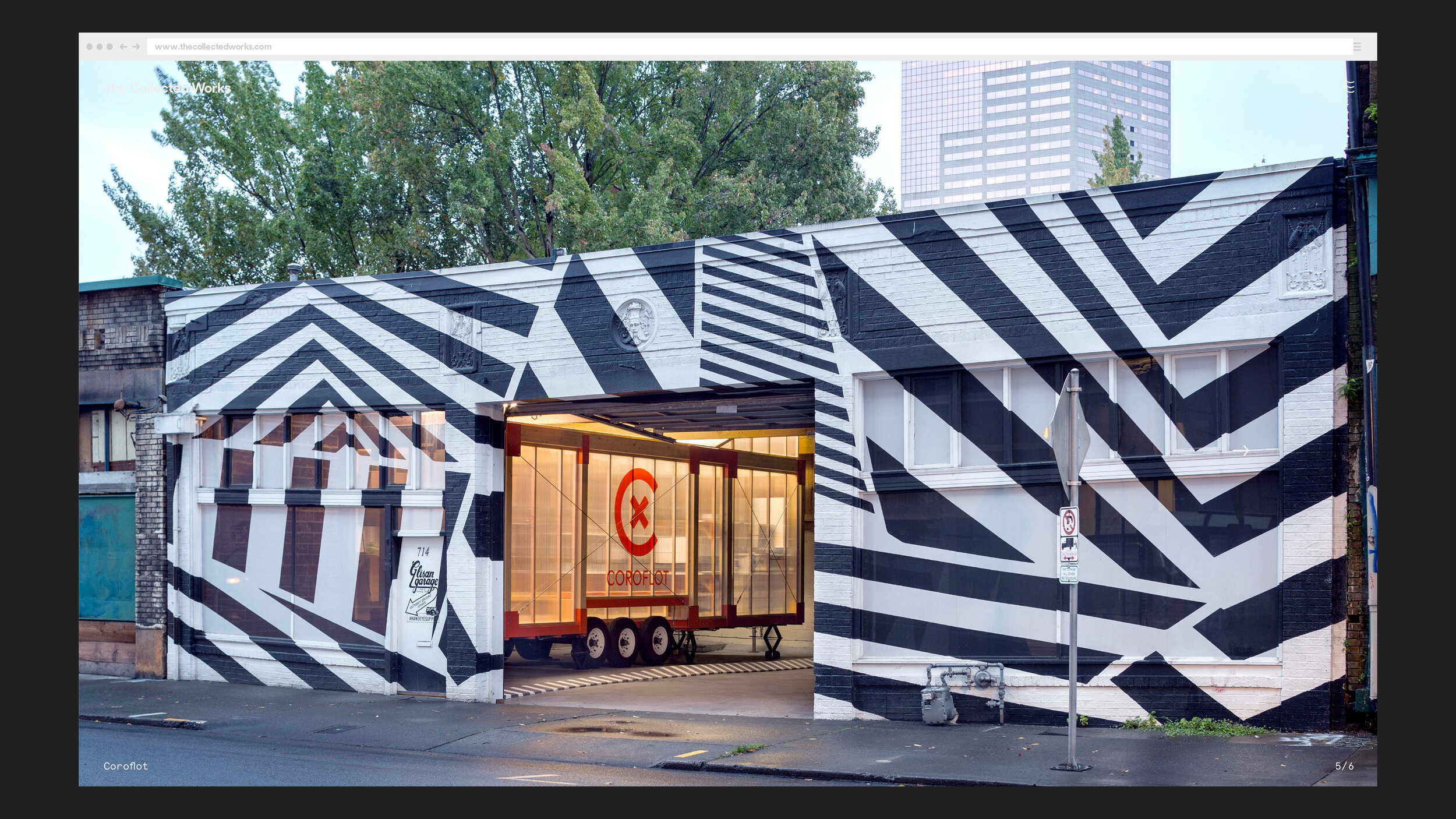
It’s our belief that a case study should tell a story. Show an evolution. Take your audience on a journey through the project. We approach every case study as though we had to explain the project (and process) to a person for the first time. What’s the overall flow? What’s the foundation of the project, and what is layered on as we go? What did we learn along the way? How did this all come together in the end? Why was it successful? All of these details tell a much more robust (and interesting) story than just dropping a few beautiful photos on your site.
Another evolution we’ve seen (that we agree with) is to show design systems in case studies (rather than one-off deliverables). I believe this is also related to the fact that designers now take on projects that span many mediums–so they naturally have more work to show. For instance, it’s not just the logo, or just the website that a designer is responsible for. It’s the connecting system. The concept, the typographic system, the color palette, the logo(s), the website, the art direction of photography, the social media components, the packaging, the event–these are all deliverables and components of most projects now, and should all be showcased and explained in case studies. This, again, makes for a more robust story (which is what a case study is).
“It’s our belief that a case study should tell a story. Show an evolution. Take your audience on a journey through the project. We approach every case study as though we had to explain the project (and process) to a person for the first time...All of these details tell a much more robust (and interesting) story than just dropping a few beautiful photos on your site.”
Are you proactive about exploring portfolio site trends to see what’s working and what isn’t?
Sort of. We like to keep an eye on who is doing noteworthy work, which often leads to finding some rad sites. We (like anyone else) also check out when a favorite studio overhauls theirs, to see what’s changed, and if it feels better (sometimes it doesn’t).
Do you think it’s wise for some creatives to ditch portfolio sites in favor of Instagram and other visual platforms?
These two mediums really go hand-in-hand in our opinion. On the portfolio side of things, this is an opportunity for more long-form content. Tell a story about the project, show the evolution, and explain your process (and how it all came together). Showcase the effort and intelligence that went into the work.
On the social media side of things, this is your opportunity to share the eye candy. Social media is bite-sized content for quick consumption. Don’t try to shoehorn long backstories into Instagram posts: make it flashy and make it immediate. Pull your favorite pieces of the larger case study, and drop these on Instagram.
It’s our belief that you really need to have both. If you only have the bite-sized Instagram posts, the work can feel rather one-dimensional and shallow. This might work to drive up your Instagram followers, but makes it more difficult for clients (with budgets) to come to you–knowing you can handle large scale work.
If you only have the portfolio side of things, you’re missing out on a huge audience and potential clients. We’ve had quite a few cold-call clients who stumbled onto our Instagram feeds and slid into our DMs.
“If you only have the bite-sized Instagram posts, the work can feel rather one-dimensional and shallow. This might work to drive up your Instagram followers but makes it more difficult for clients (with budgets) to come to you–knowing you can handle large scale work. If you only have the portfolio, you’re missing out on a huge audience and potential clients.”
How often do you think a portfolio site should receive an overhaul? Or is it more about finding the right formula and look and sticking to it?
Keep an eye on the landscape of design and the internet. As mentioned, your portfolio can compete with the biggest studios, agencies, and the best of them. If you look low-budget or dated, that’s really going to affect how people perceive you. I don’t believe a studio or designer site needs to be overhauled every year, but I do think it needs to feel relevant and up to date. For instance: it’s taken many high-level studios and agencies a long time to even have a site that looks good on mobile. For the most part, that’s not a feature—that’s a bug. So, technologically, you should feel current.
Make sure your portfolio is a representation of your best work, and work you want to attract more of. I know a lot of people who are hesitant to take down old design projects, even though their new work is much bigger (and better). Self-curation is really important, and trimming old projects can be an “overhaul” on its own.
Lastly, know your audience. Is you site eye candy for other designers? Is it trying to attract new clients? If so, what type of clients? Consider how that informs the overarching design, what work you show, how you show it, and how you explain yourself. If you need to pivot to a new audience, this is usually a good time to overhaul.
What are some of your favorite components of this new iteration of the Collected Works?
One of the best features of the site, is just how easy it is to update. We often hear from designers we know who wanted to update their site that they want to do something really custom and built from scratch. They get their first version of the site up, it looks pretty rad, but then they never ever update it again because it’s such a pain. For our site, we wanted the opposite. We never wanted to touch any code, and wanted it to take only minutes to upload everything for a new case study. Shout out to our go-to designer Nick DiMatteo for taking our design and building a fully custom backend that’s a dream to work with. This ensures that we’ll keep this site relevant and updated with new work.
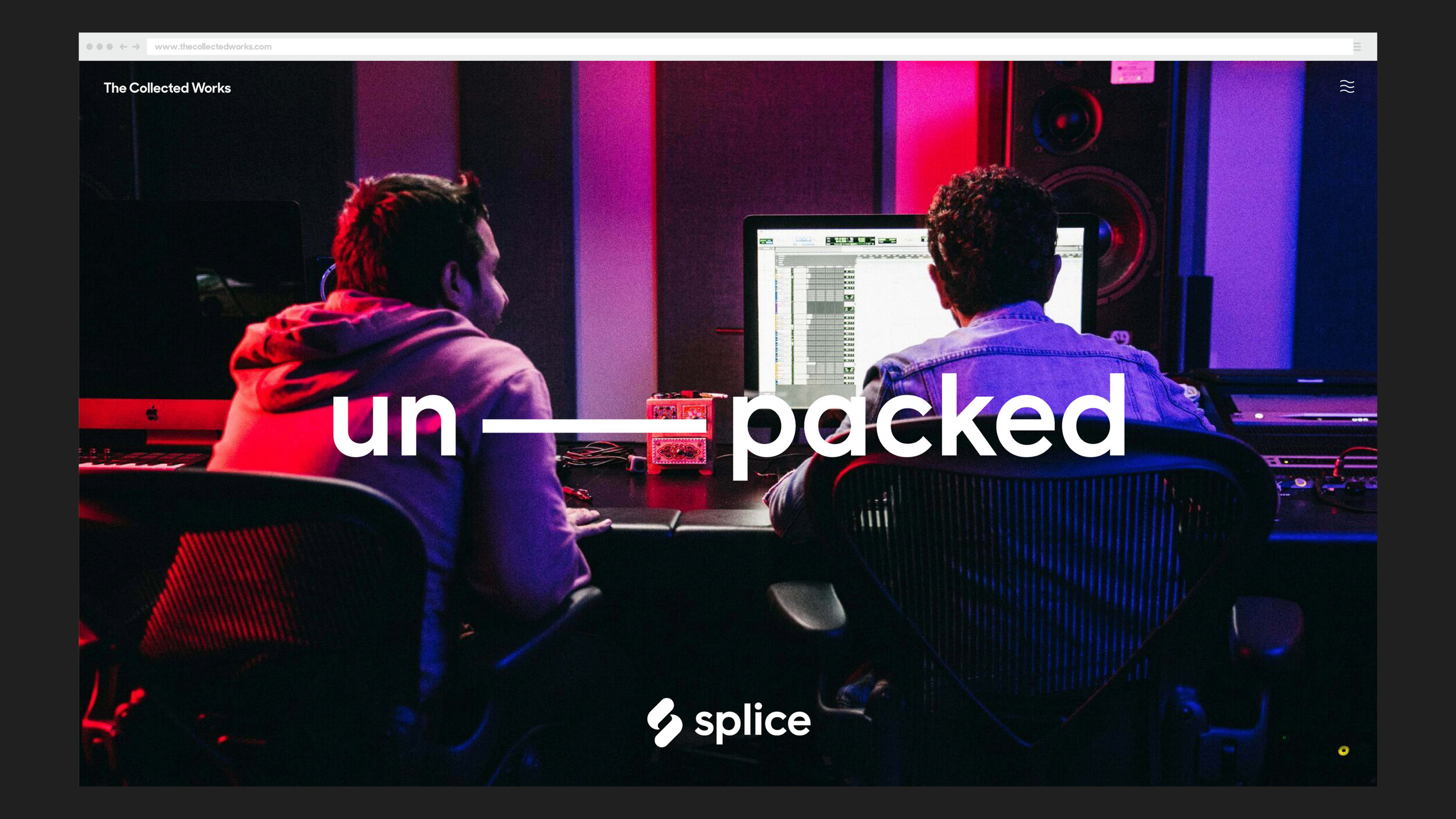
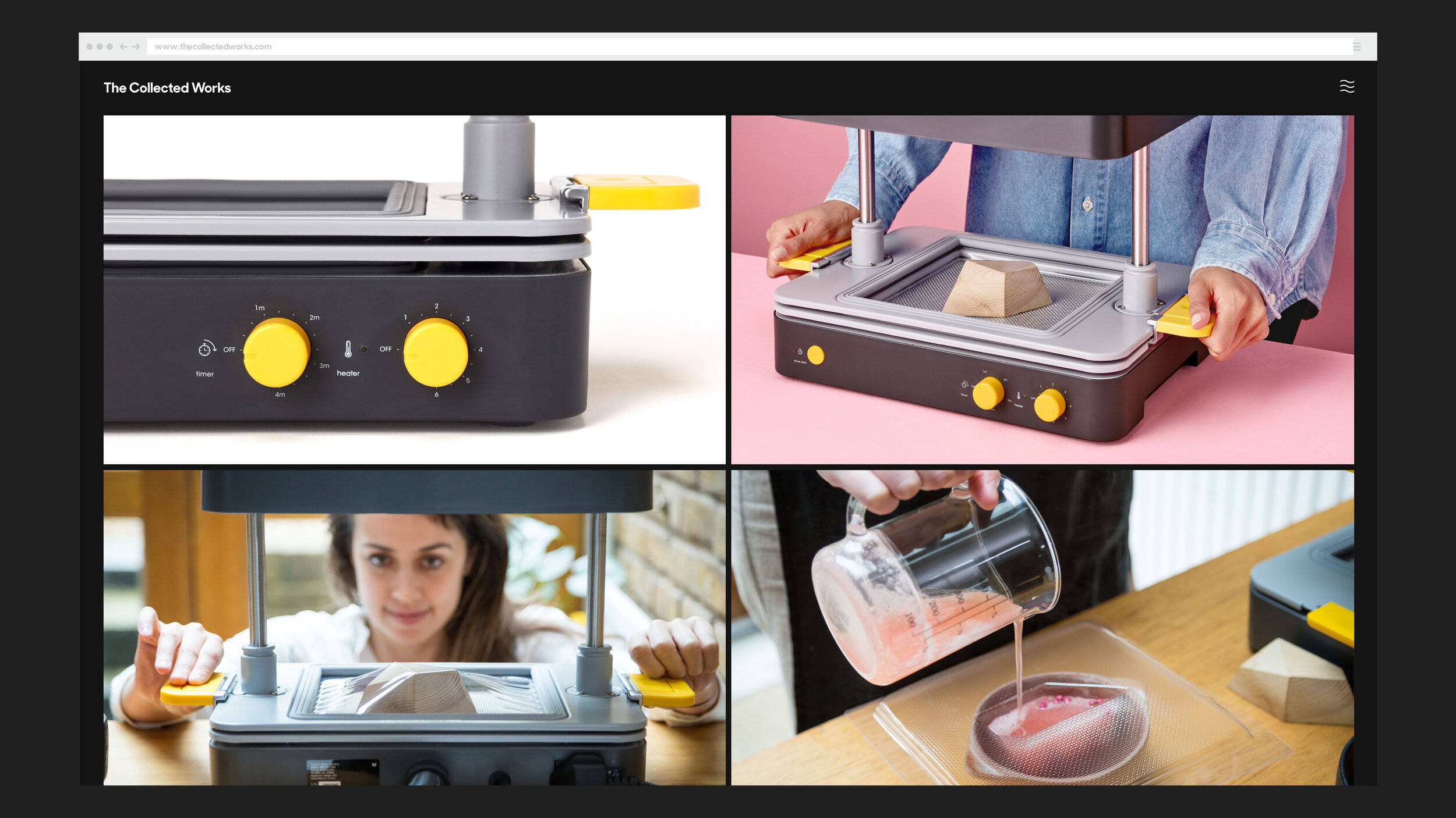
Second, our case studies contain a robust amount of information. They tell a story, show a bunch of work, and have a pretty good flow to them. Motion elements break up still photos, and design systems are pretty well showcased. Most of our case studies have been tweaked and modified dozens of times–based on reviewing, self critique, and outside feedback.
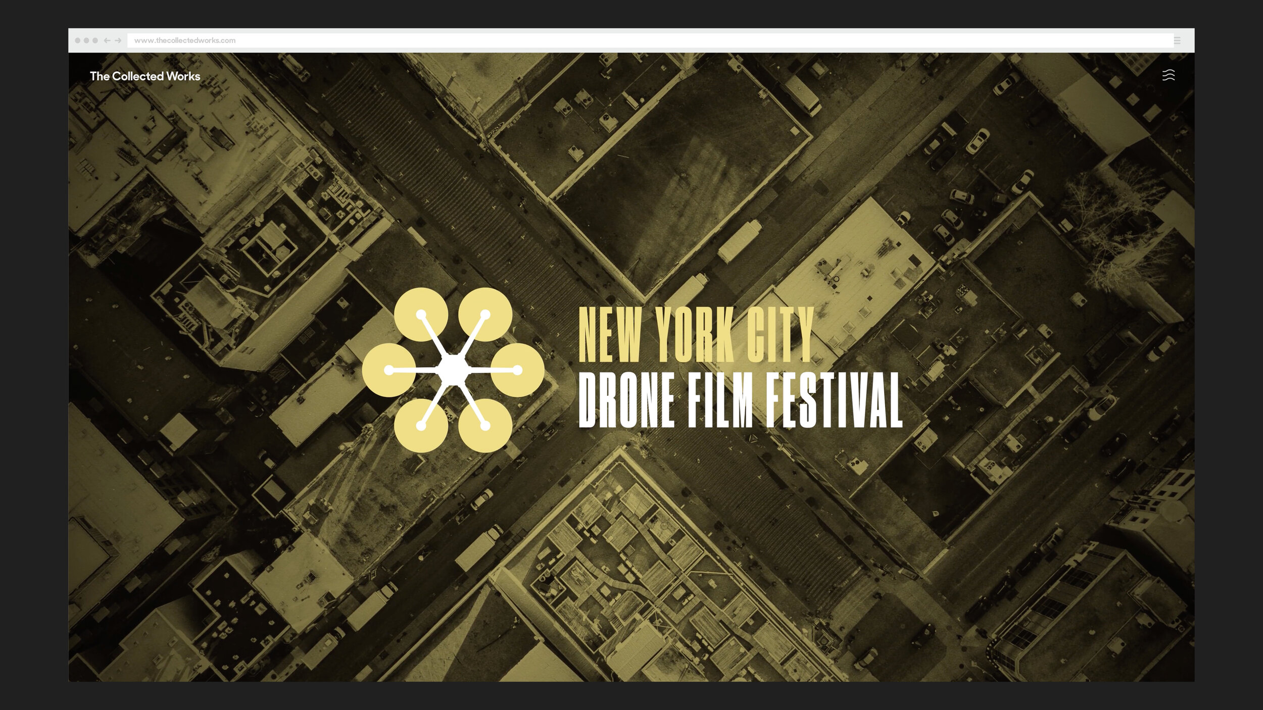
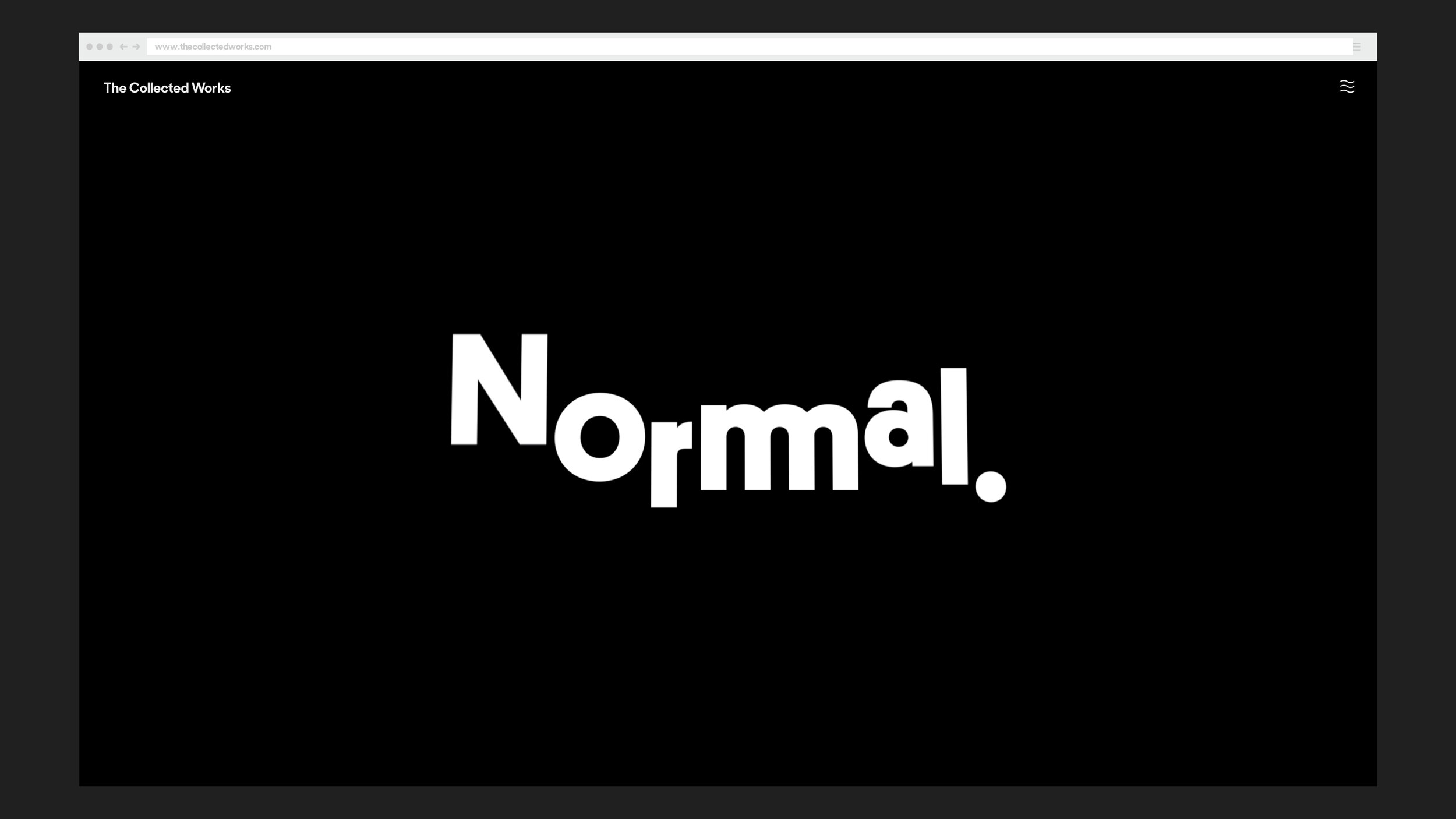
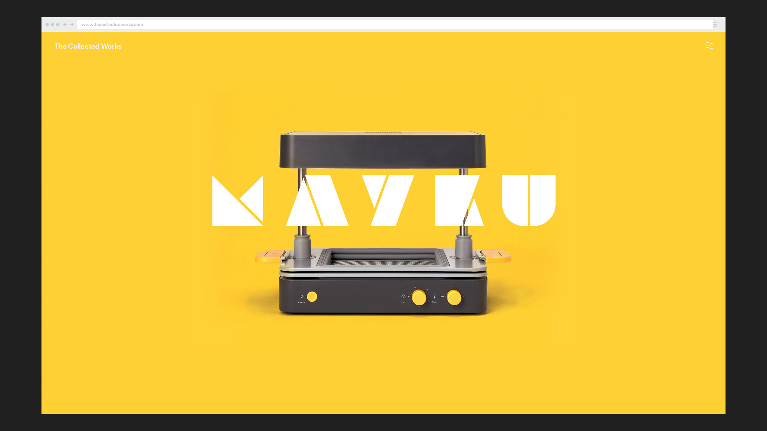
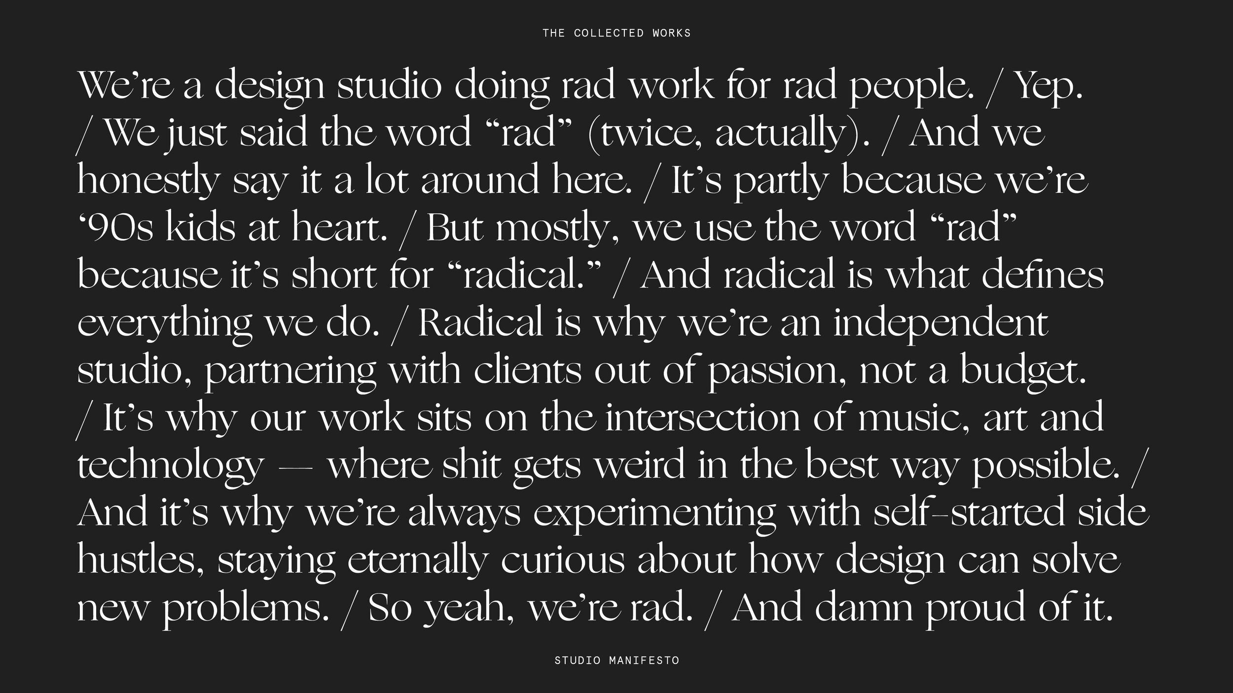
Also, from an overall design standpoint, there are a few places where we can change a few small things but give the site a radically different feeling. The first is our “hero message” that takes over the screen for a few seconds. We can swap out whatever message we want here, and easily update those colors. “A Design Studio Doing Rad Work For Rad People,” “The Intersection of Music, Art & Technology,” “Studio Party This Friday,” etc… We can season this to taste, based on what we’re feeling. Also, our big header carousel on the homepage makes it easy to have a dramatically different appearance. We can point to different projects and keep things feeling fresh by keying in on different featured projects.
A few smaller things we dig: we built a “screensaver mode” that auto kicks-in if you don’t touch the site for 10 minutes. Our custom “rad work for rad people” loader between pages has gotten some good responses. Our roll-over phone number always makes people ask “is that really your number?” (it is). Our hidden ascii text in the source code is rad. And lastly, we 3d scanned ourselves and rigged those models to different mocap movements, which is fun.
Who are some creatives whose portfolio sites do a great job of capturing their creative personality but also present their work in an effective and original way?
https://badbadbadbad.com/ - The amount of work that Braulio produces is inspiring, and the way that its showcased on his site is simple and to the point.
https://dia.tv/ - Still trying to wrap our head around DIA’s new site. The site itself is maximalist and minimalist at the same time, and the work is presented in a way that every image or video asks for your our full attention.
https://www.playlab.org/ - Playlab’s work is rad and diverse, and yet their site makes everything work together nicely.
https://fuzzywobble.com/ - Fuzzy’s work is something that has to be experienced. His site is deceptively simple and downright “ugly”, yet effective at making you know what he’s all about.
https://spin.co.uk/ - We love Spin. Everything they do feels polished, and I think their case studies do a good job of telling a story.


