Night Shift is a one-night-only pop-up gallery show where female artists reveal what they create at night. I spoke with the collective of contributing artists to learn about the conception of Night Shift, how the nighttime influences the output of daytime creative professionals, and what advice they have for up-and-coming artists looking to create their own projects and make their own opportunities.
Read MoreFuck Your Manners: Shawna X Critiques the Western Gaze in Multimedia Exhibit
Shawna X's new exhibit "Fuck Your Manners" is a multimedia outpouring of artistic inspiration that packs both Shawna's signature palette & a well-deserved punch. "I focused on eating habits that are deemed impolite by the western gaze, but accepted in my culture.”
Read MoreOlimpia Zagnoli Demonstrates How to Eat Spaghetti Like a Lady
Olimpia Zagnoli Demonstrates How to Eat Spaghetti Like a Lady
MIKE O'DONNELL / EDITOR
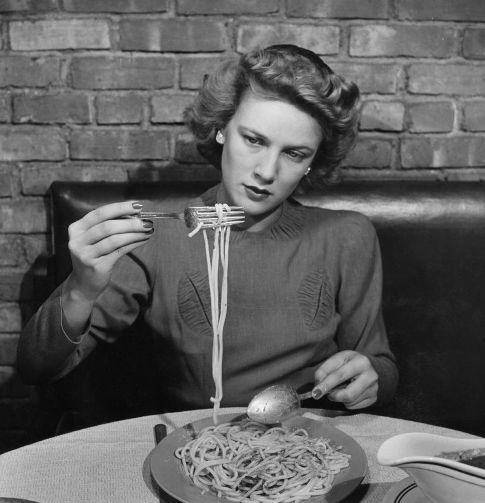
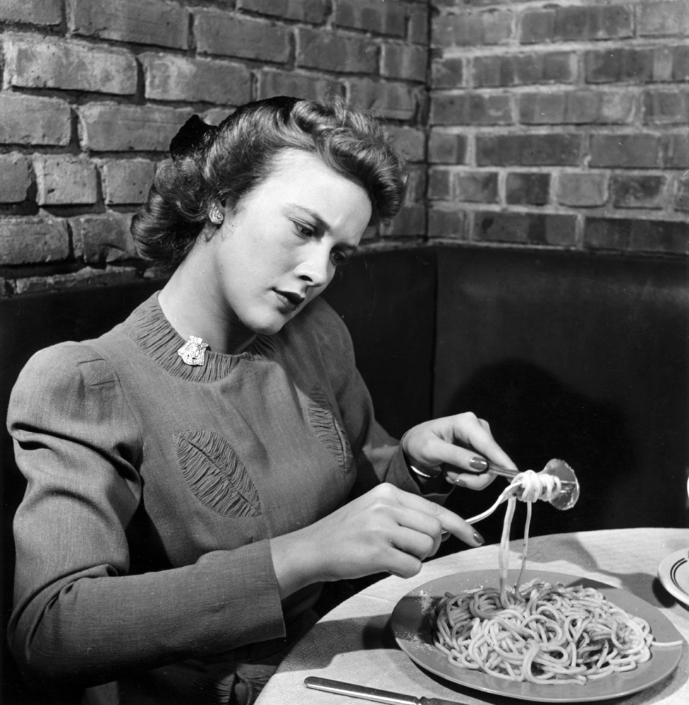
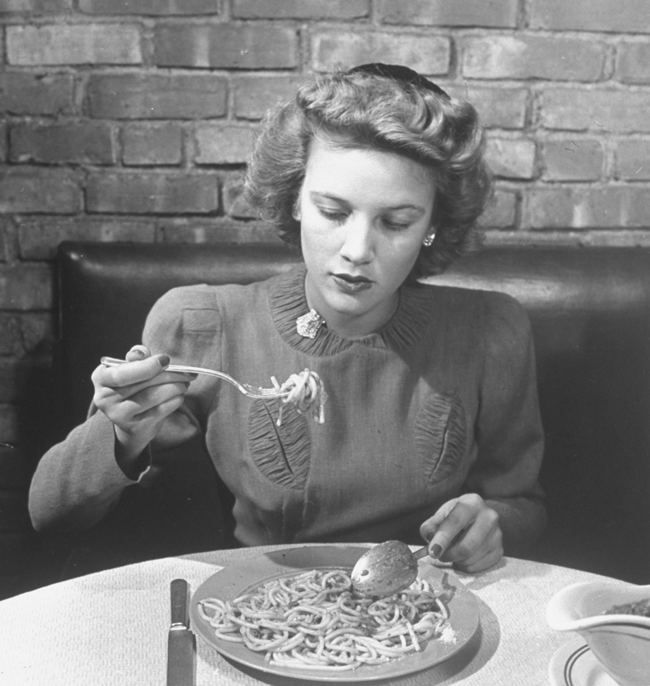
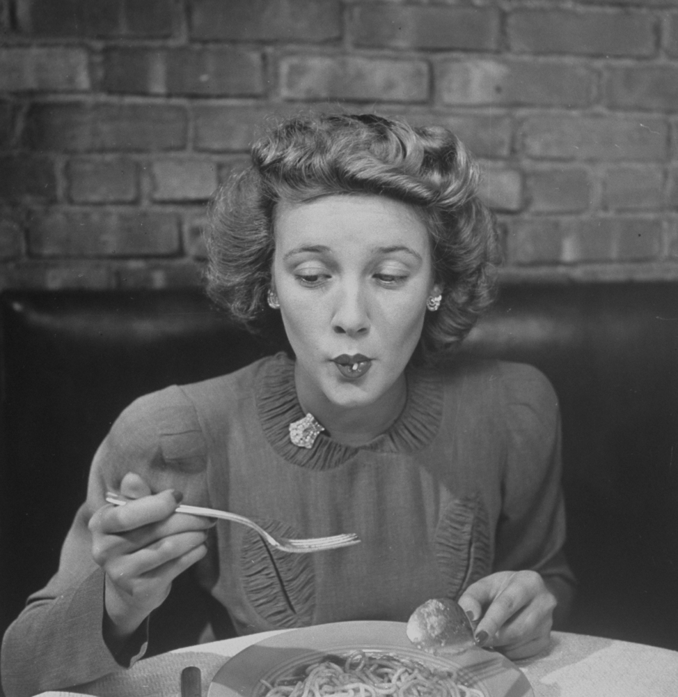
In 1942, Time Life magazine prescribed a step-by-step process for "how to eat spaghetti like a lady." It seems the times have changed. Milan-based Illustrator and WNW Member Olimpia Zagnoli has now masterfully subverted the original with her own series, also titled How to Eat Spaghetti Like a Lady. The black-and-white originals by Alfred Eisenstaedt (displayed below) suggest composure, conduct, and convention. Olimpia twirls this idea of uniformity into submission and shows off an eclectic array of colorful personalities, creatively enjoying their pasta as they defy the rules of conduct and, while they're at it, even the rules of gravity. Olimpia's show will be open through the end of July at Antonia Colombo Arte Contemporanea in Milan.
Photographs and Instructions from Time Life
Step 1: “Four strands of spaghetti should be segregated from the pile.” Step 2: “With soup spoon as prop, twirl fork and spaghetti gently.” Step 3: “A ladylike mouthful of spaghetti is ready for consumption.” Step 4: “Full forkfuls should be consumed in entirety. Nibbling is out.” Step 5: “Truant strands require patience, lip facility, suck-power.” Step 6: “With end in sight, diner has consumed 160 in. of spaghetti.”
Are you a WNW Member with new work, exhibits, products, or news to share? Email us!
AN ILLUSTRATOR FROM KENTUCKY HOLDS HIS FIRST SHOW IN PARIS
AN ILLUSTRATOR FROM KENTUCKY HOLDS HIS FIRST SHOW IN PARIS
We're always excited to see our members take a big step in their creative careers. WNW Member Jeremy Booth, from Louisville, just reached several milestones in his budding illustration career. Jeremy brought his new collection "The Simple Life" to Sergeant Paper for his first solo show. As Jeremy tells us, "This exhibit was a lot of firsts for me: my first show, solo show, and in Paris."
We ask Jeremy how a Kentucky-based designer-turned-illustrator wound up with a solo show in Paris, how he defines his signature style, and what inspired this new collection: "I had spent some time in Palm Springs. That place lives and breathes mid-century art, design, and culture. It was fresh on my mind and I knew I could create some sort of connection between Palm Springs and my exhibit." We're excited to see how taking in the rich architectural history of Paris will inspire Jeremy's next collection.
Tell us a little bit about your creative background. Who is Jeremy Booth and how did he get here?
I am a self taught designer and illustrator with a focus on illustration mostly. I have been pursuing design and illustration for 5 years now. Through that time, I have pursued graphic design, lettering, web & app design, but mostly some form of flat illustration. About three years ago I started noticing that illustration was the easiest to pick up and over all I enjoyed doing it the most. I have pursued many styles within the flat illustration genre but over the past couple of years I have taken on a style that uses limited color, good usage of negative space, and harsh lighting. That derived from a Tomorrowland poster by Ken Chapman that I had seen in a Disney book with a collection of old Disney posters. I moved on to finding inspiration in old travel and plakatstil posters, and that has evolved into where I am today.
How would you describe your creative style? Do you recognize a signature style that links all of your projects, or do you try to excuse yourself and approach each project as its own entity?
My style is signature across the board. I know going into an illustration there will be limited color, good use of negative space, and harsh lighting. After my recent show in Paris I am seeing clients insist on mid-century inspired art. It seems that my subject matter is becoming a part of my signature. I am certainly not limited to that though.
How did a designer-turned-illustrator from Louisville get his first Parisian solo exhibit at Sergeant Paper?
This past Spring I signed to a French Agent, Valerie Ouilad. Soon after I received an email from Sergeant Paper, a retail store and gallery in Paris with a focus on digital art. They asked if I’d be interested in having them sell my artwork within their retail space. Before responding, I forwarded the email to my agent and she instructed me to hold off responding as she wanted to discuss things further with Sergeant Paper. A few days later I had received a response from both Valerie and Sergeant Paper. Sergeant asked if I’d be interested in having a solo exhibit in Paris. I agreed of course and thought to myself, “how did this just happen?” This exhibit was a lot of firsts for me: my first show, solo show, and in Paris. I’m happy I did it though.
What was your inspiration behind “The Simple Life” exhibit?
Before Valerie and Sergeant Paper reached out to me I had spent some time in Palm Springs. That place lives and breathes mid century art, design, and culture. It was fresh on my mind and I knew I could create some sort of connection between Palm Springs and my exhibit. So I decided to create my artwork around the design and culture of the mid century.
When did you start taking an interest in combining the worlds of design and architecture?
Probably a couple of years ago when I started illustrating. I have always had a fascination with architecture; when illustration came along I was able to mesh those two loves together.
Did you have time to take in the architecture of Paris during your visit?
It was a short trip for my wife and I. We were there for four days. The last day was really for sightseeing and we were finally were used to the time difference and public transit. We did take all of the 400 steps up of the Notre Dame tower to see a beautiful view of Paris. It’s so captivating and vast, I highly recommend it.
What’s next for you?
Right now I am working on a few freelance projects and enjoying the rest of the year. I’m trying to break a little. I spent most of my summer indoors working on “The Simple Life.” If you would have told me 8 months ago that I would have a solo exhibit in Paris I would have said you're crazy. With that I’m not sure what will happen next but I am hoping it’s equally exciting.
Who are some other WNW Members whose work you admire and why?
Nathan Yoder: He’s a great guy and he can draw. His new style and exploration is much friendlier, I really enjoy it.
Ben Stafford: Ben is a friend of mine and I really respect his outlook on illustration and design. Everything he puts out is money.
Anything else you’d like to add?
Yes! Thank you for giving me the opportunity to share about who I am and what I have been doing in Paris.


