Meet the Freelance Team Pushing
Tribeca Film Festival Forward
MIKE O'DONNELL / EDITOR
There are a bunch of firsts at the Tribeca Film Festival. That's the nature of putting together a lineup of thought-provoking films, shows, games, and VR, all in conversation with one another. But this year also sees a first for Tribeca's entire marketing campaign, as the festival decided to bring in a freelance creative team. Below, we talk to Eduardo Palma, Luke Williams, Juan Miguel Marin, and Avni Jain. Eduardo's the Lead Designer at Tribeca, but the latter three were brought on by Tribeca's Creative Services Director Jaime Fallon via Working Not Working and our UnJobBoard. We have a conversation below to discuss the thinking behind the initial concept, why it felt right to use a hands-on aesthetic and approach, and how it feels to successfully push Tribeca forward with this relatable campaign.
Had any of you worked together previously? Or were any of you already fans of each other’s work?
Eduardo: We had not collaborated before. The first time I saw Juan and Luke’s work was after Jaime and them had gotten in contact through WNW. But I really liked their work, and thought we could make a good team since we have such different approaches to our practices. Avni came in a bit later.
Luke: Although we had not previously worked together, we all shared a mutual appreciation for one another’s past work and experiences. We approached this project with a shared interest in exploring a great idea, and given how organic the resulting artwork became, I feel really excited that the outcome is truly a rich collision of each of our design perspectives and influences.
If I wasn’t a fan before, you might say I’m the biggest fan of this crew now.
Juan: I didn’t know Eduardo or Luke before taking on this project, but I quickly realized that this was going to be an enriching experience for me. Not just talking about design, but at a human level. Same applies to Avni who joined the team a bit later in the process.
Avni: I hadn’t worked with the team before or known their work but that said as Luke summarized it I am very delighted to have worked with them. I loved the idea of the campaign from day one and it was very exciting to execute the campaign together.
What was the conceptual reason behind using a very hands-on aesthetic and approach this time around?
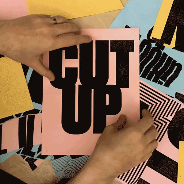
Eduardo: In the beginning we worked in many different concept options for the campaign, but the use of screenwriting language came up very quickly. We were mainly interested in the commands that were applicable to all kinds of storytelling: zoom to, fade in, etc. Once we started digging deeper into that, it took us directly to the script as an object: the colors, the materials, the typefaces. This pretty much started informing the visual language of the campaign. We really wanted the campaign to be true to the spirit of the script.
The layering came from how we understand the experience of the Festival. There’s such a wide variety of options there: from films and tv, up to video games, virtual reality and talks. This is something Tribeca was really interested in communicating, and the way we thought of that is by talking about the experience as a collection of layers: the more layered your Tribeca Film Festival experience gets, the richer it is. That’s when we started exploring the idea of creating mashups of visuals and language. We really wanted to keep all our visual devices feeling very human, very personal; hence the rips and the hands-on aesthetic in general.
Avni: I came into the project a little later, when the idea was established to work on a language-specific approach that is used in the film industry. And then broaden it to other verticals that are celebrated at the festival (TV, VR, games etc). It was heavily based on the industries’ relation to scripts that are physically made of paper. So being true to that idea, it was natural to use the hands-on aesthetic approach. That technique also brought about the inherent energy that is around a festival - that of the excitement and the overwhelming feeling of witnessing and digesting the projects that different creatives show in the festival. That comes with an equal amount of celebratory mess and chaos and that atmosphere is captured in the spontaneous ripping of the paper.

Were there any particular references or influences you turned to going into the project?
Eduardo: On a personal level, I’m a huge fan of Wolfgang Weingart, as well as the 70s punk rock aesthetics. I think these influences played a major role in how I approached the campaign from a visual standpoint.
Juan: Basic Filmmaking/storytelling terminology and language were a big conceptual reference. A reference that permeated into the design executions as well.
Luke: Letting the language and material qualities of the iterative printed screenplay lead our narrative, it was immediately important to us to not concern ourselves with a style for the work, but to make the most of the tearing, layering, and resulting visual surprises. We quickly embraced the natural side of collage as a kind of found art with minimal intervention.


“We made sure to revel in the romance of the physical compositions in our hands; what the scanner bed saw was what the final design would be.”
Do you often relish the opportunity to step away from a screen and get your hands dirty? Is it revitalizing? Are there particular pros and cons that a non-designer might not be aware of?
Juan: Stepping away from the screen as much as possible has been my modus operandi for quite a few years now (I have a visual arts practice). Not only is it revitalizing –and healthy– but I also believe it creates tremendous opportunities for the unexpected, for those things that you can’t anticipate, things that happen only when you work with your hands and physical materials. As I got to know more about Luke and Eduardo –and their work– in those first few days, I realized that although we come from different places, we all share that thing about physical design and craft. I got me really excited about the possibilities.
As a pro of working away from the screen, I’d say that the final output should feel more human and genuine. And as a con, you really need to experiment, plan, and prepare for unforeseeable executions that will come down the road. Because your chosen design approach/aesthetic has to be flexible for such a broad campaign.
Avni: Yes, it was revitalizing for me to step away from the computer, as prior to this I was very engrossed in the digital world of design. I didn’t even realize that till I started working on the campaign and it became a breather for me. I also really enjoyed the simplicity of a material and how that can bring about versatile results. It pushed us to plan out and chalk out what information we would be dealing with or how much content we'd have to place and where in advance, as the time frame increases of adding the step when re-printing and scanning if there are any changes.
Eduardo: I hadn’t tried stepping away from the screen in a while (which is a shame), but I’m so glad I went back to it for this project (which is great!). But as Juan said, the physical aspect of design is something that I’ve always found appealing and I guess you can see it in my work too. I feel lucky we all came together around that, and managed to create a project that was mainly based on a hands-on approach. I feel that this kind of work really makes you go back to the basics of design (form and composition). This is even more true for a project that is as type-driven as our campaign. I found it refreshing, and I totally see it as a positive aspect.
From a very pragmatic standpoint, I feel that the main negative aspect of this approach is the level of planning it requires. If you’re working on a video (all of which we made by creating each frame, scanning it and putting all of those together) and you need to make any adjustments, it’s very likely that you’ll have to remake the whole thing. A film festival is one of those places where things are bound to change every minute, so sometimes you have to keep stuff very general or you run the risk of having to go through many iterations for each piece you design.
Luke: These guys said it best. But to add one small thing here, I recall the moment when we all looked at each other and realized that this campaign was about to be entirely hand-made. It was at once alarming and thrilling! From that point on, we made sure to revel in the romance of the physical compositions in our hands; what the scanner bed saw was what the final design would be.

What were some of the challenges and creative breakthroughs that came with this project?
Eduardo: Besides a couple of quick smaller projects, I hadn’t collaborated with anyone in a while. I guess that was the main challenge for me, to adapt to those dynamics again, especially with people I had just met. I also had been working at Tribeca for almost a year as the only designer, so it was among my responsibilities to bring the team up to speed with the company, the people, etc.
In terms of breakthroughs, and again this comes from my experience, I would say this project brought back a great interest of mine, which is language. For the last couple of years I had been working on academic and personal design projects that dealt with language, and to find room to bring some of that into the campaign was very exciting. I feel that a lot of this project comes from the elasticity of english language, and I was thrilled to have the opportunity to continue exploring that from a totally different setting I had done before.
Juan: I agree, it is always challenging to step into a room having to collaborate with talented creatives that you haven’t met before. And especially for a big project like this one. I leave this project with three new friends and hopefully future collaborators too.
As far as creative breakthroughs goes, I’ll remember starting to noticed that even paper scraps or piled test prints on our desks –and floors– looked great. This trigger the exploration of more abstract ways to work with the paper. You can see what I am talking about on a lot of the videos and animations.
Avni: The initial challenge for me was to get accustomed to what the team had conceptualized but at the same time I had a fresh perspective of the campaign so it became an interesting opportunity for me to understand and exercise of pushing an idea without changing its foundation.

How long did the entire process take?
Luke: We all came together in January and were handed a blank slate to create this campaign upon. We’ve been developing and producing the campaign consistently since then, running up to the first events of the festival this month in April—collectively the better part of three months. The executional discovery of torn paper and collage entered the process about mid-way, following a lot of big picture strategic pondering, and a number of alternate campaign directions we were also considering.
Avni: I joined-in in February and by then there were three distinct directions that the film-centered industry terminology would take shape of and when this particular direction got the green light we delved into exploring with the techniques and started producing the work that went out mid Feb and will keep going out till the end of the festival.
Juan: I am adding scanner and professional paper-tearer to my resume.


“A lot of times, when speaking about culture, it’s done in a very inaccessible way, and we wanted to react to that. I think all decisions...came from the idea of making the campaign more relatable.”
What do you think this year’s branding says about this year’s festival and the Tribeca Film Festival going forward?
Eduardo: I feel it revitalizes it. I believe what had been done for previous editions of Tribeca Film Festival certainly built on the festival’s prestige and its cultural importance, but, to me, what we are doing is making it more approachable, more inviting. A lot of times, when speaking about culture, it’s done in a very inaccessible way, and we wanted to react to that. I think all decisions, from the hands-on approach, and even going back to having the actual script as the main inspiration, came from the idea of making the campaign more relatable.
It also opens the path to the future. When talking about the initial concepts we had, one of the most interesting things that came up was “if Tribeca was a verb, what would it be?” Since we were already working with verbs, we thought this was the perfect opportunity to pose that question. This is why we are calling this campaign “Tribeca Forward”, which is also the final verb combination we are putting out in the ads. It’s not about defining what Tribeca is, but understanding Tribeca as an action that suggests pushing forward, and going beyond. Hopefully this is something that serves as the seeds to new ideas for the Festival in the future.
Juan: Additionally, I love that this campaign is genuinely rooted and celebrating the most basic aspects of storytelling. Most people don’t know this, but when multiple versions of a film script are printed, they each are printed on a specific colored paper. Similar to what you see throughout our campaign.

Any lessons learned that’d you like to impart?
Luke: This campaign was a great example of how to listen to a strong idea and allowing it to be what it wants to be. We were faced with so many possibilities for visual execution after settling into merging torn paper as our campaign mnemonic (lots of excited outbursts would occur in the studio during our discovery phase whenever a new collage technique was born), but by identifying critical areas where restraint would offer the smartest solutions, we unveiled a lot of production design epiphanies. This was a territory of this collaboration that I feel taught me critical lessons around balancing broad visual explorations and efficient working habits to arrive at the strongest-possible creative resolution.
Eduardo: I agree with Luke. I feel that as soon as we defined some relevant concepts for the campaign, we tried to marry them with visuals we already had in our minds. It took us a couple of reviews to let the ideas grow organically, and that’s where we started joining the dots and defining what the campaign was going to be. That’s another important lesson, I believe: just because an idea as a whole doesn’t work, it doesn’t mean all of its parts are flawed. Many aspects of the initial concepts (which we discarded along the process) found their way in the final result, and made it stronger.
I also believe that this speaks to two of my main beliefs about design: interesting ideas come from interesting questions, and posing a question can be just as valid as finding an answer. I feel both of these are true to the campaign.
Juan: Keep trusting your gut, and never stop the conversation. I truly believe that we landed where we did because we engaged in meaningful –and respectful– conversations at the early stage of this process. This also applies for life in general ; )
“Keep trusting your gut, and never stop the conversation. I truly believe that we landed where we did because we engaged in meaningful and respectful conversations at the early stage of this process.”

For each of you: If you could screen a double header of any two movies, what would they be?
Luke: I’m torn. It’s either a double header of It Follows and Catch Me if You Can, or a comparison study of The Evil Dead and Evil Dead. The 1981 original and it’s 2013 remake were both stunning examples of cinematic excellence.
Eduardo: Trainspotting and Children of Men. Guess you could call it “excellent british movies with excellent soundtracks”. In all seriousness, these are my two favorite movies. I love the sense of defeat in both of them, and how it’s shown in very different ways: Trainspotting is of course a bit more humorous, but feels miserable nonetheless; Children of Men is very bleak, but with the right touch of hopefulness.
Juan: The french film Trafic by Jacques Tati, followed by Stop Making Sense by Jonathan Demme. Specially on the big screen.
Avni: I would just go for two movies I saw recently, haha, Crimson Peak and Death of Stalin. I feel like seeing them back to back is interesting given their moods.
