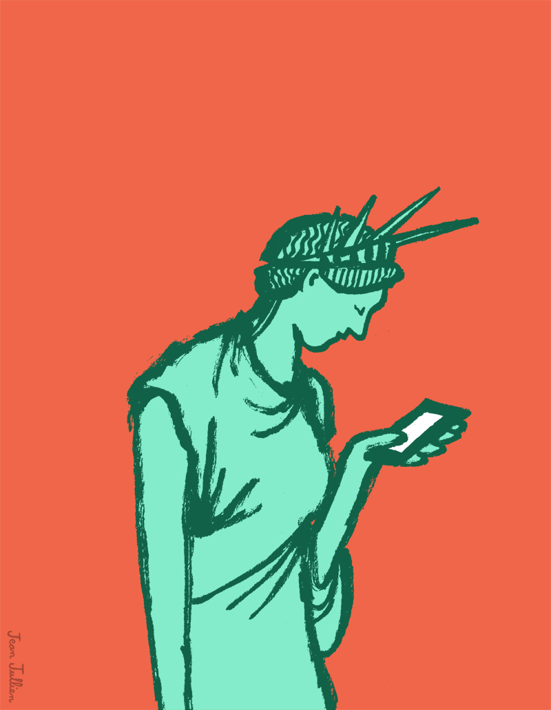
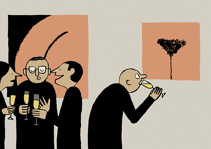
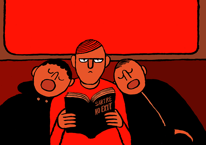
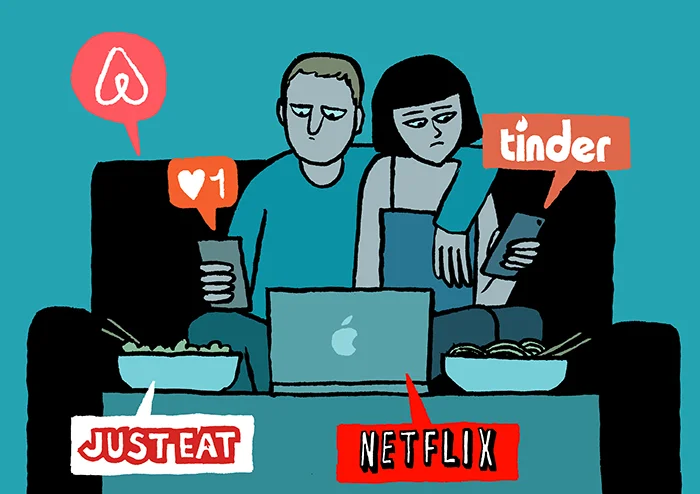
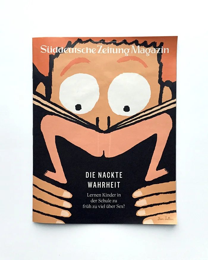
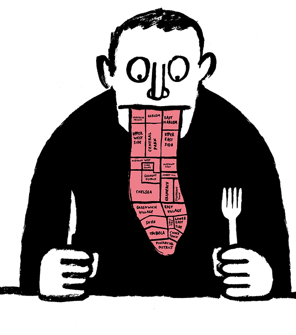
Here are seven projects from Working Not Working Members that caught our eye this January.
Read MorePROFILES OF THE WEEK: MAY 25TH
PROFILES OF THE WEEK: MAY 25TH
John Lu, UX/IA Designer. New York
Kate Getty, Copywriter. Portland.
Andres (Nook) Rivera, Illustrator. Brooklyn.
Francesca Martorelli, Designer. London.
Julie Glassberg, Photographer. New York.
Patrick Matte, Front-End Developer. London.
Carly Gray, Producer. London.
Pierre Nel, Full-Stack Developer. London.
Eric Kramer, Animator. Raleigh.
Think your profile should be featured? Email us!
HOW TO GET THE MOST OUT OF CLIENT FEEDBACK
HOW TO GET THE MOST OUT OF
CLIENT FEEDBACK
WNW Members #1395 Breanna Radermacher and #5602 Jen Serafini are designers on a mission to pay it forward. They've joined forces as co-founders of Be Free, Lance, an online course for designers who want to build a successful business from the ground up. The next session begins on June 1st and registration is now open. You can learn more about what the course entails right here. Last week on Free Range, Jen covered the importance of creating successful project proposals. This week, Breanna offers insight into getting the most out of client feedback.
Last week, we chatted about the importance of creating successful project proposals to make sure that expectations are set and understood up front. But when you’re in the thick of the design process, gathering helpful feedback from clients is another pivotal moment that can make or break a project. Think about it this way — you’ve already strategized, conceptualized, designed, refined, and created a killer presentation of what you believe to be the best solution. And although you may be extremely proud of the work shown, everything can fall apart in an instant if you don’t handle the revision process in a professional and educational manner.
So how do you facilitate appropriate feedback? Be a leader. I always like to start off with a strong presentation. Instead of just showing my clients something pretty, I give them some context as well. That way, they are learning about why I made certain design decisions while also being reminded about the original objective. For example, I may present a logo concept and also state the following: “Because we wanted to convey your outgoing personality, I used a bold and modern typeface. It’s solid, strong, and can stand the test of time, just like you. The composition, however, remains simple so that your branding does not detract from your beautiful artwork.” By shedding a little light into the thought behind a design, the client will better understand what they are looking at and be able to provide better feedback.
But educating your client doesn’t stop there. At the end of my initial presentation, I always provide a guide for feedback. I’ve found that more often than not, clients don’t have experience in giving critique, so it’s best to help them out from the get go. If you just say “What do you think?” there’s no telling what you’ll get in response. But if you outline some questions for the client to run through and consider, they instantly have a cheat sheet on what to look for. For example purposes, here are some questions that I ask most clients after they’ve seen their initial designs:
Is your gut consistently drawn towards one direction? Ask yourself this same question over the next few days.
Do you feel the typography represents your brand voice, in wanting to achieve something that is (put descriptive words about their project here)?
Do you feel that the overall tone is inline with your target market and what they’re attracted to? Remember, we wanted to go for something that was (put descriptive words about their target market here).
Do you have any other comments or things you’d like to see changed?
As you can see, most of these questions are structured in a way that helps remind the client about their original objective. It’s easy for clients to begin sharing their stream of consciousness without giving much thought to the strategy behind a design, so it’s important to guide them into it. And these questions do just that! But if you’d like to take things a step further, you can also give them examples of good and bad feedback, just so they have a starting point. For example, plain statements like “I don’t like that blue” aren’t helpful, but explanatory statements like “I don’t like that blue because it feels too childish” are.
If you find yourself receiving bad feedback, or even feeling like a design puppet (which is the worst), take a look at your revision process and evaluate your communication with clients. At the end of the day, feedback is a collaborative process, and if you are leading confidently while listening closely, things tend to go a lot smoother.
Bre Radermacher's Work:
Are you a WNW Member with new work, exhibits, products, or news to share? Email us.
DRINKING NOT DRINKING: CHICAGO
DRINKING NOT DRINKING:
CHICAGO
The Drinking Not Drinking tour continues! The next stop was Chi-Town where WNW Members #3868 Amy Schwartz, #1210 Jenelle Huddleston, #5602 Jennifer Serafini helped organize and host. Big thank you to WNW Member #597 Lucy Hewett for being our photographer for the evening.
Open to both members and friends, DND x CHI had a strong showing with the consensus that networking is best done in a relaxed way, over beers. Networking not networking, anyone?
The ladies gave us a recap of how it went, getting us even more excited for future events to come.
Drinking Not Drinking Chicago went really well!
It was great to meet people in person that I only really knew from the Internet. I always feel slightly awkward about things like that, but once you get talking you remember how cool and welcoming creative communities are. I'm used to admiring work from afar, so this was an awesome chance to learn about the person behind it.
We had a great mix of skills and backgrounds. Copywriting, photography, Illustration, all forms of design, people who felt strongly about the Wu-Tang Clan, people who apparently don't know enough about the Wu-Tang Clan...everything was represented. I'm so glad we got the chance to pull everyone together though, I definitely came out with a few more friends, and I'm excited to see them around town!
Plus, The Rocking Horse was a fantastic location – I had never been there before but I will definitely be back now. Partially for the back patio, mostly for the tater tots.
Jen Serafini adds, So many people came up to me and said how much fun it was and how'd love to do more of that. Networking can be so overwhelming and expensive, that just getting together for beers is ultimately the best way to do it. :)
WHY I KEEP MOVING
WHY I KEEP MOVING
After over four months in Thailand, WNW Member #5670 Steven Skoczen has moved on to Mexico, the next stop on his country-hopping adventure. His last piece was about making the life that fits you, and redefining how to see success. Now Steven brings us deeper into his world of constantly being on the road, and how moving impacts you emotionally, physically, and creatively.
When people hear I’m constantly on the road, switching cities every month, changing cultures, learning new languages, constantly trying to comprehend how even basic things like crossing the street or getting on the bus are done, they often say the same thing: “That must be exhausting.”
The truth is, it’s not. In fact, personally - and especially creatively, keep moving has been the best decision I’ve ever made. It recharges me in fundamental, powerful ways.
As creatives, none of our work lives in a vacuum. If you’re a writer, think of how reading another writer’s work echoes out in yours the weeks after. As a photographer or designer, how your visual style is impacted by the work you see on a regular basis.
Now imagine that every single piece of stimulus in your life is changed, all of it entirely new. Imagine that you’re suddenly living in a world where people have found entirely new solutions to problems you thought were solved. A world where the standards for what’s appropriate in public are radically different, where the balance of what you share and what you hide are shifted.
And imagine that none of that is explained to you - you have to figure it out, day after day, mistake after mistake. That’s the world I get to live in. The effects are profound.
It’s so much easier to take creative risks, and make creative mistakes.
Would I have ever published an open-hearted piece about depression or the deep philosophical insights you can get from traveller’s diarrhea when I was living in the states? No way. It might impact my klout score or my brand or any of the bullshit I’ve made up in my head as a rationalization for not putting genuine work out there.
But when you’re out in the world, failing at communicating, buying groceries, and even basic navigation, failure just becomes a normal part of what you do. It ceases to be scary, and you don’t need try-harder mottos to help you put things out there. You just live with your work how you live with your life. You know some of it will be an abject failure, and you learn how to recover and still get to where you want to go.
You get access to entirely new ways of seeing the world.
All of our work is rooted in the world in which we live. So when how-the-world-works shifts, the effect on our work is tectonic. Imagine the sort of work you’d create in a world where you never said sorry, or one where you never said best. How would things shift if instead of meat or bread, vegetables were the foundations of food? How would your work change in a world where child sex trafficking was something you had to look in the eye, understanding first-hand what it says about all of us.
There are huge overlays on the cultures we live in that are only visible when we’re able to step out of them into something genuinely different. The effect of Christianity in the United States is powerful and forms the bedrock of every natural-born American’s world view, even if they’re not Christian. Spend a few months in a country that, for all of its recorded history, has been Buddhist, and those differences become obvious and palpable. They open up a new way of seeing, of expressing, and of course, of creating.
You have a built-in deadline.
One of the most lovely bonuses is that once you’ve settled in and started making, you immediately feel the clock start ticking. I’m in Mexico now, but I won’t be forever. How much can I soak in here? How fully can I express the things I find?
There’s a real power to a deadline, even a gentle one, that prompts you to keep creating, keep making today and every day - because soon, this muse will be gone.
It’s like one of those short-term flings. It’s wonderful, and you want to squeeze every second in before it’s gone. Which reminds me - it’s time to close this laptop and head off. There’s more to Chiapas to experience, and more to write.
Steven Skoczen is currently living in San Cristóbal de las Casas, Mexico, and writes over at Ink and Feet. He writes a hand-crafted letter every week that a lot of people really love.
Do you have travel stories you want to share? Email us!
MAKING THE LIFE THAT FITS YOU
MAKING THE LIFE THAT FITS YOU
This is the second installment of Living the Dream, a series by WNW Member #5670 Steven Skoczen on his experiences this year traveling - and working - all over the world. This week, we learn about the 'Steven Manual' and how the lack of structure can make us even more productive.
Read the first installment to learn how Steven sold everything he owned, left his life in Portland, and set out on the ultimate adventure.
One of the most striking things about my life here in Thailand is what it doesn’t have. No solicitors. No junk mail. No regular mail. No advertising (I can’t understand the stuff I do hear.) No social obligations. No set time I really have to be anywhere. No expectations of who I am, or what I do. No habits.
And in this space, I’m thriving like I’ve never thrived.
I write every day. I eat salad for breakfast. I work until I’ve accomplished a significant chunk of work, then I stop. I make projects and art. I exercise every day. I meditate. I give myself a break when I need one.
The result has been that I’m more productive at work than I was in Portland, on fewer hours. As a result, I now have the time and energy to pursue the creative projects that recharge me and keep me lit up. And time to explore a new country and learn a language.
In Portland, I wrote The Steven Manual - software that tracks every bit of my life, and keeps an eye on if I’ve exercised lately, if I’m getting out of the house and seeing friends, all of those kind of things. I love the manual. It’s been a daily habit for more than two years, and it has single-handedly steered me out of depression, gotten me into nature when I really needed it, and generally been psychic, robotic best friend.
But here, even after a few conscious attempts, I just don’t use it. Here, it’s like I have a hand on all the knobs - seeing people, number of work hours, time with friends, number of new experiences - and when something feels out of balance, I’m just giving myself permission to just do whatever it is that needs done.
In a beautiful and powerful way, it’s working. I haven’t been as centered, fulfilled, as genuinely good as I feel here in a long time - and without propping myself up on love or someone else - maybe ever.
There’s an unacknowledged weight, an inescapable mold that presses on our regular lives. The space of our days defined by house, car, bills, life, friends. These mark every one of our minutes, cordoning off the truly free space in which we can move.
But sell everything, move to a new country, culture, and time zone, and suddenly everything is opened up. The facts remain unchanged: I’m awake for sixteen hours every day. But only here, with everything stripped away, do they actually feel that plentiful.
Every one of us is different. Each of us has our own equilibriums and knobs, and our balances are sure to change with the seasons and the weather and all the passing tempests of our lives.
But there’s something to unhooking. Something powerful in that quiet, persistent voice: let’s not go to that show. Let’s not clean out the car. A pause. A space made. Waiting in it:
Let’s do what makes us come alive.
Do you have travel stories you want to share? Email us!
Preaching Not Preaching: SXSW
Working Not Working took over SXSW in full force with an unsurprising blur of parties, run ins with WNW members and really awesome, late night music. Co-founder Justin Gignac joined Behance's Scott Belsky, Ryan Merkley (the CEO of Creative Commons) and Red Antler partner Emily Heyward at The Rise of the Creative Economy panel, a discussion on how creatives can truly empower themselves to do the work they want.
Read MorePROFILES OF THE WEEK: MARCH 9TH
PROFILES OF THE WEEK: MARCH 9TH
KYLE SAUER, DIRECTOR. BROOKLYN.
JACQUI OAKLEY, ILLUSTRATOR. HAMILTON, ONTARIO.
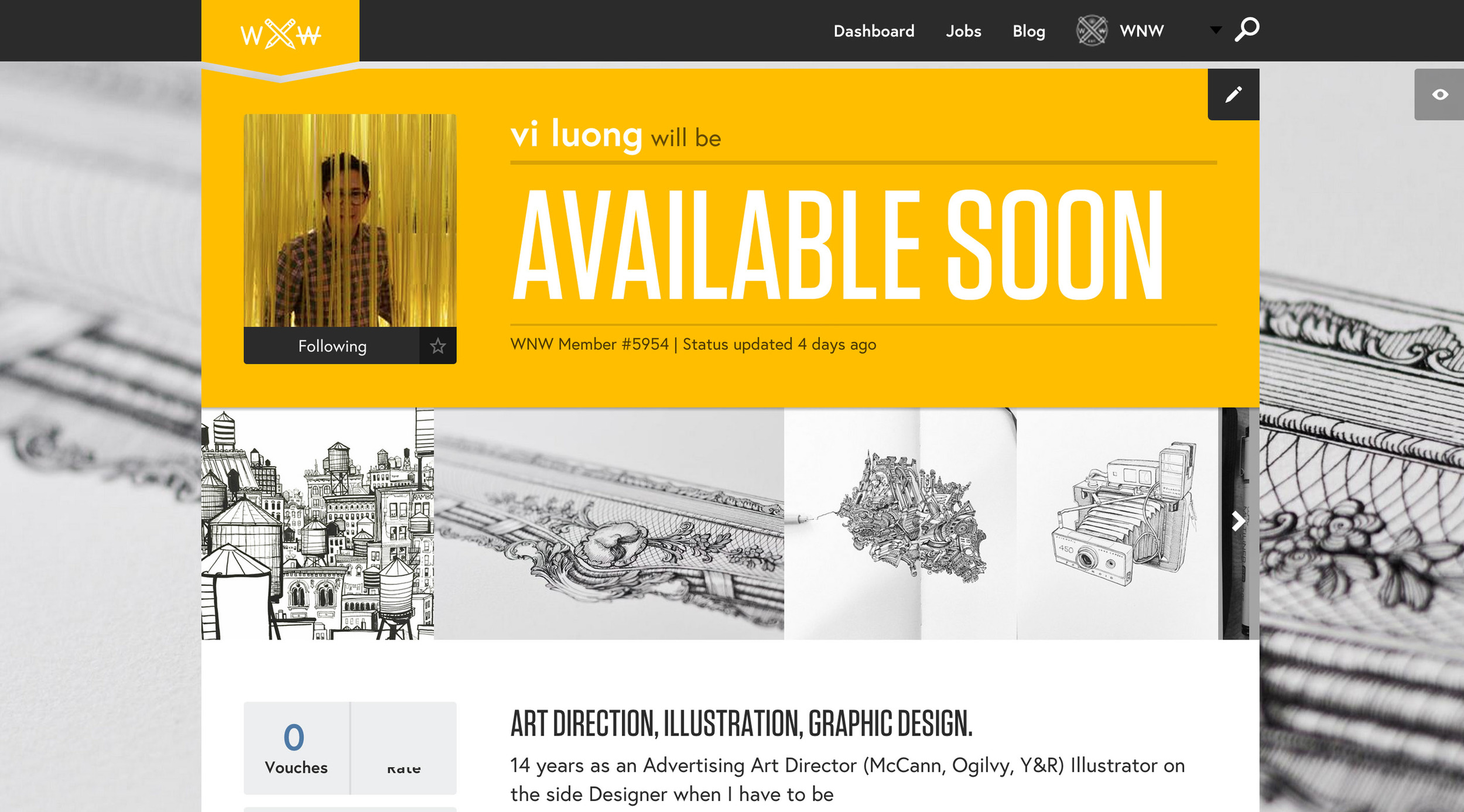
VI LUONG, ART DIRECTOR. BROOKLYN.
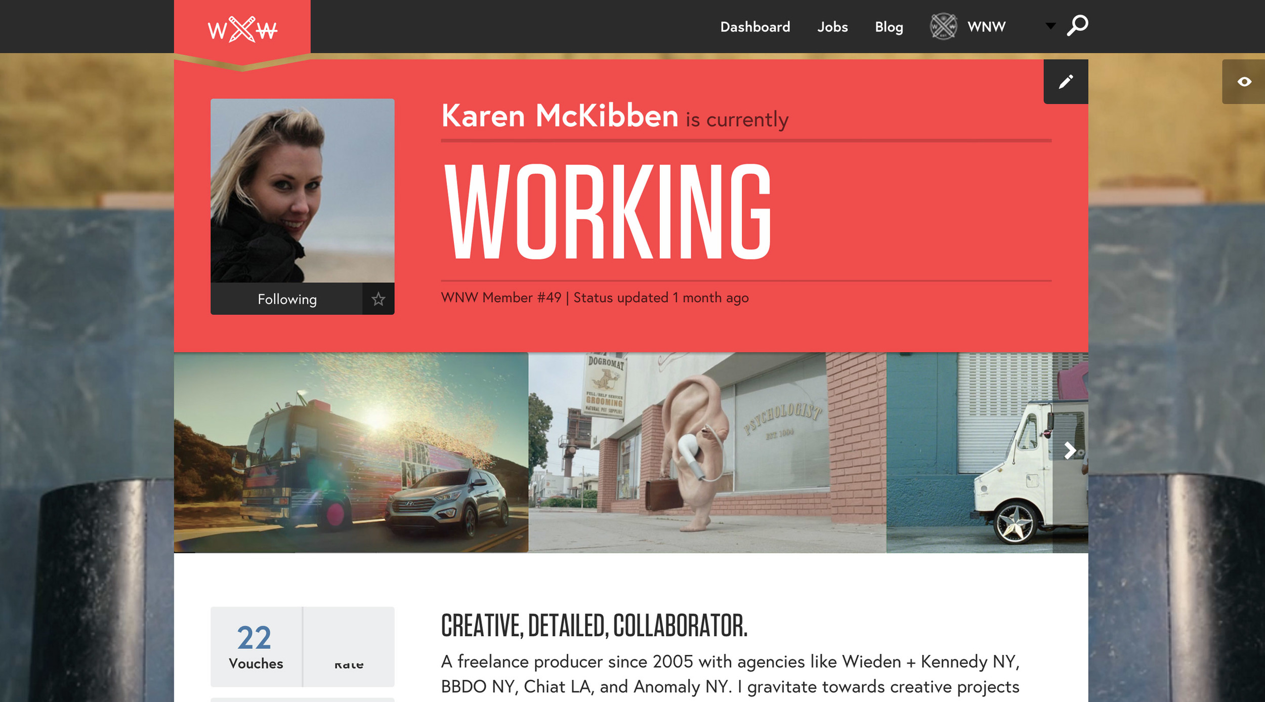
KAREN MCKIBBEN, PRODUCER. NYC / LA.
TOBY HARRIMAN, PHOTOGRAPHER. SAN FRANCISCO.
KIRSTEN LEPORE, ANIMATOR. LOS ANGELES.
HENDRICK ROLANDEZ, DESIGNER. MELBOURNE.
PAWEL NOLBERT, DESIGNER. WARSAW.
Think your profile should be featured? Email us!
HOW TO PRESENT YOURSELF: TOBIAS VAN SCHNEIDER
HOW TO PRESENT YOURSELF:
TOBIAS VAN SCHNEIDER
The man, the beard, the legend. Though he'd prefer not to discuss it, the facial hair precedes him. WNW Member #1830 Tobias Van Schneider, product design lead at Spotify and king of side projects, makes us believe there may actually be more than 24 hours in a day. He's recently launched Semplice, the first fully responsive case study portfolio system based on Wordpress. In other words: a simple tool - not a template - to create a unique portfolio, no code needed.
Tobias is just as passionate about empowering creatives as he is about design. With his network les Avignons and now Semplice, Tobias is acutely aware of the importance of our relationships and how we present ourselves as ways to obtain the opportunities we want. He says, "Based on the data we have seen, the About page on a portfolio is always the most visited page. Thats because people are interested in people. Show your face, show who you are and how I can get in touch with you. While the work itself is important, the person behind is even more."
Hi! Tell us about yourself: who is Tobias Van Schneider?
Hi! I’m Tobias, I’m a Designer & Maker who does many different things. Mostly I’m a Product Design Lead at Spotify and Co-Founder of Semplice, Authentic Weather & les Avignons as well as Design Partner & Advisor at memomi. I’m currently loving way too many things, but mostly good food & longboarding. It’s winter, so right now it’s more about eating.
Tell us about your decision to drop out of school at 15. Did you know what you wanted to be when you grew up?
I really didn’t like school, I always hated it (and I say that rarely) and I could not wait to be done with it. I more or less decided to drop out because there was just no other way to continue with it. Right after school I started an apprenticeship as a computer scientist & software engineer - I did it more because I was forced to do something, I had to pay my rent. I had no specific plan but I knew that I loved building something out of nothing.
I did this for a few years which ultimately led me into writing software and then I fell in love with design. It was more of a self-taught process and what it all had in common was that I just love building things.
Standard WNW question: do your parents understand what you do?
Yes, absolutely - At least to a certain degree when it comes to actual output of my work.
Side projects: How do you know what to say yes to? Say no to?
I have many ideas, often too many. As I always like to say, ideas are cheap. Everyone has them, but ultimately it comes down to executing on them. For me it’s mostly intuition and feedback from others that will eventually tell me if I should pursue something or not. The more crazy the idea, the better. The more resistance I will get from people around me, the more likely the idea will stick with me.
I read that you don't keep to-do lists, notes, or rely on your calendar. How the hell do you keep yourself organized? What's the best piece of advice on productivity that you can give us? You clearly know how to get things done.
I do wish I would get more done, and I wouldn’t say I’m very organized at all. I started using my calendar a bit more, but mostly just to keep track of meetings to make sure I don’t disappoint those around me. My number one piece of advice is to do things immediately, act fast and always stay in motion. I know people who are incredible organized with lots of process involved, but their actual output is very low. The more process you have involved, the more time you spend managing the process rather than actually getting things done.
These things of course change when working with a larger team, but we all know how easy it is to fall into the trap of just managing a process, rather than getting things done.
Generating press: is creating great work all you need to do to get covered? Any other tips on cultivating a personal brand?
Yes, I strongly believe in this, at least to a certain degree. Great work will stand on it’s own and it will stand the test of time. However, there are many examples of great work that never gets seen. Depending on your personal goal it’s very important as a designer to not only do great work, but also make sure that it gets seen or used. It’s important to keep a healthy balance - Too much self-promotion will lead to nothing if the work itself isn’t strong enough. If you do self-promotion, make sure you have an opinion, stand for something and create value for those around you.
Being a connector + passing others forward: what's your philosophy on this and why is it important?
This is fairly simple for me. I believe that everything I pass forward will eventually come back to me. I’m not only creating value for those around me, but also try to practice a “fear free” mindset for myself. I’m not afraid that someone is taking something away from me.
Give us some background on Semplice: what is it + how did it start? What was your intention in creating it and what are your goals?
Semplice is a portfolio tool for designers. The core of the idea started about 4-5 years ago when I created pretty extensive case studies for my portfolio. At that time only myself & Fantasy Interactive (an agency I actually ended up working with) created those heavy case studies for their projects which slowly became a trend within the creative industry.
I always loved the idea of presenting a project I worked on in my portfolio within a fully branded environment. If I worked for a project for Red Bull for example, I wanted the viewer to fully dive into the project rather than just looking at a couple JPGs. Creating case studies is a ton of work and it’s essentially building a custom website for each of your projects within your portfolio framework. In order to streamline it, a friend of mine (Semplice Co-Founder Michael Schmidt) and I created the first version of Semplice. I loved this system, it helped me get the work I wanted and position myself in a very competitive industry. This was the moment Semplice was born.
What did building it teach you?
We worked with many designers and close designer friends during the process of building Semplice. There are two sides to building a portfolio that we planned to focus on:
1. For Designers
Designers seek tools that give them freedom to express themselves and flexibility to show their process, their work and help them position themselves in the best way possible.
2. For the viewer
Reviewing portfolios as a company/agency sucks. Designers lack of showcasing their process, and those designers who’re not in the field of digital design lack of building a portfolio that is easy to navigate. So how can we build a system that helps designers build unique portfolios, but streamline the process and help them focus on the UX too? Browsing a portfolio should be a joy - The work can be amazing, but if the presentation fails no one will take a look at it.
What were some of your biggest challenges?
The biggest challenge is to create an extremely powerful system but at the same time keep it as easy to use as possible. We did not want to build another “fill in the blanks” template. At the same time we tried solving the problems from both sides, building a great tool for designers, but also trying to steer them in the right direction to build a great portfolio that others LOVE to look at. There should be a win/win situation happening on both sides.
Anything surprise you?
Yes, designers are incredibly lazy. Everyone wants the best, but not many want to put in the work. I like to count myself to those as well, at least sometimes. Our vision is to help you go the extra mile, because we know the extra mile is required if you want to stand out. And we love to go that extra mile with you.
Why did you decide to white label it?
This was a big decision for us. We as designers love to own things, we take a lot of pride in building our own solutions, or make something to appear fully custom. There is a certain pride in doing so which we aim to protect by giving our users the choice to white label Semplice.
What are some tips for creating an awesome portfolio?
Your portfolio is not the work you did, but the work you will be doing in the future.
This simply translates to “Chose the work you display wisely”. If your goal is to get more branding projects, don’t show any web design work on your portfolio, even if that’s the best you have.
Show yourself. Based on the data we have seen, the About page on a portfolio is always the most visited page. Thats because people are interested in people. Show your face, show who you are and how I can get in touch with you. While the work itself is important, the person behind is even more.
Favorite Semplice examples?
There are so many great ones but our favorites are featured on a regular basis in our hand picked showcase. Semplice designers who are also WNW members include: Pawel Nolbert, Verena Michelitsch, Quintin Lodge, and Hendrick Rolandez.
More of Tobias' work:
Are you a WNW Member with new work, exhibits, products, or news to share? Email us.
LIVING THE DREAM: A NEW SERIES
LIVING THE DREAM: A NEW SERIES
Warning: this article may cause extreme envy. Meet WNW Member #5670 Steven Skoczen, a creative technologist who is living The Dream. Last fall, Steven sold everything, packed a laptop, an unreasonable number of books of poetry and some clothes into a suitcase, and bought a one-way ticket to Asia. His plan for the next few years is to live in a different country every few months. Steven begins his journey in Thailand, moving next to Mexico, Nicaragua, Panama, Costa Rica, Columbia, Japan, New Zealand, France, and then the unknown. (Though Steven warns us that it may not actually play out like that.)
Steven declares that just a few months in, the impact on his creative life has already been tremendous, “The influx of new ideas, ways of thinking, and just overall stimulus have been radically helpful in my process and my productivity.”
Over the next four months, he'll be sharing regular updates from the road on travel, culture, and the advantages and challenges of creative work while on the move.
A bit about Steven:
He’s a writer and entrepreneur who has worked on hundreds of projects. By day, he works as the CTO for an early-stage startup. By night, he writes essays about what it means to be human and makes the occasional person-centric software product. “Here, on the other side of the world, I can’t understand why those can’t all be the same person. I’m a writer. I’m a top-notch programmer. I lead and grow teams of developers. I’m a maker, an artist. I am a man who loves curry, who struggles with depression when it stops by, who will stay up all night talking with you about art or the world or the meshing of technology and humanity."
In the Fall of 2014, I sold everything I owned, bought a one-way ticket to Thailand, and got on the plane.
Before that, I worked a pretty normal job in Portland, OR. You’ve heard stories like this before, and the narratives all go pretty similarly: one day, I said, screw it, and I just jumped. Those people are inspiring as hell, but if you’re a normal person like me, not relatable. They’re superheroes. They jumped.
Except I’m not a superhero. I didn’t jump. Maybe it’s that I’m chicken. Maybe it’s that I haven’t actually done anything all that bold. But most likely, it’s that I’ve figured out a little secret on how to get yourself from the life you have to the one you want. The bold one. The unfettered what-if one.
That secret?
Take actions that make you a little bit scared.
Eleanor Roosevelt famously said “Do one thing every day that scares you.” It’s great advice. But it’s also terrifying, and non-specific. What one thing? How scary? Should there be snakes? I hate snakes!
Mark Manson beautifully argues that the key is to realize that your emotions aren’t real, that you will survive them, and that your actions are what really shape your life. It too, is brilliant advice. But if you’re driven by your heart, like me, that argument, beautiful as it is, never makes it past your heart into action.
But here I am, living in Thailand, picking the language up on the fly, and loving it. Somehow, I’ve done it. How did I do it?
These three simple steps.
ONE: PICK YOUR MOUNTAIN.
Take some time, reflect, and pick your mountain. That far off dream life. The career change. The bucket list. The thing you’ve always wanted to do. Whatever that big “if” is. (If you don’t have a big “if”, seriously consider the possibility that you’re already living your dream life, and just enjoy it.)
Once you have it, write it on a piece of paper. Take up the whole page.
Stick it on your wall.
TWO: ASK HOW, NOT IF.
Now that you have your mountain, switch the question from if I could do ____ to how can I get to ____. Move your brain from dream-mode to problem-solving mode. What are the actual things you’d need to do to get from here to there? This will dull some of the romance. That’s ok. When you get there, the romance (and a whole lot more) will be there, waiting.
If this doesn’t come easily, it pick an arbitrary date in the future that you’ll be on your mountain. Then, think of that as a true thing that happened, and backtrack. How did you get there? What sorts of things did you need to do?
However, don’t worry about a plan or making a list. All you need to do is switch your frame of thinking. When you think about your mountain from here on, you’re not asking if. You’re asking how.
THREE: TAKE ACTIONS THAT MAKE YOU A LITTLE BIT SCARED.
On a regular schedule, once a week, once a day - whatever you will actually do, commit a block of time to take one action with the following characteristics:
1. It scares you a little
2. It is small and absolutely achievable
3. It tangibly moves you toward your goal
Importantly, your action should be completely self-contained. It doesn’t commit you to anything in the future, and it is completely separate from your big mountain. It’s its own thing.
Tomorrow, you can totally decide that the whole mountain is a terrible idea and walk away. But today, you commit to doing that one totally achievable, slightly scary thing.
HERE'S AN EXAMPLE:
I wanted to learn Parkour, but was way too scared to actually go do it. I was in my 30’s, not coordinated, and hopelessly unhip. Have you seen those videos? Those kids are buff and crazy and can fly!
But despite my terror and unhipness, I was honestly interested. So I tried the little-bit-scared technique. The first day, my action was to get online and look up if anywhere nearby offered lessons. I didn’t have to go to any classes or talk to anybody or anything. I just had to see if classes existed. I could do that. I did.
The next day, my action was to schedule a class. I wasn’t committing to go to the class, just schedule it. I could do scheduling. I did.
When class day rolled around, my action was to show up to the start of that one class. I could leave five minutes in and never come back, no problem. I wasn’t committing to anything more than showing up for the start. I could do that. I did.
Four months later, Parkour training was a 2 or 3 times a week part of my life, I loved it, I’d made friends there, and I could scale an eight foot wall and jump-roll off a six-footer. And on the way there, though I’d been a little bit scared, I’d never really been terrified.
Seem like magic or too simple to actually work? It’s not. It’s actually science.
HOW IT WORKS:
Tackling a challenge this way does something really neat: it uses your brain’s habit-forming mechanisms for your benefit. When you’re taking a small risk, your brain kicks in all those fight-or-flight chemicals. When you succeed, you get the rush of all the dopaminey feel good chemicals. What you’re doing, day after day, is training your brain that taking small risks is pleasurable. And once you’ve got a good groove going, your brain will start prompting you on its own. It’ll have a craving. It’ll say, “heeey, isn’t it about time we took another little risk on that dream life?”
The little bit scared is the absolute key, and it’s an emotion you can rely on to guide you toward your goal. If you feel a little bit scared, you can trust you’re actually moving in the direction of that big scary/awesome thing. But you never have to look it right in the eye. It never gets a chance to eat you. You just get up, take your little risk, succeed, and walk away.
Day after day, your little risks and little actions will add up. And before you’ve even realized what’s happened, you’ll find yourself standing on top of your mountain. You won’t have ever been terrified, and you won’t have ever jumped. It’s uncanny.
THAT'S THE SECRET.
That's how I got on the plane to Thailand. By the time I walked down the ramp, I’d been taking little-bit-scared actions for months, eating away at Move to another country. When flight day came, my day’s little-bit-scared action was to walk onto the plane. And it did feel a little bit scary - but also like every day before it. I could totally handle it.
That’s how you get the life you want without being a superhero. Those three steps. The little-bit-scared. Give it a shot.
The only thing you risk is feeling a little bit scared. You can totally handle that.
p.s. Since I wrote this, I've actually built a product, based on the principles in this essay. It's called the Change Monsters. If you dug this essay you might want to check it out :)
Do you have travel stories you want to share? Email us!
ON MINNESOTA: SEAN O'BRIEN
ON MINNESOTA: SEAN O'BRIEN
So much of what we create is inspired and influenced by our environment. The kinetic energy of the city fuels us but an escape into nature grounds us. Though they may seem diametrically opposed, we need both. WNW Member #2944 Sean O'Brien welcomes us to his adopted hometown of Minnesota. After fifteen years in San Francisco, Sean experienced a strong dose of culture shock to which he responded in the way only a true creative can: by observing, documenting, empathizing, and celebrating it through art.
Sean recently completed a personal project entitled Hibernation, a photo series about Minnesota motorcyclists as they wait out the winter.
Tell us a bit about yourself. Who is Sean O'Brien?
Husband, proud dog dad of a Boxer and a Bernese, motorcycle loyalist, and creative tradesman. I was born in Daytona Beach, Florida (insert redneck joke here.) Went to high school in a small rural town east of Flint, MI where I worked at a hunt club through the winters and a large ranch in the summers. From there I moved around a bit, started school in Detroit and Pittsburgh. Lots of love for ‘da Burg and all of the post-industrial rust belt. Spent some time in Miami, launching a swimwear brand called Island Company. Learned a lot since it was just two of us, I was responsible for making everything. Funny anecdote, a bikini I designed was worn in an issue of Sports Illustrated’s Swim Suit Edition by Petra Nemcova..
Right after the dot com crash I moved to SF. Freelanced around town, doing odd jobs before going full-time at some awesome shops like EVB doing a ton of web design back when flash was cool. Spent two years in Portland at W+K, which were the hardest two years of my life, but I learned a ton. I took a break to freelance at CP+B in Boulder where I met my now wife at “The Res” where they put all freelancers and new hires. Our dogs introduced us. We spent 3 more years back in SF before she decided to make a career change triggering the move to Minneapolis.
What are you currently working on?
It’s the middle of my second winter here in The North, and I’m continuing a personal project started last winter called Hibernation. Its a portrait series documenting Minnesota motorcyclists and how they survive the cold months with their bikes on blocks and tenders. Hanging out in random garages, meeting all kinds of characters, staring at bikes and listening to stories is a great way to get through the darkness.
Outside of the personal work, like all freelancers, the majority of my time is spent in the ad world, but I also work with small businesses and non-profits too. Small businesses is where it’s at, so much fire and heart in that zone. I just got back from Colorado visiting Mountain Toad Brewing, we’ve been working together since they started two years ago. They’re building a bigger brewery and starting to can next year, so this year we’ll be working on packaging and expanding the identity system. Super proud of them and Blackfern, a surfboard shaper in Portland; they’ve both built strong local communities around their brands.
Today I’m working on a brand refresh and packaging with a super cool shop based in San Diego. Favorite thing I did recently was a large book for 3M through a local agency called Space150. It was a nice change of pace to dig into something deep and tangible that’s designed to be picked up and used on a daily basis. It’s been years since my last press check. There’s nothing like the smell of fresh ink and paper.
Any upcoming projects?
I’ve got another personal project in the early stages of development. This one is a bit more complicated, so I’m finding people to help guide me through it. It’s focused on relieving some of the negative tension the media is creating around our Muslim community here in the twin cities. It’s a really vibrant and diverse community from lots of different countries. I’d like it to be centered around portraits, food, poetry, and music. Lots to learn beforehand though.
What are some of your current obsessions?
I just discovered Anish Kapoor’s work the other day, that really blew my mind. I never knew he was responsible for Cloud Gate in Chicago. His work is so visceral. It’s massive and evokes so many different feelings it can be dark, serene, violent, playful, and spiritual.
The Internet is my mainline into podcasts. I’m pretty addicted. WTF with Marc Maron, Death Sex and Money with Anna Sale, Invisibilia, Radio Lab, Snap Judgement, Love & Radio, Reply All, and of course This American Life and OnBeing. Krista Tippet introduced me to Mary Oliver’s work last week. So I’ve been reading her stuff in the morning.
My wife and I are looking forward to House of Cards season 3, and I’m looking forward to Game of Thrones kicking back off. The Peaky Blinders on Netflix took the cake this year, so well done.
We know you lived for a long time in San Francisco. Tell us about the transition to Minnesota: why did you move?
My wife left advertising to pursue a career in social work with a focus on trauma therapy. Helping vets with PTSD & TBI. The transition started in SF, but quickly became too expensive. She is from Minneapolis and some of the best programs in the country are here in the twin cities. Not to mention the VA here has a reputation for being one of the most progressive. So it was a no brainer.
After 12 years I was pretty nervous about leaving Northern California. My relationship with San Francisco had been over for sometime, but Marin County to the Oregon border is my favorite place on earth. Year ‘round motorcycle season, best roads in the country, farms, mountains, road side BBQ oyster shacks, The Pelican Inn, Muir Beach, middle of nowhere bakery’s, and Lake Tahoe. It was an emotional departure to say the least.
Favorite things about living there, biggest challenges...
Once you embrace winter, it's a beautiful thing. One big difference from the coasts, is that everyone here is from here. A big shift from the transient nature of SF. It was rare to meet someone born and raised in SF. Here in Minneapolis it’s the opposite, and when you do find someone the answer to “Why the hell did you move here?” is almost always “I got married, and my wife/husband is from here.” Minnesotans always return home.
It’s also weird to be the odd man out when it comes to kids. They procreate early and often here. Must be the winters.
The biggest challenge for outsiders is adjusting to the unique culture. The coasts have their own way of being very confrontational. Brutal honesty is the modus operandi. To the point where you become very comfortable with harsh criticism and open dialogue. Minnesota’s rules of engagement are very different. It's courteous, emotionally restrained, non confrontational, and politely passive aggressive. Commonly referred to as ‘Minnesota Nice’. There are some very funny blogs, YouTube videos, and translations you can find to help you navigate it.
When local fine art photographer Alec Soth was asked to describe Minnesotans, the two words he chose were: Friendly and Remote.
Aside from that, the city has really grown on me. The pinnacle discovery this summer was a region in Wisconsin called the Driftless or Paleozoic Plateau if you want to get technical. 16,000 square miles of un-glaciated terrain deeply carved river valleys prime for motorcycling. Also the home of Frank Lloyd Wright’s Prairie School of design and architecture.
My favorite thing about being here is not being so insular and wrapped up in the Silicon/Techno/Advertising navel gazing ego trip. I rarely hang out with industry people here and when my wife comes home from the VA or the Domestic Abuse Project I get solid dose of real world perspective. I enjoy spending time with regular folks who could care less about the latest app, they don’t know what Y Combinator is, and no one is complaining about having to stay at the Viceroy because Shutters was sold out last week. It’s allowed me to look at what I do simply for what it is. A trade. No different than a carpenter, real estate agent, or mechanic.
How does the city inspire you?
It’s crafty, loud, tasty, and gritty.
In the winter they make art shanty’s and throw a big party on a frozen lake. They drill spikes into their tires and ride dirt bikes on ice. The Walker and The Guthrie keep the culture pumping. First Ave and the music scene is legendary, blows SF out of the water. Almost any night of the week you can find high quality live music like Charlie Parr or Ben Weaver. Damn good food from all over the world. Killer farm dinners. Beer, Beer, and more Beer: there’s a brewery for every neighborhood. As a designer, there’s no shortage of amazing typography around the cities - both old and new, hand painted, or dimensional, crazy cool signage.
What neighborhood stores, cafes, etc. do you love and why?
Tea Source - locally owned tea company with some amazing blends. i don’t drink coffee, so this was like discovering Stumptown for me.
Tiny Diner - cool project focused on sustainability, they have their own urban farm just down the street, and they experiment with diner food. started by a powerhouse of a woman Kim Bartmann, she owns several spots in the city.
Hola Arepa - favorite food truck turned small restaurant.
Spoon and Stable - the new hot shit in town. farm to table with next level service.
Fulton Beer- great taproom in the north loop our industrial area turned hip neighborhood. The Worthy Adversary will melt your mind.
Creative community - tell us about the creative scene in Minnesota, where do people hang out?
Northeast Minneapolis is where all the creative folks go. It’s our art district, and it’s starting to get recognized nationally which is cool. The big event every year is called Art-A-Whirl it’s kinda like our version of Art Basel. Very cool stuff to be seen and heard.
There's so much music here, it's crazy. I collaborate a bit with Ben Weaver, a songwriter, poet, and cyclist. He recently rode from Minneapolis to New Orleans on his bike, playing shows along the Mississippi. Ben is so hardcore that he takes his kids to school on his bike when it's like twenty below His son Frankie loves it when people in cars freak out. That's fucking inspiring.
Like I mentioned before. I’m not connected to the industry scene, but something I really respect was started by one of the city's finest, Mr. Mike Fetrow and a handful of crazy talented designers. It’s called The Shirt Show: a bunch of cool tees, Minnesota puns, beer, and people. Shout out to Smasal, Beckman, and Kirsebaum.
The motorcycle community here is super creative as well. Lots of restoration, custom builders, vintage, bobbers, choppers, cafe racers etc. We have our own little show called The Bearded Lady. It’s one of the many Block Parties during the summer. The cities love their block parties, there’s one almost every weekend.
There are a lot of really creative hard working folks on the farm in the dirt here too. I had the pleasure of branding and shooting photography for a new blog started by two women who left advertising to pursue their passion for permaculture. We got to meet and talk to bee keepers, urban farmers, aquaponic farmers, an incubator farm run by a few super smart twenty-somethings, and a thirty something couple who decided to take what they learned in the backyard and move the family out to the country and give it at scale.
When I think of creative in Minneapolis though, I think of my new friend and maker Mike Haeg - this guy is The Mayor of the smallest town in Minnesota called Mt. Holly. A population of four, the number of people in his family, the town is his yard. Thats not a joke, he went through the whole process of making his property on the corner of two streets in Shakopee, MN his own little town complete with his own zip code, film festival, newsletter and radio station. I love Mike. He’s constantly making something new and fun. He took me on a motorcycle ride to Franconia sculpture park this fall. It’s such a weird funky place.
Any WNW members whose work you admire?
Hands down, Doug Pedersen - the dude is a fucking machine. he’s crazy smart, and super fast conceptually. Beyond all that ad stuff - he’s the nicest most genuine human being i’ve met here. I didn’t get to spend much time with him, but I was really captivated by his personal work. It's typography/illustration experiments, inspired by his son who has Autism. They are really fantastic. Doug is a very talented illustrator.
This is a new series that explores all the corners of the world where our members live, work, and play. Want to see your city featured? Email us.
CREATIVE COUPLE: THE DIETZES
CREATIVE COUPLE: THE DIETZES
For our next installment of WNW couples, we're pleased to introduce you to Member #1511 Mandy and Aaron Dietz, one of our favorite husband and wife creative teams. Working together was an obvious choice but it wasn't an immediate decision, "When we first moved to SF and were looking for jobs, we had the silly idea we’d go work separately, so we could have a normal married relationship. We’d go on separate interviews, but about ten minutes in, it would come up that we were married creatives and everyone just wanted us together."
MANDY
Describe your partner.
Introverted. Hardworking. Loyal. Hilarious. Handy. AND he cooks!
What do you admire about him?
I admire his enthusiasm. When mine has long left the building, Aaron will still care. And push.
Through working together..
..I have discovered that Aaron is pretty much never satisfied.
AARON
Describe your partner.
Mandy is lethally clever. Stylish. Loves animals. Thinks coffee is gross. And is a great drummer.
What do you admire about her?
I admire Mandy’s ability to find the little truths that can really crack a brief. Also she has a healthy skepticism for advertising, which I think makes our work truthful.
Through working together..
..I have discovered that Mandy’s bullshit meter is amazingly accurate.
MANDY + AARON
What came first, romance or work?
We met while working together at a small agency in Connecticut. We were often paired up as a team, and that friendship and work partnership became a full-time arrangement. We moved in together, and got married. Then picked up and moved out to San Francisco! Our background is more design-based, which led us to a lot of digital work. We’re happiest doing idea-driven projects in various media. We recently worked on a short animated video for Facebook’s birthday – Friend’s Day -- about two adorable monster besties. That was a fun one!
Do you have work/personal boundaries? If so, how do you draw that line?
Aaron could probably talk about work all day and all night. But I definitely draw the line. We have a rule that either of us can change the subject at any time.
When we first moved to SF and were looking for jobs, we had the silly idea we’d go work separately, so we could have a normal married relationship. We’d go on separate interviews, but about ten minutes in, it would come up that we were married creatives and everyone just wanted us together.
Favorite thing about working together. Hardest thing.
Favorite thing about working together is probably that we get to experience a lot of big moments together. Coming up with cool ideas together. Having a great meeting together. Traveling together. Most people don’t get to share any of their career highs with the person they like the best.
The hardest thing about working together is that you do lose a bit of that “I’m so happy to see you” that you’re supposed to have with your spouse. Luckily we have pets for that.
Are you friends with other creative couples? Why do you think people date each other in this field?
We’re friends with The Sharkeys, and Michelle Hirschberg and Nate Able, two great married creative teams. People date each other in this field because creative people tend to have similar senses of humor and taste, which are important ingredients for a successful relationship.
Do you have advice for other creative couples?
Advice... we’ve learned to entertain each other’s dumb ideas even when you want to shut them down. Oh, and try to fight over IM instead of out loud when you’re at work.
Check out more of the Dietzes' Work:
Are you part of a creative couple and want to share your story? Email us.
PROFILES OF THE WEEK: FEBRUARY 16TH
PROFILES OF THE WEEK:
FEBRUARY 16TH
NAN LAWSON, ILLUSTRATOR. LOS ANGELES.
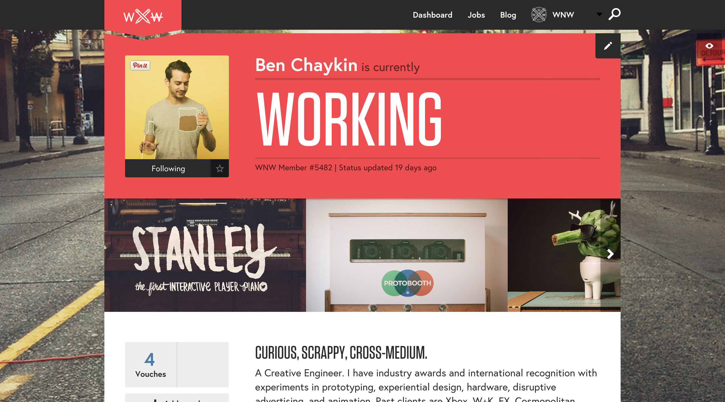
BEN CHAYKIN, CREATIVE TECHNOLOGIST. SEATTLE.
BEN JOHNSTON, DESIGNER. TORONTO.
BERNADETTE SPEAR, PRODUCER. NEW YORK.
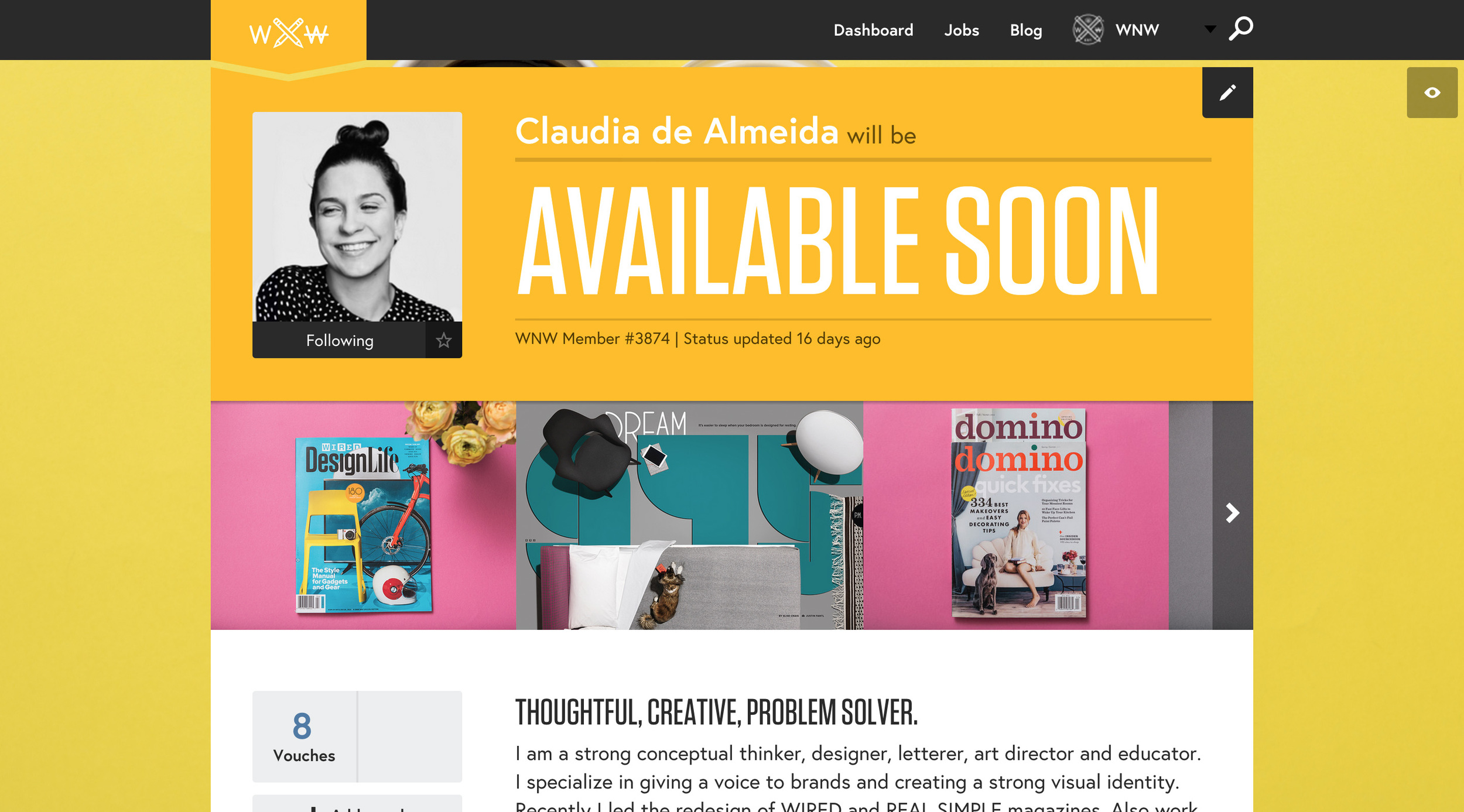
CLAUDIA DE ALMEIDA, ART DIRECTOR.
SAN FRANCISCO.
JIM GOLDEN, PHOTOGRAPHER. PORTLAND.
SUZAN CHOY, UX/IA DESIGNER. BROOKLYN.
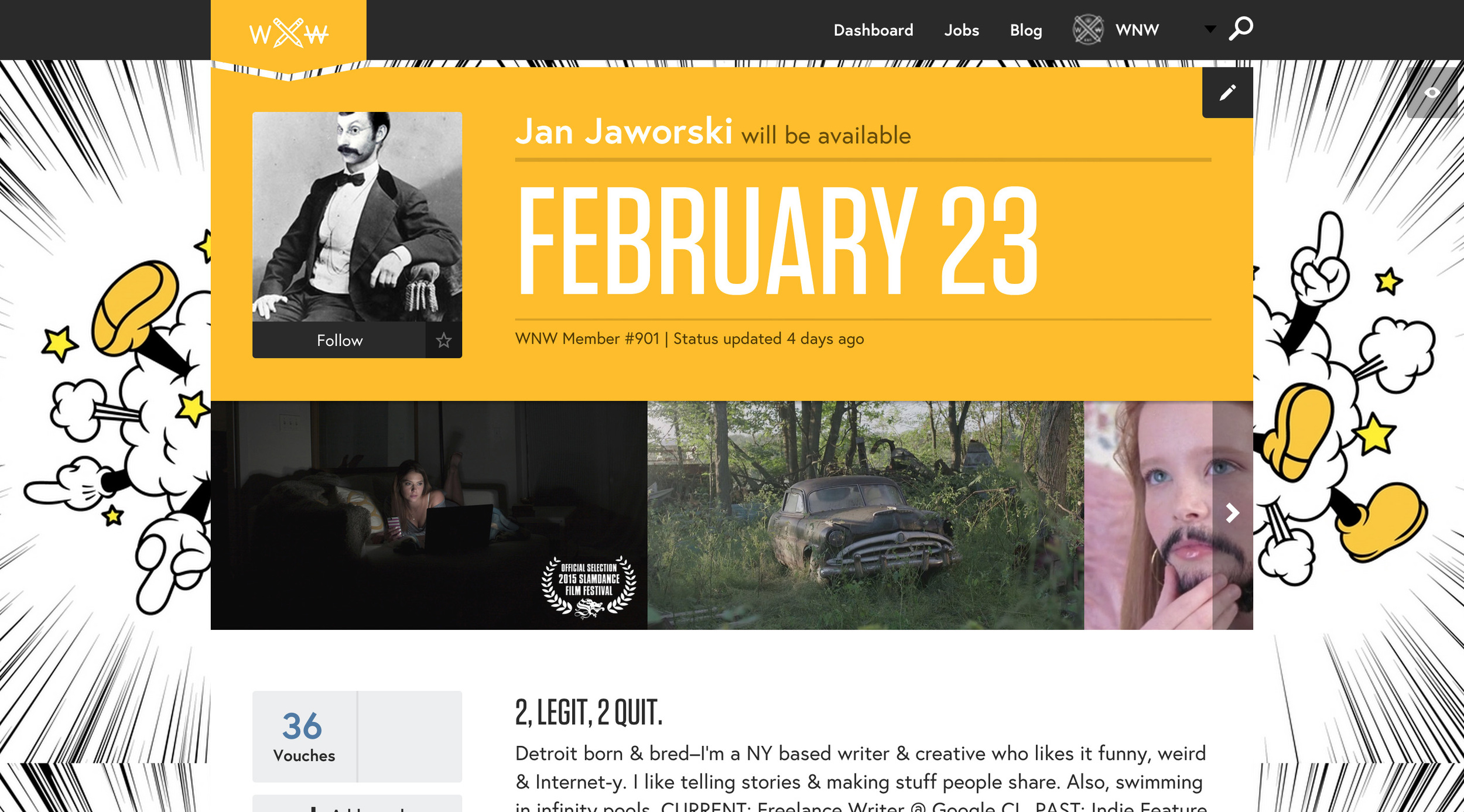
JAN JAWORSKI, COPYWRITER. NEW YORK.
JAY QUERCIA, ANIMATOR/ILLLUSTRATOR. BROOKLYN.
ANDREW RYAN SHEPHERD, DIRECTOR. NEW YORK.
Think your profile should be featured? Email us!
Shop more of Shawna's super cute card designs here!
WITH LOVE, FROM SHAWNA X
WITH LOVE, FROM SHAWNA X
"Thanks love y'all! I've found the one!" "EVERYONE IS A FUCKIN TROLL." These are two things WNW Member #2851 Shawna X hears on the daily. That's because she's a full-time designer at OKCupid, the dating site and source for love data. Since it's Valentine's Day, we had to seek Shawna out for some dating advice. She's refreshingly honest, optimistic and reminds us that V-Day is "just another day after Friday the 13th." Thanks, Shawna!
Tell us about about yourself..who is Shawna X?
My name is Shawna X - originally from Portland, Oregon but I've spent a good chunk of time in Chicago. I moved to NYC on a whim and I think I have found my city, for now.
In the day time, I have worked in agencies, startups, and more recently started at OKCupid - though I'd rather be defined by nights/weekends. I'm a huge enthusiast of self-initiated projects - from making cards and flags to metalsmithing to running a vintage clothing shop and shooting lookbooks for all of these things. Though I've dabbled quite a bit, throughout the years, I've found my good days are when I have made a drawing I still like at the end of the day; I'm trying to see how to take my illustrations into a million other tangible mediums. In everything I do, I like exploring lighthearted themes from a curiously deviant perspective.
I am stoked for a few gallery showings I am working towards, as well as personal projects I am amped to get off of paper and into other mediums. My dream project is one where I can take my 2d work into an 'IRL' space, from packaging to fabric pattern to store front, all within the same brand. Currently my mindset is that if it exists, I can make it, or at least find help to do it. I'm a super fan of creators who can take their craft and push it outside of their comfort zone - that is something I aim for myself every day.
I also can't wait until it's a bit warmer so I can explore outside of this city and get lost and not lug around a giant blanket scarf.
Tell us about your transition to OKCupid - what were you doing before, why you decided to work there, and what you focus on.
I've worked mostly in ad agencies but always had a soft spot for the small, smart, startup types as I freelanced for them on the side. I wanted to try out working in-house as well as the world of digital product design, especially one that caters towards my favorite topic of all time (and yes I can discuss the concept of dating for hours.) For now I am helping with revamping the brand / visual language - but for the most part, I will be starting over from scratch.
What are some things you've learned about love through working there (does all that OKCupid data inform the work you do?) Any stories you can tell us?
I have a great time looking through user feedback. Some are extremely optimistic and positive ("thanks love y'all! I've found the one!") while the nasty comments are pretty hilarious still ("EVERYONE IS A FUCKIN TROLL.") We get emails of all the confirmed matches, which means people who have successfully found somebody from the site and have since disabled their account (Facebook official or OKCupid disable, its the same thing that makes you sure you're in a relationship.) I've really opened my eyes to the types of relationships out there and the different types of people who are engaged in them. People are complex beings - but there is someone for everyone. Working here has definitely opened my eyes and has helped inspire my own personal work.
Recently PBS came to film a segment on OKCupid and I successfully set up my roommate with a coworker's brother for their date which just aired and coincidentally they went to the same college and knew the same people.. OKCupid is honestly a magical place that just links people up whether it is a hookup, serious relationship or friendship.
Best online dating profile you've seen. Worst one.
Not sure I can do this one specifically :)
Any tips or advice to share about dating in NYC? I know you're originally from Portland so I'm curious how you would characterize the NYC dating scene vs. Portland's.
O man, NYC dating is ridiculous. I am relatively new to the city but from what I've gathered, there is someone for ANYONE here - and it's the same for jobs, hobbies, activities - anything you want, you have it. Also, in the city when NOBODY has time, honesty and knowing what you want is key. Too many people are trying to be someone they're not which leads to them wanting something they actually don't want. Being open and knowing what you are looking for from the get-go means more fun, less hurt, no lame games. Of course, keeping an open-mind and letting things flow through being in the present is equally important.
In Portland, things move a lot more leisurely - and I feel like dating is more of a slow process because we have time to figure shit out since we don't have to worry about much (because why would you when you live 20 minutes from being lost in any forest or river?) I have a feeling we're a bit more casual and relaxed about things - but then again early 20's dating game is another beast in itself.
Any first date recommendations?
First dates for me aren't ever serious and are always without pressure/assumptions because it's almost like an interview process for a job as a ride-tester at a new amusement park before it's opened to the public - you gotta test to see if the amusement park will have the rides you actually want to get on, but if there aren't any then there are tons of other amusement parks in the city (worst metaphor ever..!) But obviously it's important. I think a chill bar with good music that's not too loud, where you can have a good conversation, eat food if you are hungry - no pressure - and I prefer it around 8 in case if it sucks then you find something else to end the night with - or if it doesn't... :)
Going on a first date on Valentine's Day: a do or a don't?
Why not? This city is a lonely place. Also Valentine's day is just another day after Friday the 13th.
More of Shawna X's work:
Are you a WNW Member with new work, exhibits, products, or news to share? Email us.
NOT WORKING: BLESK
NOT WORKING: BLESK
For those of us unversed in the annals of typeface design, we can sometimes take lettering for granted. WNW Member #2053 Ksenya Samarskaya is not one of those people. She can hold court for hours on the subject of typography, expounding on the intricacies of a glyph and teaching us new vocabulary. Though Ksenya has made dozens of typefaces before, they were always for clients. Now, Blesk is out and it's all her.
The Czech word for lightning flash, Blesk is a chromatic typeface inspired by vintage book covers and designed for magazines, headlines, theater, animated titles, three-dimensional printing, literary foils... the list goes on. Full-Stack Developer and fellow WNW Member #722 Eric Jacobsen brought Blesk to life through a whimsical site with just enough hidden goodies to keep you hitting refresh.
Tell us about the birth of Blesk:
I’ve worked on dozens of type families for companies and various foundries in the past but this is the first one that I’ve released directly to the public.
There’s an established history of chromatic typefaces, often inlines and outlines of a similar form that’ve been used in the letterpress days. Whenever I start toying with a concept, I’m constantly asking myself: Can I contribute something to this conversation that doesn’t exist? Am I offering a viewpoint that hasn’t been covered and is beneficial to designers? Even in some subtle minute way. I felt like there was something in developing and having a font that layered in another way, the coming together and breaking apart of it, the contrasting elements going on inside and outside of it, that hasn’t been fully explored.
How did you know you were on to something?
I played with it before I committed to it. I got the idea and then James Todd and I started by sketching out a few letters and words to see if it worked. I tried it in some of the design projects I had going on to see how it felt and to see if it was usable besides just looking good isolated on a shelf.
If you’re still motivated and inspired during the process, you keep growing and adding to it. Typefaces take a long time to create and if you’re motivated enough to work a full typeface to the end, that already says something about it.
Where did the name 'Blesk' come from?
You’re working with people, so you’re always talking about these things and personifying them. Even if it’s meaningless, or Project No. 319, you’re referencing it and you cycle through different terms you’re using for it until you land on one that feels just right. When I got to the word Blesk, which translates to flash, lightening, or thunder in Czech, I knew it was the right one immediately.
It had the feel, the energy, and the connotations of the typeface on multiple levels. It looked good. In the way that the website is an extension of the mood or the concept, the name functions in that same way.
How do you know when a project is done and ready to be released to the world?
When doing something that's self-released, there’s always the voice that’s saying “What if i’m not ready, what if i could make it better?” Several people who've known about Blesk have been playing with it since we wrapped up most of the drawing in the fall, but I kept procrastinating on announcing anything. Then several diverging things came together, and as I was thinking of making an announcement… a couple other people started tweeting about the new release earlier this week! So then it was a natural follow-up: other people were tweeting its release so I realized should probably say something too..
How do you market a typeface?
Since this is our first public release, I still have no idea how to market it.
After James and I finalized Blesk, we started working with Bo Fahs on the quirky copywriting and with Eric Jacobsen to expand the mood of the type into the development of the website and how the type makes it’s introduction into the world. I didn't set out to make a microsite, I just love making, building, and perfecting things. I'm a creative at heart! We looked through a lot of movie and animation credits from the same inspiration era as the typeface, trying to get a sense of playful movement. Like a couple of sides that come together to make a full letter.
In addition to a traditional press kit, we created matchbooks as a unique promo piece. Since its a throwback typeface named after lightning, creating a vintage style letterpress matchbook just made a lot of sense. We worked with Salt and Cedar out in Detroit to letterpress the them. (And for the first 50 people who purchase the whole font family, Ksenya will send a matchbook to you!)
When you’re describing the font, it sometimes sounds like you’re describing yourself. if you were to have a font with your name, would it be this?
It wouldn’t be this, no. There’s an element, definitely. You always bring all of your history and experiences and background of your work. All of my typefaces do come from me.. Identity is prismatic, you're not the same you at different times or in different circumstances, just as you wouldn't use one typeface for everything you make. As for choosing one that I feel could identify me, I’m not ready yet. I feel like you’re only allowed to name things after yourself on your deathbed. My story isn’t over yet :)
Where can we go to learn more about type?
The Type Directors Club does an amazing job in organizing lectures & workshops here in NYC. They’re going to have their first conference in June. Its an amazing resource that not enough people take advantage of. And when you go to these things, the typeface community is pretty small and nerdy with a lot of brilliant minds and brilliant people around who would be happy to talk about their experience.
Besides the year long type design certificate program, Cooper Type hosts free public lectures and paid weekend workshops throughout the year.
The Herb Lubalin Study Center of Design and Typography has an eminent collection of design works. You can schedule an appointment to look through all of it.
TypeCamp has several weekend workshops coming to NYC and still has spots available. They provide an alternative educational experience to anyone who wants to learn more about typography and design.
Typecon is an American conference that travels from city to city. It’ll be in Denver this year.
ATypI is a more academic and international conference, happening this year in Sao Paulo.
And finally..the public library! They're a fantastic resource to find old type specimens.
How would you like to see Blesk used?
The beauty of designing type for people is that it’s a conversation, a dialogue. I certainly have a vision of how I see it used but other people may see it differently. Type design is very much an exquisite corpse: you contribute all you can and then you pass it on… and it’s not necessarily how you would imagine. If it shows up in film or on bathroom wallpaper, absolutely. It was used on a book cover and a couple of the glyphs were stretched out to look like a railroad, I wouldn’t have thought of it - and I loved it.
Blesk in action
What's up next?
We’re constantly building and conspiring. There’s definitely a lot of stuff in the hopper that’s going to come out soon. I’m not yet sure of the timing or order so will not say exactly what, but definitely expect quite a few more font releases in the mix.
Any other WNW members whose work you admire?
WNW has been great for me to get back in touch with people and start up conversations. I posted a job opening on there a while ago when I was looking for someone to help me out, and that instigated various phone calls and plans to collaborate, a film animator in Portland Michael John, an ex-New York designer turned Los Angeles-bikebuilder and all around fascinating individual, Sam Potts.
Are you a WNW Member with new work, exhibits, products, or news to share? Email us.
CREATIVE BRAIN: PAOLA SALIBY
CREATIVE BRAIN: PAOLA SALIBY
Inspired by researcher Charles Limb's TED talk on what a brain looks like when its creating art, we wanted to know about our own community's creative minds. If we were to peek inside, what would we see? Sao Paulo illustrator and WNW Member #4745 Paula Saliby sent us her version and though her style is very much her own, we certainly saw ourselves in her.
Dolores & Felícia
Once my therapist told me that I have two girls living in my brain. No, I do not have a split personality. It’s just a way to understand how my mind works.
Let’s call the first girl Dolores. Anxious, croaker and very much a perfectionist, she worries too much about the future and insists on trying to control the other girl, Felícia.
Felícia is a sassy, fearless girl who takes risks and enjoys every moment of her life. She's never afraid of making mistakes and doesn’t worry too much about final results.
As both live in the same place, they need to get along with each other.
Most of the day they work together as a team. Felícia explores all her creative potential, works freely and joyfully while Dolores stays in charge of organizing and helping Felícia to meet deadlines.
But when dealing with some personal project they start fighting with each other. Dolores tries to control Felícia, saying all the time she needs to be careful or everything is gonna be ruined. She demands so much of her that Felícia starts to believe that she’s not good enough and sometimes she just quits.
But it’s not always like this. Sometimes Dolores wakes up in a very good mood and decides not to bother Felícia so she can work peacefully, with no pressure and then she’s able to give birth to one of those special projects that I’m so proud of.
More of Paola's work:
Are you a WNW Member with new work, exhibits, products, or news to share? Email us.
ON CENSORSHIP: JEAN JULLIEN
ON CENSORSHIP: JEAN JULLIEN
When tragedy strikes, words can be incapable of expressing our grief. We turn to images instead as the very best ones capture simply and succinctly what we are all feeling. The most powerful among them not only pay homage, they become rallying cries. WNW Member #5414 Jean Jullien's "Je Suis Charlie" is that image for the recent terrorist attack in France. We sat down with him recently to discuss the fine line between criticism and censorship, the ways social media impacts creativity, and how he designs both chocolate and chairs. (Plus, his upcoming show in Los Angeles!)
You immediately responded to this event with the very creative expression that was targeted. Was there a moment of hesitation or was this what drove your prompt response?
No, there wasn't a moment of hesitation on whether to react or not: it was a heartfelt reaction, very instinctive. I needed to respond. I was touched as French kid growing up reading Cabu, as an illustrator and as citizen of the free world (however corny that might sound.) I was shocked by the atrocity and tried to show my solidarity in the way that I know best: with a drawing.
A tragedy like this raises discussions regarding censorship and freedom of expression. Have you ever felt the need to self-censor? In what scenarios would that be appropriate?
Oh yeah, I do it all the time. All creatives do I think. But I wouldn't necessarily call that censorship, it's more about being critical and assessing your work before putting it out there. I often think of people's reactions before uploading an image on social media. I don't want to upset people for the sake of it, because I realize that one image can be interpreted in the wrong way, or because it might not always be appropriate to "jump on the bandwagon" —so to speak.
Major media outlets, including the New York Times, decided against reposting Charlie Hebdo cartoons in their coverage of this event. Executive Editor Dean Baquet stated, “We have a standard that is long held and that serves us well: that there is a line between gratuitous insult and satire. Most of these are gratuitous insult.” Do you agree with that distinction?
I do agree with that distinction, but I don't agree with them saying that Charlie Hebdo was gratuitous insult. That's misunderstanding the work of these cartoonists, which is surprising for an institution such as the New York Times. Charlie was not subtle in their humour, I agree, but their heart was in the right place. They weren't insulting the prophet, they were making fun of people who are using violence in his name. They wanted to depict him as a character, to articulate their point. There was humour in that, not hatred.
I can completely understand that people got upset by the depiction of the prophet, I really can. But in a modern peaceful world, you react by suing them, or making a cartoon in response to voice your anger. You don't respond with murder.
It's important to understand that it's not about cartoons and cartoonists, it is about the bigger picture: it's about culture vs obscurantism. If we let terrorists dictate what can and cannot be printed, then next is music, papers, cinema...Culture as a whole!
Yes, content can be offensive and one has the right to be offended. It just should be responded to in a civilized manner.
The reaction from artists like yourself is inspiring. What are other artists’ reactions (to this tragedy and others) that you admire and why?
David Pope, Lucille Clerc and Ruben Oppenheimer did fantastic pieces on the subject. I liked Mr. Pope's for his depiction of the absurdity of the duel. In his cartoon however, it seems as if the murderer defends himself, as if he'd realize the disproportion of his act. Unfortunately, that's not the case in real life. Lucille's was full of hope and strength, which we all need now. I think the biggest "lesson" to arise from this tragedy was that people are ready to stand up for their freedom of speech.
5. Where are you excited to head next? What are you excited to make?
I'm currently working on my first solo show in Los Angeles, which opens on March 27th at HVW8 Gallery. It's called POOR TRAITS and will be a series of portraits. It's quite a change from what I've been doing in my shows so far but that's what shows are for in my opinion. I'm really excited to get there and meet a new audience.
I also have a food show in Paris where I'm working with chocolate makers to create a giant chocolate sculpture (as well as a "capsule" series of chocolate), burger makers for a special event, and designing a giant table unit to host the whole thing. I'm partnering up with French food magazine Fricote, for whom I designed this cover:
I love working with these guys and I'm excited to try "designing" food!
I'm also working with an actor that I love on his next book and with Opening Ceremony. I've also been working with my brother Nico on an animated series pilot that we're eager to present to networks and hopefully get produced! It uses a very cartoony visual language to discuss quite current matters such as our food obsessions, religion, popular culture, feminism, body shaving, etc...
6. Some of the social observations you make are about our love affair for screens. Do you think that influences budding creatives' practice? If so, how?
I think it's helping creatives define audiences and what makes them tick. We store and check in online so much, we map ourselves so openly that it's heaven for anyone trying to create targeted content. The audience defines itself and, in a way, helps design the content they are eager to "discover". It's an interesting take on supply and demand...
I think about it constantly, trying to intellectualize it in my work but I'm also a prime "victim" of it, constantly checking my phone and social media. I'm as addicted as any of us. That's why I allow myself to be a bit cynical and critical in the images I create: I'm laughing at myself too.
One of the things that drives my work is Communication. I do what I do to create discussion and to exchange with people. Social media has allowed that to happen in a fantastic way. It is now very easy to put something out there for people to see and react to. It's of course also very easy for people (trolls...) to get involved and ruin it for everyone. C'est la vie!
So yeah, I enjoy drawing our modern life because I find it fascinating and because I'm so concerned by it. It's a form of social documentation, trying to discuss things as they happen.
7. IS THERE GOING TO BE A CHAIR SERIES?!
I hope so, there has been a table! There are so many things that I want to do like furniture, clothing, movies etc... I just need to find the right partners and opportunities to make it happen!
A bit of Jean's work:
Profiles of the Week: February 9th
PROFILES OF THE WEEK: FEBRUARY 9th
Having to pick a favorite among WNW profiles isn't an enviable task. In a community this talented, scrolling through the search page is a straight dive into a rabbit hole of inspiration and oops! There goes three hours. Now we know how our parents felt when we bugged them which kid was their favorite...sorry, guys.
We're kicking off a weekly roundup of members who not only do great work, but have also done a stellar job in maximizing their WNW profile to show off that work. The most crucial piece of the profile is the mini-book. Six beautiful images are a must but serious points go to those that include project links within their book. Recommending others really steps up your WNW game and a unique background is always a good way to catch not only our eye - but our managers'.
With recruiters making a decision about you in a matter of seconds, its important to remember that first impressions are, well, important. (For a refresher course on hustle and WNW hacks, be sure to read fellow member Greg Collins' piece.)
It wasn't easy but here we go. Please meet our WNW profile heroes of the week:
JANE CRONK, COPYWRITER. NEW YORK CITY.
ZARRIN MAANI, PRODUCER. LOS ANGELES.
