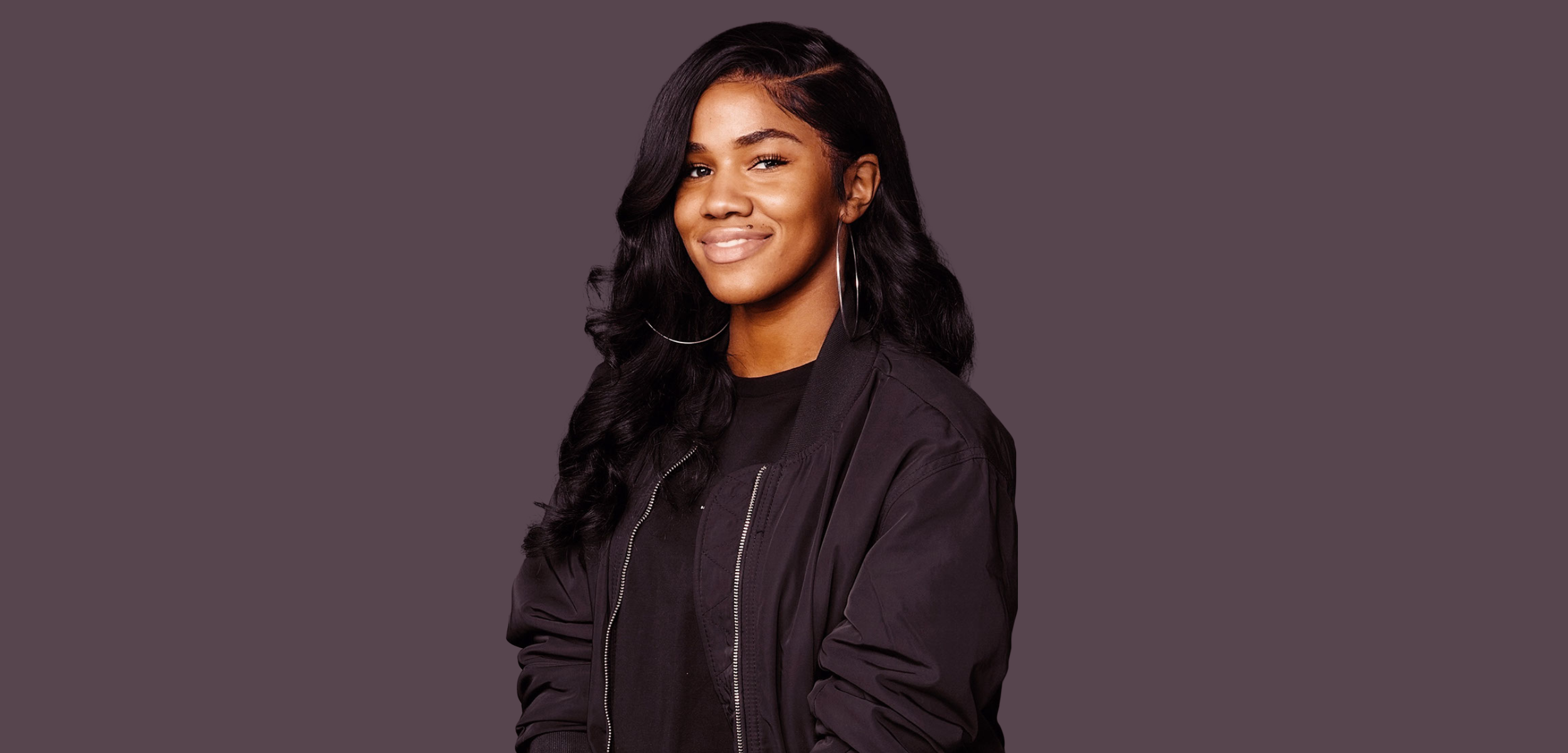
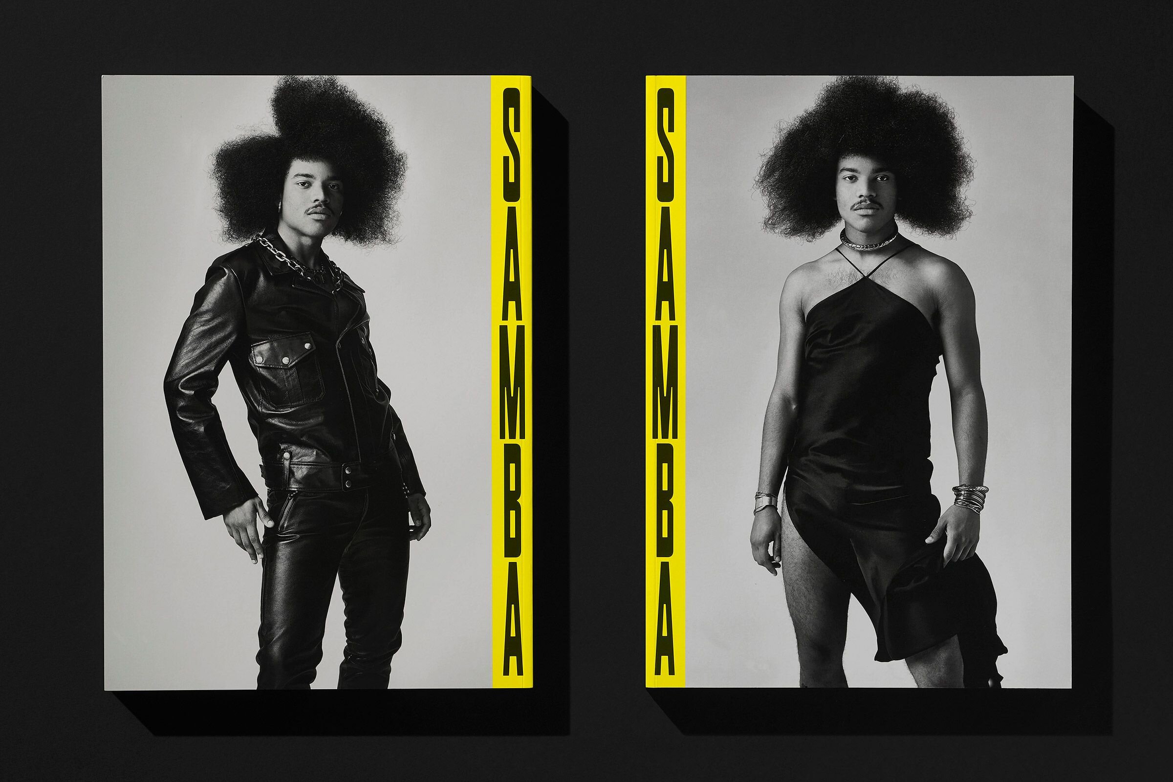
The award-winning non-binary interdisciplinary creative is an Associate Creative Director at Spotify, where they’ve worked on different rollouts for artists such as Billie Eilish, BLACKPINK, and Maluma. Along with their role as a Co-Founder of the brand Crushed Tonic, Yeung’s hands are full as they continue to realize the full extent of their creative abilities.
Read MoreDonye Taylor Cut Her Own Path Into The Creative Industry
From working with R&B artist 6LACK to market his 600 Degrees hot sauce to handling creative direction for a project with Nike, Donye Taylor has carved her own path on her terms. She’s not letting up for anyone. Taylor talks The Digital Footprint, what drives her, and what she plans on doing in the future.
Read MoreThe Brazilian Designers Behind Brooklyn Studio Porto Rocha Make Work that Moves at the Speed of Culture
“Both immigrants ourselves, we founded the studio upon the idea that unique and global perspectives are key to creating work that is both innovative and culturally aware. Through PORTO ROCHA, we see an opportunity to help build brands that are in dialogue with the real world.”
Read MoreWork With Zipeng Zhu
In this primary color-infused installment of Work With, a film series from Working Not Working that introduces you to the creatives behind the work, Zipeng Zhu takes us on a tour of his everyday “razzle-dazzle musical.”
Read More21 Years, 21 Lessons: About Success & Failure as a Creative Immigrant
Us immigrants, we tend to shy away from voicing our stories because we are afraid of how it will effect our status. Here’s to hoping that telling my story will help someone else like me in their journey.
Read MoreCraig Black
Surviving the Coronavirus Crisis as an Independent Creative
“What I am about to share with you is actionable steps that I have taken to ensure my business and my mental well being will survive through these challenging times. I really hope that this insight can provide value to the community.”
Read MoreOvershare Podcast: Sophia Chang on Hoarding Skills and Staying Busy
In this episode, you will learn to assess and repurpose your skills in new ways for people who may need them. And you’ll learn ways to be proactive when work starts getting slow.
Read MoreMotion Graphic Designer Job Descriptions, Salary, and All Things Hiring
If you want to write a motion graphic designer job description, browse portfolios, or write cold emails to talented designers, this post has everything you need to get started.
Read MorePhotography by Mohammad Amir Hamza
Want to Work on Patriot Act’s Emmy-Winning Creative Team? Here’s What It Takes
Patriot Act with Hasan Minhaj just won an Emmy for Outstanding Motion Design. Justine Webster, the Netflix show’s Graphics Producer, tells us about her approach to building a creative dream team that can tackle the workload and time crunch while maintaining a collaborative spirit and comedic touch.
Read MorePROFILES OF THE WEEK: SEPTEMBER 19TH
PROFILES OF THE WEEK:
SEPTEMBER 19TH
Trevor Davis, Designer. Brooklyn.
Scott Balmer, Illustrator. Dundee.
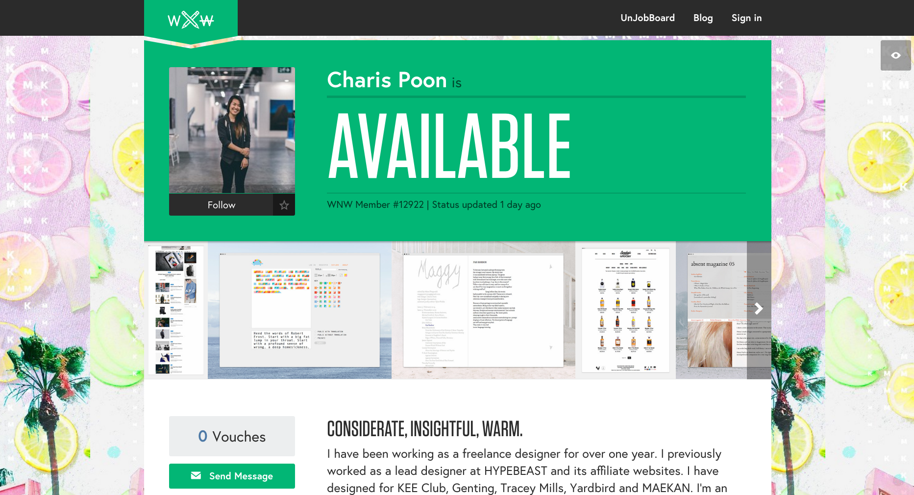
Charis Poon, Designer. Hong Kong.
Lauren Geisler, Art Director. New York.
Wes L. Cockx, Illustrator. Brussels.
Remus Roman, Photographer. Detroit.
Nadine Saez, Producer. San Francisco.
James Mabery, Motion Designer. Atlanta.
Are you a WNW Member with new work, exhibits, products, or news to share? Email us!
SPECIMEN: WELCOME TO YOUR NEW ADDICTION
SPECIMEN: WELCOME TO YOUR NEW ADDICTION
You can't say we didn't warn you.
WNW Members #2763 Erica Gorochow and #6818 Charlie Whitney are the colorful minds behind Specimen, a just-released app that tests color perception and is crazy addictive. If you like Dots, you'll love Specimen: "To play, simply tap the specimen that matches the background color. As you advance, earn patterned boosters and chroma coins to combat an ever faster clock."
We spoke to Erica and Charlie about how they got the idea for the game (they sit across from each other at work), the impact that incubator NEW INC has had, and why they hate color blind people. Easy to learn but tough to master, download the (free!) game and see if you can beat our score of 1312, knocking us off the global leaderboard. Not that we're counting or anything...
Why do you hate color blind people?
Erica: Ha! If you’re color blind Specimen might not be your new favorite game, but it doesn’t preclude you from playing. Color-blindness itself isn’t a totally binary thing, there is a whole spectrum of color vision. We really want to find a Tetrachromat to play. Anecdotally, we’ve found that people definitely improve. I think the game is as much about focus as it is about perception. That said, we want to make color-blindness a mechanic. Having a color-blind mode doesn’t make sense but we’re asking: is there a way color blindness might be an advantage? Or can we do something that might engender color blindness empathy? Stick with us for the 2.0.
How’d you come up with Specimen? How did you meet the team and start collaborating?
Erica: The team is made up of Erica, Charlie and Sal Randazzo who is the lead iOS developer at Paperless Post. The music and sound effects were by Upright T-Rex. Sal and I have released other side-project apps before Specimen. We met several years ago while while working on a music video for Rihanna. Sal actually started his career in VFX doing flame. In early 2013 he mentioned that he was interested in making a game to learn new aspects of programming. As an animator, I knew my skills would be an asset.
Charlie: Erica and I have been friends for a little while and actually sit across a desk from each other. I came in shortly after she and Sal started working on this new project. While Erica and Sal were crunching on core game mechanics, I began explorations for how the specimens themselves could look and feel. It was a collaborative process where I would iterate with Erica, but then had to make sure I was working inside of a system that could integrate with Sal's existing code.
How did the museum-led incubator NEW INC help the game come along?
Erica: Charlie and I are full time members. NEW INC was a consistent hub for a side project that had an inconsistent schedule. The incubator helped us to connect with people who gave us advice, which in turn shaped the game. The supportive community was kind enough to put up with our constant play testing. And as we launch it was great to strike up partnerships with others in the space like Print All Over Me. Check out these rad leggings!
What have been the biggest challenges so far in bringing this to life?
Erica: Specimen is a bootstrapped side project. It took a lot of patience and faith that everyone involved would follow-through. Also, making a game is so tough. Trying to pin down what makes something “fun” is a lot harder than it might sound.
Charlie: I’m used to working heads down on a project for a month or so and then launching it. Keeping enthusiasm and attention to detail at a high level over the course of a year is tough. Having friends to hold you accountable is a must for me.
Anything unexpected happen along the way?
Erica: The game originally had a bigger quantified-self angle to it. We found we had to choose between making a diagnostic and making a game. That said, we want to bring back features that more explicitly reveal how you see color.
Have you already reached the highest level or beaten the game?
Erica: I’ve gotten to Zeta, but I don’t think I’ve beaten the most recent version of the game. I’ve played so much that I suspect my brain is somehow different. (I’m hoping for the better).
Charlie: I think I beat Delta once, but we might have made it harder since then. I am very bad.
Any advice for fellow creatives looking to build their own game?
Erica: Prototype until people won’t give you back your phone after you ask them to play.
Charlie: It will literally take at least 5 times longer than you think it will.
Do you have any plans to work on another game, or are you in need of a breather? What’s up next?
Erica: It’s nice to think longer term for once. We want to see how the 1.0 goes and evolve it from there. I definitely need a breather but I’m still excited about Specimen.
What are some of your favorite apps or games?
Erica: Dots, Two Dots, Finger Battle, Plug & Play, Ready Steady Bang, Metamorphabet, Loopimal, Edge, Threes. The Reuters TV app is stunning in how it incorporates motion graphics. I wake up and go to sleep to NYT Now.
Charlie: I don’t use too many apps, but I would like to know what happened to “Bump.” Remember that one? I used to be pretty obsessed with Flappy Bird and Ridiculous Fishing.
Normally we don’t ask this, but what’s your favorite color and color combo?
Erica: I love almost-neon red. Color combos with two desaturated colors and one hot highlight color always does wonders.
Charlie: Green, somewhere right around #75a834
Wish you had those delicious Specimen caps that Erica and Charlie are wearing above? Head over to Print All Over Me, where you can match your app to a sweet Specimen cap, leggings and of course, tote bag.
Are you a WNW Member with new work, exhibits, products, or news to share? Email us.
HOW TO GET THE MOST OUT OF CLIENT FEEDBACK
HOW TO GET THE MOST OUT OF
CLIENT FEEDBACK
WNW Members #1395 Breanna Radermacher and #5602 Jen Serafini are designers on a mission to pay it forward. They've joined forces as co-founders of Be Free, Lance, an online course for designers who want to build a successful business from the ground up. The next session begins on June 1st and registration is now open. You can learn more about what the course entails right here. Last week on Free Range, Jen covered the importance of creating successful project proposals. This week, Breanna offers insight into getting the most out of client feedback.
Last week, we chatted about the importance of creating successful project proposals to make sure that expectations are set and understood up front. But when you’re in the thick of the design process, gathering helpful feedback from clients is another pivotal moment that can make or break a project. Think about it this way — you’ve already strategized, conceptualized, designed, refined, and created a killer presentation of what you believe to be the best solution. And although you may be extremely proud of the work shown, everything can fall apart in an instant if you don’t handle the revision process in a professional and educational manner.
So how do you facilitate appropriate feedback? Be a leader. I always like to start off with a strong presentation. Instead of just showing my clients something pretty, I give them some context as well. That way, they are learning about why I made certain design decisions while also being reminded about the original objective. For example, I may present a logo concept and also state the following: “Because we wanted to convey your outgoing personality, I used a bold and modern typeface. It’s solid, strong, and can stand the test of time, just like you. The composition, however, remains simple so that your branding does not detract from your beautiful artwork.” By shedding a little light into the thought behind a design, the client will better understand what they are looking at and be able to provide better feedback.
But educating your client doesn’t stop there. At the end of my initial presentation, I always provide a guide for feedback. I’ve found that more often than not, clients don’t have experience in giving critique, so it’s best to help them out from the get go. If you just say “What do you think?” there’s no telling what you’ll get in response. But if you outline some questions for the client to run through and consider, they instantly have a cheat sheet on what to look for. For example purposes, here are some questions that I ask most clients after they’ve seen their initial designs:
Is your gut consistently drawn towards one direction? Ask yourself this same question over the next few days.
Do you feel the typography represents your brand voice, in wanting to achieve something that is (put descriptive words about their project here)?
Do you feel that the overall tone is inline with your target market and what they’re attracted to? Remember, we wanted to go for something that was (put descriptive words about their target market here).
Do you have any other comments or things you’d like to see changed?
As you can see, most of these questions are structured in a way that helps remind the client about their original objective. It’s easy for clients to begin sharing their stream of consciousness without giving much thought to the strategy behind a design, so it’s important to guide them into it. And these questions do just that! But if you’d like to take things a step further, you can also give them examples of good and bad feedback, just so they have a starting point. For example, plain statements like “I don’t like that blue” aren’t helpful, but explanatory statements like “I don’t like that blue because it feels too childish” are.
If you find yourself receiving bad feedback, or even feeling like a design puppet (which is the worst), take a look at your revision process and evaluate your communication with clients. At the end of the day, feedback is a collaborative process, and if you are leading confidently while listening closely, things tend to go a lot smoother.


