See the exact, step-by-step process you can take to search through the WNW database, connect with and follow UX designers whose work you love, and create a short job post to attract UX designers.
Read MoreHow to Get a UX Design Job
So how does a UX designer not only get a job but make sure it’s a good one? As you might guess, it requires more than hard skills and proficiency in prototyping tools.
Read MoreWhat the Best UX Designer Portfolios Have in Common (Including 10+ Examples)
We discuss five qualities that the best UX designer portfolios share, along with several portfolio examples for each one. If you’re looking to hire a UX designer for your next project, use this post to help you find the right designer for your team.
Read MoreHow to Use Working Not Working to Land a Job at a Top Company Like Nike
“I applied to a full-time role at Nike and within a day I heard back about a job in New York...And just like that, I kicked off a very streamlined and informal conversation with a team at Nike about what they are looking for and how I could help. With the help of WNW’s platform, the interview process was casual and clear, breaking down the formality of job-seeking and interviewing.”
Read MoreWNW CONNECTS: THE COLLECTED WORKS & STARRY
WNW Connects:
The Collected Works & Starry
WORKING NOT WORKING
We love when creatives and companies come to us with Working Not Working success stories. Makes us feel all warm and fuzzy. The recent collaboration between design studio The Collected Works and startup Starry is a perfect example, especially given the impressively sleek and innovative outcome. Starry, which offers a pioneering touchscreen anti-router with perfect WiFi, used the WNW platform to discover and hire The Collected Works with the challenge of "visualizing the internet."
Below, we talk to Collected Works duo Justin Colt and Jose Fresneda, and Jane Huschka and Don Lehman, Starry's Creative Director and Head of Product Design. The conversation's pretty insightful, hearing from both sides simultaneously as they walk us through each step of the collaboration, from first contact to finished product. The Starry team tells us what they saw in The Collected Works that made them a perfect fit, and how the creative studio ultimately exceeded their expectations. The Collected Works duo goes in-depth into their creative process for this project, which included bringing in fellow WNW all-star Nick Hum.
P.S. Interested in connecting with Starry and The Collected Works? Good news: Starry is hiring. "Don is looking for Product Designers. Jane is looking for Art Directors, Designers, and Copywriters. Definitely reach out if you’re reading this and are interested." And The Collected Works is down to meet up. "If you want to talk about a project, are starting a studio of your own, want to explore the virtual reality, or just want to chat, we make time whenever we can. Hit us up!"
Tell us a little bit about your creative backgrounds. Who are Justin Colt and Jose Fresneda and when did you start The Collected Works?
We met each other at The School of Visual Arts when we were both pursuing our Masters in Design. During school, we often collaborated on assignments, and generally helped each other out as most of the students in the program do. We were also taking on occasional freelance work. It was beneficial to team up as it made us seem more legit as a partnership. We were also both working part time at other studios in the city. Jose was working with Dark Igloo, and Justin was with Milton Glaser.
When we graduated in 2013 we were at a bit of a crossroads. We could take full-time design jobs or take a chance on starting our own studio–a personal goal for both of us. We had one client at the time with a project budget that could keep us afloat for a month. We took the plunge and started The Collected Works together. We applied what we learned in school, at Dark Igloo and Milton Glaser, and hustled to find as much work as we could. That was 3 years ago. Since then we’ve been lucky to not only stay afloat, but work with really talented people on rad projects.
Who are Jane Huschka & Don Lehman and how did you both wind up in-house full-time at Starry?
Jane is the Creative Director and part of the founding team at Starry. She’s specialized in branding, marketing, visual and experiential design. Before Starry in 2014, she was with much of the same team at Aereo. Previously she worked at the small branding agency called RED with clients like the NFL, Civic Entertainment Group, and Apollo Theater.
Don is Head of Product Design (UX & ID) at Starry. His background is in industrial design and user-centered research. Before Starry, he ran his own design studio, More/Real, working with clients like SiriusXM and Rubbermaid. He also happened to be a big fan of what the team at Aereo was building (which, as Jane would say, is how he was lured in).
We met in early 2015 when Don first joined Starry. We were excited to work together for a ton of reasons. We saw what a huge project and opportunity it was. We’re the type of designers that are very comfortable wearing a lot of hats, so working at a startup is appealing to us. But most importantly, we’re both passionate about making people’s lives easier. If there is a way to make anything we touch more useful and delightful, we will find it.
Since the very beginning, everything has been incredibly collaborative. We started small with finite resources. We worked together on everything. Engineers, developers, designers, marketers… anyone who could contribute would. We’re slightly larger now and it’s still the early days, but we strive to work this way. We’re all on this fantastic mission to make something great.
Had you heard of Starry when they first reached out to you on WNW to help with the design of their new router?
Collected Works: We had very little idea of the concept, the project, or really anything Starry was planning to do. This was prior to announcing anything publicly, and they were still working with a secret codename. In our first meetings, we didn’t know if Starry was a product, a service, or anything about their general mission. We did know it was going to revolutionize how we use the internet, and was founded by an incredibly talented team. After we said we were onboard, and they felt we were a good fit, we got all the info.
Can you give us a little insight into how Starry got started and what its core mission is?
Starry: The internet is amazing. But internet service? Not so much.
So we set out to reinvent how you get the internet. We’re creating radical technology that’s wireless, fast, affordable, and easy to use. Just one company for everything you need including your service, products (including Starry Station), and support. We think people deserve more choice and a better experience.
If building our own ISP from scratch sounds insane, believe us, it is. But everyone here is scary-smart. Most of the founding team (including Jane) came out of Aereo, the internet-TV service that allowed you to stream over-the-air TV (the kind you usually need an antenna for) to any device. Kind of like Netflix for broadcast. It was considered slightly controversial, and after spending several years fighting the broadcast companies, Aereo ultimately lost its case in the Supreme Court.
Obviously, that’s quite the way for a company to end and you would think something like that would’ve forced the core team to call it quits. But the amazing thing about this group is that we didn’t just rest on one great idea; we moved on to the next. Like how to use millimeter-wave technology to deliver Internet through the air! After Aereo closed its doors, we immediately started the development of Starry Internet.
What was it about Collected Works’ WNW Profile that most stood out to you?
Starry: All of their projects have such a unique look and feel. They’re smart. Thoughtful. Bold. And even though Justin and Jose are both classically-trained designers, everything they create feels so totally fresh and playful. We hadn’t planned to hire a studio to help bring our wireframes to life (at the time, Jane was looking for a full-time designer to bring in-house) but we came across their profile on WNW and felt right away like they were the right match.
Was there a particular past project in their portfolio that clued you into the fact that they were the right fit?
Starry: For us, what really stood out about the Collected Works' portfolio was the combination of experimental and practical work. On the experimental side, we appreciated their Nike light paintings, the sound visualizations for Red Hot, and the countless little animations that they’ve sprinkled throughout their portfolio. That was something neither of us could really capture in our wireframes and we hoped that their imagination would help bring the experience we’d designed to life.
What was the brief?
Collected Works: In short, the objective was to “visualize the internet”. That’s a really broad question, but an exciting one. At this point, we knew Starry was building a touchscreen router, called Starry Station, that was part of a bigger internet ecosystem. It also had a larger objective: to help people understand how they’re connected to all these devices in their home.
The router itself was already beautifully designed, and now they needed to figure out the UI for the touch screen. This is how people would interact with and understand what was connecting to their network. How do you show a complex web of devices? How do you interact with them? How do you quickly understand your internet health? How do you fix problems when they occur? These were some of the challenges we needed to figure out.
Starry: When we started our collaboration with the Collected Works we had a fistful of wireframes and early prototypes but knew we needed help if we were going to redefine a category. Our competition? The router. Your stereotypical ugly, black, blinking box. A device designed by utility companies – not something you’d set out in your home that's kind of scary for the people who use it.
So we asked Collected Works to imagine we had designed a router that was easy to use. Fun to set up. At a glance, it could tell you that your internet is working, what devices are connected, and what’s using the most bandwidth. And when there is an issue, it could tell you how to fix it. On top of that, make it beautiful and intuitive. A touch magical. Something that belongs in a home, not in a science lab. Easy, right?
Did Starry give you a lot of freedom to run with it? Or was it a very collaborative process?
Collected Works: Overall it was the best sort of collaboration. We could run with ideas and come up with lots of different directions we could take the project. On our end, we did a lot of animation mockups of what a visualized internet looked like. Sometimes it was a blob. Sometimes it was a chart. There’s really no definitive right answer, so it was all about playing with and testing a lot of different options. Then we’d all get together and talk about what made sense. We’d also talk about what was possible from a technology standpoint. This was also awesome because the Starry development team could build and test these prototypes we were conceptualizing at the studio.
Did you find inspiration from other products in this arena? Or were you in more of a futuristic sci-fi frame of mind when “visualizing the internet”?
Collected Works: During our initial research sweep we found a lot of examples of what NOT to do. Most data visualization, especially in this field of internet speed and usage, is incredibly clunky and confusing. We needed to make this information understandable and engaging. It needed to feel more organic, almost like the router was a microscope, looking at the DNA of your internet. Soft shapes, simple color logic, and data visualization that was easy to understand were all the underlying goals.
What were some of the challenges of delivering the goods on this brief?
Collected Works: One of the challenges off-the-bat was to staff up as a studio so we could handle the workload. As it’s just two of us over here, one of the first things we did was hire a friend of the studio, and WNW all-star, Nick Hum. Nick had helped us with a few other projects, and he was a perfect fit for this one. We also really liked that everyone involved was from the WNW community.
Secondly, for the work itself, everything we proposed (all the UI, animations, charts, graphs, interactions and screens) needed to be incredibly flexible and able to accommodate any user's home network. So, a visualization for a network with 3 connected devices had to work just as well as a network with 30 devices. This took a lot of testing and prototyping to get just right. Which meant a lot of collaboration with the Starry team, to code and test what we were prototyping.
Finally, time was always ticking. The Starry team had a hard shipping date that was rapidly approaching, so we needed to be really efficient with our time.
Tell us about the finished product. How does it work?
Collected Works: Starry Station is a router that allows users to control and understand their WiFi like never before. It’s a powerful piece of hardware that’s beautiful enough to put on your desk, and simple enough for your parents to use. No more blinking lights to decode, just a better way to stay connected to the things we love.
On the Starry Station touchscreen, there are a variety of different visualizations. “Ambient” view is the default screen, which represents connected devices as floating orbs. The more devices connected to your network (phones, computers, printers, TV, etc.) the more floating orbs. In the center of these orbs is a number (from 1 to 100) that we call your “internet health score”. This number represents how healthy your connection is. A variety of factors can influence this–from internet speed to the number of devices online. Overall, ambient mode gives you an at-a-glance view of your internet. You can see it from across the room, and understand if everything is cool, or if something is going wrong.
The secondary state is what we call the “1-foot view”. This is when you tap on the screen and the orbs and health score transitions to a simple dashboard. From here you get a detailed breakdown of your internet and can fix any issues. You can see what is connected to your network, and how those devices are using bandwidth. You can test your internet speed, and see your usage over time. You can also add or remove any restrictions, such as disabling your kids' devices until after they finish their homework.
In the end, the UI eloquently and simplistically answers a very tough challenge–to visualize the internet. Starry Station works so well that we use it every day, here at the studio.
In what ways did Collected Works surprise you?
Starry: The Collected Works surprised us in a lot of ways, but what really stands out is how collaborative and unflappable they were. Despite the ridiculously tight timeline we’d set for ourselves and, admittedly, a constantly shifting set of deliverables. What you would call stereotypical startup problems. :)
This project could have easily turned into one of the worst experiences ever, but it didn’t. They met deadlines and exceeded our expectations every time. We’re still very proud of how much we were able to accomplish in such a short amount of time.
When searching for and discovering creatives, what do you look for first in a portfolio?
Starry: Outside of great work? The ability to explain and rationalize a process and the decisions made – whether it’s product, design, or copy. Attention to detail and craft. The desire to do something great.
Who are some other Working Not Working members whose work you admire and why?
Starry: We’ve had the pleasure of working with and interviewing quite a few talented WNW individuals over the last year. Aside from Collected Works, we’ve collaborated with Sarah Lim and our own Justin LaFontaine is a member.
Profiles we admire include the talented Leta Sobierajski (who just gets geometry), Mike Lacher and Todd Lamb (who just get the internet)...the list goes on. We do a lot of our recruiting on our own so there’s a chance you’ll hear from one of us if we like your work.
What’s next for Starry?
Starry: We recently started a beta program for our internet service in Boston. After that, hopefully coming soon to cities across the US.
Anything else you’d like to add?
Starry: Yes! We’re hiring. Don is looking for Product Designers. Jane is looking for Art Directors, Designers, and Copywriters. Definitely reach out if you’re reading this and are interested.
Collected Works: Thanks so much to Working Not Working for the continued opportunities, parties, lectures, connections, and adventures. You’ve really been a pivotal part of the studio.
Other than that, we’ve been very fortunate that many studios, agencies, designers and people we look up to have made time to meet with us and lend advice. We like doing the same whenever possible. So, if you want to talk about a project, are starting a studio of your own, want to explore the virtual reality, or just want to chat, we make time whenever we can. Hit us up!
Are you a WNW Member or company with new work, exhibits, products, or news to share? Email us!
PROFILES OF THE WEEK: AUGUST 15TH
PROFILES OF THE WEEK:
AUGUST 15TH
Alison Bracegirdle, Copywriter. London.
Neri Esparza, Front-End Developer. New York.
Erik Johnson, Designer. Encinitas.
Buddy Bojorquez, Designer. Los Angeles.
Audrey Desler, Designer. Portland.
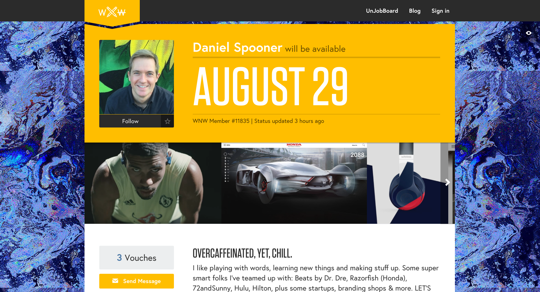
Daniel Spooner, Copywriter. Los Angeles.
Nate Pence, Editor. Chicago.
Shirley Huong, UX/IA Designer. New York.
Are you a WNW Member with new work, exhibits, products, or news to share? Email us!
PROFILES OF THE WEEK: JULY 18TH
Brandon Burns, Designer. Brooklyn.
Jill Silberstein, Producer. Nashville.
Kelsey Hannah Walsh, Designer. Brooklyn.
Nitzan Hermon, Designer. New York.
Riikka Laakso, Illustrator. Berlin.
Job Hall, Producer. Los Angeles.
Pouya Ahmadi, Designer. Chicago.
Noemie Le Coz, Designer. New York.
Are you a WNW Member with new work, exhibits, products, or news to share? Email us!
PROFILES OF THE WEEK: MARCH 28TH
Bevan Mahaney, Copywriter. Brooklyn.
Muriel Naim, UX/IA Designer. Los Angeles.
Joshua Glazer, Copywriter. Santa Monica.
Mike King, Designer. New York.
Caley Ostrander, UX/IA Designer. New York.
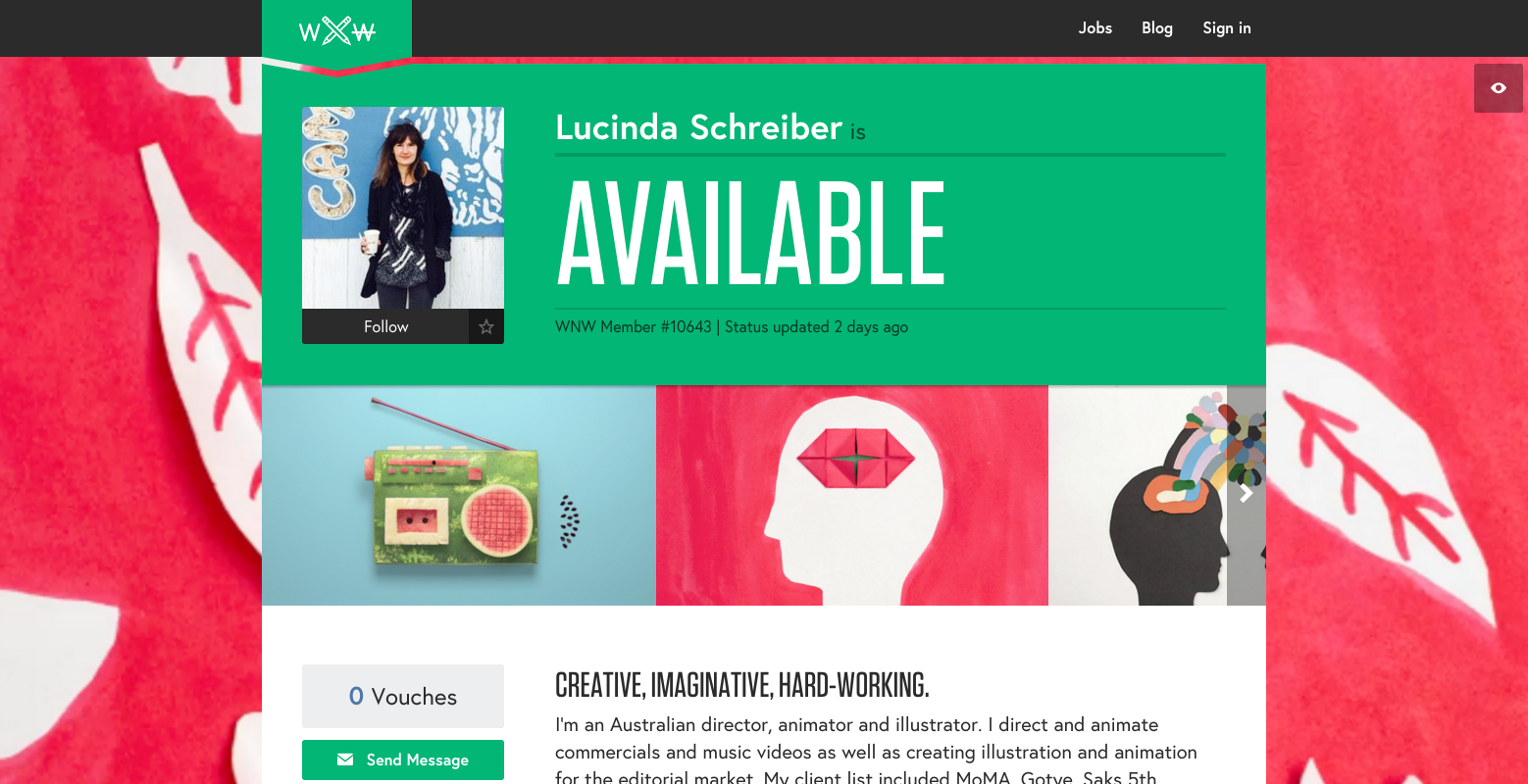
Lucinda Schreiber, Animator. New York.
Rob Devaney, UX/IA Designer. Haddonfield.
Fabien Pons, Art Director. New York.
Are you a WNW Member with new work, exhibits, products, or news to share? Email us!
WHAT THE F*#!CK IS A UX DESIGNER, ANYWAY?
We've all heard of UX Design, but what is it? We enlisted the help of Sweden-based WNW Member #2079 Anton Sten to peel away some layers from this mysterious, ever-shifting role. As Anton notes in his new e-book User Experiences that Matter, it really boils down to valuing your customer, and understanding how to make them happy. But he also stresses that while UX is integral, it is only part of a great experience: "Even if your product is amazing - like really the best of the best - it can all be destroyed by one impersonal customer service answer, a slow loading website, or not delivering on a promise. After that it’s back to square one. I think Uber is a good example. Regardless of how ‘friction-less’ the app is, if your driver is bad, then you’ll have a bad experience. Everything has to play well together."
WNW members, use the code 'wnw25' to get 25% off of User Experiences that Matter.
Your book does a great job of breaking down UX Design (and all of the abbreviations that come with it) so that its purposes and applications are more transparent. What lead you to write this book?
Thank you! It was about a year ago that I started writing more and more. When I started, it was purely out of wanting to share my personal reasoning behind my designs in a more thoughtful way. Due to working remotely, I often have to express my concepts in written text. It was only natural to begin to share my ideas and opinions with the world about UX Design and what it takes to make a really great user experience. I started working with a great editor, Joshua Yuhas, who helped me to transform these articles into better pieces, making sure the structure is easy to follow. We both noticed how they would do even better if they were placed in an order where they could build off from each other.
What gaps in understanding UX do you hope to fill?
There are so many opinions on what UX Design is and I wanted to provide other UX Designers with a simple guide to clear up the confusion. I sincerely believe that even the best wireframes - a UX Design mainstay - can result in a really poor experience for the user. A really well thought out plan needs more than just a UX Designer, but participation from the entire team. The user needs to be considered in every step of their journey.
What’s your background? How did you become a UX Designer?
I started way back in 1996 with web design. Back then, there really wasn’t much in the way of ‘design’ and it would be many years before UX Design was even a concept. Because the industry was so young, I was able to get a job at a traditional advertising agency without an education or any prior experience. While working there, I learned all the ground rules of good design (typography, color theory, etc) from the people I worked with.
In 2000, I started at Hyper Island and for the next ten years I spent much of my time working as a designer/art director for agencies in Sweden and Denmark. Ironically, my last two full-time jobs were at large advertising agencies (BBDO and Bates Y&R) teaching the “traditional” staff how to do better digital work. It was a real role reversal.
When I did finally venture out on my own, I was much more aware of what I was good at - and what others do better. I realized that my strengths were in making sure everything fits well together and understanding how people use these “things”. I found that even while working as a designer, I was more focused on the big picture than just adjusting the drop shadow perfectly on a button.
If you weren’t doing what you do, what do you think you’d be?
I like to think that no matter what I’d be doing, I’d still be focused on making sure people are having a great experience. I’ve specialized in digital products because it’s still such a new field and there’s so many exciting things going on. I do have a passion for animals, and working with them would be amazing. In fact, I bring my dog to my office every day. She’s my only co-worker.
In User Experiences That Matter, you stress how it really boils down to valuing your customer, and understanding how to make them happy. Can you tell us a little bit about the challenges that come with that?
While most of us want to create great user experiences because we know that happy customers equal happy sales, we tend to limit the scope of what really creates that great experience. I have worked with numerous e-commerce sites that only wanted me to improve 2 or 3 pages believing that if we get those right, it’ll be all blue skies and unicorns. I think the challenge with user experiences is that it takes so much effort to build something great and it can be destroyed with just one mistake. Even if your product is amazing - like really the best of the best - it can all be destroyed by one impersonal customer service answer, a slow loading website, or not delivering on a promise. After that it’s back to square one. I think Uber is a good example. Regardless of how ‘friction-less’ the app is, if your driver is bad, then you’ll have a bad experience. Everything has to play well together. For larger companies, this can be especially difficult since they tend to work in silos.
Any advice you can give to our members on the importance of understanding the customer / how to keep ‘em happy?
Become a customer! :)
There are some great books on this topic, but I believe Delivering Happiness by Tony Hsieh is one of the best. To better understand the customer’s point of view, it’s important to see what their full journey is. What did they do before visiting your site? Why did they end up on your site? If you sell something, why did they choose to buy from you? There are so many questions here and they boil down to the exact same thing - you have to really understand your customer. If you don’t, you can’t make them happy in the long run because you’re just guessing.
If nothing else, what are five things our members should know?
1. Work problems are very rarely solved in the office. I usually take my dog for a walk around Malmö and I get so much more done that way. Staring at a blank canvas on a computer screen doesn’t get good results.
2. Don’t have an ego - it’s OK not to know everything.
3. Don’t make promises you can’t keep, especially as a freelancer, but really as a human being in general.
4. Try new things. About a year ago I finally tried Pilates Reformer and now I love it. For many years I had an idea of what it is (I was wrong) and that I wouldn’t like it. Finding an exercise form that you love makes it a lot easier to keep in shape.
5. Find out when, where, and how you do your best work. Then adjust your life to better support it. It’ll mean you’ll create better work and be happier when not working.
What’s next for you? What are some dream projects?
I was asked to work on the UI of new car models recently and that would have been a great experience for sure. They are so important to our everyday lives, but have evolved so little. I bought a new Audi last summer and basically it has the same UI and UX as a model from ten years ago! While companies like Tesla are doing some great things, their improvements seem to be primarily technical. You get a 17” touch screen, but it’s still showing things that we are all used to. It would be a dream project of mine to create a new and exciting UI and UX in something we use as often as the car.
Unfortunately, this position would have meant moving, which I wasn’t up for. I enjoy the freedom that freelancing brings and will continue to do great work for my awesome clients.
What do you do when you’re Not Working?
I enjoy hanging out with my wife and dog, reading, watching football (soccer), and playing FIFA on my Playstation.
Are there other WNW members whose work you admire?
I’m sure that there are a bunch of awesome people on WNW, but it’s hard to communicate great UX work/projects just through screenshots. Lia Software Art seems to do awesome work and I would love to hear about challenges in working on a voice-controlled experience. Adam Glynn-Finnegan has done awesome stuff and I’ve always loved the Evernote branding.
Tell us about the significance of your email address :)
I’ve always had a love for France and anything related, so when I started my first company I called it Le Petit Garcon (The Little Boy). Mostly, this was because I felt very small compared to the agencies I was pitching against. The last year though, I’ve come to realize that my clients hire me and I might as well just do business as Anton Sten. My website is now antonsten.com and has the added bonus of being far easier to pronounce to someone over the phone.
Are you a WNW Member with new work, exhibits, products, or news to share? Email us!
PROFILES OF THE WEEK: DECEMBER 14TH
Rebecca Litt, UX/IA Designer. Brooklyn.
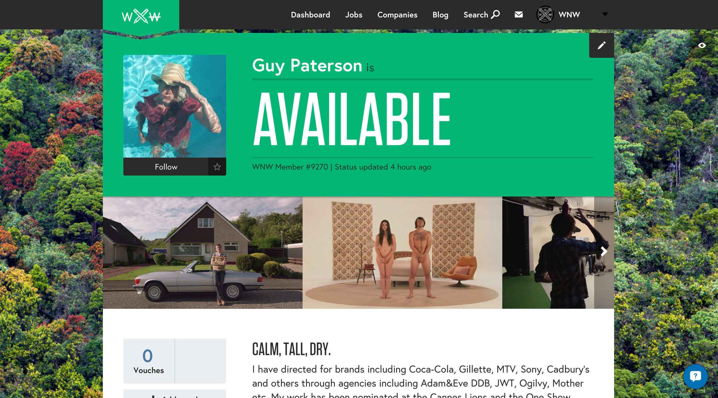
Guy Paterson, Director. London.
Sophie Gate, Animator. London.
Sebastian Lees, Full-Stack Developer. London.
Rick Abbott, Copywriter. New York.
Sinem Erkas, Illustrator. London.
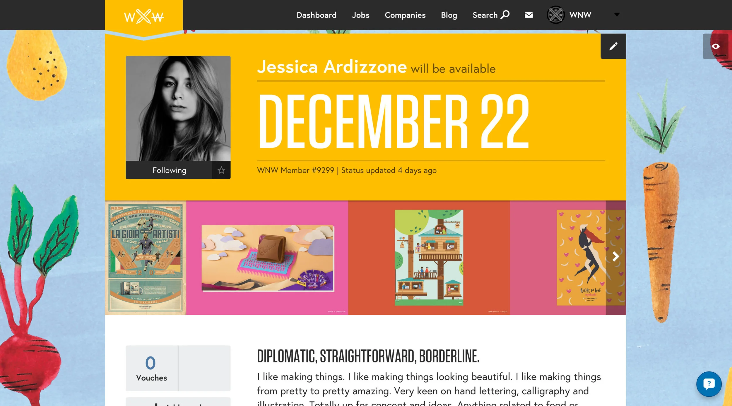
Jessica Ardizzone, Designer. London.
Katie Harrison, Copywriter. London.
Are you a WNW Member with new work, exhibits, products, or news to share? Email us!
PROFILES OF THE WEEK: DECEMBER 7TH
Woody Smith, Editor. Santa Monica.
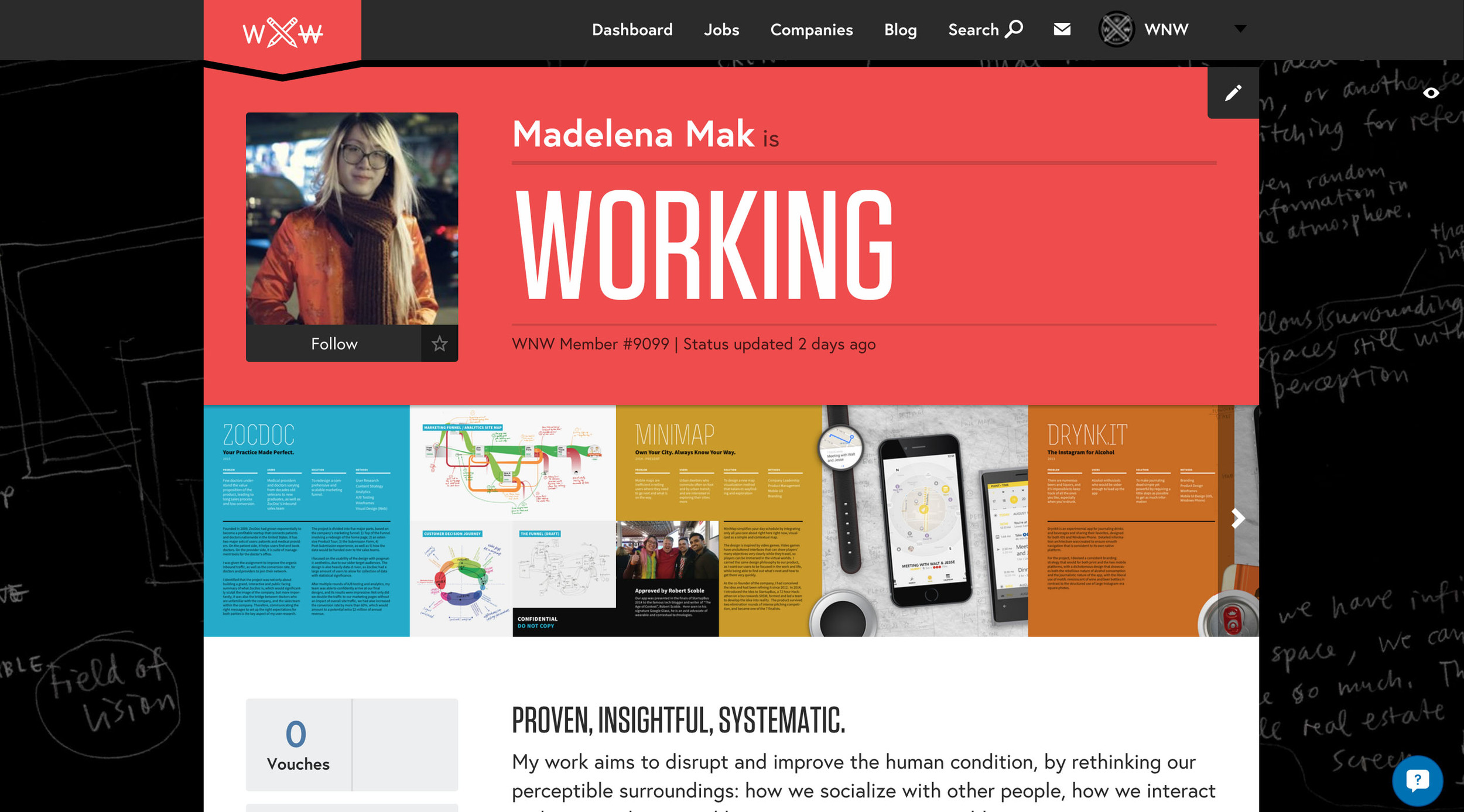
Madelena Mak, UX/IA Designer. Brooklyn.
Martin Gordopelota, Illustrator. Buenos Aires.
Philip Smith, Illustrator. London.
Brooke Bamford, Designer. Brooklyn.
Marie Noorbergen, Art Director. Venice.
Mike Farrell, Designer. Los Angeles.
Alyssa Phillips, Designer. Brooklyn.
Are you a WNW Member with new work, exhibits, products, or news to share? Email us!
ON MONEY: KATE PROULX
WNW Member #542 Kate Proulx is a full-time UX/IA Designer at Huge. She recently posted a refreshingly honest piece to her blog titled "On Money: How I got my shit together, paid off my credit cards, and finally started saving money." In the post, Kate opens up about her spending tendencies, and offers her take on personal budgeting programs. In her own words, "What's a self-sufficient and unsatisfied designer to do? Solve your own problems and make the thing you wish existed, duh. [I made] a plan for how to spend the money I have right now and am able to re-evaluate when I fuck up that plan."
We figured this was sound advice for all our members and wanted to learn more. So we spoke to Kate.
Hi! Who are you?
I'm Kate Proulx, a digital product designer in Brooklyn, NY. I recently returned to Huge and I've been working on a mix of pitches and client work since I've been back. Before that, I was working at Studio Rodrigo, a small digital studio in Flatiron—they finally put up a website and it looks great, check it out!
You + money = ?
Frenemies.
When it comes to money, what's the toughest thing for you?
Impulse and patience! For a long time, when I had money in the bank I felt like I had to figure out what to do with it, like I couldn't just let it sit there. It sounds crazy, I know! Sometimes I still get those feelings—a lucky moment where my bank account is flush with cash and I'm like 'Hell yeah! Time to buy that rad leather jacket!' I have to remind myself to not think that way. Relatedly, I can feel really bad when I look at my savings account and feel like "I am NEVER going to get to my 10k savings goal, what's the point?"—I have to remind myself that saving takes time. Patience has never been my strong suit.
What inspired/motivated you to write this?
One of my resolutions is to write one real thing a month this year. I'm hoping that 2015 will be the year of less fluff, less re-blogging, less hype-manning and more of being a real person with thoughts & opinions. I think almost anyone that knows me in the real world (and not just on the internet) can attest that I am very honest, blunt, and prone to over-share. If that's what I want to see more of this year, why not be the one to set it off? This post felt like a baby step towards that.
How did you feel about going so public with this topic?
A bit nervous, for sure. I could have easily written the post without sharing anything about myself or my finances—you know, be a lot more safe about it—it's really scary to be open and vulnerable online, everyone has an opinion and isn't afraid to tell other people that they're wrong or why they suck. But like I said, I really want to read more things where people seem like people, and less perfect. I'm nowhere near an authority on money, the beginning of the post should make that clear, I'm just sharing a bit about what I suck at and something I made that helped me suck less at those things.
What's been the response so far?
People have been saying that they want to dig into it and give it a shot. That feels cool!
What's the biggest takeaway you want us to have?
Everyone has their own relationship and weirdness with money, and if you're someone who struggles with stuff, know that you're not alone. And sometimes you can build fast solutions out of unglamorous tools!
Did you learn anything about yourself in writing this?
Writing this made me realize that I've actually come a long way—I used to feel so shameful and avoid even looking at my bank account. Now I enjoy staying on top of stuff and making good choices. The second paragraph actually made me pat myself on the back a little bit and realize even if I haven't reached my 10k savings goal (yet!), I still have a lot to be proud of.
Why do you think creatives are stereotyped as being bad at managing money and other admin type stuff?
I don't believe that—I know so many freelancers that have their shit locked up. I like to think that people do what they're good at and what interests them, for me, if I was good at numbers and finance I'd probably have been better at school growing up and would have gone to business school.
Best piece of advice about money you can give us:
Last year when I was hanging out with my brother—he's the opposite of me, he plays golf and is a business consultant—he said "Dude, you need to realize that when you buy things on your credit cards that you can't pay off right away it's as if you're like 'Yeah, let me pay 20% more for this thing'—it's expensive money." It's so obvious, but it made me think a lot differently about buying things I can't afford right away on credit.