The artists featured here put their mastery on full display, building staggering exterior and interior murals that brighten your office hours, city walks, and gallery nights. Some creatives opt for standing desks. But muralists take things a step further and use standing ladders and cranes to capture the scope of their creations.
Read MoreKeep the Apocalypse Confined to Your Idling Computer
Your Mac screensaver features pristine images of mountaintops, golden fields, ocean life, and polar bears. It's intended to show the world's beauty. But it could quickly become an obsolete and depressing reminder of how the world used to look.
Read MoreHow to Lose Your Mind Finding Your Next Freelance Job
My mind has always been a fair-weather fan, cheering me on when I'm producing wins at work. "You're so smart, Nick. A stable genius I tell you." But at my first mental fumble, he turns on me. It doesn't matter if I've given him two Super Bowl spots. Or that I'm a great dad. Or that I'm happily married. To the fair-weather fan in my head, I'm a failure.
Read MoreAndrew Jasperson's Short Roasts Silicon Valley's Self-Importance
It's cool to want to change the world for the better. It's amazing to actually do it. But it's super annoying to act like you're doing it and talk about you doing it while you do it. Silicon Valley and Madison Ave are some of the biggest exporters of this often hilarious self-importance.
Read MoreCoverage Coalition: Join Barton F. Graf to Spread the Health
The advertising budget for the Affordable Care Act (ACA/Obamacare) has been slashed by 90%, and the window for enrollment, which starts November 1st, is half the length. Creative agency Barton F. Graf wants the advertising industry to come together to make up this 90% difference and ensure people sign up for affordable health care. Below, we talk to WNW Member Zoe Kessler, a Senior Art Director at BFG, who will tell you everything you need to know to help make a positive impact with the Coverage Coalition. We love seeing our members using their creative skills and communicative powers to make a difference, and this initiative perfectly encapsulates that ingenuity and spirit. #SpreadTheHealth
Read MoreThis is a "How to Look Within & Get Over Your Own Bullshit" Book
There's an abundance of "How To" books by "experts." WNW Member Adam J. Kurtz doesn't see his new book, Things Are What You Make of Them, in that light, nor does he regard himself that way. But would you really want to read a book that purported to have it all figured out by someone who's tagged themselves with every complimentary title?
Read MoreMaria Louceiro Embraces Discomfort to Develop Her Creative Eye
WNW Member Maria Louceiro is finding ways to be creatively comfortable with the uncomfortable. For one thing, it's how she created her best work as a photographer. "I was working full-time as a designer, so I took the days off, but didn’t prepare beforehand and was totally lost in Gothenburg.
Read MoreLife & Work in Motion: Meet Art Director & Designer Joyce Ho
"Spending my formative years as an animator really helped me understand what is exactly needed to bring design to life through motion. This means when I’m art directing now, I can tailor my designs to fit a certain animation workflow or pitch something that is within the project budget because I know the ballpark on how long it might take to animate."
Read MoreProfiles of the Week: Stop-Motion Animators
Profiles of the Week:
Stop-Motion Animators
This week’s featured profiles highlight top-notch Stop-Motion Animators. Scroll down to get a light-hearted and food-heavy taste of the stop-motion talent currently available on Working Not Working.
Phyllis Ma. New York, NY.
Kirsten Lepore. Los Angeles, CA.
Taili Wu. New York, NY.
Lucinda Schreiber. New York, NY.
Discover more creative talent and projects like this on Working Not Working. To subscribe to weekly curated lists like "Stop-Motion Animators," sign up for a Pro plan here.
If you're a WNW Member with new work, exhibits, products, or news to share, email us.
Darren Oorloff Makes Album Art Melting in Nostalgic Futurism
Darren Oorloff Makes Album Art
Melting in Nostalgic Futurism
MIKE O'DONNELL / EDITOR
"Those flamingoes are out of control!" "Look at this! Are you fucking kidding me?!" "I can't stop looking! Is this Pink Floyd or from the future?" When WNW HQ first came across WNW Member and Designer Darren Oorloff's album covers, there was a fair amount of wonderment, disbelief, and profanity in the volley of our responses. So we decided to interview Darren to find out some of the secrets to his approach, his influences, and what's next. While we might describe the common thread through Darren's work as "super-awesomeness," Darren helps us find some more descriptive words: "I’ve carefully curated my art to create an illusion of consistency – largely through similar colours and type treatments – but look closer and you’ll notice the only real links between the content are a sense of nostalgic futurism."
Darren also opens up about the trend in music toward designs that challenge the boundaries of the music's genre, as well as the necessity of creative tension to open a greater dialogue. "I don’t think new trends catch on in a creative field unless there is a sense of tension, perhaps a conflict – people need to disagree in order to create a conversation that will propel the trends’ reach." Here's to Darren's portfolio and music design continuing to surprise and provoke.
Tell us a little bit about your creative background. Who is Darren Oorloff and how did he get here?
My name is Darren Oorloff and I’m an Art Director from Melbourne. More specifically I create identity, packaging and artwork for the music industry.
How would you describe your creative style? Do you recognize a signature style that links all of your projects, or do you try to excuse yourself and approach each project as its own entity?
Committing to one particular style has been difficult for me. I think it’s important to establish a distinct identity as an artist, but this has a tendency to limit one’s skillset. As soon as I’ve mastered a style or a technique, I’m no longer interested in it and need to move onto something more complex. I’ve carefully curated my art to create an illusion of consistency – largely through similar colours and type treatments – but look closer and you’ll notice the only real links between the content are a sense of nostalgic futurism.
What do you see as the turning point in your creative career and development so far?
The biggest turning point for me was when my approach to design changed from ‘how do I make this?’ to ‘how do I make this look good?’ Prior to this, the physical execution of a concept was my biggest challenge – stitching multiple images together to create realistic compositions. Nowadays I have a pretty versatile set of skills and access to excellent resources where I lack, so my focus has shifted to creating beautiful compositions without the restrictions of technical incapacity.
Can you give us a little insight into your process for designing album and concert artwork? Do you try to only allow the music itself to influence your visual response, or do you also draw inspiration from whatever you’re into at the moment?
Surprisingly the music isn’t my primary influence. I’ve found a lot of artists have a carefully crafted image that doesn’t necessarily align with their sound. In my initial steps, I identify how the artist wants to be perceived. Then, I find a middle ground between what inspires me and what is applicable to the artist’s image and branding.
Do you find that it’s easier to create album artwork if you’re a fan of the music, or does it not really make a difference in your approach?
I don’t believe it makes a great difference. I try to remain fairly objective and open-minded about every project. You would think the quality of work would be much better if I was a fan of the genre and had an understanding of the history. However, some of the most creative and influential art is born of contrasting design style with genre. There is a strange movement happening right now where rappers are using a ‘metal’ aesthetic, the metal-heads are taking influence from the ‘electronic’ aesthetic and all the genres are swapping styles.
Which of your projects are you proudest of and why?
The project that garnered the most attention was for a Japanese heavy metal band called Crossfaith. This is a perfect example of a strange genre crossover as mentioned above. Crossfaith has some electronic influence in their otherwise heavy sound, so we decided to go all out on a sci-fi, almost Vapourware aesthetic. The biggest challenge here was to introduce aggression into a typically vibrant, fun style (Vapourware) and I think there’s a very fine line in the sci-fi spectrum between being cool and being nerdy. Anyway, I think I managed to navigate all of this gracefully with this particular artwork and the response was just manic.
What would be your dream project?
I’d love to work on some kind of elaborate stage/set design with immersive projection mapping. I’m also totally fascinated by VR and augmented reality, so it’d be nice to get involved in something within that realm.
Who are some of your biggest creative influences?
Shusei Nagaoka
Doug Johnson
Hajime Sorayama
Roslaw Szaybo
Tadao Ando (Architect)
Jiro Ono (Chef)
What are your favorite album covers of all time and why?
My parents had a couple of Vangelis CDs and as a child they had the most intriguing covers, depicting strange sci-fi worlds.
I am completely bamboozled about how Doug Johnson created this series. His airbrushing skills and use of colour make me sweat.
In my opinion Neil Krug’s best work to-date. He captures so much momentum and drama in a still image.
Released this year, this is probably the most perfectly executed example of a crossover of metal design on a rap cover.
How would you describe the creative scene in Melbourne? Do you thrive off of being part of a creative community or are you more in your element as a lone wolf?
Melbourne has a very vibrant, ever-evolving creative scene. I particularly love this place because it’s young and still establishing its own identity as a creative city.
I surround myself with creatives every day for inspiration. However, up until now, I’ve designed solo, on account of having a very specific vision for developing my identity. Today, having established that style/aesthetic, I’d be open to collaboration with other artists where my technical abilities lack.
What do you do when Not Working?
I’ll try to get a skate in when there's time, and sun.
I also like to go for a run – I feel like I’m problem-solving 24/7 because I don’t – and can’t – apply a consistent method to each project. Running gives me an hour each day to focus on nothing, and to give me a break from that persistent problem-solving.
What’s some of the best creative advice you’ve ever heard or received that our members need to hear?
Ken Robinson said something that floored me in a talk about schools killing creativity: “If you're not prepared to be wrong, you'll never come up with anything original”
This isn’t something I’d ever considered. I feel like I’ve taken risks, but they’ve all been calculated risks. I don’t think new trends catch on in a creative field unless there is a sense of tension, perhaps a conflict – people need to disagree in order to create a conversation that will propel the trends’ reach.
Who are some WNW Members whose work you admire and why?
I’ve always been a fan of Anny Wang, her 3D game is on another level.
Discover more creative talent and projects like this on Working Not Working. If you're a WNW Member with new work, exhibits, products, or news to share, email us.
How to Organize a Brazilian Design Festival with Felipe Rocha
WNW Member Felipe Rocha is a Brazilian art director and graphic designer based in New York, recently serving as a Senior Designer at Sagmeister & Walsh. Currently, Felipe is putting the finishing touches on a Brazilian design festival called Bonde, which will take place on Saturday, July 22nd in New York. We talk to Felipe below about the logistics, challenges, and breakthroughs of organizing a design festival.
Read MoreThe Freelancer's Guide to Being a Genius at Saving
So you’re self-employed. Congratulations! Now you can go to the gym at 3:30 p.m., when no one’s there. Braise a pork shoulder on Tuesday afternoon and actually make it to your kid’s performance of “Third Graders Sing the Lady Gaga Songbook.” (You can also nap. Not that you'd ever do that.) As long as you can fight off the specter of loneliness by talking to the cat all day, there are many benefits to the gig economy.
Read MorePROFILES OF THE WEEK: NOVEMBER 21ST
PROFILES OF THE WEEK:
NOVEMBER 21ST
Monica Welsh, Art Director. New York.
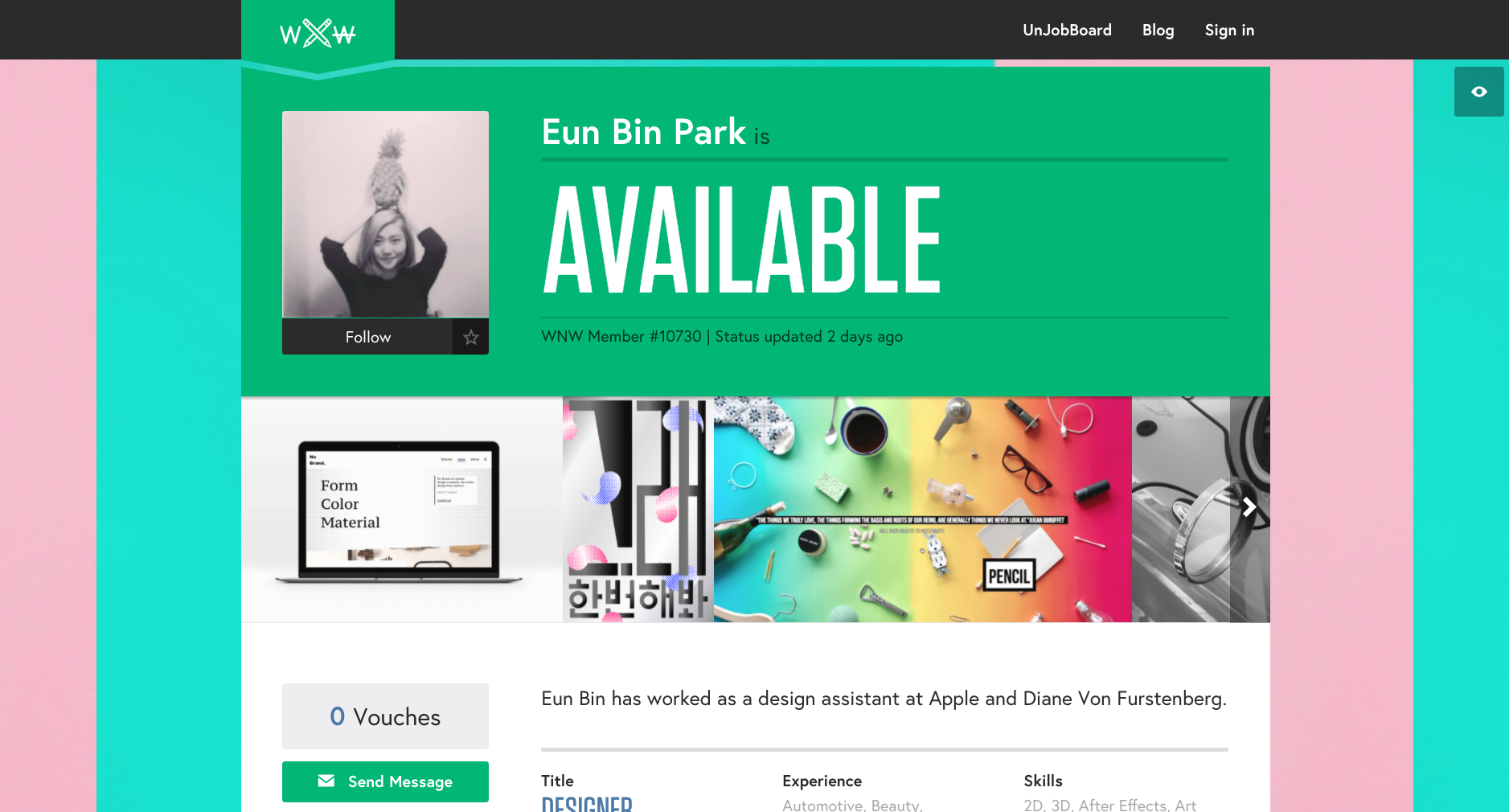
Eun Bin Park, Designer. Seoul.
Caitlin De Angelis, Producer. New York.
Michelle Hirschberg, Copywriter. Brooklyn.
Charles Haggas, Creative Technologist. Austin.
Miro Klasinc, Motion Designer. Los Angeles.
Corey Koberna, Art Director. San Francisco.
Are you a WNW Member with new work, exhibits, products, or news to share? Email us!
6 Ways Agencies Can Get the Most Out of Freelancers
I recently wrote up 7 Tips for the Advertising Freelancer. But how about the agencies that employ them?
Pulling in specialized talent when needed has long been a hallmark of agency life. But the trend seems to be on the rise with more and more project work (versus Agency-of-Record assignments) and a new breed of “lean by design” agencies.
Read MorePROFILES OF THE WEEK: OCTOBER 17TH
PROFILES OF THE WEEK:
OCTOBER 17TH
Kat Kaye, Photographer. Los Angeles.
Björn Jonas, Photographer. New York.
Deanna Halsall, Illustrator. Manchester.
Haik Avanian, Designer. Brooklyn.
Katherine Fernandez, Copywriter. San Francisco.
Matthias Hoegg, Animator. London.
James Wignall, Director. London.
James Cameron Ewing, Art Director. San Francisco.
Are you a WNW Member with new work, exhibits, products, or news to share? Email us!
PROFILES OF THE WEEK: AUGUST 22ND
PROFILES OF THE WEEK:
AUGUST 22ND
Ashley Mackenzie, Illustrator. Edmonton.
Sarah Herron, Art Director. Playa Vista.
Julie Wilkinson, Designer. New York.
Philip Haynes, Photographer. London.
Simi Mahtani, Art Director. New York.
Eric Chaves, Front-End Developer. Brooklyn.
Cheri Anderson, Producer. New York.
Terence Eduarte, Illustrator. Manila.
Are you a WNW Member with new work, exhibits, products, or news to share? Email us!
PROFILES OF THE WEEK: JULY 5TH
PROFILES OF THE WEEK: JULY 5TH
Franziska Barczyk, Illustrator. New York.
Omar Acosta, Director. New York.
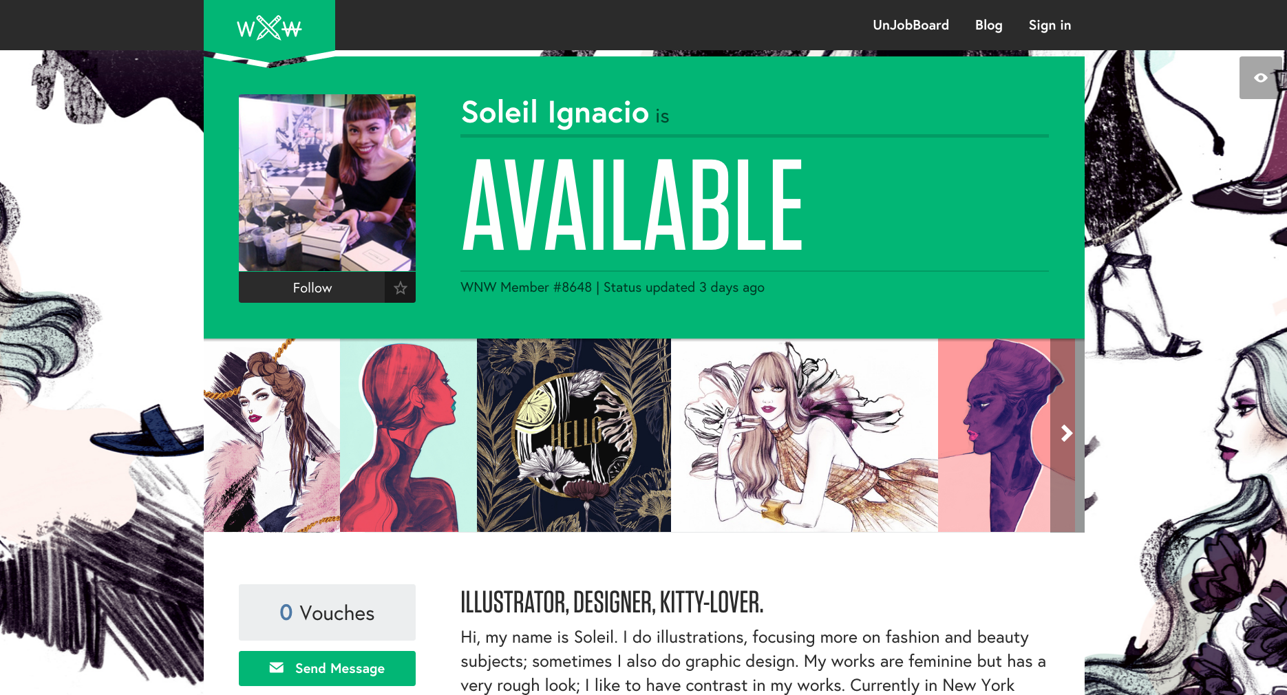
Soleil Ignacio, Illustrator. New York.
Tim Lampe, Designer. Atlanta.
Ellen Schofield, Illustrator. Minneapolis.
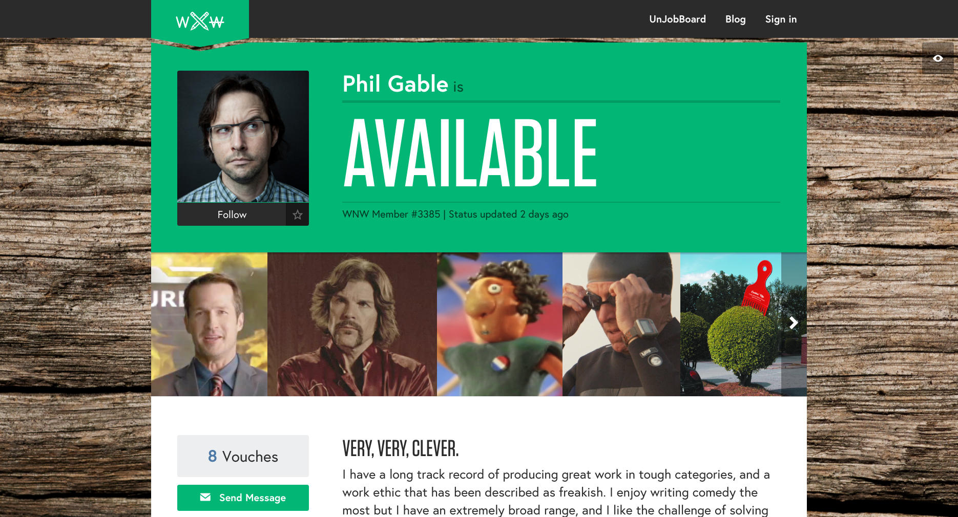
Phil Gable, Copywriter. New York.
Christine Taylor, Producer. Portland.
Joel Knoernschild, Director. Los Angeles.
Are you a WNW Member with new work, exhibits, products, or news to share? Email us!
WNW MEMBER ART DIRECTS NEW BECK MUSIC VIDEO
WNW MEMBER ART DIRECTS NEW BECK MUSIC VIDEO
In Beck's career of over twenty years, he's had some pretty oddball music videos, released primarily in the nineties. Like "The New Pollution", "Sexx Laws", and "Nicotine & Gravy."
He's just released a video for his new single "Wow", which harkens back to those days both musically and visually. Which is to say it might give you a contact high.
Art directed by WNW Member #5541 Bráulio Amado alongside director Jimmy Turrell, with animation by WNW Member #6274 Antonio Vincentini, "Wow" lets you revel in all of the non-sequiturs Beck is known for. Created in just eight days, no music video could do a finer job accompanying a song with the following lines: "Standing on your lawn doin’ jujitsu/Girl in the bikini with the Lamborghini Shi Tzu.”
Are you a WNW Member with new work, exhibits, products, or news to share? Email us!
The 4A's Transformation Conference: No Blazer Required
By Pamala Buzick, WNW Business Development
So what happens when WNW goes inside a 4As Conference? Other than some spectacular food and suits, the following is a rundown of our top takeaways:
Talent Turnover
Good talent + good ideas = real engagement. In 2016, just add these two elements: speed + agility. Guess what? Clients still need their agencies and agencies still need great talent. Both are looking to reboot the system. For example, clients are now asking agencies about their attrition rate (a fancy word for staff turnover.) They want to get a feel for what kind of agency they're going to plop their multi-million account at. So, in turn, agencies are still trying to figure out ways to keep you from going to tech company with the blue letter or the blue bird.
Money, Money, Money?
Sadly, the key slide of the presentation about working at agencies was the pay gap. Tech companies are on average offering a higher salary. Like a $45k difference.(Cough.) Agencies are not laying down on this note though. We'll continue to see titles like "Cultural Officer" or "Head Coach" still roaming the halls pouring you the latest office Kool-aid. Career guidance is the strongest reason for staying! Ryan Smith can map out your Qualtrics career from beginning to end with them. They have very little turnover, because at the end of the day all of us just want to know where we stand, where we are going, and how to get there. That's invaluable. And he's the data guy!
Get Out of Your Comfort Zone
YouTube's Tara Walpert Levy reminded us (again) that our audience isn't watching TV anymore. And if you don't know these top 10 famechangers, then you might want to do your homework. (Psst, 7 & 8 don't count.)
Susan Credle, CCO of FCB, reminded us to not be lazy. Stop going for the automatic response of the top 5 names you already know. Work with new people and new companies - a la Vice. She also reminded us that if you want to change diversity levels, then you have to make space for that person at the table. Literally. She made space on the panel for R/GA's passionate Chloe Gottlieb.
And lastly, Jeff Goodby always reminds us to be in a constant state of readiness by taking a different route to work everyday. He may have been remarking on our everyday creativity, but it certainly rings true for our careers and those who hire us.


