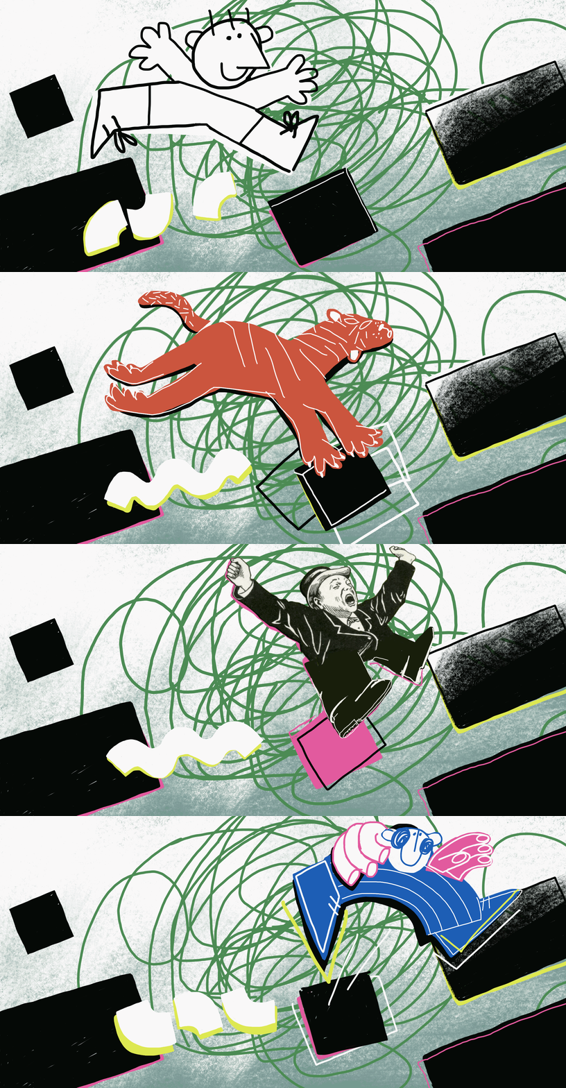
“While a beautiful thought, a room full of designers nullifies the shared skill. If everyone is a logo designer, who will make logos when the need arises? Everyone, and therefore no one. Keeping like-minded company is critical to being seen, but diversity will help us survive.”
Read More401 (Yay!) How to Save Your Creative Future
The days of company pensions are long gone and we’re staying alive longer than ever. There is no doubt that we need to save aggressively for our retirement so we can afford to live when we can no longer work.
Read MoreKeep the Apocalypse Confined to Your Idling Computer
Your Mac screensaver features pristine images of mountaintops, golden fields, ocean life, and polar bears. It's intended to show the world's beauty. But it could quickly become an obsolete and depressing reminder of how the world used to look.
Read MoreJosh Cohen's Design Chops Inform His Unique Exploration Into Video
One of the coolest parts of WNW Member Josh Cohen's portfolio is on display in the project credits. The man is wearing a lot of hats. Director, writer, editor, designer, art director, producer. "It’s a special feeling and privilege, being able to have a vision, and have the end product be just that or something really close to it."
Read MoreWhat It Takes to Work at Work & Co: Meet Co-Founder Joe Stewart
Work & Co's Founder and Design Partner Joe Stewart tells us how Work & Co was born from wanting to get his design hands dirty again, and the internal trust that exists with having agency leadership learning and building alongside you. Joe also offers great advice on what it takes to work there, as well as what he looks for in prospective hires and their creative portfolios.
Read More100 Days of Silence: How Doing Nothing Enriched My Life (and Creative Career)
"I’ve since sat more than 100 days on silent meditation retreats (including one stint for 30-straight days) and have witnessed firsthand how this practice has deepened my sense of compassion, enriched my creativity, aided my self-awareness, and even advanced my career."
Read MoreHow to Get a Job at Spotify
Spotify! I've been looking forward to this interview and I’m happy to finally share it with you. As some of you may already know, I worked at Spotify for almost three years. So I couldn’t resist reaching out to my friends and asking for their wisdom about landing a design job at Spotify.
Read MoreCreative Mark Moll Reminds the Industry that Ideas Know No Age
Creative Mark Moll Reminds the Industry that Ideas Know No Age
MIKE O'DONNELL / EDITOR
WNW Member Mark Moll has been in the advertising industry for over 20 years, which is long enough to notice a lot of its positive and negative trends. One particular subject perhaps became even more apparent with each year Mark got under his belt, and that's the deep-seeded role that ageism plays in the behind-the-scenes of advertising. Mark's latest project "Ideas Know No Age" aims to put the emphasis back on the ideas that drive the industry, not the chronological ages of their creators.
It's ideas that first lead the 51-year-old creative director into this industry and what continues to keep him invested in it. "What I like most about what we do is ideas that stop people and ask them to engage. Sure it has to connect emotionally, but now I think people just want to see interesting things in the world they can participate in. That’s what gets me going as a human being first and a creative second. Good ideas just make life more fun."
In our interview below, Mark tells us why sharing his own age was an important element of this project, whether he thinks lists of the "30 Under 30" and "Young Guns" can exist without being detrimental to the way older creatives are perceived, and what experienced creatives should do to become even more indispensable: "Whatever age you are, you should be curious about everything in the world we use to communicate. This is your livelihood so please stay in the know... Also, ideas aren’t about the tech, but they can help us amplify or distribute them. Everything still needs an idea first and that’s what anyone at any age should stress through their work."
Tell us a little bit about your creative background. Who is Mark Moll and how did he get here?
I’ve been in the business over 20 years. Have seen it evolve from the days of print, radio, and broadcast to one where everything in the world is fair game to use in our communications. Digital sure, but I honestly think experiential is the most exciting. What I like most about what we do is ideas that stop people and ask them to engage. Sure it has to connect emotionally, but now I think people just want to see interesting things in the world they can participate in. That’s what gets me going as a human being first and a creative second. Good ideas just make life more fun. That’s what’s cool about what we do and why I like doing it.
What lead you to create “Ideas Know No Age”, and what is its primary message?
Good question - The first is obvious - my age. I’m 51 and will be 52 in July. I have no problem saying how old I am. Maybe it’s because I look like I’m 44. Ha. Also maybe it’s because age is something no one talks about. I’m proud of it. I also can’t do anything about it. No one can.
The primary message is that age doesn’t matter one bit in the creation of ideas. They say advertising is a young person’s business and that they know about the latest tech and that makes them more in tune. Blah Blah Blah. Advertising is for the curious no matter what age you are. My idea was to use great accomplishments that are great on their own regardless of how old the person was when they did it. The age of the person just makes them stand out more.
Ideas Know No Age does a great job of addressing troubling industry trends with a campaign that focuses on great work. Was that a tough balance for you, to address this negativity with positivity?
Thanks for those kind words. Maybe I was just trying to state a fact. Not purposely using positivity, just showing how misguided focusing on age is. A friend of mine just told me that a designer at Apple is 81. That’s great. And the ideas I highlight show that age is a non-factor. And just to state this for no other reason than this thought just came to me - this is not an anti-young campaign. Everyone highlights those feats. "They founded a billion-dollar company at the age of 9", etc. This approach is just proving that older people don’t stop thinking just because they hit the age when someone might hand them an “Over the Hill” balloon for their birthday.
Can you share some of the other challenges and breakthroughs that came with this project?
Well I’ve been thinking about this for a while and it was gonna be an Old Guns type of ad competition that was only open to people 50 plus and they had to solve something just using a billboard, but I didn’t know how to pull that off. That evolved into something cleaner with just a simple message. Breakthroughs? Well a lot of people I didn’t know reached out and said thanks. One called it brave. That was kind, but I was just being honest, not brave. Ted Royer was nice enough to share it. Nice guy, meant a lot.
One person had an interesting comment - he said everyone will have to deal with ageism sooner or later. Which is very true. This isn’t just reserved for older creatives, everyone else will join in soon enough.
Do you think that with the “age of information,” there’s a perception that the value of an individual’s wisdom and experience has been diminished? Or is it more just financially motivated to hire the younger creative with a lower day rate?
I hadn’t put those two together, but you may be right. But everyone has their own experience and knowledge and that’s what people ultimately want on a project. Interesting individual perspectives make us who we are. The lower rate is an argument I’ve heard and even had a conversation about this with someone my age. My counter to that is where is it written down that just because we have experience do we automatically get paid more. That’s false thinking. We should be paid on what people think we are worth and what’s in the budget. And we should be open to negotiating that. I look at every opportunity first and the pay second. Not the other way around. Why older creatives or anyone older in this business think they are entitled to a certain salary might be part of this perception problem. Older creatives demand more compensation and that’s not right either. There has to be a balance.
At what age did you first start noticing ageism in the ad industry, either firsthand or toward others?
I haven’t really noticed anything directly. Seriously. It has just always been part of the ad industry in thought and lore. I have heard from a friend who is much older than me and still works a lot that there is an unspoken element to their conversations with recruiters. Actually, now that I think about it, I do get a little worried when recruiters ask for my birthday to book a flight to go visit an agency. So maybe it’s there and I didn’t realize it. Ageism is a society thing and as more and more people enter the second stage of life and stay active, it will remain a topic.
Do you see a lot of ageism in ads themselves? Or do you feel that it is more of a behind-the-scenes problem?
I think it’s more of a behind-the-scenes problem. Maybe more of a focus on the shiny penny around young creatives and the hot new campaign they just completed. But that’s BS too because anyone feels the heat when they do something cool that people like. It’s been interesting to see the reaction to “Ideas Know No Age.” Someone actually asked me if I was gonna say my age when I did it. That was the whole point. The other thing I should mention is a lot of older people have risen the ranks and have their names on the door or the big title. So maybe there’s a perception that if you’re not that then you must not be good or haven’t done great work. Both of which are completely false. Everyone finds their place in this business.
What advice can you offer to older creatives who are constantly battling this lazy notion that if you’re older, your ideas won’t be as fresh?
Prove them wrong. Stop listening. And prove them wrong again. Whatever age you are, you should be curious about everything in the world we use to communicate. This is your livelihood so please stay in the know. And learn how to be fast on the computer and be able to share ideas within hours. Things zip along and everyone has to keep up. Also, ideas aren’t about the tech, but they can help us amplify or distribute them. Everything still needs an idea first and that’s what anyone at any age should stress through their work.
Ageism takes up a much smaller space in public discourse compared to other -isms. Why do you think that is? And what’s been the response to this project thus far?
No reason really, maybe it’s just that we needed to tackle the other ones first. They should all have equal weight or their day in the sun, but that’s more about what happens in the universe as things come into focus. Both online and in life events. It’s important, but maybe it’s more up to the individual to be strong and make their own case. I mean, AARP is an advocate for older folks, maybe they will tackle ageism on a big scale one day. The response has been unexpectedly awesome. I had hoped it would strike a chord, but it went much deeper than that. Maybe it was because I put myself out there and called out my own age. Being from a person and not an organization could have made it more relatable. Just spitballing here.
Do you think there’s a way for honors like the “30 Under 30” and “Young Guns” to exist without being detrimental to the way older creatives are perceived?
I wish there was, but their very nature makes that hard. But it’s not just in our industry. Pro athletes experience ageism. Of course Hollywood deals with it. And so on. To me, the only way to even it out is to have places that celebrate it. 50 over 50 lists. Old Guns. Etc.
What do you do when Not Working?
Hang out with my family. Watch Red Sox games. Run. Play with my cats. Watch the latest show and try to catch up on one I missed. Golf. Watch Red Sox games.
Who are some other “Old Guns” on WNW whose work you admire and why?
I don’t know anyone’s age so I don’t know if they are old guns, but I know a lot of creatives and admire anyone who can keep a career in this insane business going.
Anything else you’d like to add?
I appreciate the opportunity to shed a little light on the subject of ageism. Hopefully, this campaign will open some eyes and help older creatives be perceived differently. To be honest, if it helped one person not be ashamed of how old they are then it was successful.
Are you a WNW Member with new work, exhibits, products, or news to share? Email us!
Watching Not Watching: Twin Peaks with Artist Summer Ortiz
Watching Not Watching is a recurring Free Range series where we invite a WNW Member to nerd out with us over a particular TV show that fuels their creativity. It's essentially a way for us to experience a taste of the water-cooler conversations that the freelancing portion of our community might be missing out on.
Read MoreLUIS MENDO ILLUSTRATES A TOKYO RARELY SEEN BY VISITORS
LUIS MENDO ILLUSTRATES A TOKYO RARELY SEEN BY VISITORS
In our interview below, Illustrator and WNW Member Luis Mendo discusses his move from Amsterdam to Tokyo, the difference between the two creative scenes, and how he developed a fascination with his latest subject: Tokyo interiors. "In Tokyo, people use their houses merely as a place to sleep. Most of us eat and meet friends outside, in cafes or restaurants. The apartments are tiny and don’t allow much of inviting others in. That’s why the interiors are often very personal, full of things, and reflect very well the true personalities of the people living in them."
Tell us a little bit about your creative background. Who is Luis and how did he get here?
I was born in a small city in Spain and after studying graphic design in Madrid and Holland, I worked in Barcelona for a while designing magazines and newspapers. Then moved to Amsterdam where I became known as an editorial designer and art director, relaunching titles and creating new ones on a lead role. After 18 years of that, it became all too much and I needed a big change so I moved to Tokyo where I decided to draw for a living.
How would you describe your creative style? Do you recognize a signature style that links all of your projects, or do you try to excuse yourself and approach each project as its own entity?
My Spanish background and visual references (from Picasso to Goya) are probably visible in what I do, I try to keep my line loose and fresh, that’s why I rarely do pencils before making a drawing and start inking straightaway. People say they recognize a style although I do different things, some tight and some really loose. As a former art director I know each client needs a different approach to convey the message so I adapt easily. Also I like to keep changing styles so I don’t end up boring myself.
You recently created a series of 7 animations of Tokyo interiors for Electric Objects. What were you hoping to capture with this project?
Years before moving to Tokyo, I found the Kyoichi Tsuzuki book "Tokyo: A Certain Style” which showed the insides of small Tokyo apartments, tiny spaces packed with stuff from floor to ceiling. I found those photos mesmerizing and loved to look at them. Now that I’ve lived here for a while, I made these drawings being a mix of my own apartment, the one I would like to live in and those of friends, including some city constants like the red lights on tall buildings, the crows, and the carefully “hairdressed” trees.
Can you share some of the creative challenges and breakthroughs that came with the undertaking?
Since I was working from mental references directly in my sketchbook, it was a pretty straightforward process. I enjoyed making all the mistakes which I partly left in there. Only used photoshop to color them. The most difficult part was the animation (which is not my strong suit) but luckily my friend Fons Schiedon helped with that and made beautiful animations out of my drawings.
Do you see the interior world of Tokyo as an escape from the city’s bustle, or just a natural display of a Japanese way of living?
In Tokyo, people use their houses merely as a place to sleep. Most of us eat and meet friends outside, in cafes or restaurants. The apartments are tiny and don’t allow much of inviting others in. That’s why the interiors are often very personal, full of things, and reflect very well the true personalities of the people living in them. That’s what interests me so much and I always try to visit people’s homes to see who they really are.
What’s the creative scene like in Tokyo? How does it differ from that of Amsterdam?
I think it’s very different to other cities I know mainly because of how well people treat each other. There’s no conflict, envy or rivalry. We are all pretty good friends of each other and the disciplines are very mixed, so I will go to UI/UX meet-ups and you see architects at illustrators' parties. We all get along really well and everybody is nice and friendly. Something very different with my experience in Amsterdam.
In what ways has living in Tokyo surprised you?
There’s always something to discover. So many neighborhoods all full of different things. You can walk endlessly and there’s always something interesting around each corner. I always avoid the big streets as the charm is really in the back alleys.
Who and what are your biggest creative influences?
So many… Comic book artists like Loustal, Joann Sfar and Christophe Blain, modern illustrators like Quentin Blake, Javier Olivares and Lauren Tamaki, but also timeless heroes like Robert Weaver, Miroslav Sasek and Ronald Searle. Picasso and Luis Buñuel have always been a constant in my world of references and as of late I have discovered people so different in approaches like Chris Sasaki, Damien Cuypers and Georges Beuville.
What advice can you offer to creatives for drawing inspiration from their immediate surroundings?
Don’t look so much to other people’s work and concentrate on yourself more, draw all the time, carry a sketchbook with you at all times and annotate what you see. A face, a building, a detail… As Paul Smith said, “there’s inspiration in everything, and if you don’t see it, look again”.
What’s next for you? What are you working on now?
Now working on a T-shirt line for a sustainable fashion brand, doing monthly covers for Wako department store in Ginza, weekly travel sections for Volkskrant Magazine in Amsterdam, some animation backgrounds for a huge Japanese train company, and planning a show in Shanghai. It’s all very mixed in theme and kind of work, but that’s how I like things to be.
What do you do when Not Working?
I am always working. In the sense that I do not really see the difference between drawing someone in the train or a small spot illustration for a magazine. I do enjoy both and they fill my head all the time. Even when I am eating or walking I will think about how to draw things.
Who are some WNW Members whose work you admire?
Jessica Hische and Amélie Tourangeau.
Anything else you’d like to add?
I consider myself a total amateur, having been drawing professionally for just the last 4 years. I think I know nothing and learn a lot every day. My extra asset is that after 20 years as an art director, I easily think as such and help art directors to make the best of a job. I also understand what moves them and their needs.
Are you a WNW Member with new work, exhibits, products, or news to share? Email us!
THE HOW TO MOVE TO NYC E-BOOK FROM TOBIAS VAN SCHNEIDER
THE "HOW TO MOVE TO NYC" E-BOOK FROM TOBIAS VAN SCHNEIDER
WNW Member Tobias van Schneider is a German award-winning Designer currently living in New York City. We highly recommend spending some time to learn from Tobias's work for the likes of Red Bull, BMW, Google, and Sony. He's also made his mark as the former Lead Product Designer and Art Director at Spotify, and the founder of Semplice, a fully responsive portfolio system based on WordPress and built for designers. Also, just take a look at that legendary beard, which clearly suggests great wisdom.
And now, you can not only learn from his creations but also from his journeys. If you're a creative looking to make the move to NYC, make sure to check out Tobias's "How To Move To NYC" e-book.
As Tobias explains, "I moved to New York seven years ago. The process was painful and difficult. I learned most things the hard way: finding a job, getting a visa, calculating my cost of living, choosing an apartment. That's why I wrote this e-book, to tell you how I did it. No bullshit, no stress." Buy your copy here.
"You can find some information on the internet but it's either scattered, outdated, or written in complicated and confusing language. This e-book puts it all in one place in simple, no-nonsense terms. All lessons are based on personal experience or collected from NYC friends and legal experts. Each chapter is designed to be one step in your journey. You'll receive a 110-page PDF you can print or read on your computer, your iPad, smartphone or Kindle. Easy."
Are you a WNW Member with new work, exhibits, products, or news to share? Email us!
PROFILES OF THE WEEK: NOVEMBER 21ST
PROFILES OF THE WEEK:
NOVEMBER 21ST
Monica Welsh, Art Director. New York.
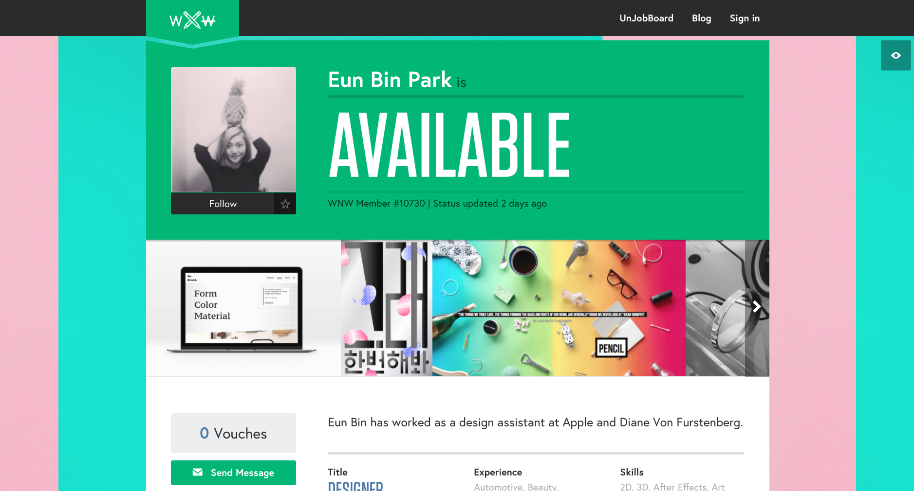
Eun Bin Park, Designer. Seoul.
Caitlin De Angelis, Producer. New York.
Michelle Hirschberg, Copywriter. Brooklyn.
Charles Haggas, Creative Technologist. Austin.
Miro Klasinc, Motion Designer. Los Angeles.
Corey Koberna, Art Director. San Francisco.
Are you a WNW Member with new work, exhibits, products, or news to share? Email us!
THE ALL-SEEING TRUMP'S CREATORS WILL SHOW YOU AMERICA'S FUTURE
The All-Seeing Trump's Creators Will Show You America's Future
MIKE O'DONNELL / EDITOR
Plenty of WNW Members have found really creative ways to get involved in tomorrow's election, putting in the hours on their own time with money out of their own pockets. No project better sums up this socially and politically charged artistry and workmanship than The All-Seeing Trump. With a nostalgic nod to the 1988 film Big, in which a wish-making machine named Zoltar morphs a kid into Tom Hanks, the All-Seeing Trump machine comedically looks into the future and offers 30 terrifying misfortunes scheduled for when he's elected into the White House. The concept is inarguably genius, matched only by its execution.
Below we talk to WNW Members Jon Barco, Andy Dao, Bryan Denman and Nathaniel Lawlor, who together created the All-Seeing Trump. They tell us how the idea was born and why the attention to detail was essential for the intended effect: "From the tiny hands (with one making Trump’s signature 'OK' sign), to the evil glowing eyes, to the 'receive your misfortune' plaque around the ticket outlet, every tiny detail was critical...They’re what separates good execution from great execution, in any medium." The creators also go into the process of balancing humor and discomfort, and how the latter can be an especially effective tool. "It was a lot of trial and error to find the sweet spot where we can entertain and make people laugh, but also stick them with a really dark insight that makes them a little uncomfortable."
You can expect to see the All-Seeing Trump tomorrow outside of Trump Towers, and possibly appearing on NowThis’s Election Day Livestream. After that, the machine will travel to the Joshua Liner Gallery for the final week of their Trump-themed show, which concludes on November 12.
Oh yeah, GO VOTE!
When did you first realize the equally comedic and terrifying potential of a Donald Trump and Zoltar union?
Independently, we had started thinking of what we could do to speak out against Trump, how to put our specific skills to use, and we had a few different creative ideas. But this one rose to the top, because it seemed the most conceptual and potentially viral, because of the nostalgic connection to the film Big. And honestly, there were some misgivings in the early stages of concepting. Was the idea clever enough? Did it make its point clearly? But that's common with creative ideas; you have to work them a bit, and spend quality time pressure testing them.
Can you give us a little insight into the process from there? Who built this highly-detailed machine? What were some of the specifics that you were adamant about seeing?
The machine was fabricated by Characters Unlimited, the company that makes Zoltar and other fortune-teller machines you see at places like Coney Island and Fisherman’s Wharf. We initially spoke to some other production companies, but for authenticity, which was highly important to us, we decided it would be best to start with the people who already make these. Why fake it when you can have the real deal? We see this a lot in our industry, like when directors will use a Red camera and then affect the footage in post to make it look like a VHS camcorder from the 80s. And it never does! We're much more of a fan of just using an actual camcorder from the 80s. So we used Characters Unlimited, and we may have been the most particular customers they’ve ever had. From the tiny hands (with one making Trump’s signature “OK” sign), to the evil glowing eyes, to the “receive your misfortune” plaque around the ticket outlet, every tiny detail was critical. We hired our own sculptor to sculpt the head, and lots of other specialists and friends for all the other details: the custom human hair wig, the SFX paintjob on the face, the handmade curtains and tiny MAGA hat, the hand-painted lettering on the cabinet. We could go on and on about the details. Details are so important, they’re what separates good execution from great execution, in any medium.
How many pre-recorded answers are housed inside of the All-Seeing Trump? Was it fun coming up with them? Any surprises or challenges?
There are 30 “misfortunes” in total and the set-list can be customized depending on the location we’re in. For example in front of Planned Parenthood we played a lot of misfortunes having to do with women’s issues and Supreme Court nominations and “disgusting dogs.” Writing them took quite a while, with many drafts and rounds of revisions, just like writing anything else. We watched WAY too much Trump footage in order to learn his cadence, his rambling manner of speaking, and his (very limited) vocabulary. It was a lot of trial and error to find the sweet spot where we can entertain and make people laugh, but also stick them with a really dark insight that makes them a little uncomfortable. Everyone laughs when Trump says, “I build the best deportation trains, I really do.” But then they wince when he follows it up with, “My trains are so much better than the ones the Germans used.” Making people uncomfortable was always part of the goal. It’s a really powerful tool that we can almost never use in the commercial world.
Obviously this was a great idea with equally impressive execution. But did you expect the amount of media coverage that the All-Seeing Trump ultimately received?
We spent so much time and put so much love into the idea, our ultimate fear was that we’d put it out into the world, and then… nothing. It would just fizzle out. But in reality we expected at least something would happen. And we got lucky. A journalist was walking to get coffee past our very first location, and she immediately wrote up the story for Gothamist. From there, it escalated, and by the next morning, we were getting press requests from tons of outlets, big and small. So the makeshift PR plan we had in place actually got usurped organically, which was great. We didn’t have to do much PR work in the end.
Any surprising reactions? Any angry reactions? Did you worry that someone might try to assault the machine?
We definitely worried about angry people trying to assault the machine, especially when we took it to a Trump rally in Portsmouth, New Hampshire. We actually hired two bodyguards to stand next to the machine, dressed as Secret Service. But ultimately even the Trump fans got a kick out of it. Most of our time has been spent in friendly territory, and if we learned one thing, it’s that Manhattan really hates Trump. What a bizarro world when rural America gets behind a rich city slicker, and the city he’s from can’t stand him.
What are the most important messages that you want to send with this project?
The All-Seeing Trump pretty much speaks for itself—a future with a President Trump is a bleak future. Initially, the little fortune tickets that pop out were going to act like an end card on a TV spot, reading “There’s No Future In Trump. Vote, Volunteer, Spread the word.” But then we realized that was our advertising training getting in the way. We asked ourselves, what would Banksy do? And the answer was obvious: Keep the experience dark all the way through. Don’t talk down to your audience. People will draw their own conclusions. That’s how we landed on putting “misfortunes” on the tickets, too. From that point on, the whole idea really gelled.
Have you ever dabbled in guerrilla art or politically-charged work before?
Yes, members of our group created Occupy George to highlight wealth distribution inequality, Good Day Blimp, which raised money for Ice Cube’s charity, and a few other projects as well.
Will the All-Seeing Trump be making any appearances on Election Day?
Yes, we’ll be out, probably at Trump Towers, and possibly appearing on NowThis’s Election Day Livestream. After that it’ll go to the Joshua Liner Gallery for the final week of their Trump-themed show, which ends on November 12.
What’s next for you all?
All four of us are back freelancing, with no immediate plans for the next idea. This project was a ton of work, but it was really fun and it definitely made us want to work more on our own projects, so we’ll see what happens. Let’s just get through this god-awful election first.
Anything else you’d like to add?
We’re lucky to work in an industry with so many smart, talented people all around us. We called in many favors and so many people stepped up to help us. Heard City, Cosmo Street Editing, and Future Perfect Music each volunteered their resources, rallying behind the idea and the cause. And so many others, from producers to business affairs to PR. The project really made us think, if we spent half the effort we spend selling soda and cellphones and cars on our own creative endeavors, we could make a lot of really cool stuff.
Are you a WNW Member with new work, exhibits, products, or news to share? Email us!
PROFILES OF THE WEEK: AUGUST 22ND
PROFILES OF THE WEEK:
AUGUST 22ND
Ashley Mackenzie, Illustrator. Edmonton.
Sarah Herron, Art Director. Playa Vista.
Julie Wilkinson, Designer. New York.
Philip Haynes, Photographer. London.
Simi Mahtani, Art Director. New York.
Eric Chaves, Front-End Developer. Brooklyn.
Cheri Anderson, Producer. New York.
Terence Eduarte, Illustrator. Manila.
Are you a WNW Member with new work, exhibits, products, or news to share? Email us!
The Little Assignment That Could
While in conversation with an art director, I listened to her detail the incessant drudgery of a recent workday. In the morning, she had to attack two 90-second TV commercial briefs. After that, she kicked off a global branding campaign for the agency’s most prized account. She also had to start designing new logos for one of the biggest companies in the world. On top of all this, there’s an upcoming film shoot in Fiji that she hasn’t even packed for yet.
Read MoreTUESDAY BASSEN CALLS OUT ZARA FOR ALLEGEDLY BEING TOTAL ASSHOLES
TUESDAY BASSEN CALLS OUT
ZARA FOR ALLEGEDLY BEING
TOTAL ASSHOLES
WNW Member #324 Tuesday Bassen is an award-winning illustrator and designer with a wide range of high-profile clients including The New Yorker, The New York Times, Target, Playboy, and the list goes on. But there's one name that's surprisingly missing from the list: Zara. And while Zara has never hired (or paid) Tuesday for her work, plenty of her work is seemingly for sale on Zara's site. Tuesday's friends and fans quickly took note and informed her of the similarities. Below you can see Zara's response to Tuesday's inquiry, which she shared on her Instagram.
Tuesday's cause has been covered by GOOD, Guardian, Nylon, Vogue, Fashion Law, Cosmopolitan, and many more. And she's not the only artist whose work has been lifted by Zara. Adam J. Kurtz and Gabriella Sanchez are just two WNW members whose work has striking similarities to their products. "Some of you are asking how you can help," Tuesday writes. "Repost and tag them, on Twitter, on Insta, on Facebook. I don't want to have to burden any of you with the financial strain that comes with lawsuits."
Adam J. Kurtz, a WNW Member and Bassen’s friend, put together an image comparing the work of 12 independent artists with near-identical products on Zara’s website. Adam also listed the products in a subsection of his site called “Shop the Stolen Art.”
It's tough to go into battle alone. Kudos to Tuesday for standing up for her work and, in doing so, standing up for other independent artists. It's clear Tuesday isn't alone, which may at first seem disheartening but it is also encouraging. A shout-out to all the artists who have helped get the message out there. It only underscores the importance of creative communities. Without everyone's support of Tuesday, both before the controversy and since, and without artists sharing their own similar experiences, who knows if Tuesday's voice would have been heard.
Are you a WNW Member with new work, exhibits, products, or news to share? Email us!
SHE-MOJI, A MUCH NEEDED GIRL GANG AT YOUR FINGERTIPS
It's impossible for a person to reach their potential if they're not given the tools and language to express themselves. Three WNW Members took notice that emoji, while a fun, easy and increasingly popular tool for communication, offer a shortcut to a whole collection of troubling stereotypes. They've taken charge, creating She–Moji. It's an emoji keyboard, for women. We spoke to Melbourne-born and New York-based WNW Members Nirmala Shome, Noemie Le Coz and Karina de Alwis, who share the origin story of She-Moji and tell us why a miniature girl gang is long overdue:
"The standard emoji keyboard reduces female identities to brides, princesses and dancers, with female activities centered around getting nails or hair done. As professional women in the field of digital and design, we decided to put our skills to work and change all of this – as a small, yet globally-accessible move towards a better representation of women all over the world. Red-headed yogis. Blondes with sass. A black belt karate master with an afro. A latina astronaut. An Indian chef. Even an African-American goth."
The She–Moji keyboard for iPhone launched July 8 worldwide – available on the App Store. It includes 400+ original emoji, including women representing all shapes and colors, professions, activities, outfits and nationalities, plus a slew of powerful call outs like Slay All Day, Kween and Om. As if that isn't enough, they're also donating 50% of app profits from the App Store to the Malala Fund, which strives to ensure every girl has access to 12 years of free, safe, quality primary and secondary education.
P.S. They're calling all emoji users to help them build the She–Moji girl gang and tell them what you want to see in the next release. Use #MAKEMYSHEMOJI, or reach out via Twitter: @shemojiapp, Instagram: @she.moji, or Email: hello@she-moji.com
How was the idea for She-Moji born?
During a casual night in, we started talking about the need for a better range of female emoji, and decided that maybe instead of talking about it, we could actually make it! We’ve been working in digital and design for so long, we were excited to do something together and put our skills towards something we really cared about.
Why is it important that something as seemingly innocuous as an emoji keyboard be carefully considered and as inclusive as possible?
Emoji have grown into their own lexicon and we see them more and more in everyday communications. Even though they seem frivolous, emoji play a huge role in the way we communicate, and affect how we subliminally think about women. We understand that the native emoji keyboard can’t include everything, for everyone, but we’ve all become far too comfortable working around the skewed offering, and retrofitting our messages to work with the limited set.
We hope She-Moji helps reiterates the need for better female emoji in the official Unicode set.
What were some of the challenges in making sure no woman was left behind? How did you ensure that She-Moji reached its potential in this regard?
While we tried to make sure we covered many bases we just couldn’t get them all in – we had a list as tall as us and just had to focus on our MVP so we could get this to market. We spoke to friends and relatives and settled on the current set – but this is just the beginning.
We also knew that for this to succeed it needed to work well and look hot(!) so we enlisted the help of our super talented friends Devin Ross (iOS developer) and Blair Burke (3D animator).
Which She-Mojis are your favorites?
Bad ass skateboarder
Zen meditation
Baller astronaut
Black Belt Jiu Jitsu Master
BFFs in bathing suits
What’s your hope for She-Moji’s impact? What’s next?
Our initial intention with this first release was to spark a conversation around the lack of female representation in the native set of emoji – a conversation that people (including us!) have been too comfortable to ignore. Plus, we would love to be able to reach out to the Malala Fund with a sizable donation to help move their programs forward.
Beyond this first release, our plans are simple – to continue to expand our She-Moji girl gang! There are so many we thought of but didn’t get to include for launch, which we want to add in the next round. Also in the inclusive She-Moji spirit, we want people to send in their She-Moji requests with the hashtag #makemyshemoji – effectively empowering our audience to decide what’s included in the next generation.
As well as expanding the She-Moji options themselves, we hope to roll out to Android too, if we are able to grow our user base enough.
You’re donating 50% of app store profits. What makes The Malala Fund a fitting partner for She-Moji?
We knew we wanted to donate 50% of our profits to a women’s charity from day one. There are so many emoji apps out there now, we didn’t want to just add to the clutter without trying to make a real impact.
Malala herself is synonymous with inclusivity, and advocating for women everywhere. We all followed her story and her work long before we started this project, so she immediately came to mind.
The Malala Fund works to provide 12 years of safe, quality education for all girls. So we really felt this organization aligned with the philosophy and inclusive nature that She–Moji itself was built on.
What do each of you do when Not Working?
Nirmala
When I’m not working, I’m busy working on my side projects with my super talented mates. I also love being active and am a self confessed health freak who is addicted to yoga.
Noemie
I’m a nerdy designer at heart and probably never not designing up something ridiculous in my head. I also love laughing more than anything – I try to sneak in time for re-runs of Seinfeld and Absolutely Fabulous whenever I have couch time (which is less than I’d like these days!)
Karina
Every time I'm asked this question, I make a mental note to get a hobby! When I'm not working, I love a good girls’ night out, or even just having friends around for dinner.
Anything else you’d like to add?
Just this: