Simon discusses dream projects, what scares him most about a creative career, why it’s good to stay inside your comfort zone (as long as you’re expanding what fits inside it), and why at this point he might be addicted to the feedback loop.
Read MoreWieden+Kennedy Amsterdam Teams with Non-Profit to Empower Young Refugees Through Sports
Wieden+Kennedy Amsterdam launched a visually striking campaign to announce the arrival of Klabu, a non-profit that is building sports clubs in refugee camps and settlements. Klabu’s mission is to empower young refugees by providing facilities, equipment, and clothing. 100% of proceeds go towards the foundation, with the ultimate goal of recreating this simple and sustainable concept in other refugee settings around the globe.
Read MoreFITC Amsterdam Pub Night: Recap
To celebrate our partnership with groundbreaking design & tech conference FITC Amsterdam, we threw a closing party for WNW friends and attendees in one of the oldest pubs in Amsterdam, Schreierstoren.
Read MoreNeed an Inspirational Escape & Creative Recharge? Meet FITC Amsterdam 2018
FITC is returning to Amsterdam to host the groundbreaking design and tech event on the future of innovation, design, and all the cool shit in between. We talk to Founding Director Shawn Pucknell to learn what lead him to launch FITC, how the FITC team selects speakers, and more.
Read MoreThis Designer Approaches Design With The Seriousness It Deserves
"Look at my work if you want to know about my creativity; great design is great because it speaks its truth to you through visuals." This is what it sounds like when a designer takes the artform and practice of design with the seriousness it deserves. In our interview below, WNW Member Alex Engzell takes us on a tour of his unwavering path toward a career in design, one he dropped out of high school to pursue.
Read MoreLUIS MENDO ILLUSTRATES A TOKYO RARELY SEEN BY VISITORS
LUIS MENDO ILLUSTRATES A TOKYO RARELY SEEN BY VISITORS
In our interview below, Illustrator and WNW Member Luis Mendo discusses his move from Amsterdam to Tokyo, the difference between the two creative scenes, and how he developed a fascination with his latest subject: Tokyo interiors. "In Tokyo, people use their houses merely as a place to sleep. Most of us eat and meet friends outside, in cafes or restaurants. The apartments are tiny and don’t allow much of inviting others in. That’s why the interiors are often very personal, full of things, and reflect very well the true personalities of the people living in them."
Tell us a little bit about your creative background. Who is Luis and how did he get here?
I was born in a small city in Spain and after studying graphic design in Madrid and Holland, I worked in Barcelona for a while designing magazines and newspapers. Then moved to Amsterdam where I became known as an editorial designer and art director, relaunching titles and creating new ones on a lead role. After 18 years of that, it became all too much and I needed a big change so I moved to Tokyo where I decided to draw for a living.
How would you describe your creative style? Do you recognize a signature style that links all of your projects, or do you try to excuse yourself and approach each project as its own entity?
My Spanish background and visual references (from Picasso to Goya) are probably visible in what I do, I try to keep my line loose and fresh, that’s why I rarely do pencils before making a drawing and start inking straightaway. People say they recognize a style although I do different things, some tight and some really loose. As a former art director I know each client needs a different approach to convey the message so I adapt easily. Also I like to keep changing styles so I don’t end up boring myself.
You recently created a series of 7 animations of Tokyo interiors for Electric Objects. What were you hoping to capture with this project?
Years before moving to Tokyo, I found the Kyoichi Tsuzuki book "Tokyo: A Certain Style” which showed the insides of small Tokyo apartments, tiny spaces packed with stuff from floor to ceiling. I found those photos mesmerizing and loved to look at them. Now that I’ve lived here for a while, I made these drawings being a mix of my own apartment, the one I would like to live in and those of friends, including some city constants like the red lights on tall buildings, the crows, and the carefully “hairdressed” trees.
Can you share some of the creative challenges and breakthroughs that came with the undertaking?
Since I was working from mental references directly in my sketchbook, it was a pretty straightforward process. I enjoyed making all the mistakes which I partly left in there. Only used photoshop to color them. The most difficult part was the animation (which is not my strong suit) but luckily my friend Fons Schiedon helped with that and made beautiful animations out of my drawings.
Do you see the interior world of Tokyo as an escape from the city’s bustle, or just a natural display of a Japanese way of living?
In Tokyo, people use their houses merely as a place to sleep. Most of us eat and meet friends outside, in cafes or restaurants. The apartments are tiny and don’t allow much of inviting others in. That’s why the interiors are often very personal, full of things, and reflect very well the true personalities of the people living in them. That’s what interests me so much and I always try to visit people’s homes to see who they really are.
What’s the creative scene like in Tokyo? How does it differ from that of Amsterdam?
I think it’s very different to other cities I know mainly because of how well people treat each other. There’s no conflict, envy or rivalry. We are all pretty good friends of each other and the disciplines are very mixed, so I will go to UI/UX meet-ups and you see architects at illustrators' parties. We all get along really well and everybody is nice and friendly. Something very different with my experience in Amsterdam.
In what ways has living in Tokyo surprised you?
There’s always something to discover. So many neighborhoods all full of different things. You can walk endlessly and there’s always something interesting around each corner. I always avoid the big streets as the charm is really in the back alleys.
Who and what are your biggest creative influences?
So many… Comic book artists like Loustal, Joann Sfar and Christophe Blain, modern illustrators like Quentin Blake, Javier Olivares and Lauren Tamaki, but also timeless heroes like Robert Weaver, Miroslav Sasek and Ronald Searle. Picasso and Luis Buñuel have always been a constant in my world of references and as of late I have discovered people so different in approaches like Chris Sasaki, Damien Cuypers and Georges Beuville.
What advice can you offer to creatives for drawing inspiration from their immediate surroundings?
Don’t look so much to other people’s work and concentrate on yourself more, draw all the time, carry a sketchbook with you at all times and annotate what you see. A face, a building, a detail… As Paul Smith said, “there’s inspiration in everything, and if you don’t see it, look again”.
What’s next for you? What are you working on now?
Now working on a T-shirt line for a sustainable fashion brand, doing monthly covers for Wako department store in Ginza, weekly travel sections for Volkskrant Magazine in Amsterdam, some animation backgrounds for a huge Japanese train company, and planning a show in Shanghai. It’s all very mixed in theme and kind of work, but that’s how I like things to be.
What do you do when Not Working?
I am always working. In the sense that I do not really see the difference between drawing someone in the train or a small spot illustration for a magazine. I do enjoy both and they fill my head all the time. Even when I am eating or walking I will think about how to draw things.
Who are some WNW Members whose work you admire?
Jessica Hische and Amélie Tourangeau.
Anything else you’d like to add?
I consider myself a total amateur, having been drawing professionally for just the last 4 years. I think I know nothing and learn a lot every day. My extra asset is that after 20 years as an art director, I easily think as such and help art directors to make the best of a job. I also understand what moves them and their needs.
Are you a WNW Member with new work, exhibits, products, or news to share? Email us!
PROFILES OF THE WEEK: AUGUST 1ST
PROFILES OF THE WEEK: AUGUST 1ST
Ricardo Portocarrero, Designer. Rio de Janeiro.
Ida Kristina Andersson, Animator. London.
Sara Vrbinc, Designer. London.
Jacob Stead, Illustrator. Amsterdam.
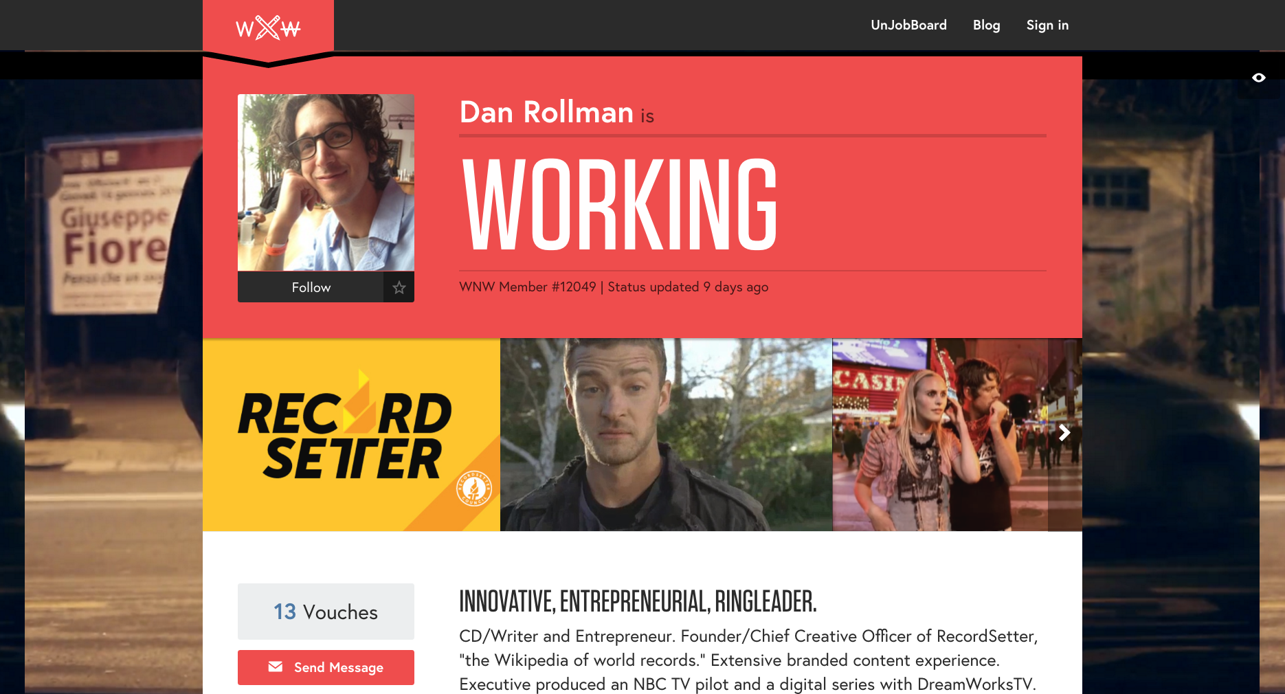
Dan Rollman, Copywriter. Los Angeles.
Eric Anderson, Front-End Developer. Brooklyn.
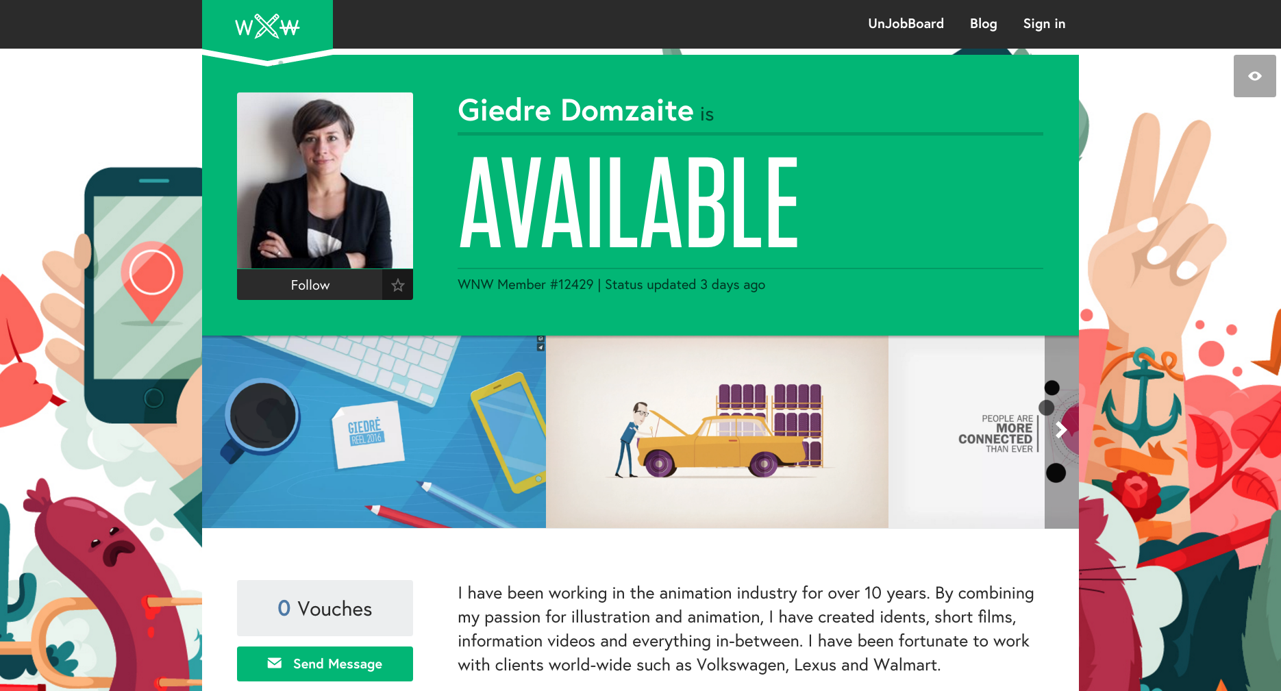
Giedre Domzaite, Motion Designer. Sydney.
Josh Goldsmith, Producer. Los Angeles.
Are you a WNW Member with new work, exhibits, products, or news to share? Email us!
NOT WORKING: ON ANIMOGRAPHY
NOT WORKING: ON ANIMOGRAPHY
WNW Member and Amsterdam-based Art Director #2184 Jeroen Krielaars is behind Animography. We spoke to Jeroen about the beginnings, process, and future of this project.
Why did you start Animography?
The first animated typeface I did was Moshun. It was just a personal experiment. Moshun succesfully combined typography and motion in a modular system. A good unison of things that excite me. Moshun got quite a lot of attention by the international press. A lot more than any other work I ever did. This was very stimulating, and I decided to explore this thing a bit more. Shortly after, I created Typogami and teamed up with Maria Jose Torerro Heredia to create Binary 2.0. After a while I noticed other people also getting into animated typefaces. To combine my and their work on a specialized platform was the next step. Animography was born. Having a dedicated place on the web for this kind of work also allowed my regular portfolio, calango.nl, not to be all about animated typefaces.
How does the project work?
I don’t see it as a project but as a collection of lots of projects. Every animated typeface or promotional video is a project on its own. The main goal is to make animated typefaces and build a steady collection with those. For this, I’m always working on it in between commercial projects. I also spend a lot of time inviting and helping others in their effort to create an animated typeface. Second to building the collection, I see it as an ongoing experiment to implement these in different kinds of animation. That’s why I started a new sub-project called Animography Monthly. Each month of this year a different motion designer is invited to work his/her magic with an animated typeface of their choice. The results so far are quite stunning. It’s very interesting to make something, and then hand it over for someone else who can use it in a way you’d have never thought of yourself.
What are the biggest challenges of animating a typeface so the individual letter animations work together?
For me personally, it’s a challenge to find the perfect balance in motion and type design. On one hand I strive for something that is uniform, elegant and smart. On the other hand, a minimal and systematic approach can result in something that is boring, and lacks character. It should stay interesting even after looking at it for a dozen times. To take this to the extreme, I started a large collaborative project last year. I took an existing typeface containing 110 glyphs, and invited an equal number of animators to each work just on one glyph. I gave them some basic rules, like a maximum of colors, timespan, etc. The end result was very exciting. 110 different styles combined to form one animated typeface. This can also be balanced in it’s own way.
How many animators have contributed to Animography?
Apart from the 110 animators that worked on Franchise Animated, we have 15 artists with their work already available, about 5 artists working on something right now, 3 artists who already did an issue of Animography Monthly and 9 more lined up for the rest of the year, 3 regular sound designers, a great developer and 3 guys from aescripts & plugins who’ve worked on the Characteristic script. It’s an ever-growing family.
What's next for the project?
There’s still a lot to do. We’ll be having a blog soon, to host all the Monthly’s and other implementations on. Lots of new animated typefaces and experiments. Also I would still like to have a good serif style animated typeface. If anyone is interested in making that, give me a shout. I would also like to get in contact with some editors to get a foothold in that scene. It’s pretty difficult for me reach beyond the tight knit community of motion designers who live on vimeo, twitter and dribbble. And maybe, a new collaborative project like Franchise somewhere down the road. Oh, and get the bespoke design service running. The plan from the beginning is to create custom animated typefaces for brands next to the ones that are available for everyone.


