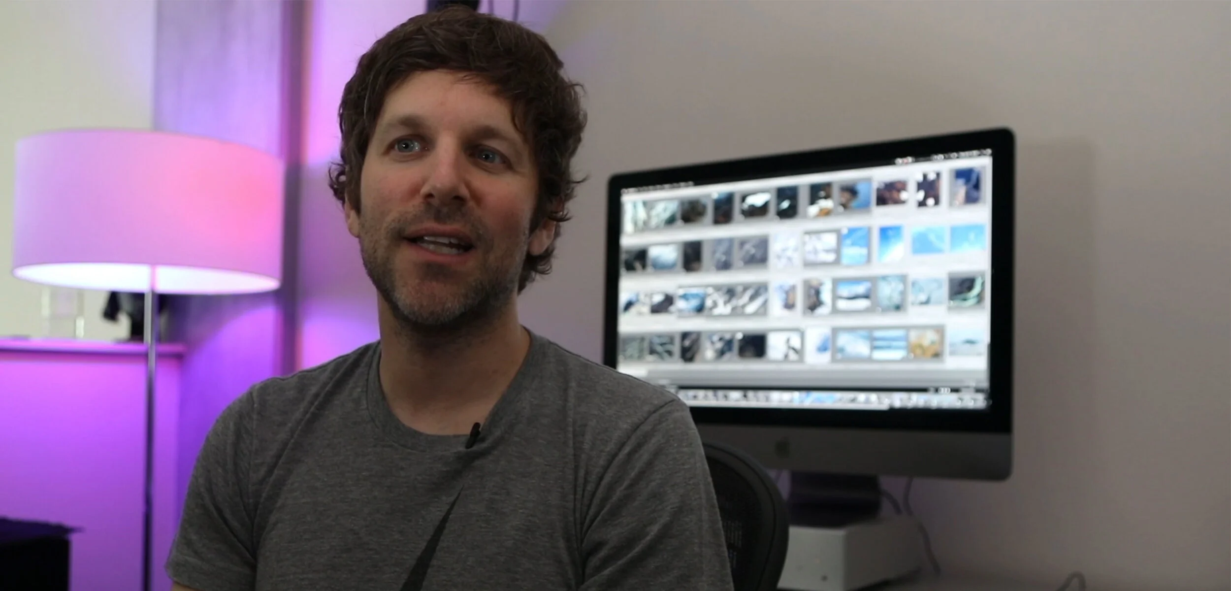
Ray Smiling speaks about creativity as if it were a recap of a Transformers fight. It’s about creating and destroying, it “needs more explosions.” He’s the kind of Creative Director that you want to have if you’re into advertising. His ability to think outside of the box, and encourage other creatives to do so, is well-documented.
Read MoreWe Are COLLINS: A Conversation with Design Leadership at the Celebrated Strategy & Brand Experience Company
We caught up with design leadership, split between COLLINS’ two offices, to shine a light on the industry perspective of the strategy and brand experience company, how that insider reputation was met and swiftly surpassed, and which projects have only further solidified their team appreciation for incredible craft at incredible scale.
Read MoreIllustration by WNW Member Pierre-Paul Pariseau
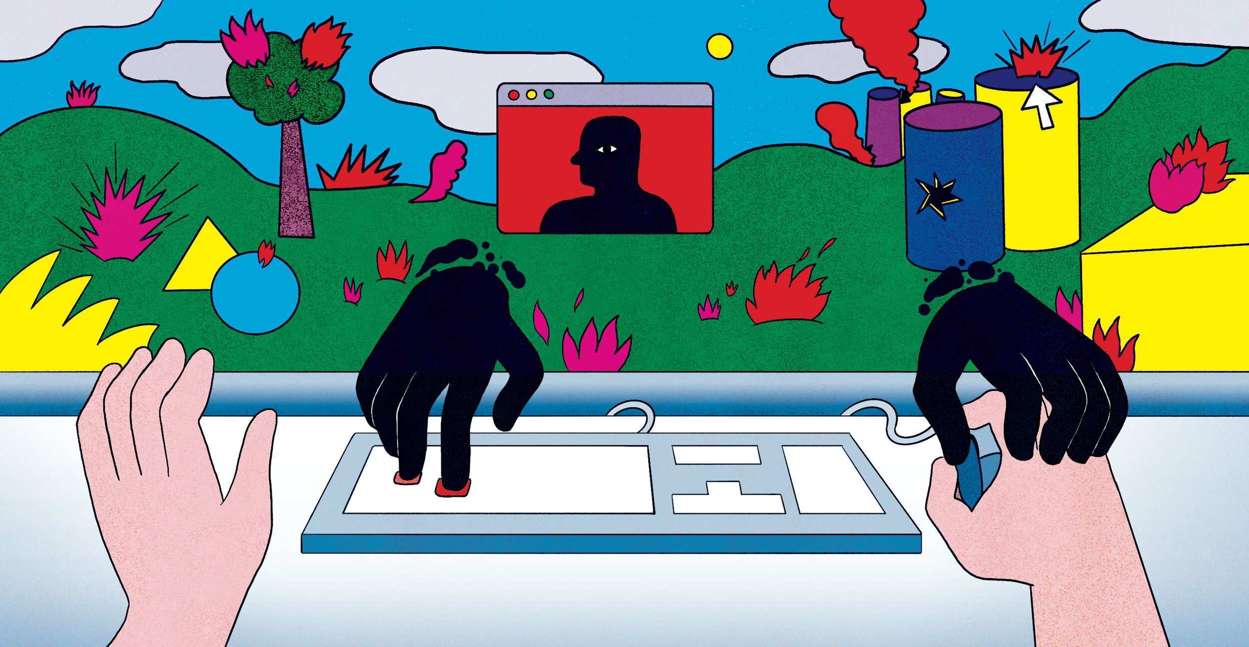
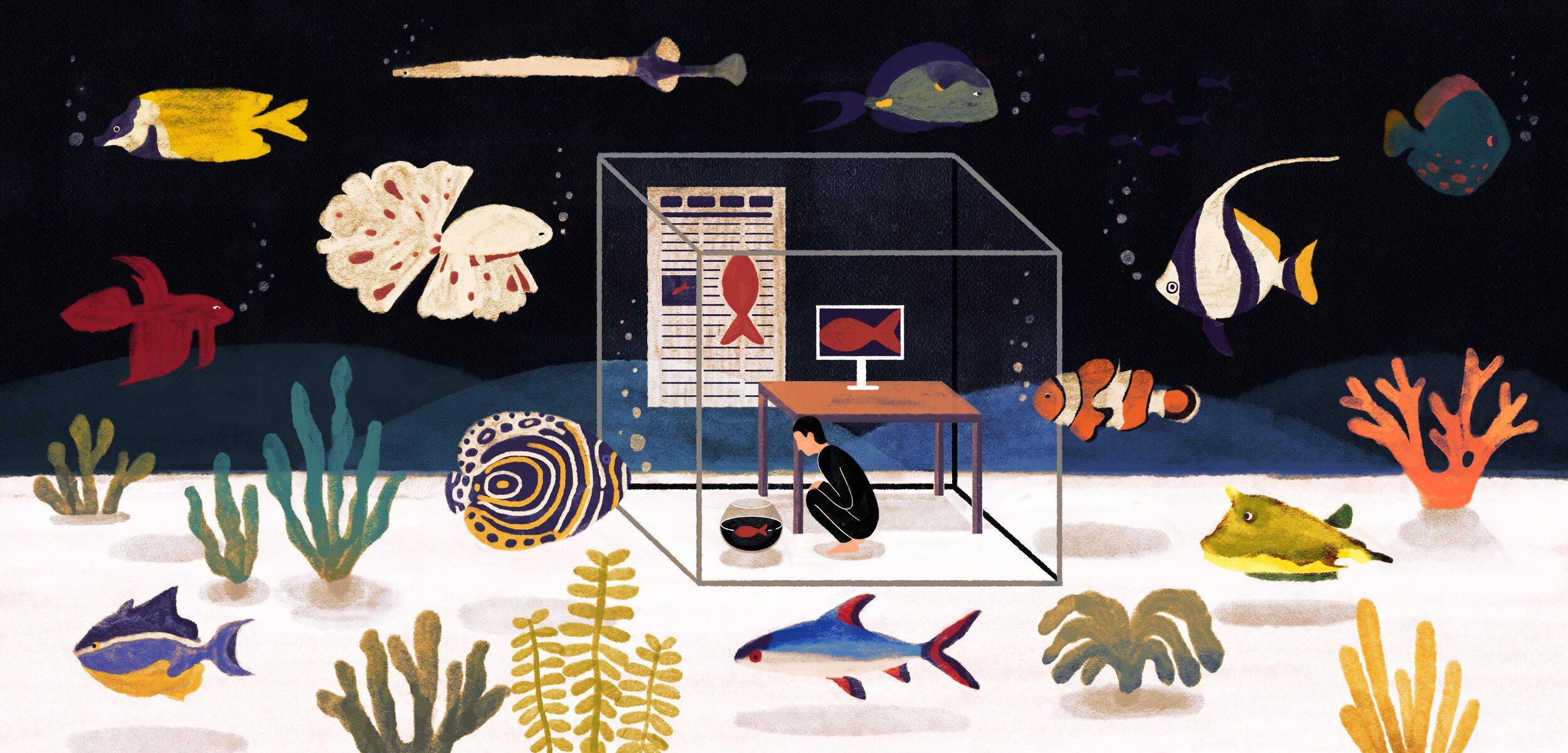
I Miss My Desk (and So Should You)
This pandemic has reminded me of a lesson I learned years ago but had since forgotten. The desk is more than a piece of office furniture; it’s an integral part of a designer’s creative life. The desk is a rock of stability, a place to be active, to be still, and to work.
Read MoreIllustration by WNW Member Mark Wang
The Villain We Deserve: When Turning a Blind Eye to Hatred Weakens the Critical Gaze
“When design turned up its nose at thoughtful criticism through civilized discourse in favor of strictly 'good vibes', it created a vacuum...All systems require balance and by avoiding this requirement, we collectively created instability.”
Read MoreWork With GMUNK
In this episode of Work With, GMUNK buys you a one-way ticket to an enigmatic, atmospheric, and metaphysical reality.
Read MoreOvershare Podcast: Jonathan Jackson Will Not Be Constrained to a Singular Expertise
In this episode, you will learn the power of not having a self-limiting mindset, and how important it is to have diverse voices in the room when creating design and culture.
Read MoreOvershare Podcast: Lauren Hom Will Teach You Everything She Knows
In this episode, you will learn the importance of destigmatizing money in the creative industry, and how necessary it is to be around people who help you dream bigger and encourage you to think about yourself in a different way.
Read MoreOvershare Podcast: Archie Lee Coates IV Can't Believe He Did That
In this episode you will learn how to dream bigger, how to seek out that feeling of "I can't believe I'm doing this," and the importance of knowing when to check yourself when you're going through the motions.
Read MoreIllustration by WNW Member Simon Flöter
The Bad Physics of Meritocracy
There is no formula for becoming a successful creative, but even we are bound by the laws of physics. Our motivational advice mirrors high school science books: move your mass. Take risks and gain momentum. Orbit positively charged people. In the face of these constants, there is a variable often unconsidered.
Read MorePhoto by Jack Dylan, Sr. Design, Global Communications at Huge
Courtney Burns & Margaret Morales Break Down Huge’s Reputation, Creative Culture, & Talent Hiring Approach
We talk to Courtney Burns and Margaret Morales from the hiring team at Huge about the digital agency’s reputation for innovation, as well as how their hiring approach further shapes and solidifies Huge’s reputation and culture.
Read MoreAesop's Latest Campaign Unveils Menacing Hidden Messages in Insta-Poetry for Anti-Trafficking Charity
Heather-Mariah Dixon on the Unique Creative Brief of Designing Death
When approached with the opportunity to design Some Light at the End, a book about hospice and end-of-life care, Heather-Mariah couldn’t resist the challenge to take on something new. Death itself is nothing new, but the practical implications from a design perspective were also strangely enlivening.
Read MoreIllustration by WNW Member Yifan Wu
Abundance in Scarcity: Why Prosperity Should Be at the Heart of Your Practice
Generally, we’re not interested in gigs that don’t deliver on creative fulfillment or social currency. Why do we limit ourselves?… When we succumb to the myth of one marketplace, we scramble to be seen and heard. We scramble for opportunity along the well-worn path.
Read MoreHow to Use Working Not Working to Land a Job at a Top Company Like Nike
“I applied to a full-time role at Nike and within a day I heard back about a job in New York...And just like that, I kicked off a very streamlined and informal conversation with a team at Nike about what they are looking for and how I could help. With the help of WNW’s platform, the interview process was casual and clear, breaking down the formality of job-seeking and interviewing.”
Read MoreWNW Connects: Alex Center with New Balance Basketball
“Over the course of the next year, we imagined what would become New Balance Basketball. A brand that could stand out in the crowded sneaker space by doing things independently, not about hype, but by being humble, focusing on craft, all while staying true to New Balance’s legacy. Then they signed Kawhi Leonard. The perfect partner.”
Read MoreFeeling Chaotic? Embrace the Calming Effects of Things Organized Neatly
Things Organized Neatly is a "collection of collections" that calms the viewer with even spacing, color coordination, arrangement by size, and every other requirement for soothing the obsessive. Austin shares what draws him to organization both happenstance and intentional.
Read MoreJosh Cohen's Design Chops Inform His Unique Exploration Into Video
One of the coolest parts of WNW Member Josh Cohen's portfolio is on display in the project credits. The man is wearing a lot of hats. Director, writer, editor, designer, art director, producer. "It’s a special feeling and privilege, being able to have a vision, and have the end product be just that or something really close to it."
Read MoreGo Backstage with the Collected Works’ Governors Ball Branding
Go Backstage with the Collected Works’ Governors Ball Branding
MIKE O'DONNELL / EDITOR
The Collected Works has been on a roll lately. The NY-based graphic design studio, consisting of WNW Members Justin Colt and Jose Fresneda, keeps propelling itself forward with a range of diverse projects from album packaging for a Grateful Dead celebration to visualizing the internet for a sleek new router. Their latest undertaking was creating the entire identity and branding for this year's Governors Ball. As we said, they're on a roll.
This isn't the studio's first foray into designing an identity for a big event. Last year, they cut their teeth on The Meadows, another music festival in New York. They also helped Working Not Working with the identity and visuals for their 5th Birthday Party in January, which one attendee called "the single greatest event of the decade." Anyways, below we talk to Justin and Jose about their process and mission for designing the Governors Ball as the event to kick off summer in New York. They also share some insights into the learning curve that came with 3D modeling and animation, and tell us what it was like actually attending the event as VIPs and seeing their work in action.
How did you come to create the branding and identity for this year’s Governors Ball?
A year earlier we had worked with Founders Entertainment, the creators of Governor’s Ball on the identity and design for The Meadows, another music festival that they were putting together. It was a great partnership, and we really enjoyed working with them. This seemed to be a mutual feeling since they invited us to pitch ideas for Gov Ball after The Meadows wrapped up. We went all in on the pitch and developed a handful of concepts that we presented. They liked one of those directions quite a bit, and we were hired to develop the whole system and expand it for the festival.
What were some of your goals and inspirations for the aesthetic?
The main inspiration for the identity is summer in New York–good vibes, a positive atmosphere and (hopefully) nice weather. Repeated festival attendees think of Governors Ball kicking off the start of summer in the city, and the identity should have this same excitement. So, we already knew that we wanted a bright and vibrant color palette and overall energetic attitude.
The other aspect that makes Gov Ball special is that it’s a festival made by New Yorkers for New Yorkers. It’s deeply rooted in NYC, and we saw a great opportunity to use icons of the city to build the identity system. It should feel born and raised in New York.
What was the hardest part of nailing down the identity?
Taking a dive into 3D modeling and animation was a big learning curve. We had a great designer, Ben Ross, working here at the studio, who taught us all a ton about Cinema 4D and how to model all these objects. One of the hardest parts was creating a consistent set of 3D models, that would work together as a unified set. For instance, many of these items were created from scratch, here at the studio. However, for the gigantic Manhattan 3D model, we had to find a pre-existing map that we could customize–as creating this from scratch would take forever. Then, we had to ensure all these different objects (ones we modeled here, and ones we had to source) all felt like they matched and belonged together.
The other bottleneck was the amount of time needed to render everything. We had built a custom PC to handle the workload, which was pretty efficient at still frames, but took a ton of time for animation. For instance, 1 second of video would take about an hour to render. So a 60-second animation took days to render, which created some time crunches.
Once everything was actually modeled and rendered it was pretty smooth sailing. We essentially had a massive toolkit of all these objects, which we could keep pulling from and reusing.
How did creating a festival identity differ from creating one for a company?
From a conceptual standpoint, we approach both types of projects in the same way. One thing that we always push when working on identity design is the importance of thinking about the greater system that has to be in place, rather than just the individual pieces. The poster, website, tickets, signage, animations and stage design all need to feel consistent–to name a few. That’s very similar to working with most clients.
However, there are a ton of politics when dealing with artists. For a better part of the process, we don’t even know who’s going to be performing at the festival that year. Then, when the lineup is figured out, there are a bunch of contractual obligations we need to follow. The order of artists, when we can announce they are booked, the size of the artists' names, the color of the artists' names; all of these are things that artist managers dictate long in advance, and will need to sign off on. So, it all becomes a sort of jigsaw puzzle, to satisfy these obligations but still have everything feel well designed. You’ll see a lot of ugly festival posters, and this is usually the reason why–because there are hundreds of cooks in the kitchen, and everyone wants their aesthetic preferences to come through, and their artist to have top billing. I guess that’s show business for you.
How did it feel seeing the fruits of your labor all over the festival?
We’ve been very lucky as a studio, to work with clients we sincerely appreciate and respect. It feels incredibly exciting to be involved with a project that we have a vested interest in and, in this case, a festival we would have paid money to attend even if we didn’t work on.
A few highlights are seeing our design work all around the city–some posters are wheat-pasted across the street from the studio right now for instance. It’s also rad to see artists and their fans sharing the work on social media, and everyone feeling sincerely excited about the event. Finally, being at the festival itself is especially awesome. The design system really comes together at that point, and all these dozens of elements (screens, tickets, signs, apparel, stickers, tattoos, sculptures, geofilters, stages) create an incredibly consistent and strong system and experience.
Who were some of your favorite acts at the festival? Did you get a VIP experience?
Let’s see, some of our personal favorites were Chance, Beach House, Francis and the Lights, Childish Gambino, Wu-Tang, Air, The Avalanches, Mac Demarco and Warpaint.
Gov Ball also hooked us all up with VIP tickets, which was the icing on the cake. It’s pretty awesome to hang backstage to see how a festival and a concert is run from that perspective–which is incredibly overwhelming. Oh, and the VIP bathrooms are pretty nice.
What’s next for you?
We have some rad projects in the pipeline that we’re excited about. We’re designing everything for The Meadows 2017, which is coming up in a few months. It’s an evolution of the identity we designed last year, and another one of our favorite projects. We just finished up the branding and design for another festival called Suwannee Hulaween, that’s happening down in Florida. We’ve also been working on the live visuals for Japanese rockstar, helping one of our favorite bands The National with their website and a bunch of animations, playing around with some VR projects, and doing a few self-initiated projects.
We might throw a big studio party in the next few months, and are trying to figure out how to brew and package a bunch of beer to give away.
Anything else you’d like to add?
Wanted to give a big thank you again to Tom, Josh and Laura at Founders Entertainment for the continued collaboration with Gov Ball and The Meadows. Another huge thanks to you, Working Not Working, for the continued opportunities you’ve connected us with. We’re huge WNW fans over here. Also thanks to Ben, Ahna, Steph and Ethan for all the Gov Ball help. Finally, we always want to connect with interesting people, so if you’re reading this and want to get in touch, hit us up!
Are you a WNW Member with new work, exhibits, products, or news to share? Email us!
I LAUNCHED MY CAREER THROUGH A PRIZE ON KICKSTARTER
I LAUNCHED MY CAREER THROUGH A PRIZE ON KICKSTARTER
By WNW Member #3180 Philip Johnson
I grew up in Indiana with dreams of being an animator—the next Disney, specifically. My brother and I had drawn floorpans for the animation and architecture company we would start. It wasn’t until I was looking at universities that I was told 2D animation was no longer a viable career (so they said.) When someone then mentioned “graphic design” to me, I was a little revolted, thinking it meant designing billboards for a living. Once I actually learned it was essentially what I had been already doing for years- designing gig posters, hacking bands’ MySpace pages and making logos for relatives’ businesses- it was pretty clear that’s what I would do. Meanwhile, I was in a band (together, in some form, for about 9 years). The plan became to support myself with design but give the band the old college try once we graduated. In school however, I was introduced to Sagmeister Inc and it quickly became the one place that really excited me: the only place I wanted to work. Still, to me it was the moon, unattainable. Which usually just means I want to find a more creative way to go after it (while not holding my breath.)
My school held its annual talent show. I played the catchiest of the band’s songs and won the category I was in, along with some prize money. Almost immediately after, someone directed my to Stefan Sagmeister's Kickstarter for The Happy Film. For the exact amount I had won, I could donate to the campaign and fly to New York to have dinner with him in his 14th St penthouse. I did. I told him I wanted an internship. I emailed Jessica Walsh, his designer, an updated portfolio when I got home. A few quiet months passed. The Thursday of my senior year Spring Break, I am headed to lunch with my dad and peek at my email. There’s one new message from Jessica Walsh. I lose my mind for a moment and my poor father doesn’t know if I’ve found Wonka’s Golden Ticket or sat on a tack. The email read that a position had opened up and asked if I can be there the following Monday to start. I said “Maybe not Monday but I’m packing my bags.” Monday, I told my professors I was leaving and I was out in New York, working in the studio that next Wednesday.
So, you could say, I Kickstarted my career. (That’s honestly the first time I’ve said that. Marketing people: Get at me. Sorry Not Sorry.)
9 things I've learned in my career (so far):
I’ve found that much of design is about understanding relationships. That in mind, I thought it would be a fun gimmick to try and present some of my newly minted values in simile form. You guys are my guinea pigs so enjoy.
1. Social Media is like my old messenger bag
Constant use results in hard to perceive consequences. I used to wear a messenger bag and run cross country. (Not simultaneously.) I developed a pain in my knee that was obviously from running. Nothing helped. At the end of a seven day trip to London, I was having trouble walking. My messenger bag was on it’s last leg as well. I came home, discarded the bag and found that within a few short days my knee had completely returned to normal. The bag had put me slightly off kilter. It was almost imperceivable day to day but, over time, had created a fairly perplexing problem. The quick and little escapes of social media feel beneficial in the short run but lower my quality of life over time. I wear a backpack, now.
2. A decision is like a cookie jar
The jar, by itself, is not that valuable. You choose the jar. You fill said jar with cookies. That is when the beauty of the cookie jar is truly realized. The cookies, in this scenario, are your actions. I can fret all I want about choosing between full time employment and freelance but, at the end of the day, I’m selecting a vessel. One might be easier to open, more manageable, but I know if I feel strongly enough about one I'm going to do whatever it takes to fill that sucker up. (It also helps that I only have one mouth to feed.)
3. Talking to new people is like a Chinese finger trap
It’s so much easier if you just relax. I’m now discovering this is true of so many things. Meeting new people, presenting work, solving some design problem—it’s all so much easier when I simply get myself to chill. My hyper-analytical mind makes it difficult most of the time, but the benefits are pretty astounding when I'm able to.
4. Passivity is like a band-aid on a splinter
Yes, pulling the thing off might be slightly uncomfortable but 20 bucks says if you cover it up and hope it heals you’ll have yourself a nice little infection. Direct, objective discussion of anything problematic has continually proven beneficial in my relationships (of all kinds).
5. A pursuit is like a quality rollercoaster
If it doesn’t scare the crap out of me, at least a little bit, it’s probably crap. All of the work I’m proudest of, the best life choices I’ve made, have scared the crap out of me—at least a little. Let’s say this is a fear of the unknown (not knowing if I’ll be able to support myself as a freelancer, not knowing exactly how this project will come together with x budget and x timeline, etc.) The unknown leaves the most room for surprise and discovery. It’s the trial by fire projects that leave me the most fulfilled, having acquired some new understanding or skill set. Being comfortable, in this regard, gets me nowhere.
6. Life is like a box of chocolates
(Though sometimes there are little pictures of what chocolates are where on the underside of the lid.) Food for thought.
7. Happiness in work is like that thing where you relax your body as much as possible and are like “Am I that tense all the time? Like, even my eyebrows were tense. Why don’t I do that all the time?"
Even though I love what I do, I still have to remind myself that I have the capacity to love it from time to time. An exciting project inevitably turns into a list of tasks. Like all great things, they can cease to feel great once I become accustomed to them. I’ve been training myself to recognize these moments, responding and thus thinking “Why don’t I do that all the time?"
8. School is like a buffet
Many people (myself included) go to school expecting a sit-down restaurant where everything is neatly presented to you. In reality, it’s more of a buffet. Everything is there—probably more than you can imagine—but it’s up to you to get up and serve yourself. If you expect to be spoon-fed, you’ll starve.
9. Like what you like
I can’t tell you how much energy I’ve wasted in my life questioning my tastes or wanting to tailor them to fit what seemed cool or respectable. It’s not an overt thing—it’s usually at a gallery with some brilliant friends. I find myself the only one unmoved by a certain piece. My gut reaction is that I am somehow at fault. I’m not cultured or intelligent enough to see what they see. This is an incredible waste of energy. It’s so liberating to be able to say “This is BAD!”—to understand that your liking or disliking something does not need validation (though understanding why is often useful). That painting does nothing for me—I’m still a decently educated person! I got a rolling tear going at the part of that young adult movie where they’re obviously trying to make you cry—I take full ownership of that and know that I still have some discerning taste! I love me some jazz but there’s a notable amount that goes clear over my head—it’s completely unrealistic and unnecessary that I grasp enough music theory to fully appreciate most experimental jazz! Adore or despise that artwork, unfettered. Openly cry at that movie, unashamed. Love that song simply because THAT. GROOVE. IS. SICK.
