


MEMBERS YOU NEED TO KNOW: DAVID BOWIE ILLUSTRATOR ROADIES
As we remember the late David Bowie, who passed away on January 10, 2016, here are 8 of our favorite visual celebrations of his life and legacy by WNW Members.
Read MorePROFILES OF THE WEEK: JANUARY 9TH
PROFILES OF THE WEEK: JANUARY 9TH
Frank Ockenfels, Photographer. Los Angeles.

Maggi Machado, Copywriter. London.

Rizon Parein, Designer. Antwerp.

Giulia Zoavo, Illustrator. Milan.

Vittorio Perotti, Art Director. New York.

Duke Aber, Designer. Weston.

Audrey Desler, Portland. Designer.

Rua Perston, Art Director. New York.

Are you a WNW Member with new work, exhibits, products, or news to share? Email us!
"NASTY WOMEN UNITE" FOR THE WOMEN'S MARCH ON WASHINGTON
"NASTY WOMEN UNITE" FOR THE WOMEN'S MARCH ON WASHINGTON
It's been inspiring to see so many Working Not Working Members apply their creativity to the social causes they feel most passionate about. One such member is New York-based Designer Simi Mahtani, who has created some super-clean "Nasty Women Unite" shirts and sweatshirts, with all proceeds going to Planned Parenthood.
Below, we talk to Simi about the impetus behind this latest project, and what she sees as the role of an artist in addressing social issues through their work. If you or someone you know is planning to attend the Women's March On Washington on January 21st, or a corresponding local march, make sure to pick up one of Simi's shirts to protest in style.
Tell us a little bit about your creative background. Who is Simi and how did she get here?
I'm a freelance art director and designer currently working in the realm of experiential design for pop-up events, brands, and retail experiences. I specialize in crafting unique lettering and typography.
Previously I cultivated my love for sports as a senior designer and art director in-house at the NFL, with an amazing team of creatives that allowed me to explore environmental branding for large-scale events such as the Super Bowl and Pro Bowl.
What social causes are you most passionate about?
I proudly stand with Planned Parenthood in their continual fight for women's reproductive care and rights. After the election especially, I wanted to find a way to fundraise using design.
Can you tell us a little bit about your latest project?
I created some tees here and I'm donating 100% of the funds from the sale of the shirts to Planned Parenthood. So not only do you get a dope shirt, but your money will also help other women around the country immensely. They make cool gifts for all the Nasty Women in your life.
Is there often a political or social edge to your work, or do you feel a certain immediacy these days?
I'm a native New Yorker, so I think I was born to appreciate and embrace immediacy. I definitely think that this has influenced my style as a creative: to be bold enough to stand out, with a clear, strong message to communicate. While I'm aware of social and political issues, it has mostly come through in my personal work. It is a method of expression for me, and hey, much cheaper than therapy.
The phrase "Nasty Women Unite" on the shirts is definitely politically charged. Who knew that one man's two words would define an entire movement of women to take action.
What do you see as the role of an artist in addressing these issues through their work?
As creatives, we have a critical role and platform to deliver impactful messages. There really is no better time to use that voice than now. We need to keep creating, making, tinkering, crafting, and pushing the envelope especially to evolve from the norm.
What’s next for you?
I would love to be involved with more projects that have a goal to create social impact. But first, let's sell some more Nasty Women Unite shirts :)
Who are some other WNW Members whose work you admire and why?
Working Not Working is an amazing community of creatives, it's so hard to narrow down! But I am a huge fan of the work of WnW Members David Saracino, Kervin Brissauex, Jon Contino, and Lauren Hom. Their work is so inspiring to me and constantly pushes me to strengthen my own craft.
Anything else you’d like to add?
A quote I love by Eleanor Roosevelt that says, "A rise in tides raises all boats." I hope this helps someone else take action.
Are you a WNW Member with new work, exhibits, products, or news to share? Email us!
Artists Honor 2016's Best Albums With Reimagined Cover Art
Artists Honor 2016's Best Albums With Reimagined Cover Art
MIKE O'DONNELL / EDITOR
No one can deny the joy of year-end lists, with their ability to help you both comb through the past 12 months of your life and catch up on all the goods you overlooked. WNW Members and music fanatics Eric R. Mortensen and Richard Perez are here to feed your fix with a unique spin. They're the minds behind 10x, which sees visual artists celebrating their personal top ten albums of the past year with reimagined cover art. This year, Eric & Richard intentionally decided to enlist a total of 19 visual artists. As Eric tell us, "So naturally we bumped it up to 19 artists this year, which was a totally intentional number and had nothing to do with anyone dropping out last minute. Totally meant for it to be 19."
It's amazing how well the project turned out, considering Eric and Richard are constantly trying to one-up and undermine each other in the interview below. They credit the brief they sent out to the artists. By setting certain parameters, the overall collection has an added touch of visual cohesion since the music selections are very eclectic. "We try to keep it simple, but coordinated. Fixed color palette, inclusion of a small logo, some basic rules as far as acceptable selections (no reissues, only releases from the current year, etc.) Some participants bend these rules, but that is half the fun."
Take a look at the past editions of 10x in case your "favorite albums of 2015" Spotify playlist is looking a little underwhelming. And remember that the next edition of 10x is only 12 months away. Eric & Richard are just as excited as you because their friendship depends on it. Because as Eric puts it, "As soon as the clock strikes midnight on December 31st, Richard is back in my crosshairs." That's a natural result of two freelance creatives with similar aesthetics going head-to-head for the same gigs. Richard, firing back with an "I’m shaking in my winter boots," explains: "I think there were at least two times this year where it came down to Eric or us at Skinny Ships. We settled it in the streets."
Tell us a little bit about your creative backgrounds. Who are Eric Mortensen and Richard Perez, and how did they get here?
Eric: I got into graphic design through music. My brother was in a band. All my friends were in bands. Even our mailman was in a band. I don’t know, someone told me The Postal Service was a music group. Anyways, I couldn’t play anything but I knew how to draw cool ska guys in photoshop. Now I get paid to draw cool ska guys for clients like NASA, Google, and Facebook.
Richard: I was introduced to the wonderful world of design in high school when I was the layout editor of the school paper.
Eric: Richard told me he took the layout editor position to impress girls.
Richard: Yeah that didn’t work out. Anyway. I went to SF to study design, snagged a studio gig at Office, before going out on my own. Somewhere along the line, I started focusing more on graphic illustration. Now I work with my partner, Jen DeRosa, under the Skinny Ships moniker. Where we get to do cool stuff for Google, Facebook and not NASA. NawSA.
WNW Member Mark Weaver
What is the 10x project, and how did it get started?
Richard: The 10x is an annual illustrated list of visual artists’ favorite albums of the year. The first was 10x10 in 2010 and originally posted to flickr (remember flickr?). Sharing just a list of my favorite albums seemed a little plain, so I jazzed things up with some illustrations.
In 2014 Eric joined the project and it’s all been downhill from there.
Eric: He means downhill like downhill skiing. You know, jumping off hills in neon colored outfits, crossing skis together in midair while an electric guitar wails kinda stuff. It’s just Richards’ weird way of saying I made the project cool.
Richard: In 2015 we upped the ante and asked a few fellow illustrators and designers to join in, bringing the number up to 10. It was a blast seeing what other creatives were listening to that year.
Eric: So naturally we bumped it up to 19 artists this year, which was a totally intentional number and had nothing to do with anyone dropping out last minute. Totally meant for it to be 19.
Richard: Yes. 19 is a nice round number.
WNW Member Richard Perez
What are the kinds of guidelines that you pass off to the artists?
Eric: We try to keep it simple, but coordinated. Fixed color palette, inclusion of a small logo, some basic rules as far as acceptable selections (no reissues, only releases from the current year, etc.) Some participants bend these rules, but that is half the fun.
What are some of the lessons you learned in previous years that helped the project evolve this year?
Richard: Just general time management. When it was only Eric and I working on this I remember we would both be working the night before to have artwork ready for the next day's post. Eric somehow managed to corral 19 artists this time around.
Eric: We also invested a lot more time into making the website more engaging... 10x16 is a huge leap forward from 10x15. We were lucky to work with Joey Maese to develop something special this year.
WNW Member Jessica Hische
Are you both musicians, or do you just love the ways that music can intersect with the visual arts?
Eric: I don’t play anything but I know Richard has a little OP-1 keyboard. I like to imagine he composes exclusively for the audience of his two cats, and that his shit is really good. Like super progressive shit for cats.
Richard: This is true.
WNW Member Simone Noronha
What are your 3 favorite album covers of all-time?
Eric:
Haha Sound by Broadcast (Artwork by Julian House)
Out of the Blue by Electric Light Orchestra (Artwork by Shusei Nagaoka)
Power, Corruption and Lies by New Order (Artwork by Peter Saville)
Richard:
Court of the Crimson King by King Crimson (Artwork by Barry Godber)
Power, Corruption and Lies by New Order (Artwork by Peter Saville)
Ladies and Gentlemen We Are Floating In Space by Spiritualized (Artwork by Farrow)
What are your 3 favorite albums of all-time?
Eric:
Pet Sounds by The Beach Boys
Graceland by Paul Simon
Blue Album by Weezer
Richard: This is tough, but at this precise moment:
Odelay by Beck
The Beatles by The Beatles
Low by David Bowie
WNW Member Damien Correll
Are you always listening to music while you work, or do you prefer zero distractions when you listen to music?
Eric: I consider the ability to listen to my own music while doing my job to be one of the greatest luxuries one can be afforded.
Richard: Lately it seems to be 80% music, 20% podcasts coming through the office speakers. But some aural distractions are always needed.
WNW Member Chris Muccioli
WNW Member Eric R. Mortensen
Do you guys collaborate on other projects, or do you just join forces each year for 10x?
Eric: Because of our similar aesthetic approaches we tend to bid against each other on projects throughout the year. 10x is a time when we set down our swords and come together in collaboration to defeat our common enemy: seasonal affect disorder. But let me be clear… as soon as the clock strikes midnight on December 31st Richard is back in my crosshairs.
Richard: I’m shaking in my winter boots. But yeah, we’re usually competing for the same gigs, I think there were at least two times this year where it came down to Eric or us at Skinny Ships. We settled it in the streets.
Who are some other WNW members whose work you admire, and why?
Both: I think we would love the opportunity to highlight some of the amazing 10x participants who are also WNW members:
Mark Weaver, Chris Muccioli, Damien Correll, Jessica Hische, Simone Noronha, Grace Danico, David J. McMillan, Shawna X
Anything else you’d like to add?
Eric: Buy some new records in 2017!
Richard: ✌
WNW Member David J. McMillan
Are you a WNW Member with new work, exhibits, products, or news to share? Email us!
PROFILES OF THE WEEK: JANUARY 3RD
PROFILES OF THE WEEK:
JANUARY 3RD
Albert Trulls, Designer. Barcelona.

Eric Locko, Director. Los Angeles.

Christy Lai, Designer. Portland.

Carmel Gatchalian, Designer. New York.

Elliott Graham, Art Director. New York.

MC Wolfman, Illustrator. Beacon.
Maggy Lynch-Hartley, Producer. Chicago.

Are you a WNW Member with new work, exhibits, products, or news to share? Email us!
MEET CHUCK KERR, ART DIRECTOR AT VARIETY
MEET CHUCK KERR, ART DIRECTOR AT VARIETY
Sometimes the best way to equip yourself with the tools to succeed in your field is to just jump in head first and learn on the go. That's how WNW Member Chuck Kerr got his start as a magazine art director in his hometown of San Antonio: "I was a 22-year-old, one-man art department with almost no freelance budget to work with and a weekly magazine to put out. To create 52 original covers a year, I had to experiment, improvise, and stretch my creativity every single week. Best education I ever received, hands down."
Chuck tells us how he winded up as Art Director at Variety, a perfect fit for his diverse skills, one of which is working with constant, tight deadlines. Chuck also offers a glimpse into his creative process: "I feel like once you crack the core idea of what the story is trying to say, every other design decision becomes easier — the concept tells you what to do. When something ultimately clicks for me, hopefully this means it will click for the reader, as well."
As a creative and hirer, Chuck shares some great advice for creatives looking to work at Variety. "If you want to get into the weekly magazine world, you’ll have to be flexible and fast. As much as I may want extra time to do tons of research, make mood boards, take nap breaks, and workshop something until it’s perfect, the deadlines never stop coming. Having confidence in your abilities and knowing to trust your gut are valuable skills when turnaround can be so quick."
Tell us a little bit about your creative background. Who is Chuck Kerr and how did he get here?
I grew up in San Antonio, Texas and was always really into drawing, comic books, and music. When it became clear that being the next great Marvel artist or a famous drummer wasn’t going to work out, I gravitated toward writing and designing for my high school and college newspapers. As an undergrad, I interned at my hometown alt-weekly, the San Antonio Current, before becoming their full-time art director in 2006. I was a 22-year-old, one-man art department with almost no freelance budget to work with and a weekly magazine to put out. To create 52 original covers a year, I had to experiment, improvise, and stretch my creativity every single week. Best education I ever received, hands down.
After six years at the Current, I was more than ready for new challenges, so in 2013 I moved to Seattle to launch some new Pacific Northwest travel magazines for Sagacity Media. While I loved living and working in the PNW, an out-of-the-blue offer from Variety was too good to pass up, so I moved to Los Angeles in 2014 and am back in the world of weekly magazine deadlines, only now on a much, much larger scale.
How would you describe your creative style? Do you recognize a signature style that links all of your projects, or do you try to excuse yourself and approach each project as its own entity?
With every project I work on, whether it’s editorial design, logo design, comics, or whatever, I am always looking to get a gut-level, emotional response from the reader. The reaction I’m aiming for is always somewhere between “Wow!” and “Oh, of course” — the sweet spot where something is simultaneously a total surprise but also satisfyingly obvious.
One of my favorite parts of the job is coming up with visual concepts for complex or thematically rich stories. I feel like once you crack the core idea of what the story is trying to say, every other design decision becomes easier — the concept tells you what to do. When something ultimately clicks for me, hopefully this means it will click for the reader, as well.
In general, my personal style tends to lean toward bold, graphic ideas, without too much extra ornamentation. Sometimes it’s a matter of putting too much stuff on a page and then editing it down, removing elements until what’s left is absolutely essential. That being said, I do have a pretty healthy sense of humor, and enjoy slipping in small details when they add something without distracting from the overall package. For example, I recently did some freelance work for Seattle Met magazine, designing a fun feature story about Sasquatch hunters. On the very last page of the section, I replaced the page number in the folio with a tiny silhouette of Sasquatch — so after several pages dedicated to how elusive this creature is, readers get a little Sasquatch sighting of their own. That was a fun one.
I am always looking to get a gut-level, emotional response from the reader. The reaction I’m aiming for is always somewhere between “Wow!” and “Oh, of course” — the sweet spot where something is simultaneously a total surprise but also satisfyingly obvious.
You’ve been an Art Director at Variety for more than two years. What separates Variety for you? How have you seen its identity evolve from within in recent years?
Variety is a legendary brand that has covered the entertainment business for over 110 years. Our readership is primarily people in the industry, so we focus on news and analysis rather than celebrity gossip. While its core mission has remained constant since its early days, Variety has survived turbulence in the print industry by changing with the times, evolving from a daily broadsheet, to a weekly newspaper, to its current form: a perfect-bound, oversized magazine, which launched in 2013.
Back when I was interviewing, creative director Chris Mihal sent PDFs of back issues for me to check out, but I was truly blown away when I got physical copies in the mail and saw how much care and attention went into each issue. Between our high production value and routinely working with the best photographers and illustrators, the Variety art team is committed to making the print edition as beautiful as it is informative.
Variety is a legendary brand that has covered the entertainment business for over 110 years. Our readership is primarily people in the industry, so we focus on news and analysis rather than celebrity gossip.
Which of your projects for Variety are you proudest of and why?
I’m proud to be designing for Variety each and every week, but there are a few projects where I felt like I brought something unique to the table.
Not long after I started, Variety had a cover story about the so-called “Morning Show War” between NBC’s “Today” and ABC’s “Good Morning America.” We obviously couldn’t photograph the anchors, so we had to go conceptual for the cover. I came up with the idea of having two coffee mugs — one with the “Today” logo, one with “GMA’s” logo — smashing into each other like “Monday Night Football” helmets, hot coffee erupting everywhere. Then when you opened up to the feature spread, both mugs were cracked, standing in puddles of coffee with steam rising up like on a battlefield (I think I even namedropped “Saving Private Ryan” during the original pitch). Craig Cutler and his team in New York shot everything practically and captured the carnage beautifully. People always assume it was created digitally, but nope — real coffee, real mugs.
This year, Variety did an issue devoted to “Hollywood and Politics.” For one of the feature story illustrations, I proposed that we pay homage to the famous Richard Nixon Esquire cover by George Lois — only instead of Nixon getting ready for his close-up, it’s Donald Trump. Illustrator Anita Kunz did such a great job that we all had to agree it should be promoted to the cover. Even though it’s got one of my least favorite people on it, it’s still one of my favorite covers.
Another cover I’m proud of is much more recent: our 2016 “Global Issue,” which looks at how the entertainment industry is doing across the world. Instead of doing a traditional illustration, I had the idea to model the entire cover on a U.S. passport, complete with gold foil lettering and a custom seal which was designed by La Tigre in Italy. I always love when print publications take advantage of the fact that they have a physical form, and I especially love the idea of a film executive with a huge Variety-size passport on their desk. And who can resist gold foil?
I’ll listen to music related to the story I’m working on as a way of getting “in tune” with it. For instance, a recent cover story on “La La Land” had me listening to Chet Baker and the Bill Evans Trio, and a feature on Paul Thomas Anderson’s “Inherent Vice” was mostly designed while listening to Can and other psychedelic ’60s groups.
What’s your general process for designing Variety features? Do you research the individual and project, or work entirely from the text?
For me, it starts and ends with the story. We cover everything from media mega-mergers to Oscar season, to filmmaker and actor profiles, and everything in between. Each feature layout has to reflect the subject and tone, but also fit in with our overall aesthetic. Ideally, I’ll have the story in hand to read before designing, but sometimes time constraints mean writing and designing happens more or less simultaneously. Any original photography or illustrations will obviously have a big impact on what the pages look and feel like, but when time permits I also try to do my own research into the subject in case it triggers any design ideas.
My officemates know I tend to wear earbuds pretty much all day, but what they might not know (nerd alert) is that occasionally I’ll listen to music related to the story I’m working on as a way of getting “in tune” with it. For instance, a recent cover story on La La Land had me listening to Chet Baker and the Bill Evans Trio, and a feature on Paul Thomas Anderson’s Inherent Vice was mostly designed while listening to Can and other psychedelic ’60s groups. I don’t do it all the time, and I have no idea if this makes a huge difference to the final product. But it’s fun to think that it does, even if only in the smallest way.
Who and what are your biggest creative influences?
There is so much inspiring stuff in the magazine world right now. I’ve been a longtime fan of GQ and Wired, and most recently have gotten into Condé Nast Traveler since Caleb Bennett took it over. Mike Solita’s newly redesigned Fortune looks amazing and is currently being passed around the office, and we also regularly share copies of Leo Jung’s always-great California Sunday Magazine. T.J. Tucker and his team are still putting Texas Monthly into a league of its own when it comes to city/regional magazines. I love what WNW Member Claudia de Almeida does at o Banquinho, especially her stunning type treatments and her work for San Francisco Magazine. Benjamin Purvis’s redesign on Runner’s World made that book a must-read; their front of book section is really inventive and cool. I loved what Chris Skiles was doing back when he was creative director at Houstonia, and Jane Sherman and Sara D’Eugenio do an amazing job designing Seattle Met every month. (Follow Sara’s Instagram dedicated to cool magazine design: @arteditdesign!) I think Tim Leong and company are doing incredible work at Entertainment Weekly. EW has a smart, fun energy and all the hidden Easter eggs consistently reward sharp-eyed readers.
Finally, an all-time favorite would have to be Richard Turley’s run on Bloomberg Businessweek, which was a master class in how to be innovative, authoritative, and clever. He really helped give that magazine a strong voice. BB comes up in the office on a regular basis.
I also still try to keep up with what alt-weeklies are up to, like The Stranger in Seattle. I might be biased, but I feel like alt-weeklies are great talent incubators and a lot of my favorite designers built up their chops at alt-weeklies.
I’m a big fan of the alternative comics work of Daniel Clowes, Adrian Tomine, Charles Burns, Jillian Tamaki, Eleanor Davis, Dash Shaw, and Chris Ware just to name a few. Many of these artists also moonlight as editorial illustrators, and are on my wish list to work with some day.
Speaking of comics … while not exactly a graphic design textbook, Scott McCloud’s Understanding Comics was a very, very early influence and detailed how ink on a two-dimensional page can create a three-dimensional, emotional response in a reader. I feel like every designer (and editor!) should read this book, it has a lot of great things to say about the relationship between words and pictures, and what is a magazine if not a bunch of words and pictures?
Having confidence in your abilities and knowing to trust your gut are valuable skills when turnaround can be so quick. One thing that makes it all easier: The Variety art team is a great creative group that genuinely enjoys working together.
What advice can you offer to creatives hoping to work at Variety? What can they expect from Variety’s creative culture and what would it take for them to succeed there?
If you want to get into the weekly magazine world, you’ll have to be flexible and fast. As much as I may want extra time to do tons of research, make mood boards, take nap breaks, and workshop something until it’s perfect, the deadlines never stop coming. Having confidence in your abilities and knowing to trust your gut are valuable skills when turnaround can be so quick. One thing that makes it all easier: The Variety art team is a great creative group that genuinely enjoys working together. I feel very lucky to work with collaborators who actually know how to collaborate. We all strongly believe in putting the work first and egos second, and letting the best idea win, because — hey, guess what? Then everybody wins.
What do you look for in a creative portfolio that is unique to Variety? Any tips for creatives to breathe life into their portfolios?
“Be undeniably good.” That was Steve Martin’s advice on how to succeed in comedy, and I think it applies to pretty much everything. The Variety art team sees tons of portfolio websites and we look at tons of magazines, and the artists that stand out the most have strong, unique voices and distinctive styles. We tend to go after people who are very consistent because we always want to have a pretty good idea what the final piece will look like before we hire them. If you’re someone who dabbles in several different aesthetics, it might be a good idea to focus on just one or two styles so art directors know more or less what to expect when they reach out to you. We usually don’t have time to go back and forth with an illustrator for several rounds of revisions, and if that did happen, we would probably avoid that person forever.
A couple other things: Check out what kind of work gets published in your favorite publications or websites, and if you fit in with what they already seem to like, feel free to submit your work to them. Blind submissions (“Hello sir and/or madam…”) tend to be less successful. Also, if you’re still building up your portfolio, personal work or fan art can be fine — especially if it has a really unique point of view — but we mostly want to see if you can tell a story visually. So one thing you could try is taking a pre-existing story and creating your own illustration for it. Even though it’s unpublished work (and make sure to label it as such), it will demonstrate that you can create art in service of a specific story, which is what you will be doing 99% of the time when illustrating for editorial. Bottom line: Make the kind of work you want to be hired for, and if you’re persistent and consistently good, you’ll break through.
What’s next for you?
We are going to head into a short publishing break while we gear up for early 2017 — specifically Oscar season. I’m hoping I’ll do better on the office Oscar pool this year; last year’s was rough. (How could Stallone not win for his work in Creed? How?!)
What do you do when Not Working?
“Not Working” isn’t something I do very often, even when I’m not at work. In 2014, I founded a monthly collaborative zine night at Meltdown Comics in Hollywood, based on a similar event I used to attend in Seattle. Melt-thology is an inclusive, social, creative space where artists of all skill levels get together and draw a one-page comic or illustration that I collect into a monthly zine for contributors. We average about 40-50 diverse artists per Melt-thology issue, and it’s been really inspiring to see the growing community that has sprung up around it.
The other thing I do, but have been taking an unintentionally extended break from, is play and write music. I’ve been playing drums since I was about 4 years old, and I also play the piano. I was pretty active in bands back in Texas and Seattle, and I’m hoping to go into the studio in early 2017 for my own songwriting project, Bad Breaks. Music is a big part of my life, whether I’m making it or watching it (or stuck in LA traffic, listening to it). My all-time favorite moment at Variety so far is meeting Brian Wilson at a cover shoot inside the studio where the Beach Boys recorded Pet Sounds in the mid-’60s. At one point, Wilson sat at a grand piano and plunked out some chords while photographer Marco Grob shot amazing portraits. It was like getting a very small, very special concert from one of the greatest musical geniuses ever, and that’ll stick with me for a very long time.
Who are some WNW Members whose work you admire and why?
I’ve been in LA for over two years now, but I admittedly still haven’t made many connections outside of the editorial world. One of the reasons I was so excited to join Working Not Working was to have a resource for getting to know other creatives in this city, and elsewhere. I do know a few WNW illustrators like Joel Kimmel, Erin Gallagher, and Daniel Fishel, who all do great work. Erin does amazing pop culture posters and illustrations, and we both had pieces in a recent Broad City-themed art show at Meltdown Comics. I look forward to meeting more artists and creatives through WNW!
Anything else you’d like to add?
Go Spurs Go.
Are you a WNW Member with new work, exhibits, products, or news to share? Email us!
PROFILES OF THE WEEK: DECEMBER 19TH
PROFILES OF THE WEEK:
DECEMBER 19TH
Zorica Radovic, Art Director. Portland.

Chris Edwards, Designer. Seattle.

Angela Mckay, Illustrator. New York.

Christopher Kahle, Copywriter. Los Angeles.

Shawna X, Designer. New York.

Jason Ferguson, Copywriter. New York.

David Chathas, Designer. Portland.

Jaye Davis, Copywriter. Los Angeles.

Are you a WNW Member with new work, exhibits, products, or news to share? Email us!
MO' MONEY MO' PROGRESS
MO' MONEY MO' PROGRESS
WNW Member Cari Sekendur tells us that before her latest project, there had not been much of a political or social edge to her work. But like many WNW Members, Cari feels that there's now a fire lit under her. It's why she created Mo' Money Mo' Progress, which ties in with the gift-giving season and makes it easier to give a gift that matters. As Cari tell us, "Mo’ Money Mo’ Progress was born of a desire to mobilize progressives to take action. After the election, my partner Laura Zax and I knew we weren't alone in asking ourselves what we could do to protect the parts of our society we value most. So we decided to merge her background in philanthropy with mine in graphic design to create this platform."
We talk to Cari about this newfound drive, how she and her partner Laura determined which non-profits to include, and what she sees as the responsibility of creatives in addressing social issues in their work. "Visual communicators, artists, musicians etc have the opportunity and responsibility to use our skills to move people to take action. Our ability to make confusing or disparate information engaging and easy to understand is essential."
Tell us a little bit about your creative background. Who is Cari Sekendur and how did she get here?
I’m a graphic designer and art director who dabbles in illustration. My work tends to be either a little bit quirky or very clean and understated.
My path to where I am now has been a winding one. As a kid, I loved making things and told everyone I was going to be a "rainbow painter” when I grew up. That's essentially what I do now... but it took me a little while to get here. I didn't study design in undergrad and started my career in marketing and operations at tech companies. I transitioned to design about four years ago when I was given the blessing-in-disguise of being laid off by a turbulent start-up I worked for in Berlin. Since then I have spent most of my time doing branding and web design in both freelance and full-time capacities.
What is Mo’ Money, Mo’ Progress? What was the inspiration behind this new project?
Mo’ Money Mo’ Progress was born of a desire to mobilize progressives to take action. After the election, my partner Laura Zax and I knew we weren't alone in asking ourselves what we could do to protect the parts of our society we value most. So we decided to merge her background in philanthropy with mine in graphic design to create this platform.
Our first initiative is a holiday gift guide that makes it easy for people to donate in lieu of (or in addition to) giving gifts this year. The organizations we've featured are ones you may not have heard of, but they're all doing critical work -- whether at the grassroots, within the legal system, or at the level of policy and advocacy. And they all need our support now more than ever.
Who else helped in making this idea a reality?
We are lucky to have had support from many of our friends and family members. The exceedingly talented Heidi Chisholm, another WNW member, created some of the illustrations. Laura led the charge with research, vetting and copywriting and had help with some writing and editing from a handful of our friends, siblings, and parents. Leigh Nelson, owner of LMNOP Creative, where I spend my days, has kindly lent us time and resources.
What were some of the challenges of bringing Mo’ Money, Mo’ Progress to life?
One big challenge has been time constraints. Laura and I both work full-time, so this has been a classic nights-and-weekends labor of love.
But, the very biggest challenge has been getting people to donate. People have been so willing and eager to share the site -- it's been viewed by thousands of people in under two weeks -- but that has translated to fewer donations than we had anticipated, especially given the overwhelming positive response we receive at every turn. It's just plain hard to get people to give away their money.
How did you select the non-profits?
Vetting non-profits isn’t a science, but we want to break down the thought process—and rigor—behind our selections.
Within each category, we aimed to select organizations tackling distinct and timely issues. We strove for a balance of organizations working at the grassroots, within the legal system, and at the level of policy. We favored those that you may not have heard of, recognizing they may be overlooked this giving season.
For each category, we researched between 10-20 different organizations, investigating leadership, scouring press mentions, hitting up friends in the field, and of course pouring over financials.
For all 501(c)(3)s, we looked at the organizations’ 990 tax filings. Where possible, we investigated their Charity Navigator profiles as well, looking in particular at fundraising efficiency, CEO compensation, and the percentage of revenue going toward programming.
The list we’ve arrived at is by no means conclusive or exhaustive. In particular, in an attempt to make this resource broadly applicable, we skipped over some outstanding organizations working exclusively at a local level (Standing Rock excluded).
What social causes are you most passionate about?
I’ve been thinking a lot about intersectionality lately. It’s hard to pick a single cause since so many of them are intertwined -- Standing Rock is both environmental and racial justice oriented, Southerners on New Ground is a LGBTQ+, racial justice and immigrant cause. That said, I’ve always been a passionate feminist, and my undergraduate degree is in Women, Gender & Sexuality Studies. However women’s issues, too, extend throughout all of the areas we are focusing on.
Is there often a political or social edge to your work, or do you feel a certain immediacy these days?
Before we started Mo’ Money Mo’ Progress, there had not been much of a political or social edge to my work, but Laura spent the first six years of her career doing social impact work in the non and for profit sectors. As is the case with many progressives, the current state of affairs has definitely lit a fire under me to use my skills for action.
What do you see as the role of a creative in addressing these issues through their work?
Visual communicators, artists, musicians etc have the opportunity and responsibility to use our skills to move people to take action. Our ability to make confusing or disparate information engaging and easy to understand is essential.
What’s next for you?
Once the holiday season is over, we are going to to expand Mo’ Money Mo’ Progress to include resources related to volunteering and organizing, education (suggested reading and film lists), and other ways people can use their time or money or skills to continue fighting for our shared values.
Who are some other WNW Members whose work you admire and why?
Heidi Chisholm, I see her every day and yet her talent and good spirit never ceases to amaze and inspire me.
Jing Wei, I love the whimsy and fun in her work. I especially love her little monster creatures and the magical hairdos she uses in her illustrations.
Anything else you’d like to add?
If Mo’ Money Mo’ Progress strikes a cord with you, help us share it. Spread it around your company Slack channel, your Insta, Twitter and Facebook, send it to your mom or your Uncle Jerry. If you have ideas or comments or want to get involved, get in touch!
Are you a WNW Member with new work, exhibits, products, or news to share? Email us!

The 5th Annual Working Not Working Holiday Party: Recap
We kicked off the holiday season with our 5th Annual Working Not Working Holiday Party on Saturday night. This year we held it in Los Angeles. Big thanks to all of you who danced and drank with us. Our annual NYC Holiday Party has earned a bit of a reputation, and we decided it was time to bring the festivities to the West Coast. Debauchery ensued. Friends were made. Their names were not remembered.
Read MorePROFILES OF THE WEEK: DECEMBER 12TH
PROFILES OF THE WEEK:
DECEMBER 12TH
Kelly Beck-Byrnes, Copywriter. Los Angeles.

David Rothstadt, Editor. Brooklyn.

Meg Douglass, Art Director. New York.

Steven Preisman, Art Director. Toronto.

Sarah Jacoby, Illustrator. Philadelphia.

Colin Smight, Designer. Brooklyn.

Paul Janas, Art Director. Chicago.

Arley Cornell, Motion Designer. Oakland.

Are you a WNW Member with new work, exhibits, products, or news to share? Email us!

WNW MEMBERS FILM NEW GAP ADS IN THE LA RIVER CULVERT
WNW MEMBERS FILM NEW GAP ADS IN THE LA RIVER CULVERT
We like to see the different ways in which creative individuals partner up to create exciting work. Sometimes it materializes with new collaborators building chemistry on the go. In other cases, it's a familiar group who all have a shared history, and are excited to reignite the creative sparks. Below we have a roundtable interview with WNW Members Piper Hickman, Kevin Li, and Joyce Lee, who were already well aware what each could bring to the table when they started on the new GAP Cozy ads.
The group offers a lot of insight into the driving themes behind these new ads, which were filmed in the storied LA River Culvert. and how everything ultimately came together but almost didn't. Piper, Kevin, and Joyce all give credit to WNW Member Cheri Anderson, the Head of Production at Untitled Worldwide, and Matt Baron from Alldayeveryday for making it happen. Ultimately, the ads offer a calming antidote to the newest hyperactive trends. As Piper puts it, "In this landscape of more/faster/shorter content, [we thought] that it would be cool to create work that breathes—that just lets a moment be a little more than a moment, both visually and musically."
Tell us a little bit about your creative backgrounds. Who are Piper, Kevin, and Joyce, and how did they get here?
PIPER: I’m a Creative Director / Writer who’s been working in New York almost nineteen years. My college degree and first job were in journalism, TV news actually. I credit the immediate daily deadlines of just a couple hours back then to my ability to work fast and not sweat writer’s block today. But I quickly grew bored of journalism and turned to advertising—I graduated from Miami Ad School and immediately came to NYC and hit the ground running. I’ve always loved writing of any sort, from telling stories to a good turn of phrase. I never thought I’d live here this long, but the city and the industry have been good to me. Just when I think I’ve done it all, a new creative challenge comes around the corner and I grab it.
KEVIN: I’m an Art Director / Creative Director. I’m also a wannabe chef. Canadian by birth, New Yorker for 15 years. I’ve never been shy to expose myself to different creative challenges. I’ve worn many different hats—when I was 19, my first job in Canada was designing faux swimming pool tile patterns for a vinyl manufacturing company. And now I make commercials about people floating on beds in the LA river. I’d say I got here by saying ‘yes’ more than I say ‘no.’
JOYCE: I’m a Producer with a Jack-of-all-Trades background. I started at reception and moved around filling holes at my first agency while learning about the industry - I was an executive assistant, business affairs, award show manager, creative manager. At a certain point my very understanding bosses gave me a chance to choose my own career path and I decided on production.
How would you describe your creative style?
PIPER: Irreverent, surprising, observant.
KEVIN: Experimental and fun.
JOYCE: Oh boy, there is a reason I am NOT a creative, but I am certainly a creative problem solver on the emotional level. Zero sum game? Can that be a style? Ha.
Do you recognize a signature style that links all of your projects, or do you try to excuse yourself and approach each project as its own entity?
PIPER: Every project is different and I tend to adjust my approach depending what the assignment calls for most. Freelancing almost demands this of you.
KEVIN: I like to approach each project separately as its own entity. It keeps things interesting and fresh that way. When you work with different teams the outcome can vary. That’s the fun of being creative, in my opinion.
Can you share a little insight into creating the concept for the Gap Cozy Ads?
KEVIN: The client wanted to showcase the Cozy Lounge Collection, really honing in on how comfortable the clothes are, yet how stylish, too. So the strategy team and Untitled nailed an angle for us: The easiest thing to wear from home to street. Then we brought the idea to life.
PIPER: Gap has such great equity in creating ads that make for great eye candy, so we really wanted to create something people would (hopefully) want to watch more than once, something they could see themselves relating to, or wanting to do themselves. And we also thought, in this landscape of more/faster/shorter content, that it would be cool to create work that breathes—that just lets a moment be a little more than a moment, both visually and musically.

How did the team come together?
PIPER: I was already working at Untitled doing some writing solo, and when some Gap work came my way I knew Kevin would be an awesome partner. He has a designer background, and that’s my favorite type of AD to work with—it’s almost like he has superpowers. Then Untitled’s Head of Integrated Production, Cheri Anderson, brought in Joyce, who I knew from my very first freelance gig, and my head exploded with excitement because she’s so f’ing great.
KEVIN: I knew Piper from Saatchi & Saatchi when we all used to work under Tony Granger. I was a designer back in those days and Piper was a copywriter. We worked together on a Crest project. I met Joyce at Untitled. Funny enough, she and I have very similar tastes in many things like restaurants and food. It’s like we’re related in a weird way. She’s even married to a Canadian. We couldn’t have pulled this off without her. Given the challenges, she went over and beyond to deliver for the team.
JOYCE: Cheri Anderson, the HoP at Untitled Worldwide, is one of my first producer mentors. She was freelancing at my first job and I asked to follow her around on set. Throughout the years I’ve reached out to her for advice or vendor ideas. Luckily she remembered me when it came time to call freelancers! =) Piper & Kevin were already at Untitled when I started. And it is true I did bring in Piper to her first freelance gig.
What was it like filming in the LA River Culvert?
KEVIN: It was a great experience. Our director, Matt Baron of Alldayeveryday brought up the idea to shoot in the river. He wanted a space that was ambiguous as a backdrop, and vast to give our talent enough runway to perform their tricks. We also wanted a location that could give us maximum light throughout the day. It’s tricky trying to check all those boxes. Also, aside from the cool fact of Grease, Terminator 2 and Dark Knight being filmed there, there’s something very beautiful, synthetic and utopian about the river. Did you know there is a group of people who live down there? They fish, eat and have camps. A whole community. Someone should make a movie about them.
JOYCE: Amazing from a film history perspective and also very efficient as there are no real distractions - we were able to shoot 3x spots in one day.
What were some of the challenges of making these ads come together in the way they did?
KEVIN: Our shoot almost didn't happen. The day before, we found out that Marvel's Agents of Shield was shooting in the exact location. The city of LA apparently made a mistake and double permitted the location. We scrambled to find an alt location, but we had our heart set on the culvert. Fortunately, the client was willing to wait two days and everything worked out.
PIPER: Finding the right talent for this was super important to us. We wanted legit skaters, bikers, athletes, etc. So casting took some time. Our final cast includes a professional surfer, a professional fixed-gear bike rider and a former backup dancer for Prince.
JOYCE: We joked a lot about how this shoot was “cursed” - as there were an unusual number of fires that needed to be put out. One great story - our production designer went to the hospital the weekend before the shoot because of a reaction on his mouth after eating a bag of pistachios. He thought he had developed an allergy but after some failed antihistamine trials the doctors diagnosed him with a black widow spider bite -- on his lip. We had a new art department by Monday.
What other work in your portfolio are you proudest of?
PIPER: I’m usually proudest of what I’ve most recently done. The Cozy work isn’t the only thing Kevin, Joyce and I did for Gap—we actually made seven projects for them over the last few months. It’s been fast and furious and fun.
KEVIN: I would say the Uniqlo Recipe App I made with Projector Japan. I mean, it’s not every day you get to make something in advertising that’s functional and beyond a typical ad. It’s also tied to food and cooking which is a huge hobby of mine.
JOYCE: I agree with Piper, I usually am proudest of the work I most recently accomplished as it’s fresh in my memory how much we put into it. Other than the Cozy work we made some for-Snapchat high-fashion animated GIFs for Gap which were fun and a totally new experience for me.

What do you do when Not Working?
KEVIN: I like spending time with my wife and traveling upstate. I love the outdoors and I love cooking. I secretly want to have my own amateur cooking show.
PIPER: I have a dude, a dog, and a daughter, so when I’m not working it’s all about them. The kiddo is a really fun age now, she’s almost 4, so as parents we’re busy discovering the city all over again from her POV. She made us go to Coney Island three times in October! And the rare times that I’m not working during the week, I try to go to museums or movies or some part of the city I haven’t been to in awhile to keep the creative juices flowing. Recently I went to the Brooklyn Museum to see the Who Shot Sports exhibit and it was really inspiring.
JOYCE: Ummm when am I NOT working, is the question. I kid. Sleeping. Eating. Traveling. In that order. I watch a ton of TV & Film but I like to think that is for work.
Who are some WNW Members whose work you admire and why?
PIPER: Aside from Kevin and Joyce...
Donnell Johnson: He and I went to Miami Ad School together and moved to NYC at the same time. He’s such a funny, great and confident writer.
Enrique Mosqueda: Another AD with insane design skills. Amazing eye on that guy. And his knowledge of music/fashion/culture spans all genres and decades. He’s great to work with.
Emily Sheehan & Claire Manganiello: I love finding young creatives that kick ass. I worked with Claire and Emily a couple years ago and their talent blew me away, as did their manicures.
KEVIN: Piper Hickman and Joyce Lee!
Chris Baker - funny guy, smart and has a great sense of humor. One of the best at working in the digital space.
Marques Gartrell - Great personality and super talented in traditional advertising. Also on of the best dressed in the industry.
JOYCE: Marques Gartrell! Chris Araujo!
Anything else you’d like to add?
PIPER: Kevin usually brings in his own lunches and they are amazing. One time he pulled out homemade chicken liver foie gras—that was pretty impressive. And then there was the day he brought in a ‘dessert’ hot dog...skills.
KEVIN: Piper speaks the truth.
JOYCE: Thank you! I feel famous.
Are you a WNW Member with new work, exhibits, products, or news to share? Email us!

THIS LEXUS IS LIT AF. NO REALLY, IT'S COATED WITH 41,999 LEDS.
THIS LEXUS IS LIT AF. NO REALLY, IT'S COATED WITH 41,999 LEDS.
Lexus just showcased a new one-off car that makes a Lamborghini look understated. While it's essentially identical to the 2017 Lexus IS luxury sport sedan and drives just like one, this particular model happens to be covered in a nice, round 41,999 LED lights. [Insert New Year's resolution joke here.]
According to Lexus, "The custom car produces 175,000 lumens when fully illuminated, and the LED strips, if placed end-to-end, would stretch half a mile in length. Three distinct modes allow the LIT IS to interact with sounds and people in its vicinity. Attract mode features a loop of colorful graphics that highlight the strong lines of the IS and play into its bold styling. Music Viz mode is designed to respond to music, as the LEDs will create custom, responsive displays that perfectly sync to any song. Gesture mode allows the motion of the LED animations to be controlled by users’ hand movements with the help of a gaming console." Pretty impressive stuff, if not exactly street legal.
WNW Members Aramique Krauthamer, Jeff Crouse and Matt Felsen were all part of the creative team behind this flashy automobile whose coat of light becomes a diversely visual platform. Below, we catch up with Aramique, who oversaw the whole creative vision of the production from the installation itself to all the ensuing film and photography, to get a quick glimpse into the making of this car. Despite the understandable challenge of making 41,999 lights glitch-free, the process sounds like it was overall a pretty smooth ride, thanks to a strong team and a helpful and supportive agency like Team One.
Tell us a little bit about your creative background. Who is Aramique and how did he get here?
I'm a Director at Tool focused on interactive installations and immersive media currently working between the US and Europe. Worked for a few years as a creative director at Syrup and Obscura Digital in New York, and then decided about 5 years ago I didn't want any kind of real job anymore.
Here's our January 2015 Member Profile on Aramique.
What was your involvement in this Lexus LIT IS installation? How'd you get involved?
Team One had the idea to make a Lexus covered in LEDs and sent an RFP out to a few places including Tool where I'm represented. I submitted a treatment that they liked a lot and won the project to direct it. My role was to oversee the whole creative vision of the production from the installation to all film and photography.
What were some of the unexpected challenges or surprises in making the LIT IS a reality?
The first surprise was that the agency had good taste. That's rare in America. Usually I struggle with agencies asking for terrible changes that I disagree with, but in this case I liked all the feedback from Team One, and really enjoyed working with the creative director Alastair Green and art director Adam Bright. The two main challenges were mapping all the LEDs on the car and dealing with glitches caused by the sheer volume of LEDs.
Do you recognize a signature creative style that links all of your projects, or do you try to excuse yourself and approach each project as its own entity?
I like doing things I've never done before so you won't see much repetition. I am my own worst critic so I always ask if I would enjoy it, if I would go check it out, if my friends would go. I try to create things that can live at music or art festivals instead of marketing so that's usually the barometer. Brands commission a lot of random work but I'm not interested in letting them waste their money and my time.
Anything else you'd like to add?
This project was all about the team, not me. (WNW Members) Jeff Crouse and Matt Felsen, as well as Mau Morgo, Gary Gunn, Lars Berg, and Jennifer Baker all made magic. We had a badass team and that's why it came together nicely. We also had a chance to bring in a super talented DP Joe Picard and photographer Sesse Lind so our documentation came together perfectly.
Are you a WNW Member with new work, exhibits, products, or news to share? Email us!
PROFILES OF THE WEEK: DECEMBER 5TH
PROFILES OF THE WEEK:
DECEMBER 5TH
Tony Chen, Editor. Los Angeles.

Michael Sevilla, Art Director. Santa Monica.

Anna Farrell, UX/IA Designer. New York.
Azsa West, Art Director. Tokyo.

Vinesh Gayadin, Designer. Amsterdam.

Jarrod Higgins, Copywriter. Portland.

Jenny Tiffany, Illustrator. Portland.

Are you a WNW Member with new work, exhibits, products, or news to share? Email us!
WNW CONNECTS: THE COLLECTED WORKS & STARRY
WNW Connects:
The Collected Works & Starry
WORKING NOT WORKING
We love when creatives and companies come to us with Working Not Working success stories. Makes us feel all warm and fuzzy. The recent collaboration between design studio The Collected Works and startup Starry is a perfect example, especially given the impressively sleek and innovative outcome. Starry, which offers a pioneering touchscreen anti-router with perfect WiFi, used the WNW platform to discover and hire The Collected Works with the challenge of "visualizing the internet."
Below, we talk to Collected Works duo Justin Colt and Jose Fresneda, and Jane Huschka and Don Lehman, Starry's Creative Director and Head of Product Design. The conversation's pretty insightful, hearing from both sides simultaneously as they walk us through each step of the collaboration, from first contact to finished product. The Starry team tells us what they saw in The Collected Works that made them a perfect fit, and how the creative studio ultimately exceeded their expectations. The Collected Works duo goes in-depth into their creative process for this project, which included bringing in fellow WNW all-star Nick Hum.
P.S. Interested in connecting with Starry and The Collected Works? Good news: Starry is hiring. "Don is looking for Product Designers. Jane is looking for Art Directors, Designers, and Copywriters. Definitely reach out if you’re reading this and are interested." And The Collected Works is down to meet up. "If you want to talk about a project, are starting a studio of your own, want to explore the virtual reality, or just want to chat, we make time whenever we can. Hit us up!"
Tell us a little bit about your creative backgrounds. Who are Justin Colt and Jose Fresneda and when did you start The Collected Works?
We met each other at The School of Visual Arts when we were both pursuing our Masters in Design. During school, we often collaborated on assignments, and generally helped each other out as most of the students in the program do. We were also taking on occasional freelance work. It was beneficial to team up as it made us seem more legit as a partnership. We were also both working part time at other studios in the city. Jose was working with Dark Igloo, and Justin was with Milton Glaser.
When we graduated in 2013 we were at a bit of a crossroads. We could take full-time design jobs or take a chance on starting our own studio–a personal goal for both of us. We had one client at the time with a project budget that could keep us afloat for a month. We took the plunge and started The Collected Works together. We applied what we learned in school, at Dark Igloo and Milton Glaser, and hustled to find as much work as we could. That was 3 years ago. Since then we’ve been lucky to not only stay afloat, but work with really talented people on rad projects.
Who are Jane Huschka & Don Lehman and how did you both wind up in-house full-time at Starry?
Jane is the Creative Director and part of the founding team at Starry. She’s specialized in branding, marketing, visual and experiential design. Before Starry in 2014, she was with much of the same team at Aereo. Previously she worked at the small branding agency called RED with clients like the NFL, Civic Entertainment Group, and Apollo Theater.
Don is Head of Product Design (UX & ID) at Starry. His background is in industrial design and user-centered research. Before Starry, he ran his own design studio, More/Real, working with clients like SiriusXM and Rubbermaid. He also happened to be a big fan of what the team at Aereo was building (which, as Jane would say, is how he was lured in).
We met in early 2015 when Don first joined Starry. We were excited to work together for a ton of reasons. We saw what a huge project and opportunity it was. We’re the type of designers that are very comfortable wearing a lot of hats, so working at a startup is appealing to us. But most importantly, we’re both passionate about making people’s lives easier. If there is a way to make anything we touch more useful and delightful, we will find it.
Since the very beginning, everything has been incredibly collaborative. We started small with finite resources. We worked together on everything. Engineers, developers, designers, marketers… anyone who could contribute would. We’re slightly larger now and it’s still the early days, but we strive to work this way. We’re all on this fantastic mission to make something great.
Had you heard of Starry when they first reached out to you on WNW to help with the design of their new router?
Collected Works: We had very little idea of the concept, the project, or really anything Starry was planning to do. This was prior to announcing anything publicly, and they were still working with a secret codename. In our first meetings, we didn’t know if Starry was a product, a service, or anything about their general mission. We did know it was going to revolutionize how we use the internet, and was founded by an incredibly talented team. After we said we were onboard, and they felt we were a good fit, we got all the info.
Can you give us a little insight into how Starry got started and what its core mission is?
Starry: The internet is amazing. But internet service? Not so much.
So we set out to reinvent how you get the internet. We’re creating radical technology that’s wireless, fast, affordable, and easy to use. Just one company for everything you need including your service, products (including Starry Station), and support. We think people deserve more choice and a better experience.
If building our own ISP from scratch sounds insane, believe us, it is. But everyone here is scary-smart. Most of the founding team (including Jane) came out of Aereo, the internet-TV service that allowed you to stream over-the-air TV (the kind you usually need an antenna for) to any device. Kind of like Netflix for broadcast. It was considered slightly controversial, and after spending several years fighting the broadcast companies, Aereo ultimately lost its case in the Supreme Court.
Obviously, that’s quite the way for a company to end and you would think something like that would’ve forced the core team to call it quits. But the amazing thing about this group is that we didn’t just rest on one great idea; we moved on to the next. Like how to use millimeter-wave technology to deliver Internet through the air! After Aereo closed its doors, we immediately started the development of Starry Internet.
What was it about Collected Works’ WNW Profile that most stood out to you?
Starry: All of their projects have such a unique look and feel. They’re smart. Thoughtful. Bold. And even though Justin and Jose are both classically-trained designers, everything they create feels so totally fresh and playful. We hadn’t planned to hire a studio to help bring our wireframes to life (at the time, Jane was looking for a full-time designer to bring in-house) but we came across their profile on WNW and felt right away like they were the right match.


Was there a particular past project in their portfolio that clued you into the fact that they were the right fit?
Starry: For us, what really stood out about the Collected Works' portfolio was the combination of experimental and practical work. On the experimental side, we appreciated their Nike light paintings, the sound visualizations for Red Hot, and the countless little animations that they’ve sprinkled throughout their portfolio. That was something neither of us could really capture in our wireframes and we hoped that their imagination would help bring the experience we’d designed to life.
What was the brief?
Collected Works: In short, the objective was to “visualize the internet”. That’s a really broad question, but an exciting one. At this point, we knew Starry was building a touchscreen router, called Starry Station, that was part of a bigger internet ecosystem. It also had a larger objective: to help people understand how they’re connected to all these devices in their home.
The router itself was already beautifully designed, and now they needed to figure out the UI for the touch screen. This is how people would interact with and understand what was connecting to their network. How do you show a complex web of devices? How do you interact with them? How do you quickly understand your internet health? How do you fix problems when they occur? These were some of the challenges we needed to figure out.
Starry: When we started our collaboration with the Collected Works we had a fistful of wireframes and early prototypes but knew we needed help if we were going to redefine a category. Our competition? The router. Your stereotypical ugly, black, blinking box. A device designed by utility companies – not something you’d set out in your home that's kind of scary for the people who use it.
So we asked Collected Works to imagine we had designed a router that was easy to use. Fun to set up. At a glance, it could tell you that your internet is working, what devices are connected, and what’s using the most bandwidth. And when there is an issue, it could tell you how to fix it. On top of that, make it beautiful and intuitive. A touch magical. Something that belongs in a home, not in a science lab. Easy, right?
Did Starry give you a lot of freedom to run with it? Or was it a very collaborative process?
Collected Works: Overall it was the best sort of collaboration. We could run with ideas and come up with lots of different directions we could take the project. On our end, we did a lot of animation mockups of what a visualized internet looked like. Sometimes it was a blob. Sometimes it was a chart. There’s really no definitive right answer, so it was all about playing with and testing a lot of different options. Then we’d all get together and talk about what made sense. We’d also talk about what was possible from a technology standpoint. This was also awesome because the Starry development team could build and test these prototypes we were conceptualizing at the studio.
Did you find inspiration from other products in this arena? Or were you in more of a futuristic sci-fi frame of mind when “visualizing the internet”?
Collected Works: During our initial research sweep we found a lot of examples of what NOT to do. Most data visualization, especially in this field of internet speed and usage, is incredibly clunky and confusing. We needed to make this information understandable and engaging. It needed to feel more organic, almost like the router was a microscope, looking at the DNA of your internet. Soft shapes, simple color logic, and data visualization that was easy to understand were all the underlying goals.
What were some of the challenges of delivering the goods on this brief?
Collected Works: One of the challenges off-the-bat was to staff up as a studio so we could handle the workload. As it’s just two of us over here, one of the first things we did was hire a friend of the studio, and WNW all-star, Nick Hum. Nick had helped us with a few other projects, and he was a perfect fit for this one. We also really liked that everyone involved was from the WNW community.
Secondly, for the work itself, everything we proposed (all the UI, animations, charts, graphs, interactions and screens) needed to be incredibly flexible and able to accommodate any user's home network. So, a visualization for a network with 3 connected devices had to work just as well as a network with 30 devices. This took a lot of testing and prototyping to get just right. Which meant a lot of collaboration with the Starry team, to code and test what we were prototyping.
Finally, time was always ticking. The Starry team had a hard shipping date that was rapidly approaching, so we needed to be really efficient with our time.
Tell us about the finished product. How does it work?
Collected Works: Starry Station is a router that allows users to control and understand their WiFi like never before. It’s a powerful piece of hardware that’s beautiful enough to put on your desk, and simple enough for your parents to use. No more blinking lights to decode, just a better way to stay connected to the things we love.
On the Starry Station touchscreen, there are a variety of different visualizations. “Ambient” view is the default screen, which represents connected devices as floating orbs. The more devices connected to your network (phones, computers, printers, TV, etc.) the more floating orbs. In the center of these orbs is a number (from 1 to 100) that we call your “internet health score”. This number represents how healthy your connection is. A variety of factors can influence this–from internet speed to the number of devices online. Overall, ambient mode gives you an at-a-glance view of your internet. You can see it from across the room, and understand if everything is cool, or if something is going wrong.
The secondary state is what we call the “1-foot view”. This is when you tap on the screen and the orbs and health score transitions to a simple dashboard. From here you get a detailed breakdown of your internet and can fix any issues. You can see what is connected to your network, and how those devices are using bandwidth. You can test your internet speed, and see your usage over time. You can also add or remove any restrictions, such as disabling your kids' devices until after they finish their homework.
In the end, the UI eloquently and simplistically answers a very tough challenge–to visualize the internet. Starry Station works so well that we use it every day, here at the studio.
In what ways did Collected Works surprise you?
Starry: The Collected Works surprised us in a lot of ways, but what really stands out is how collaborative and unflappable they were. Despite the ridiculously tight timeline we’d set for ourselves and, admittedly, a constantly shifting set of deliverables. What you would call stereotypical startup problems. :)
This project could have easily turned into one of the worst experiences ever, but it didn’t. They met deadlines and exceeded our expectations every time. We’re still very proud of how much we were able to accomplish in such a short amount of time.
When searching for and discovering creatives, what do you look for first in a portfolio?
Starry: Outside of great work? The ability to explain and rationalize a process and the decisions made – whether it’s product, design, or copy. Attention to detail and craft. The desire to do something great.
Who are some other Working Not Working members whose work you admire and why?
Starry: We’ve had the pleasure of working with and interviewing quite a few talented WNW individuals over the last year. Aside from Collected Works, we’ve collaborated with Sarah Lim and our own Justin LaFontaine is a member.
Profiles we admire include the talented Leta Sobierajski (who just gets geometry), Mike Lacher and Todd Lamb (who just get the internet)...the list goes on. We do a lot of our recruiting on our own so there’s a chance you’ll hear from one of us if we like your work.
What’s next for Starry?
Starry: We recently started a beta program for our internet service in Boston. After that, hopefully coming soon to cities across the US.
Anything else you’d like to add?
Starry: Yes! We’re hiring. Don is looking for Product Designers. Jane is looking for Art Directors, Designers, and Copywriters. Definitely reach out if you’re reading this and are interested.
Collected Works: Thanks so much to Working Not Working for the continued opportunities, parties, lectures, connections, and adventures. You’ve really been a pivotal part of the studio.
Other than that, we’ve been very fortunate that many studios, agencies, designers and people we look up to have made time to meet with us and lend advice. We like doing the same whenever possible. So, if you want to talk about a project, are starting a studio of your own, want to explore the virtual reality, or just want to chat, we make time whenever we can. Hit us up!
Are you a WNW Member or company with new work, exhibits, products, or news to share? Email us!
A MEDITATIVE GIFT FOR THOSE WHO LOSE THEIR SHIT EVERY HOLIDAY
A MEDITATIVE GIFT FOR THOSE WHO LOSE THEIR SHIT EVERY HOLIDAY
WNW Member Justin Poulter teamed up with National Geographic this fall for a new coloring book, fittingly titled Magnificent Ocean. Justin tells us a bit about how the project came together, why coloring books are in line with the meditative practice of mindfulness, and whether illustrating a coloring book is as relaxing as coloring one in.
If you're stumped on what to buy that special someone who can't keep their shit together during the holiday season, head here to gift them Poulter's coloring book that's as relaxing as it is educational.
Tell us about your creative background. Who is Justin Poulter and how did he get here?
I am an illustrator from Cape Town, SA now based in London, UK. I've been freelancing since early 2014. Prior to that, I worked at three studios: ILOVEDUST, Am I Collective and briefly at Muti.
How did you and National Geographic come to partner up and create the Magnificent Ocean Coloring Book?
My awesome agent Kat at Snyder NY put me together with the art director who I worked with from Nat Geo. They’re old friends connected through the D.C Riot Girrrl scene and a few well-known bands from that time. I was lucky enough to meet with them both while I was over in New York earlier this year.
What’s the creative process of illustrating a coloring book? What kind of research went into outlining these oceanic worlds?
Research was a big part of this. Coming up with ideas for sixty pages was quite a challenge but learning about unusual sea creatures kept me inspired. Nat Geo was kind enough to send me a bunch of books which was a great help! I also watched a lot of documentaries. I'm sure also growing up by and having a love for the sea was a beneficial factor.
There’s something universally relaxing about sitting down with a coloring book. Why do you think that is?
It’s a very meditative process. The simplicity of the task and the satisfaction of completing it is very much in line with the practice of mindfulness. I also think it may be that it makes you feel like a kid again without a worry in the world.
Was creating one relaxing as well? Or did you take one for the team?
Ha! In the beginning, the scale of the project was pretty stressful. But then once I really got going on it, the process streamlined and I did find it quite relaxing and fun. Would definitely do it again!
Are there certain creative steps an artist takes to build up a coloring book’s meditative potential? Or is that just natural to the medium?
In some ways I had to rethink how I would draw something so it would be more fun to color in. Where I would usually taper a line out, I realised I should connect it to create a cell to colour in. The art directors feedback helped me figure this out and with this in mind the process became really natural and enjoyable.
Colored pencils, crayons or markers?
I would go for Copic markers. They’re a bit pricey but create some beautiful tones when blended. Nothing wrong with classic coloured pencils though! If you wanna borrow mine make sure to KEEP THE COLORS IN THE RIGHT ORDER though.
What’s next for you?
I am busy working on a mural project in collaboration with Alex Fowkes which I am very excited about. I also have some skateboard graphics on the go, coming out next year sometime. A few other things in the pipeline including some self-initiated projects.
Anything else you’d like to add?
Just a word of thanks to my agents at Snyder NY and JSR London. Also a huge thanks to the clients and agencies I’m proud to have collaborated with over my first year and a bit of being based in London.
Are you a WNW Member with new work, exhibits, products, or news to share? Email us!
PROFILES OF THE WEEK: NOVEMBER 28TH
PROFILES OF THE WEEK:
NOVEMBER 28TH
Michael Ramirez, Producer. San Francisco.

Juliana Lynch, Art Director. New York.
Stuart Harricks, Art Director. New York.

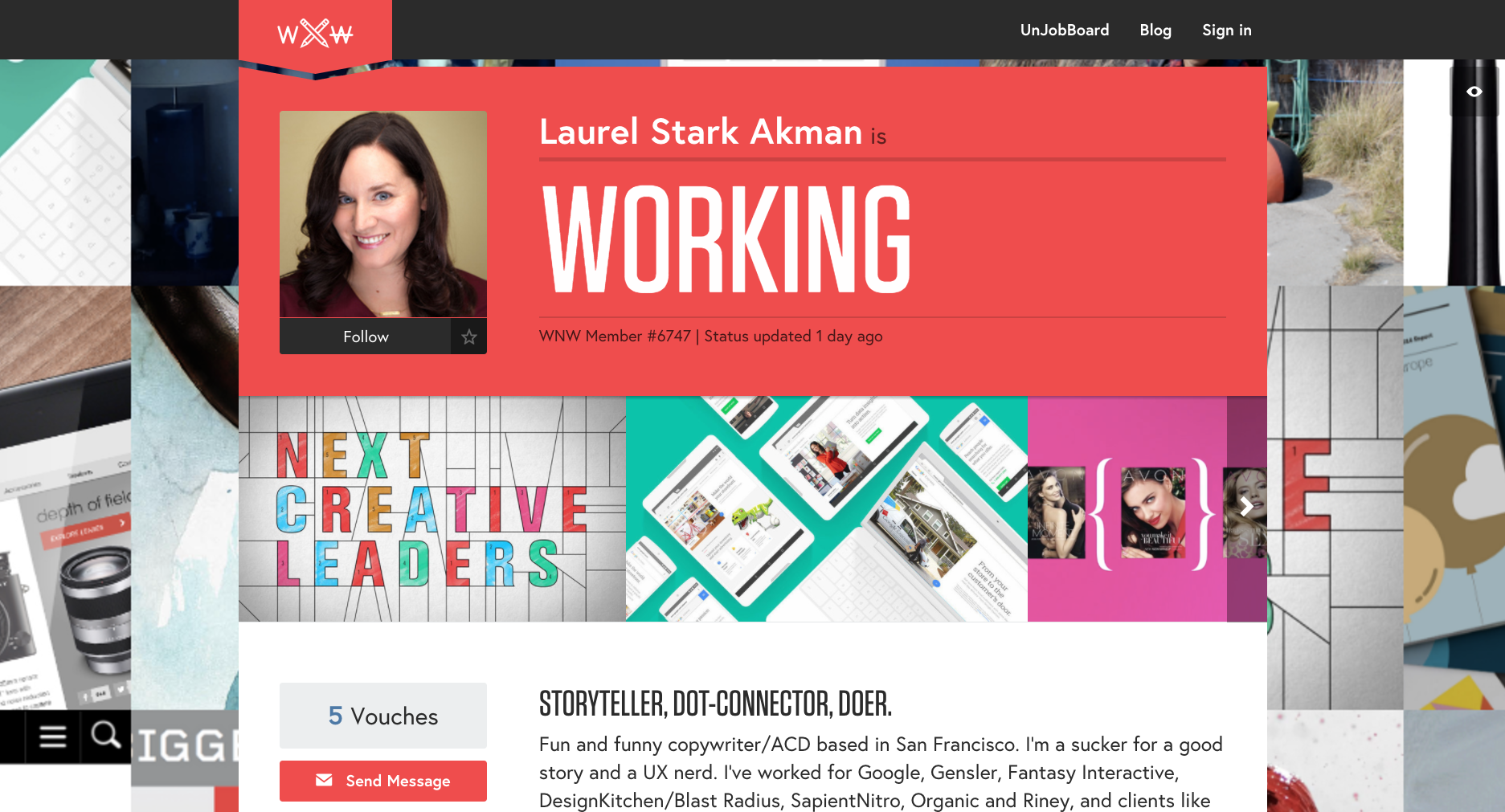
Laurel Stark Akman, Copywriter. San Francisco.
Beck Hickey, Art Director. New York.

Thomas Pregiato, Designer. New York.

Greg Dalbey, Art Director. New York.

Are you a WNW Member with new work, exhibits, products, or news to share? Email us!
Photo by Matt Bauer
VICE'S DERSU RHODES WANTS YOU TO USE YOUR TALENT TO TAKE A STAND
VICE'S DERSU RHODES WANTS YOU TO USE YOUR TALENT TO TAKE A STAND
WNW Member Dersu Rhodes is a Venice-based creative and hirer on Working Not Working. In our interview below, Dersu offers generous insights into his process on both sides of the coin as Design Director at Vice. From creating verticals for Vice like its women's channel Broadly and lifestyle channel Viceland, to searching for creatives who are as passionate as he is about making original and meaningful work, Dersu both embodies and embraces the spirit of Vice. "Vice has said 'fuck you' to offshore drilling, pipelines, discrimination of all ethnicities and sexual orientation, and I full-heartedly stand behind that. I’m 100% ready to chain myself to some trees and hopefully VICE will let me use my PTO."
Dersu repeatedly stresses that every endeavor for Vice involves extensive collaboration among creative minds. And they're always on the lookout for more impassioned makers and thinkers. When we ask Dersu what advice he can offer to creatives interested in working at Vice, he cuts to the chase: "Email me if you want to work with us and also if you want to be involved in taking your talent and using it to take a stand against the dark shit that could possibly be coming."
Tell us a little bit about your creative background. Who is Dersu Rhodes and how did he get here?
I grew up in a family that celebrated and supported absolutely any crazy creative ideas that I had as long as it didn’t involve television or video games. I remember drawing for hours listening to Ladysmith Black Mambazo and acting out imaginary epic sagas in the woods behind our house. I still find myself coming across new artistic mediums and convincing myself that this is my next calling. The benefit is that I dive into a new way of telling stories which keeps it exciting; the issue is that I end up spending a lot of time doing some stuff that doesn’t make a ton of sense for my career. For example, freestyle rapping.
My core has always been Fine Art, as that is what I went to school for. That eventually translated into graphic design, art direction, and more recently directing live action and motion graphic pieces. I come from 6 years in the surf industry before I got into advertising and media, so a lot of my aesthetic originates from that world. I also ran away to Berlin a few years ago, so my taste for sun flares was replaced with darker, moodier work.
How did spending your formative years in such naturally beautiful places as Montana and British Columbia inspire and influence your creative pursuits into film and design?
It’s funny that when I was growing up I couldn’t wait to get out of the wilderness. I thought that photo shoots and films that took place in the city felt more real and were more interesting. Now, I keep writing stories or dreaming up shoots that take place in the places I grew up.
I didn’t realize how much that chapter of my life and part of the world would influence my work until recently. I find myself gravitating towards stories that involve the outdoors or spreading a message of conservation and staying connected to nature. Now more than ever, my fear is the places that have been the source of the most peace and happiness will not always be here. Anytime that I’m feeling frustrated or uninspired I go surf, or go into the woods and immediately my brain takes a breath and I notice creative thoughts creeping back in.
How would you describe your creative style? Do you recognize a signature style that links all of your projects, or do you try to excuse yourself and approach each project as its own entity?
It varies a bit according to the project or client but my own personal style is really reflected in my Instagram feed as of late. I’ve really tried to collect inspiration and projects that I feel reflect my current mood and style.
I love photography and art that really makes me feel something. Vice has definitely influenced my taste and I find myself working with photographers who tell stories that are very authentic and gritty. On the other end of the spectrum, I love working with my friend Dean Bradshaw who has a more polished look, but his ability to tell stories with his work is just as impactful.
I’ve always loved Scandinavian design and the book Dutch Graphic Design sat on my desk for a long time. The ability to direct the eye with so few elements is mesmerizing to me and I try to mirror that effect in a lot of my work.
I recently had a friend suggest an exercise that could help define my signature style. He told me to pull together 100 images that speak to me and create a mood board with them, I’ve done this over the years and I realize that the style I’m drawn to has really changed a lot. It seems minimalism and emotion have really started to play a part in my work.

As a co-founder of music/style blog “Witness This” and a deep house DJ, what does the art of curation mean to you?
Curation is everything at this stage of my life. There is rarely a project that doesn’t involve more than one medium, and most projects present the opportunity to involve illustration, dance, photography, or music. Witness This began as an excuse to interview the people in my life who inspired me. In time it became a reason to reach out to artists or photographers in different cities and presented opportunities to learn from them. I approach most of my interviews with people like photographer Damien Vignaux or DJ HOJ as not only a chance to learn as much from them as possible but to try to convince them to collaborate with us somehow. ;)
You’ve been Design Director at Vice for three years. What separates Vice for you? How have you seen its identity evolve from within in recent years?
Long before I got here, VICE was already flying. The people that are leading the charge are so passionate about the stories they are telling and so hell bent on succeeding that it was a dream just to be able to jump on board. It was an opportunity for me to learn absolutely everything I could and be a part of telling stories that truly matter. This company is ready to take a stand for all of the progress that has taken place over the last years. Vice has said "fuck you" to offshore drilling, pipelines, discrimination of all ethnicities and sexual orientation, and I full-heartedly stand behind that. I’m 100% ready to chain myself to some trees and hopefully VICE will let me use my PTO. My goal is to learn from all the incredibly talented and passionate people here from all media channels and continue to do everything I can to tell stories that truly matter and better the world.

Is it a challenge to adopt Vice’s distinctive voice when working on a project, or do you feel that you already spoke that language when you came in?
It can be challenging because we do have a lot of verticals (channels) at this stage. However, each vertical has a publisher who along with the channel manager and their squad truly become the voice and filter for that vertical. I helped launch the women’s channel Broadly and we clearly defined the brand guidelines for that vertical, while making sure it followed the overall Vice brand guidelines.
I come from the surf world and advertising, and in a lot of ways so does Vice. Jake Burghart, the most O.G. DP at Vice, comes from the surf/skate world and there are lots of people that have worked on both sides. Our in-house agency Virtue works on brand art and design so you have to be a chameleon.
What Vice projects, campaigns, or endeavors are you proudest of?
I am very proud of our work in helping to launch VICELAND. We cranked through the holidays working on the show packages for Huang’s World, Vice World of Sports and Party Legends which all involved a lot of talented designers, art directors, motion designers and producers working very hard and really caring about what we were doing. Every time I speak with someone and I mention VICELAND, people tell me how much they love it so that feels really awesome.
Working with Diplo and K-Swiss for the launch of “The Board” was amazing as well. We had a rock star team of creatives, producers, photographer and filmmaker's and the result was a campaign geared around educating young entrepreneurs in design, marketing and making a social impact. At one point we had 5 of us in a hotel room rewriting a creative script at 1 in the morning the night before our first shoot!

Being in a leadership position, how do you cater your approach to allow your left brain and right brain to coexist?
I listen to a lot of deep house and crush coffees in the afternoon. I try to keep my creative time where I can really dive into problems and strategy for early morning or later in the evening. During the day I find myself in meetings that sometimes involve numbers which are not exactly creative, or working on Keynote which is sometimes creative so it’s definitely not all fun and games. But we have a great team and we talk through a lot of our ideas which makes it fun during the day.
What advice can you offer to creatives hoping to work at Vice? What can they expect from Vice’s creative culture and what would it take for them to succeed there?
I can say that you should email me. We are looking for designers and motion people. If your work is good and you know what we do and want to join us then let’s do this. You can expect to work on the VICELAND broadcast network, on Noisey, Broadly, Thump, experiential events, brand work and any ideas you dream up that you want to pitch for any of the Vice channels.
What do you look for in creative portfolios that are unique to Vice?
Portfolios that have a point of view. Having good taste is really a huge part of it. That could look like curating a tumblr or having a section that showcases your favorite work. Showing that you are aware of what is going on in the design/art world is important as well. Also a lot of CV’s that I get are sadly designed and honestly I won’t even look at those. Try to present a tight package that reflects who you are and what you care about. Show me you have a personality and are passionate about doing good work!
What’s next for you? What are you working on now?
We’re working on a bunch of new network shows. I’m directing the main titles and branding/animation packages and also working on a few freelance passion projects. One project is directing a short doc about a guy in Oregon who finds animals that have recently been hit by cars on the side of the road, and makes incredible moccasins and bags while not wasting any of the meat. We’re on the hunt for a composer to score it at the moment.

What do you do when Not Working?
Finding music and DJing has been such a huge source of joy for me. I’ve kept the business out of DJing and as of now it’s the one creative avenue that has no rules. I can play what I want and no one is asking me to make the logo bigger, although we do occasionally get requests to play Rihanna. I also love surfing and spend at least a day a week in the ocean.
Who are some WNW Members whose work you admire and why?
Tony Chen (former VICE broadcast editor now freelance) is someone who I have loved working with over the years. He pours his whole heart into his work and is so incredibly passionate about learning and pushing the boundaries of storytelling. I also had the opportunity to work with Michael Sevilla. That dude is seriously one of the most incredible digital designers and artists in the world. Balind is a homie as well and such an intelligent creative director/strategist.
Anything else you’d like to add?
Email me if you want to work with us and also if you want to be involved in taking your talent and using it to take a stand against the dark shit that could possibly be coming. I’m ordering Jessica Walsh’s pins when I get home tonight. Viva La Revolution!!!


Are you a WNW Member with new work, exhibits, products, or news to share? Email us!

HERE'S WHAT YOU CAN EXPECT AT THIS YEAR'S MOST CONTAGIOUS EVENT
HERE'S WHAT YOU CAN
EXPECT AT THIS YEAR'S
MOST CONTAGIOUS EVENT
As this tumultuous and unpredictable year draws to a close, Contagious will soon celebrate the best marketing creativity and technological innovations of the last 12 months, providing attendees with a roadmap for the challenges and opportunities facing the industry in 2017.
In two weeks, Contagious will be hosting 400 delegates from across the marketing industry in London for their annual Most Contagious event, exploring some of the year’s most compelling trends from Machine Learning to Mixed Reality, Gender and Choice. They’ll be joined by speakers from HoloLens, Barbie, Max Factor, 72andSunny and Axe, and will celebrate the most successful campaigns of the year, like The Next Rembrandt and The Swedish Number. The chief creatives from each of those agencies will share their behind-the-scenes insights and strategic advice on stage.
There are now less than 40 tickets available. But Contagious is generously offering a 10% discount to members of the Working Not Working community. Get your ticket here and enter WNW10 when prompted.
Below, Contagious offers a preview of some of the topics, ideas, and themes they'll be exploring during the one-day event.
Machine Learning
Arguably the most important macro trend of the next decade, machine learning is increasingly underpinning businesses across a variety of sectors, including entertainment, retail and even food. We’ll be offering insights into how this new technology could impact the way that businesses are run and advertising is created.
Keeping It Real
Artificially-enhanced environments can be used to create relevant, shareable, innovative marketing. We will cover the new creative possibilities that the fields of Augmented, Virtual and Mixed Reality have opened up this year as increased expertise, funding and adoption all make an impact. Laure Murciano, Max Factor’s Global Brand Manager will share how the brand used Blippar to share content and drive sales through its products.
Choice
The rapidly expanding nature of the online retail space means we have more options than ever before. Too much choice has always been overwhelming, but how can brands help their customers to navigate the overwhelming options? We will explore how they can do this using technology ranging from one-click buy buttons to customer service chatbots. Carling’s Sean Ferguson and Craig Wills of the beer brand’s agency Hi Mum! Said Dad will share their learnings from building an instant buy button and staying visible in the decision-heavy world of online retail.
Gender
We’ll hear about how an accelerator called Spring is empowering girls in East Africa and South Africa. And learn about how Axe and its agency 72+Sunny helped the personal care brand triple sales growth by championing a broader vision of masculinity.
This ‘Year in a Day’ also includes panel debates, an awards scheme for disruptive start-ups, and an exhibition showcasing the most ingenious new technologies and the makers behind them. The Economist’s Laurence Blair will also share key predictions for shifts in politics, the global economy, leading companies and cultural trends from The World in 2017 magazine.